I owe a lot to Rob Stenson. He’s the guy responsible for my work with Vulfpeck, and has since turned into a friend and collaborator. Rob is the designer and co-founder of Goodhertz, an audio plugin company with truly unique offerings, and as I learned in this interview, a pretty innovative process behind them.
If you’re not familiar with plugins, they are essentially fonts for sound — bits of software that allow a user to imbue their raw material with effects that can slightly color, or fundamentally alter a track.
It seems like Rob always has an intellectually satisfying and incredibly specific project for me. Whether it’s a quick lettering job or something more involved, his requests always leave me excited to get to work. Through these collaborations, I’ve learned about the arsenal of skills in his ever-expanding wheelhouse. Whether it’s directing a music video, designing interfaces, his amazing Holy Trinities series, or simply writing, Rob approaches creative endeavors with enthusiastic curiosity, and a healthy approach to having fun with typography.
A few weeks back, Rob met me for a beer at my favorite neighborhood spot in Oakland, and our conversation immediately gravitated towards the more technical aspects of his work. At the end of our talk, I was kicking myself for not recording the entire thing. Luckily, Rob was kind enough to continue our chat over email.
JE: I know recently you’ve made a switch from mocking up the layout of plugins in Illustrator, to generating them dynamically with Drawbot. Could you talk a little bit about why you made that switch, and how you did it?
RS: Heavy question! The short answer is that knowing how to program is a blessing and a curse — a blessing in that I can program things, and a curse in that I never want to do things manually that I know can be programmed, which can lead to hours learning how to program something that should’ve taken fifteen minutes. Illustrator vs. DrawBot is a perfect example of that divide; Illustrator is very manual on the one hand, and DrawBot is almost completely programmatic on the other. Unfortunately, making something programmatically is often an aesthetic tradeoff, i.e. design done in code often doesn’t look very good, usually because the tools available to that kind of workflow are subpar or half-baked. (Like they don’t support variable fonts or non-Latin word shaping algorithms.) What’s incredible to me about DrawBot is that, by leveraging the world-class Apple CoreText framework, it allows me to do Illustrator-quality typesetting in a programmatic way, which not only fits the Goodhertz engineering workflow perfectly, but also fits my kind of weird approach to design perfectly as well. So while I could still design and typeset the plugins in Illustrator, it would mean a ton of busywork and copy-pasting (which there would be a lot of now that our plugins work in multiple languages). DrawBot allows me to eliminate all that, while facilitating visual experimentation in a dimension that’s uniquely available to designing-in-code; that is, programming designs in code invites a whole new class of visual errors/mistakes into the design process — mistakes that often inspire me to go in new directions in the designs; mistakes that I’d never make in a drag-and-drop interface.
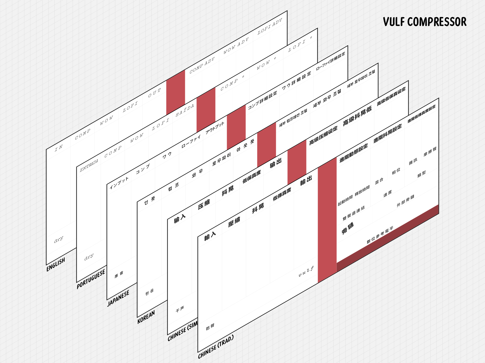
A visualization of the various translations of Vulf Compressor. Image provided by Goodhertz.
The long answer is that laying things out visually in software, particularly in software that has a fixed aspect ratio, is incredibly difficult, and sadly the thing I’ve probably spent more time thinking about than anything else in my life. Illustrator was actually the second of four bizarre layout/typesetting schemes we’ve used at Goodhertz — you know, that short answer was pretty long, so I’ll stop there.
You mentioned that Goodhertz plugins now work in multiple languages. Is that a standard practice in audio software?
Incredibly enough, it’s not, which is interesting, given that so many audio plugins are made in non-English-speaking countries, Germany in particular. As far as we know, we’re the only company that offers plugins in multiple languages, which, coming from my background in software engineering — on the web and in iOS — still blows my mind. In other industries, making software multilingual is one of the marks of a serious piece of software.
“As far as we know, we’re the only company that offers plugins in multiple languages, which, coming from my background in software engineering — on the web and in iOS — still blows my mind.”
The main factor working against translation in plugins is that these are truly specialist tools, and anyone who uses them probably has a least a working vocabulary of English audio terminology. In Japan, for instance, an audio engineer might not really speak English at all, but when they talk about compressors, they word they use is “コンプレッサー” (or “Konpuressā” as it’s Latinized). It’s like that for a lot of words, so actually when I first brought up the topic of translating the plugins into Korean and Japanese, our business partner in Seoul — shoutout to TaeHo — made that point, that translating probably wasn’t necessary, or at least wasn’t expected of us. But we went ahead with it anyway, partly because to me it’s a way to show respect to our international customers and their cultures. (The Vulf Compressor wouldn’t exist without Japanese software engineers.) And when TaeHo first got to use the plugins in Korean, his native language, he was blown away, which completely took him by surprise. I think he described it as a kind of emotional experience, which I’ll admit I had a hard time empathizing with (given that I only speak English), but then again when our translator in São Paulo — shoutout to Tiago — first used the plugins in Portuguese, he described a similar feeling.
That’s incredible. Typographic experiences eliciting an emotional response is probably the best we can hope for as designers. Can you talk a little bit about the struggles of translating an interface?
I can’t speak too much about the actual language side of the translations (though we did some interviews with our translators on our company blog), but the typesetting process was truly fascinating, given that I was working with very strict horizontal spaces to fit lots of text; designing an audio plugin — for better or worse — means fitting lots of controls into a small, unscrollable rectangle. A language like Korean tends to be space-efficient horizontally, but Japanese presents two very different scenarios, where it’s either very space-efficient kanji or very wide katakana (or a mix of the two). This sent me on a real vision-quest, and I’ll spare you the details, but basically katakana is usually monospaced, though can be proportionally-spaced (which saves a ton of pixels horizontally), but it was extremely difficult to figure out how to turn that on in Japanese fonts (the answer is the `palt` feature). Anyway, I still know next-to-nothing about CJK typesetting, so I’ve been leaning heavily on the expertise of native speakers and designers, and am very excited about working with a typographer in Hong Kong on our Chinese versions.
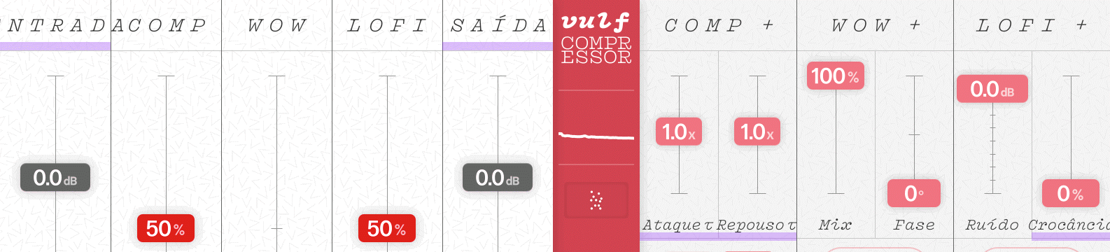
A visualization of Rob’s programmatic approach to automatically fitting text within a given amount of horizontal space.
For Latin-based languages, it’s been a lot of fun to experiment with the width axis of variable fonts, since that allows me to fit longer Romance-language words into the smaller spaces we originally allotted for English words, particularly in Vulf Compressor, which uses your Vulf Mono (not a narrow font). When our translator suggested Crocância for a slider we had been calling Crnch (no “u” for space reasons), I loved the translation (it refers to the crunch in a bite of food, as I understand it), but it was way too wide for the space. Then I remembered that when you were sending Jack early sketches of Vulf Mono ideas, there was a narrow variant stuck in there, which looked incredible. So that prompted me to send you an email asking if there was any chance in the universe you were working on a narrow version of Vulf Mono that could be part of a variable font with a width axis? You weren’t, but — miraculously (thank you!!!) — you cut the necessary characters for the Portuguese labels, which I immediately worked into the design. It also let me get the “u” back into Crunch. That experience actually prompted me to switch everything to DrawBot so I could do programmatic things with variable widths and letter-spacing, to have things automatically fit their boxes, according to a little algorithm. I think people are doing similar things with variable fonts on the web now, using Javascript.
That said, there aren’t (yet) very many variable fonts out there with a width axis; it feels like every week I’m on v-fonts.com hoping to find some new variable-width typeface. I should also say, sort of related, I’ve found variable fonts to be incredible for multilingual typesetting, since with a weight axis it’s much easier to match color in typeface pairings, even when the typefaces are totally unrelated.
Do you think this move from static to dynamic text and layouts is the future of prototyping and building interfaces? Would you recommend this approach to others in the industry?
To be honest, moving to a static layout system at all was out of the ordinary for me, because I’ve always found it incredibly difficult to determine how something should look without really understanding how it works. (And vice-versa, which makes life complicated.) I should say I don’t think that’s how design and programming should be done, necessarily; that’s just how design makes sense to me, ever since I learned CSS as a teenager. Basically, I think I approach all design tasks as a kind of web design task, just because that’s the first system I really learned deeply, not because I think it’s the best way to do it.
I will say that if you’re designing a system of interfaces or building some kind of interface language, then the benefits of programmatic design are huge, and far outweigh the ability to drag a text frame around in Illustrator. When we first started adding support for Korean to our plugins, I got a big spreadsheet of translations from English to Korean and then went through it one by one, copying and pasting to Illustrator. Then our translator came back later and said, I’ve got some changes to the translations, this one character here should be this instead, etc. That wasn’t a big deal, but the workflow was prone to mistakes, since I can’t read Hangul. Then it happened again and again and I started wishing I could just read that spreadsheet with a single API call and generate the text layer of the interface in Korean using something programmatic (that’s where DrawBot comes in), which would eliminate any human error, and make our translator not feel bad about requesting small changes. Now, a year later, we do have that system. Our translators update an online spreadsheet whenever they want, then when we’re ready to do a build, I run a single command in the Terminal and — after a few seconds of some Python code doing its thing — I’ve got six new SVGs typeset in languages that I can’t read but that I’m confident are correct and will be correct again in the future, when some new change comes in. Interfaces are dynamic, living things, and it seems difficult to create that by beginning with something static.
“Our translators update an online spreadsheet whenever they want, then when we’re ready to do a build, I run a single command in the Terminal and — after a few seconds of some Python code doing its thing — I’ve got six new SVGs typeset in languages that I can’t read but that I’m confident are correct.”
I also think prototyping in code gives a designer control over the life of an interface, since nothing will be lost in translation from static to dynamic if there’s no translation to do. This can lead to better, more exciting designs, or at least weirder ones (which is inherently good, right?). Leaning on someone else to implement a design for you often means you end up relying on cliches or other off-the-shelf solutions that work in a broad sense but probably don’t fit the task at hand all that well. Knowing how to implement means knowing how to experiment.
I recently found out a lot of the early metal type innovators actually had backgrounds in metallurgy. Kind of a weird fact, but it immediately clicked with me as someone who’s both a software engineer and a designer; learning about floating point numbers in C++ is a long way from design, but they’re just as connected as type metal composition and the shape of a lowercase a cut in the 1750s. All in all, I think it’s possible — and meaningful — to learn about the whole spectrum of a craft from the hidden to the seen.