This is a guest post on the Ohno Blog by our esteemed collaborator, Jérémy Landes of Studio Triple. I first became aware of his work in the pre-Future Fonts days, and I thought he’d be a fantastic contributor to the platform. Luckily, early on, he approached us about releasing a particular intriguing project, entitled, Digestive.
In the summer of 2019, I travelled to France and met Jérémy at Rencontres internationales de Lure, an unapologetically French type conference. We enjoyed many glasses of rosé, a few games of table tennis, and chatted about releasing his Digestive.
With great admiration that I introduce to you my friend, Jérémy.
Bookster, lettering
Everything started at the end of October 2016, when I started to work on a second poster for Bookster. This atypical publishing house creates classical novels in the shape of posters showing the whole text of the novels. Each poster heading is drawn by a different designer. I already had drawn one for Lewis Carole’s Alice in Wonderland, but this time I chose to work on George Sand’s La Mare Au Diable. I had a bit of time for this project so I decided to read the novel before starting work. This challenge had the added benefit of motivating me to read this classic of French literature.
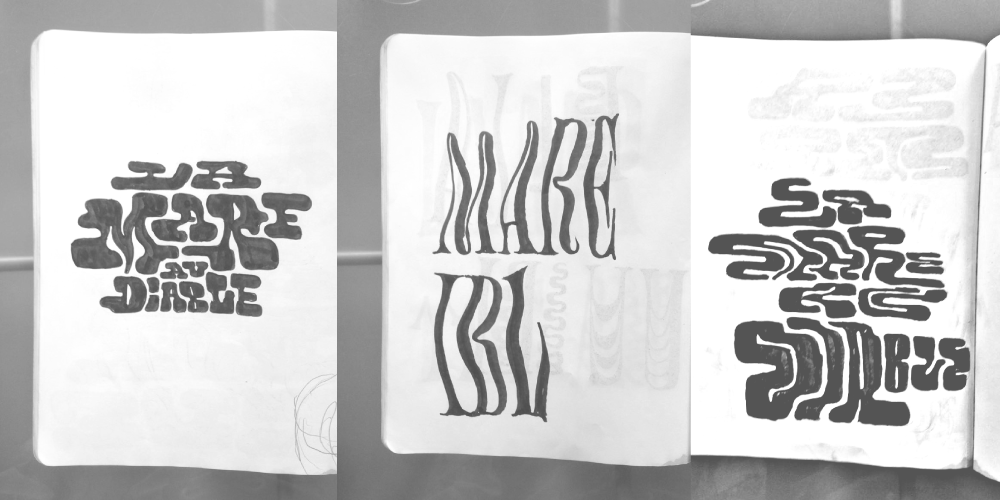
The first sketches that leaded to the lettering which would later on become Digestive. Look how different it could have been.
Surprisingly, reading the book didn’t help me at all to have any idea for the heading. While short, Sand’s novel plays on different registers and is not easily summarized in one image. I then came back to my first idea, a simple illustration of the pond described in the story, hidden in the middle of the trees and the fog of some mysterious forest. But the trees would be letters, madly condensed proportions reflecting themselves in the shady water of the pond. A first-degree illustrative idea is sometimes the best approach. Now you have the basic ingredients for the birth of Digestive. On the final poster, the letters were even warped, skewed by the years or by the myst. Funnily enough, there was no O, the signature letter of digestive, in this first lettering.

My lettering for this poster was even more condensed and wobbly than Digestive. I was pursuing a really demoniac vibe for this poster.
I already saw something interesting in these first letters at that time and couldn’t help but complete a bit of the alphabet to be able to try out a few words. The original lettering was madly condensed and my first decision was to widen the shapes by a ratio of 2. This was still really compressed, but at least a bit usable, maybe. At some point, I created some test images, was pretty convinced, put them on my website and stopped work on this typeface for the moment. I was already seeing some sort of potential in these unnamed letters, but no commercial appeal. At this time, I couldn’t have imagined that this would become a font that strangers would buy for so many different uses.
The vertical serif issue
Even with the smaller number of letters I had drawn in this font, some pretty tricky questions already arose. The first one was about the treatment of the vertical serifs. The horizontal, really short, flared serifs that characterize Digestive were already there in my first sketch, coming from the dynamism of the pointed brush I used. But on these first sketches, I had chosen a different solution for the vertical serifs than the one that can be seen today in Digestive. Then, I was trying to make the round letters look rounder. The thin stroke, coming from the bowl, would connect to a tall vertical serif, pointy on both sides.

This shape was problematic for two reasons, at least: first of all, this was giving Digestive an even more pointy and crowded vibe, evoking a demonic connotation. The design needed maybe a bit fewer demons. Also, to manage the connection, I needed to have wider round letters, too wide compared to the other set of letters, and most importantly, way too light. All this white space around these curves and vertical serifs was disturbing the compact aspect I was trying to achieve. Later, the solution simply came from the L or the T, with their really tall but black, triangular vertical serifs. Using these serifs for the C proved to be way more convincing than my first solution. The connection with the flat top of the serif and the curve of the letter felt even more natural than its previous cove counterpart.
The sales start, the emails

A few things changed between this first set of caps and what can be found in the final version — mainly some outline consistency improvements. The J and Z got new structures, fitting more with the rest of the character set and, creating less white pockets than the ones that you can see above. But, oh boy, I loved that Z.
At this point Digestive was less than 20 letters hanging together in a font file. That and some images on my websites, made one believe that I had drawn at least a complete set of capitals. That’s when I received my first email asking if I was selling this font. You can’t imagine how surprised and flattered I was—and embarrassed. Still, saying no to some new work and the money seemed silly. So I decided to be honest, say that the font was not complete, that I was planning to work on it, and that I could offer an early access to the font. This was at the end of 2016. I couldn’t have been more surprised when the first people requesting the font said they were totally fine with this model. 2017 went on, still quiet. I was receiving a tiny amount of requests, but just enough to motivate me to continue working on the font. Beside my other projects (Le Murmure was drawn during this summer), I finished a first set of caps and figures. I thought that I had drawn the core of Digestive, and that I would just add the mandatory diacritics and punctuation later be done with it.
But in 2017, the Belgian studio Atelier Brenda with Amélie Bakker bought Digestive and used it with taste for the seasonal identity of a Brussel cultural place, the Beursschouwburg. This first major public use of Digestive brought a lot of attention to the font and influenced a lot how it would be later used by other people. Digestive is still regularly used with an enormous amount of tracking. 2018 saw the number of emails coming in my inbox drastically increase Managing the sales by email was becoming tedious. At this point, I had already heard about Future Fonts and was interested in the project. I had even been a candidate before they were open. Finally, in March 18, quickly after their launch, they let me join the platform and published Digestive. This is the best thing that could have happened to Digestive. The first version I released there was only one style, the original compressed one, with caps and lowercase, figures, some punctuation, diacritics, and no kerning.
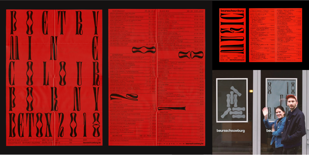
Atelier Brenda and Amélie Baker work for Beursschouwburg 2018 season paved the road for Digestive and had a lot of influence of how people would use the font in the future: tight line spacing and huge letter-spacing are still its regular companions.
The lowercase
Even if I was pretty convinced that Digestive was a capitals only font, I couldn’t help myself but try to draw a bit of the lowercase. A first attempt at the end of 2017 proved that it would get really messy if I was getting lost into complicated structures. The small `a` was proving to be a real challenge. Making every round letter as psychedelic as the `o` was too intense and repetitive, hence boring. So I came up with simpler bowls for the `bdpq`. These bowls were still concave, and a bit weird, but their weight was consistent all along the path. Finding these `bdpq` was the key to then unlock a lot of other important letters as the `n`. From there, I tried to keep it simple, using either the same structures for the lowercases than the caps, or using a simplified classical approach. At some point, you have to stop doubting and questioning everything and just decline the choices you made earlier. The `g` and the `y` appeared to be nice exceptions with their distinctive loops. After months turning around this question of Digestive should or shouldn’t have a lowercase, they made their appearance during the first months of 2018, exactly on time for the first release on Future Fonts.

Working with huge use sizes in mind and trying to keep a dense texture, I chose a ridiculously big x-height, making the ascenders and descenders just slightly overshot the other letters. This decision was also linked to my goal of keeping Digestive as compact as possible. These short ascenders and descenders also permitted tight leading, perfect for headlines.

Digestive is specially suited for super tight line spacing, even when set in lowercase.
The name, the marketing
Sometimes the name of a typeface appears by itself, as evidence, either from the context of creation, movies, books, or games I am into at the moment of creation. Other times, I struggle for months. I started to be accustomed to ask my friends about name ideas for my fonts. This is a nice way to learn what other people see in the embryo of a font you don’t have enough perspective to see clearly. I had posted an extract of the font on social media, asking for recommendations from friends. In the middle of 50 comments with other pretty good ideas, Astrid de la Chapelle simply posted, this was a “Digestive type”. She would be later one of the first users of the font for the cover of here future-fluid fanzine called Futu. There is no coincidence.

Thanks Astrid.
This name would lead me to see how Digestive is linked to my love of cooking and good food, while being elegant and weird, pleasing and surprising, full of details but also covered in thick sauce. I pushed this idea in my next seance of work on the typeface, but also on the words I would use on the specimens and in the early marketing tools developed for the font. It seems that I wasn’t the only one relating Digestive shapes to food and it has later been used in several food magazines and identities of a few restaurants. Perhaps my marketing effort was successful.
The people stretching the font—the need for a less compressed style
Digestive has been shaped by its users. As it was released so early, without even a complete set of capitals, I saw it being used, and real graphical materials played the role of proofs. This way, I could see that some of my letters were not legible enough and could be mixed with each others (N-X). The uses taught a lot about what could be improved, what users liked, and what might be problematic. As Digestive was drawing more and more attention, it was selling more and more and started to be a serious source of income. This allowed me to free some time to dedicate myself to grant the existing users with meaningful and exciting updates. One of the first things the users were doing was to stretch Digestive to make it wider. Yes, indeed, this first compressed style was way too condensed for many situations.
The absurdity of trying to make it so wide. But why not?
Thus, even if I was thinking that Digestive would stay a one-font family, I had to face the fact that drawing a wider style might be useful. I could have just drawn a new style twice as wide as the first one, this would already have been a lot less condensed. I don’t know why I decided that I needed — the world needed — some sort of Digestive Expanded. This was my mistake. No one was asking that. Making the distinctive shapes that fuel this font work when not being condensed at all proved to be an intense challenge. Being condensed was (and still is) a big part of Digestive DNA. My first attempt, drawn only with the caps, was not convincing. It just looked like someone skewed Digestive. I wanted to keep the same vibe than what my users were doing when they were deforming the compressed style but my attempts weren’t any less clumsy than digital stretching. They lacked subtlety.

The earlier sketches of some wider Digestive.

Left: digitally stretched O. Right: corrected O with a way calmer outer shape.

Left: the first version of the wide caps I shamefully released on Future Fonts. Right: the last versions of the same caps, a bit calmer and darker, with tighter curves.
The redrawn wider style
The answer came from Atelier Brenda and David Jonathan Ross, who suggested that the wider style should be calmer than the narrower one. DJR proposed that the outer outline from the letters should globally stay the same between all styles, the craziness happening more in the counter shapes. He also advised to keep the space between the letters as tight as possible, as Digestive is a titling font and should remain compact. I kept the same proportions between the black and the white in all styles, making the extended style way thicker than the original one. With this feedback in mind, I totally redrew the wider master to obtain the first ever convincing incarnation of a wider Digestive.
The myth of interpolation for a clean variable
As I mentioned, the wider Digestive is a lot wider than the original compressed style. On average each letter is 4 times wider in the new style. My users didn’t ask for that. They asked for a Digestive perhaps 1,5 times wider. During this process I kept my 2 masters compatible for interpolation. At this time I wasn’t a wizard in interpolation, and every project I worked on before was a lot less blobby and organic than Digestive. I had to pay the price and discover that keeping those sweet curves tight and sleek all along the interpolation axis would be a time consuming nightmare. To say it fast, if you don’t want to have bumps in your curves when interpolating, you should keep all your nodes with their handles horizontal or vertical. Digestive is not at all in this situation. I used a lot what we call inflection points. Happily, with the help of some handy tools such as the LettError’s Angle Ratio tool or Delorean Preview by CJ Dunn, this was doable.
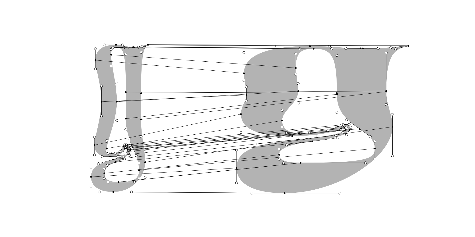
The change of proportions in width comes with a change of vertical proportions.
The tiring delusion of wanting to reinvent the wheel for every single new character
At some point, when I was happy enough with all my basic glyphs, and it became clear that Digestive would be released as a fully professional font offered to most users of the latin script, I started to expand the basic character set with all the accents, punctuation, and glyphs a retail font requires. Even if Digestive’s contrast and serif bring it quite close to the family of the Didones, the structure of each glyph often goes off road to prove its originality. The lack of reference would prove itself challenging when I set off to complete the character set. Inventing new structures, shapes, distributions of contrast, proved to be a challenge too big. Sometimes you shouldn’t try to be innovative in every part of the character set. A period is a period. And a font needs to be finished.


The companion for small sizes
Speaking of finishing the font. The Digestive family had grown from one lonely compressed style to a small family of 6 widths. This seemed enough. The wider styles had the quality of being more legible a smaller sizes, due to their more gentle proportions. But those styles weren’t legible enough. Talking with James, we concluded that the only thing lacking was a version drawn for setting smaller sized text accompanying the other heading styles. This style wouldn’t need to keep every Digestive feature, nor make them work at 10 points. It would be a shier cousin, happy to help while delivering the information in a more reliable way than the other members of the family. Sometimes having a boring cousin is nice.

The Small style shares the same structure with its titling siblings, adding wider proportions, lower weight and contrast, and softer curves to the mix.
Soon enough, after solving the problem of the contrast of this new member, came the question of its sharpness. Digestive is a typeface with sharp details — its serifs are like needles. While making everything bigger in the Small cousin, the question arose of what I should do with this sharpness. Digestive is not really about angles, is it? Thickening the serifs while keeping sharp angles leaded to a lack of elegance from another universe. I then tried to make everything smoother. No angles anymore. Babies would be safe around this smooth font. This new soft cousin provided a pleasant contrast to the display styles. It then had its own internal logic. The Small style looks a bit like a middle-aged lead cast cousin. Its softness makes it welcoming for reading. And if you want to ask the question, no it’s not interpolatable anymore with the rest of the family…

Left: Digestive Five. Right: Digestive Small with enhanced legibility.
Am I finished now?
Digestive is now a proud family of 7 members. I have no doubt that the more condensed styles will be used more than the wider ones but they will be there too for the typographicall adventurous among us. With their matching weight and side-bearings, every width can be used beside the others to create even crazier, kinetic-like layouts. For now I will stop working on this family and let you have fun with it. It was a surprise from day one to see what other people were doing with this typeface and I hope to be surprised again and again.
