It was Sunday, October 8th, 2015. My roommate and I were making the drive from a dingy Hotel in Rohnert Park, to our apartment in the fog drenched hillside of San Francisco’s Outer Sunset District. Bleary eyed and dizzy from the night before, I lazily opened up my Discover Weekly to put on Wait for the Moment, a soulfully nuanced groove from some band with a weird name.
We both knew there was something special there, so into the artist page we dove. This is a path I’ve followed many times before, but often, the remainder of a band’s discography fails to deliver the goods. We put on Thrill of the Arts and were completely blown away. About two minutes into the auditory odyssey that is Welcome to Vulf Records, I had found my new favorite band. Funky Duck made us laugh out loud, Back Pocket was the best clarinet solo in existence, and Rango II made me grab the “oh shit” handles of the car.
We immediately checked tour dates, hoping a San Francisco appearance might be in the cards. To our amazement, they had a show booked five miles from home that night. It was hands down the best show of our lives. The music gods blessed us that night, and to this day I don’t understand why.
Jack was looking for a bold monospace that referenced the Light Italic available as a golfball for IBM Selectric Typewriters. A number of things are interesting here.
- A musician aware of the power of custom type and its relationship to branding.
- A relatively young person aware of IBM Selectric typewriters, and the fonts available to them.
- Someone outside of the type world using the word “monospace.”
- A monospace for a funk band? Most definitely not an obvious choice when you consider the rich history of expressive type and lettering on funk and soul record covers.
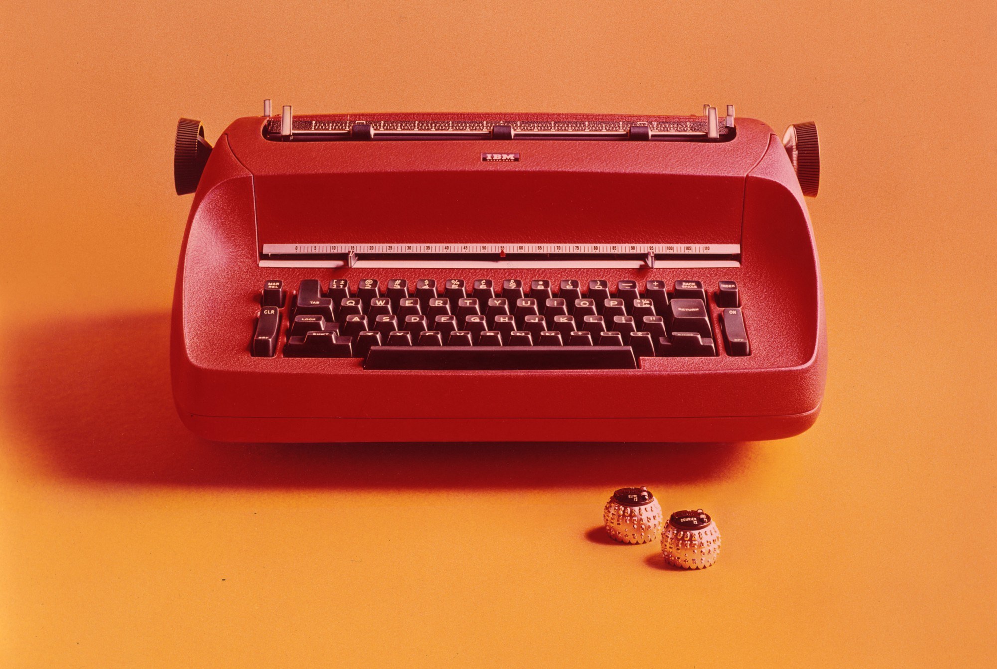
The IBM Selectric typewriter was technological milestone not only for the multiple font choices available to it (see the balls of type), but also due to the machine’s “memory” that allowed you to type faster than the machine could print.
In addition to his musical contributions to Vulfpeck, Jack is in charge of marketing and design for the unsigned band. For someone that plays any rhythm section instrument with impressive competency, he knows his way around the Creative Suite astonishingly well. It appears he is no stranger to Lynda.com, and even makes tutorials himself. I was simply happy to be working with the person who would be using the type, and it was time to start sketching.
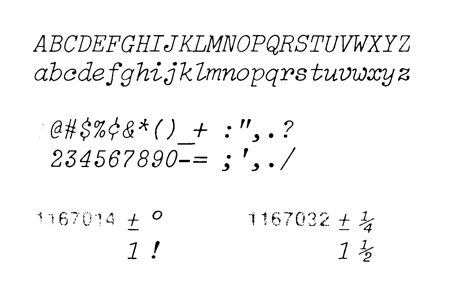
12 pt Light Italic. Image courtesy of Luc Devroye.
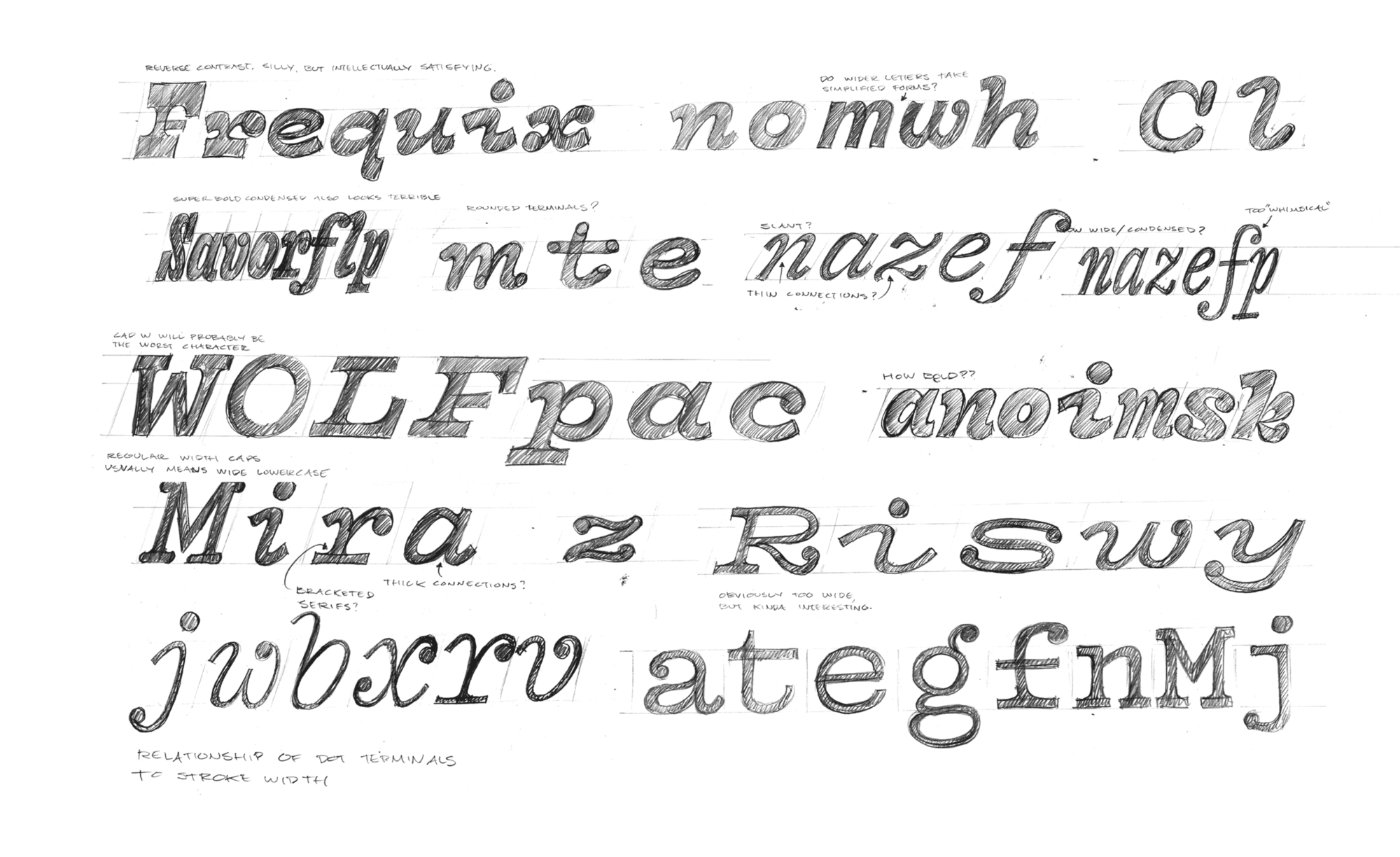
My initial sketches ranged wildly in weight and width. As is always the case, leaving no stone unturned is a good strategy for dialing in the variables to exactly their sweet spot.
Though the vast sketching exploratory revealed a few interesting directions, Jack resisted their novelty, and found my first sketch of the Vulf logotype to be more fitting for the band.
Warmth in Vectors
Putting the nuance and soul into a monospace that Vulf puts into their tunes became the name of the game. The Light Italic from IBM was so fun and lively, but part of its charm was the fact that it gets printed on a sheet of paper in front of you, with all the subtle inconsistencies that are inherent in typewriters. The job was making type come alive in digital outlines, without applying some hacky filter to roughen edges or distress the shapes. I believe those things should be left to the typographer or graphic designer.

The simple difference between a geometric square, and one with slight bends on all sides. A subtle move to be sure, but one that can breathe life into a design when echoed through thousands of outlines.
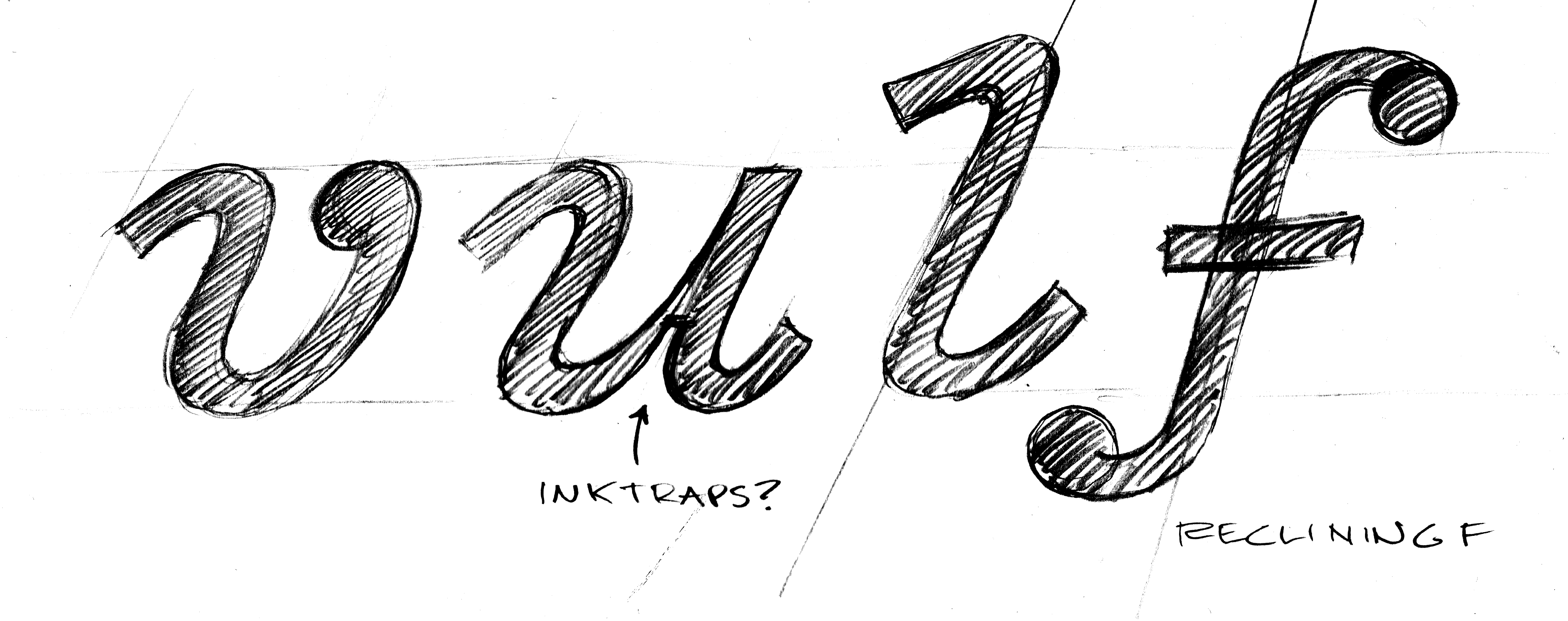
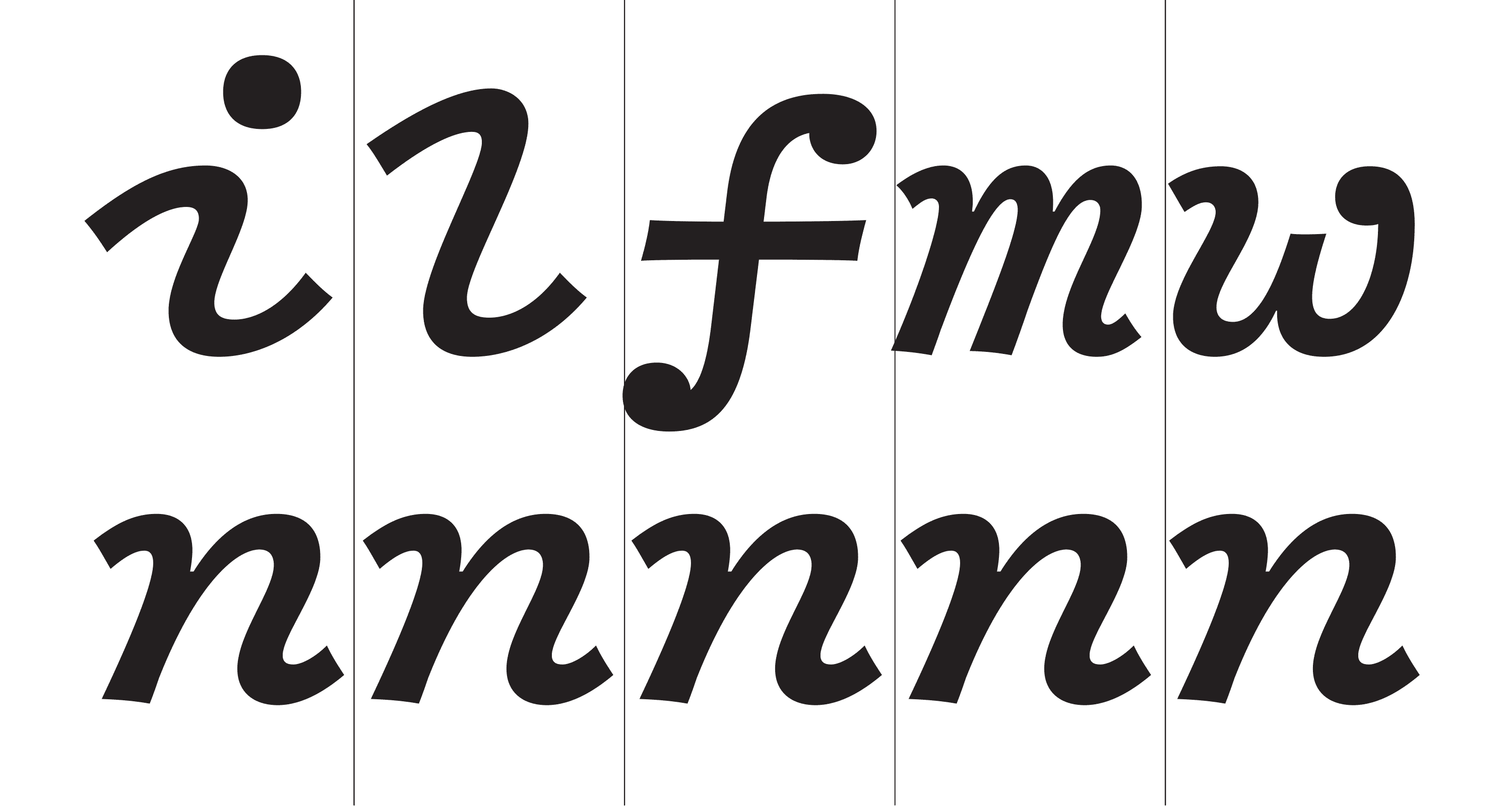
One of the biggest challenges of designing monospace type is dealing with the widest and narrowest glyphs. Simply put: i, l, j, m, and w are a real nightmare. Luckily, with a slab serif design, one can elongate entrance and exit strokes to occupy as much horizontal space as possible.
Another opportunity for warmth came from the slant of the individual letters. By making certain letters like f and ß lean back, they more appropriately filled out their rectangles, minimizing pockets of white space.
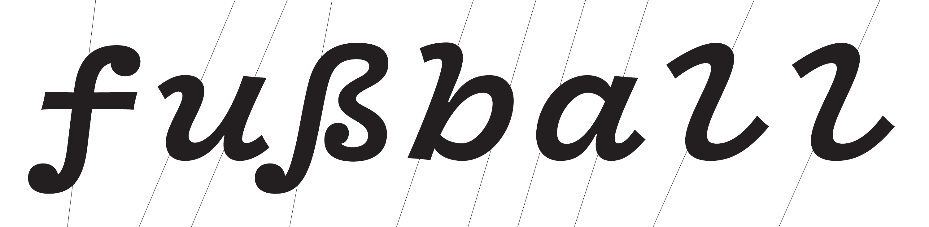
An early version of the typeface, showing how adjusting the slope individually helps to fill horizontal space more evenly.
Another difficulty is consistency in width of capitals and the lowercase. In most monospace typefaces, caps become a bit condensed, while the lowercase maintains more traditional proportions. Because this was not an actual typewriter face, and because it’s not intended for code, horizontal economy was not an issue. We had the luxury of going wide with the minuscules, allowing the majuscules to be more normal.
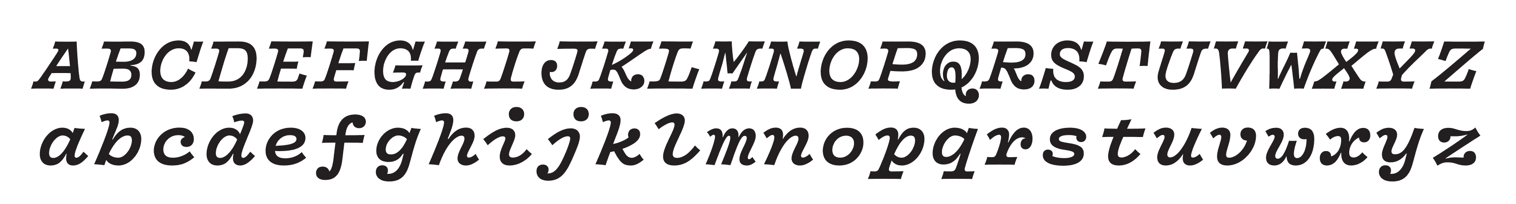
The relation in width between upper and lowercase is a challenging give and take for monospace designs. This early version of Vulf Mono also shows ball terminals on K and R, a detail that was later ironed out.
Broadening the Designspace
Although the bold italic that Jack initially requested would be a sufficient standalone, I knew that making the typeface truly useful meant building out the family. Not a trivial task, but perfectly within the realm of possibility.
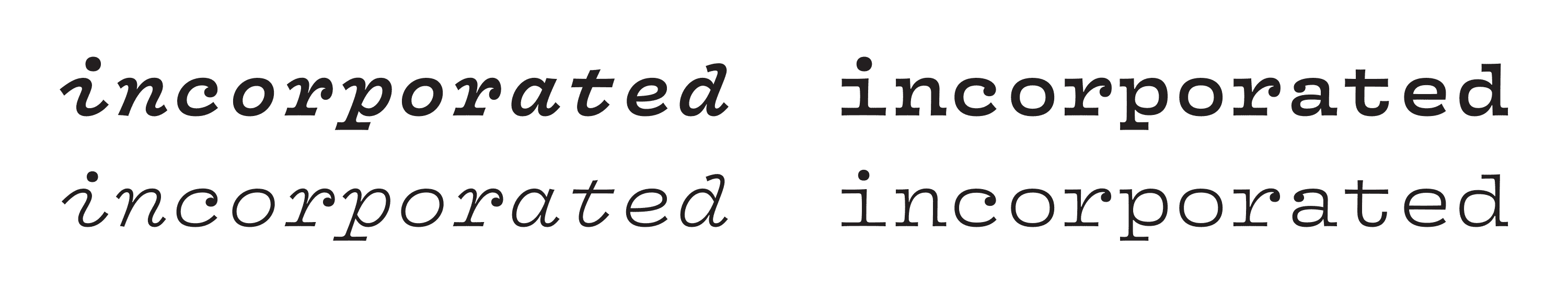
Starting with the bolder italic in the top left, I considered what additional styles might look like. By drawing just a few characters, one can quickly test ideas to get a feel for the family. Later, the x-height was increased in the bold, to help the styles maintain proportions through the weights.
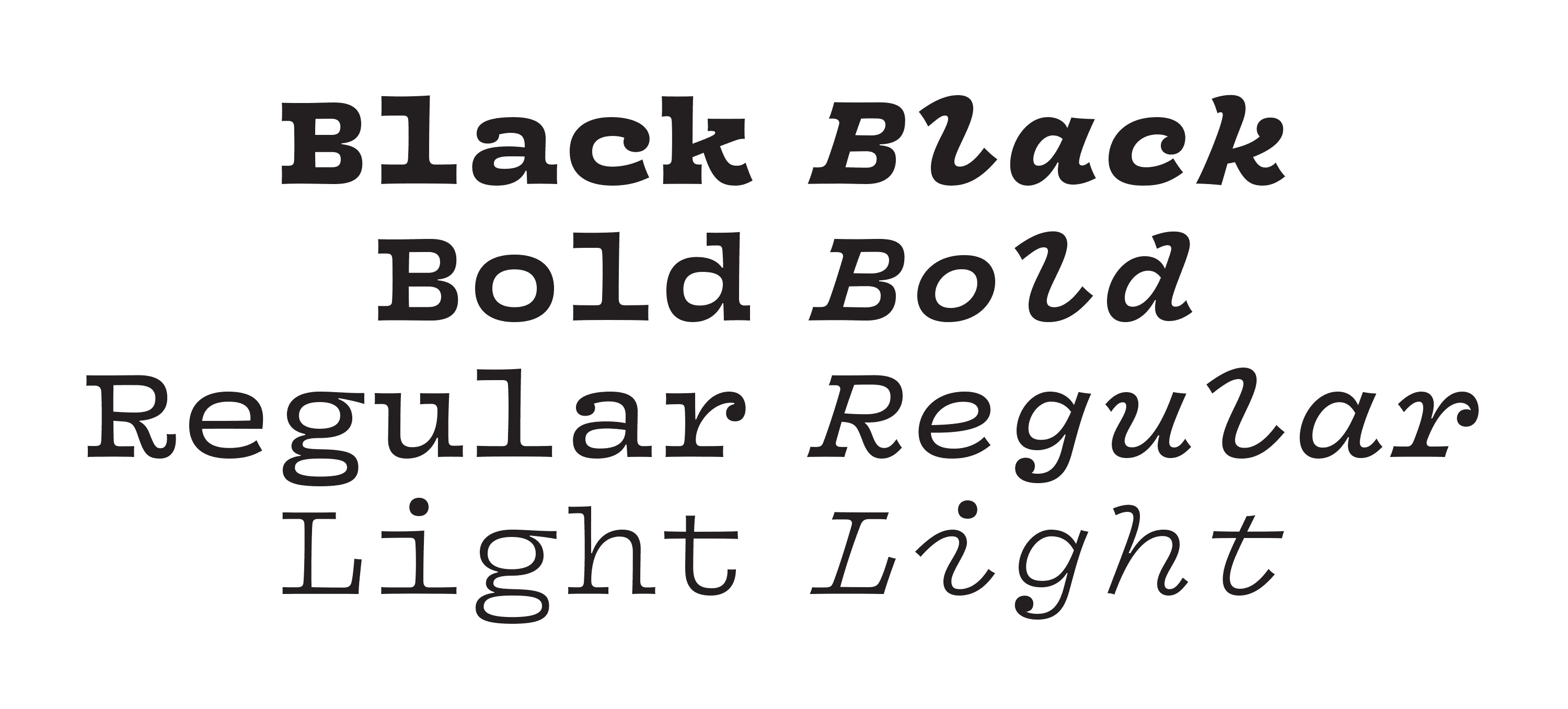
As is often the case, I realized the roman could go even bolder, but then the italic had to beef up as well. At this point, we have a nice little happy family starting to take shape.
The rest of the process is mostly manual labor, with little room for invention. Luckily, Jack was a pleasure to work with, and usually kept his responses to my email under two words, which is a great sign of respect.
Bringing it Home
Arrows are a feature in typefaces that I find to be quite useful, and because this was for a band that is particularly musically literate, I felt obliged to offer some additional music related dingbats in all four weights.
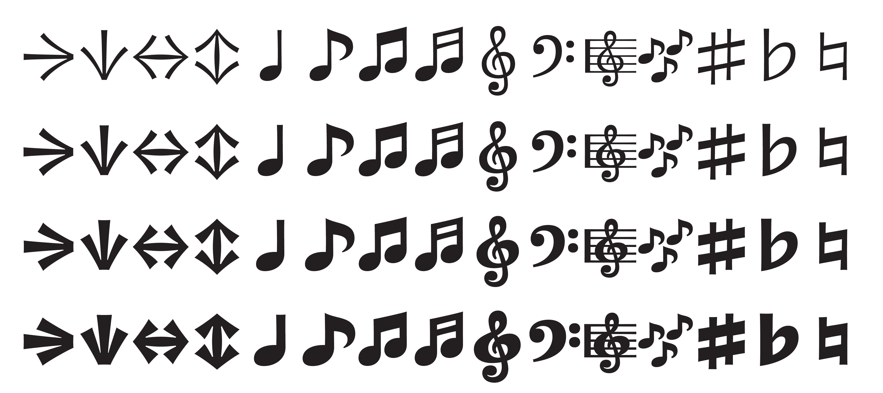
This part is pure fun. I have a prediction that treble clefs will be the new ampersands.
In Closing
When you love a band, you are compelled to express that, but you know the limitations in getting your point across. Making Vulf Mono has become my vehicle for appreciating the music, and honoring the skill and artistry with which it is made. Whether I’m reading or listening to music, I’ve always been attracted to the human element. Joe Dart, Vulfpeck’s legendary bass player, said,
“My practice regimen for a long time was playing along with a drum machine. I think that having great time is maybe the most important element as a bass player. Now I like playing along with records, getting more of the human element involved in the time.”
For me, the parallels to type are obvious: great rhythm is great spacing—harmonious whitespaces from which positive shapes are formed. The human element is something else entirely, but it’s exactly what I tried to breathe into Vulf Mono.