Bootsie Collins says it all. “It’s however you feel, but you just gotta fit in that little space that you got.” I’ve watched this video many times, and the comparisons to type design get increasingly obvious. Keeping it “on the one” was an imperative Bootsy received from his early days of playing with James Brown. “Whatever you do, don’t matter, just make sure you gimme that one.” James would implore the band. It’s a simple constraint, and as Bootsy says, “You can do anything you wanna do with it.”
Last week I contributed to a panel about graphic design for music, sitting alongside Mary Banas and Jason Munn. It was fascinating to learn the story of Mary’s work for Mitski’s Be The Cowboy, and hear stories of difficult client relationships that even Jason Munn has to deal with. At the end of the panel however, I realized something strange: we never actually talked about music.
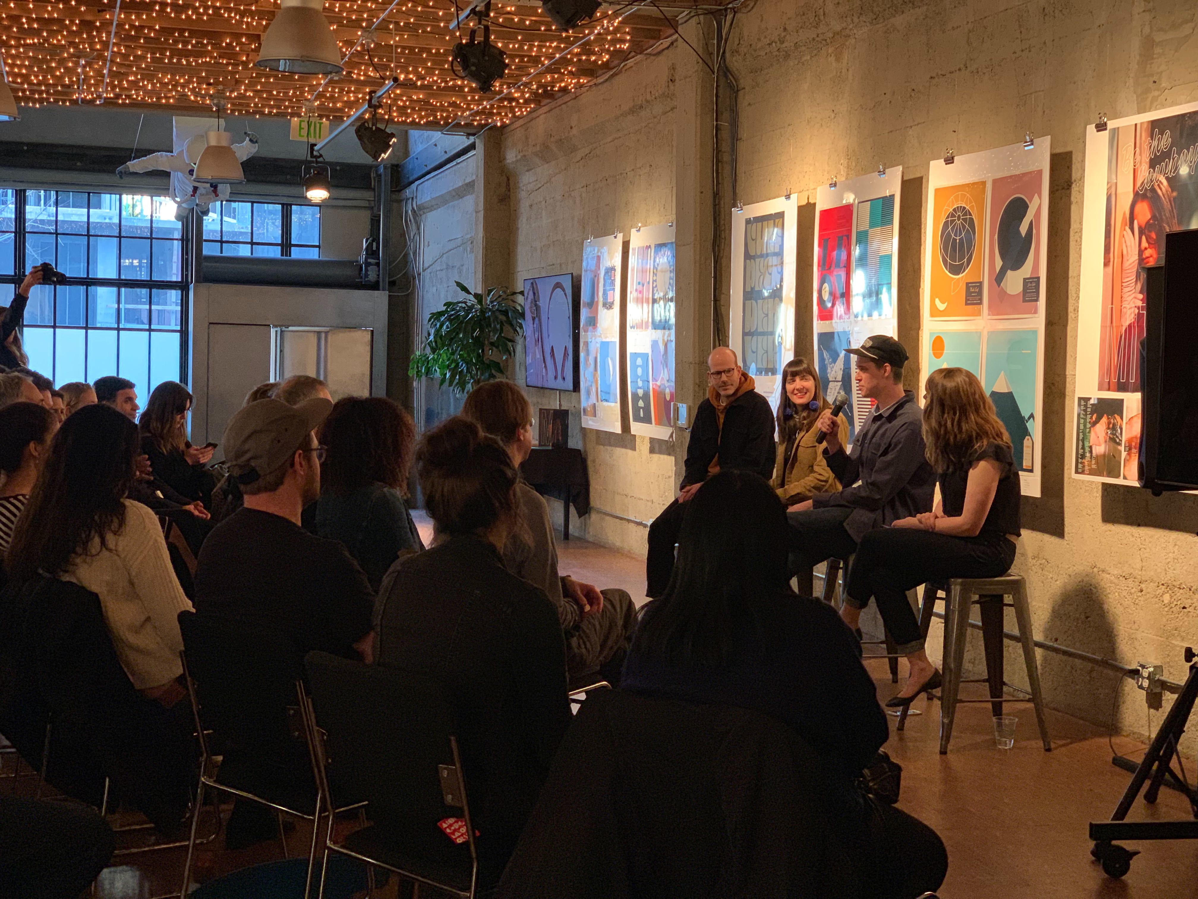
Me, trying desperately to hang. Photo by Johnny Avots-Smith.
Like a lot of people, I was fascinated with music way before I came to graphic design, and way before I ever knew type design existed as a profession.
As I grew up and started playing music, I was stoked to learn about music theory, how chord progressions are built, and how tension and release can be manipulated to synthesize emotive moments. The fact that there were rules at play made it accessible. A song could be broken down into individual Lego pieces, and reconstructed as something different.
Years later, in design school, the first comparison was obvious: you always suck at the beginning. It’s impossible to get around the E minor chord, and it’s impossible to be a designer without a working knowledge of typography and composition basics. Angie Wang was my instructor at this point, and the lessons we learned in her class come back to me daily. She stressed Sister Corita Kent’s Some Rules for Students and Teachers, and had dozens of other gems that she would casually deal students with a respectful tone. One in particular resonated with me: “If it doesn’t work in black and white, it’s not going to work in color.” I love that because it parallels music really well. If a song doesn’t work as a single vocal track and acoustic guitar, it won’t work with the fanciest production and arrangement to gussy it up. That’s the first reason Ohno is all black and white. The second is I’m no good with color.
In grad school, we learned the specifics of spacing. This was a relatively new concept to me, and it took embarrassingly long to fully understand. Before that, I didn’t realize that having a space character that was too wide was the typographic equivalent of playing to a drummer out of time. This is clearly what Bootsy is talking about in the video. You can do anything you want as long as the spacing is good. Max Phillips says, “I'll take a well-spaced typeface over a well-drawn typeface any day.” Spacing is everything. Rhythm is everything. It exists not as handcuffs, but as a perfectly constructed foundation upon which you can syncopate, improvise, and jam.
Recently I was listening to Jeff Tweedy’s autobiography Let’s Go (So We Can Get Back), and one part stopped me dead in my tracks:
“I think it’s bad for people to believe they’re only supposed to have one emotion at one time. Are you ever really only singularly happy, or sad, or angry? I’m ambivalent more than anything, and a lot of the time I’m totally unsure how it feel. It’s ambiguous. That’s the part people really hate to deal with. Humans hate ambiguity more than anything else in the world. So we pick an emotion and stick with it.” —Jeff Tweedy
Jeff tweedy is talking about music and emotion, but this resonates with me on a purely graphic design level. Nothing is aware of humanity’s bias against ambiguity like graphic design. Look at Jason Munn’s work. Look at the apple logo at the end of a commercial. Our world is chaotic. Our minds are chaotic. Our emotions are so complicated we can barely understand them, so we crave simplicity. We want songs to be a single idea, thoroughly expressed. We love that all the members of The Strokes look like the fell out of the same shitty dive bar. We love that all songs by Abba were recorded by the same engineer. And we hate when Dylan went electric!
I’m not sure if it’s useful to compare music and design as disciplines. They are completely different deliverables. Music is art that can be commerce, and graphic design is commerce that can be art. But in both, your taste is everything. You have to fully commit to a single idea. And you have to stay on time.