Fatface
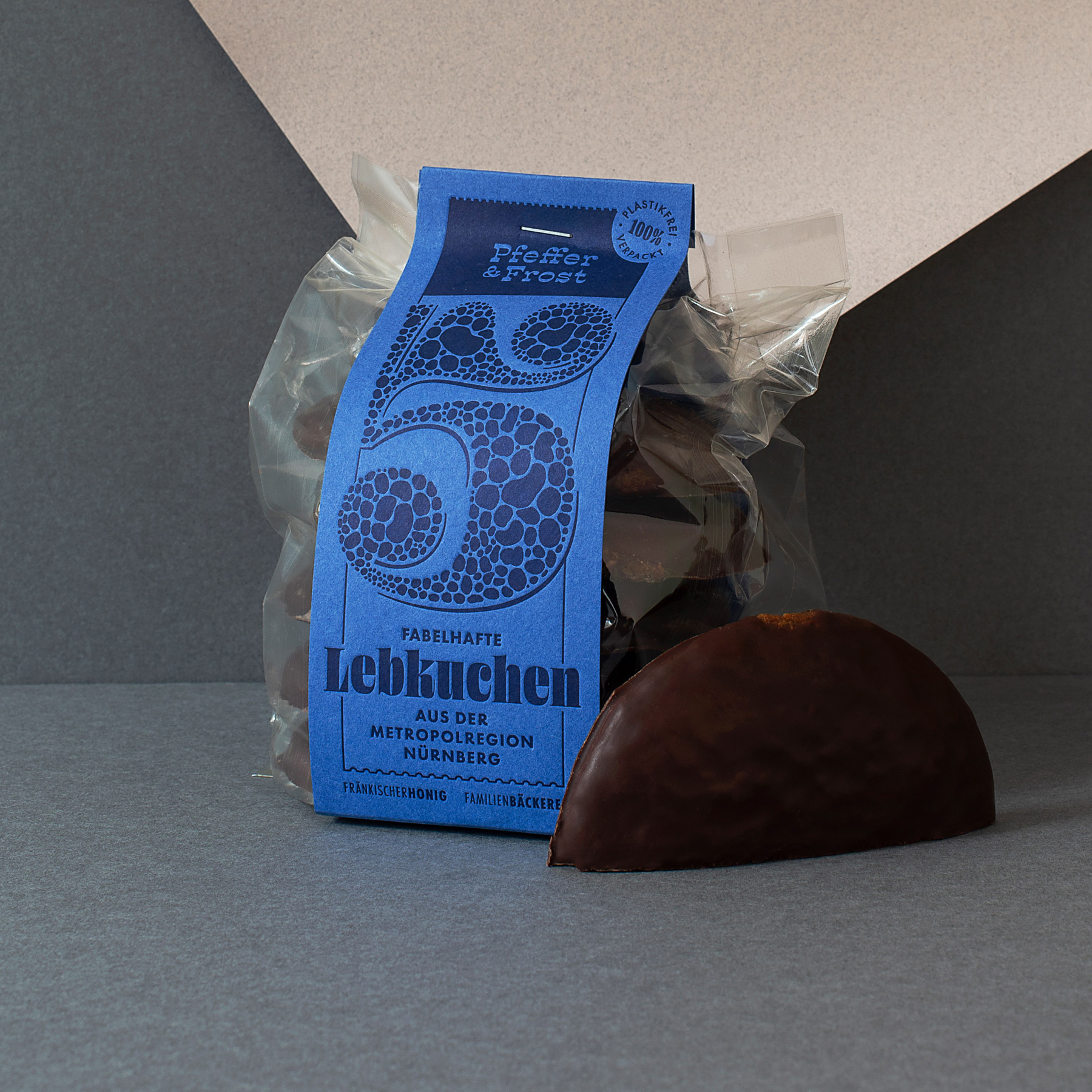
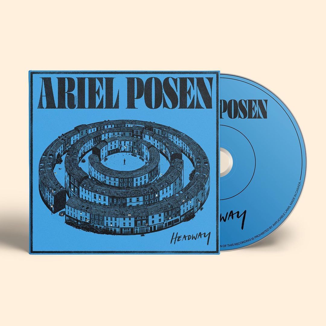
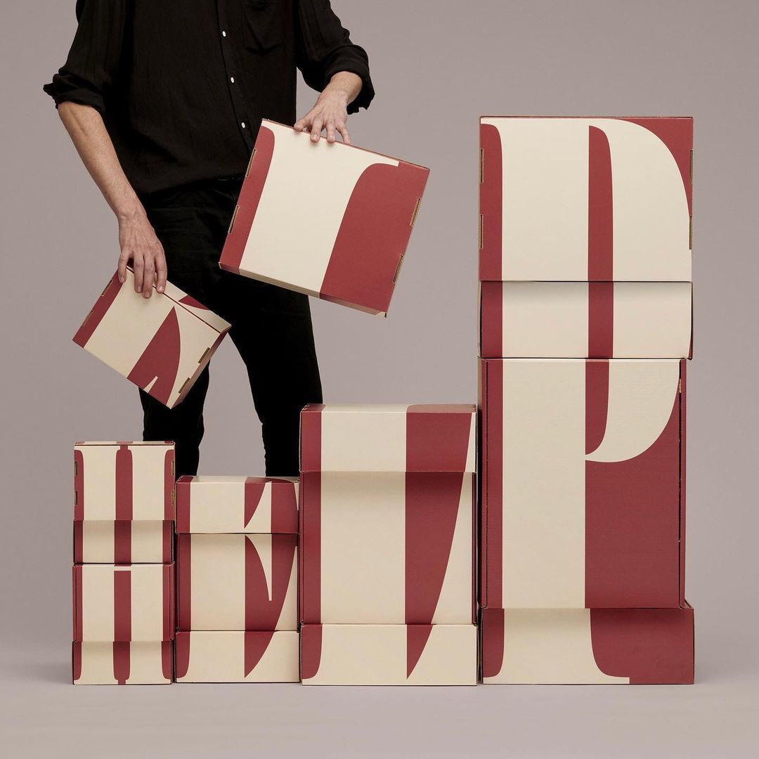
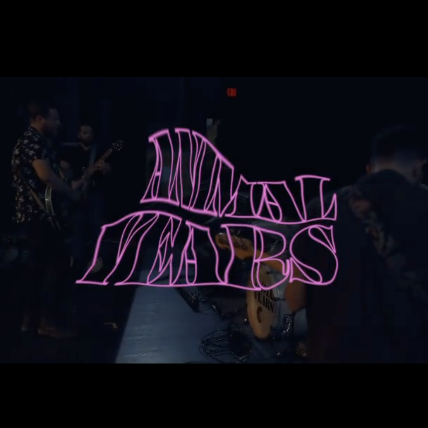
→ Beginning in the (early) 1800s, the Fann Street foundry in London produced a few designs in the brand new genre of “fatfaces.” They were intended for short words to be printed HUGE, and for this purpose, they worked quite well!
→ In the 1970s, everything old was new again, but this time the exaggerated proportions of the era infected the x-heights of many well-trodden styles. Weight was pushed to new extremes. Negative space in and around letters shrank to minuscule specs of white.
→ Now in post-Mad-Men-and-Mumford-&-Sons 2020, The 1970s are breathing new life into the landslide of digital typefaces being produced at a dizzying pace. We are reminded of the cyclical nature of trends, but also of the things that don’t go out of style: even texture, and high contrast. Where the typefaces of Fann Street were intended only for a short word here or there, we can now create the entire spectrum between display and text, providing designers with a Swiss Army knife for all their fatface needs.
5 WIDTHS. 9 OPTICAL SIZES. 45 STYLES. COMPLETE OVERKILL.
Cousin
of BLAZE
& Relative
to MANY OTHER
SPLENDID MEMBERS
of the eponymous genre
WHICH HAVE GARNERED ATTENTION
for well over two centuries. For that
REASON, OHNO FATFACE IS A GOOD DECISION.
Contrast
is HIGHER
than normal
BUT APPROACHES
lower values as the optical
SIZE DECREASES. SIMULTANEOUSLY
weight comes down, and spacing opens
—ALLOWING THE LETTERS TO BREATHE AND
render appropriately at smallish sizes above 12pt.
5 Widths
AVAILABLE
which makes
POSSIBLE LAYOUTS
that are stacked & justified
TO DENSELY FILL OUT A TEXTBLOCK.
This becomes an intuitive and tactile
PROCESS OF DESIGNING WHEN UTILIZING
variable fonts (included with the full package).
Squeezing
THE WIDTH
even more can
BE PRETTY FUN, BUT
in most cases you wouldn’t
WANT TO GO MUCH FURTHER THAN THIS.
The Compressed styles are narrow enough
TO PACK A HEADLINE LIKE a CAN of TUNA FISH.
Why would you ever want to go any more condensed?
You wouldn’t
BUT IF YOU DID
there is always the
OPTION THANKS TO THE
lazily titled, “Squished” styles. These
TYPOGRAPHIC ATROCITIES APPROXIMATE THE
proportions of the designer himself, being at least
TWO STANDARD DEVIATIONS TALLER THAN YOUR
average typeface. Need it? No. Want it? Not really. But, hey, it’s there.
