Grand
XXXXXXXXXXXX
IT IS NOT A MATTER OF WHETHER
OR NOT THEY CAN READ IT,
IT IS A MATTER OF WHETHER
OR NOT THEY WANT TO.
YAAYAAYAAYAAYAAYAAYAAYAAYAAYAAYAAYAAYAAY
OPULENT SPLENDOUR
PLAY WITH THE BORDERS ↓BELOW↓ BY TYPING A CAPITAL LETTER OVER AND OVER. EXCEPT Z. THERE IS NO Z.
VVVVVVVVVVVVVVVVVVVVVVVVVVVV
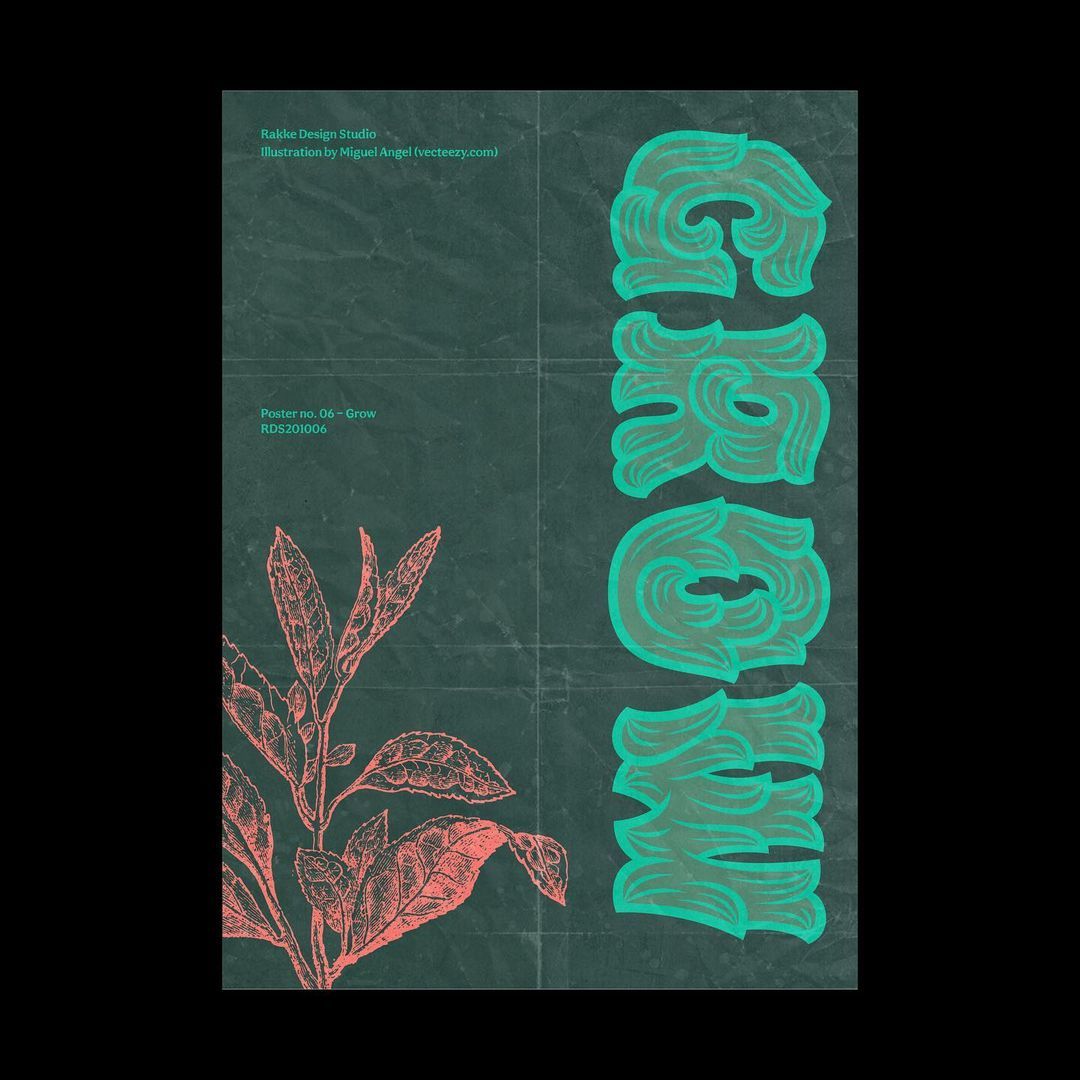
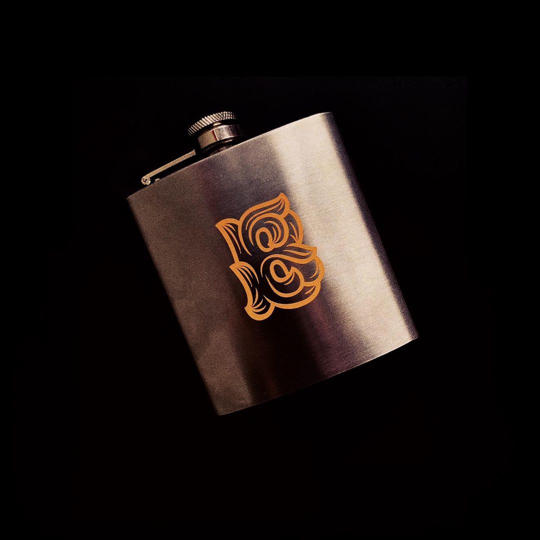
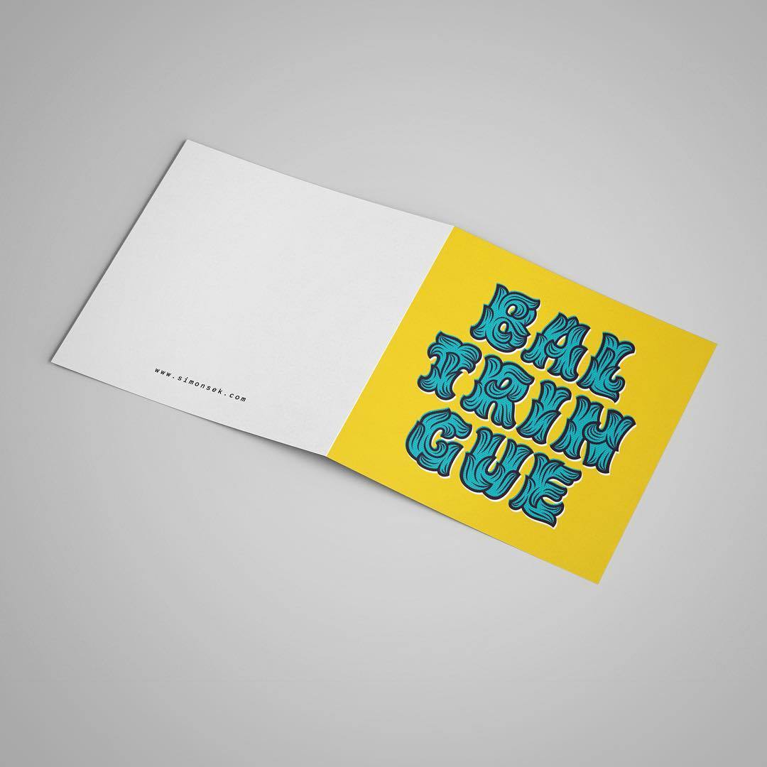
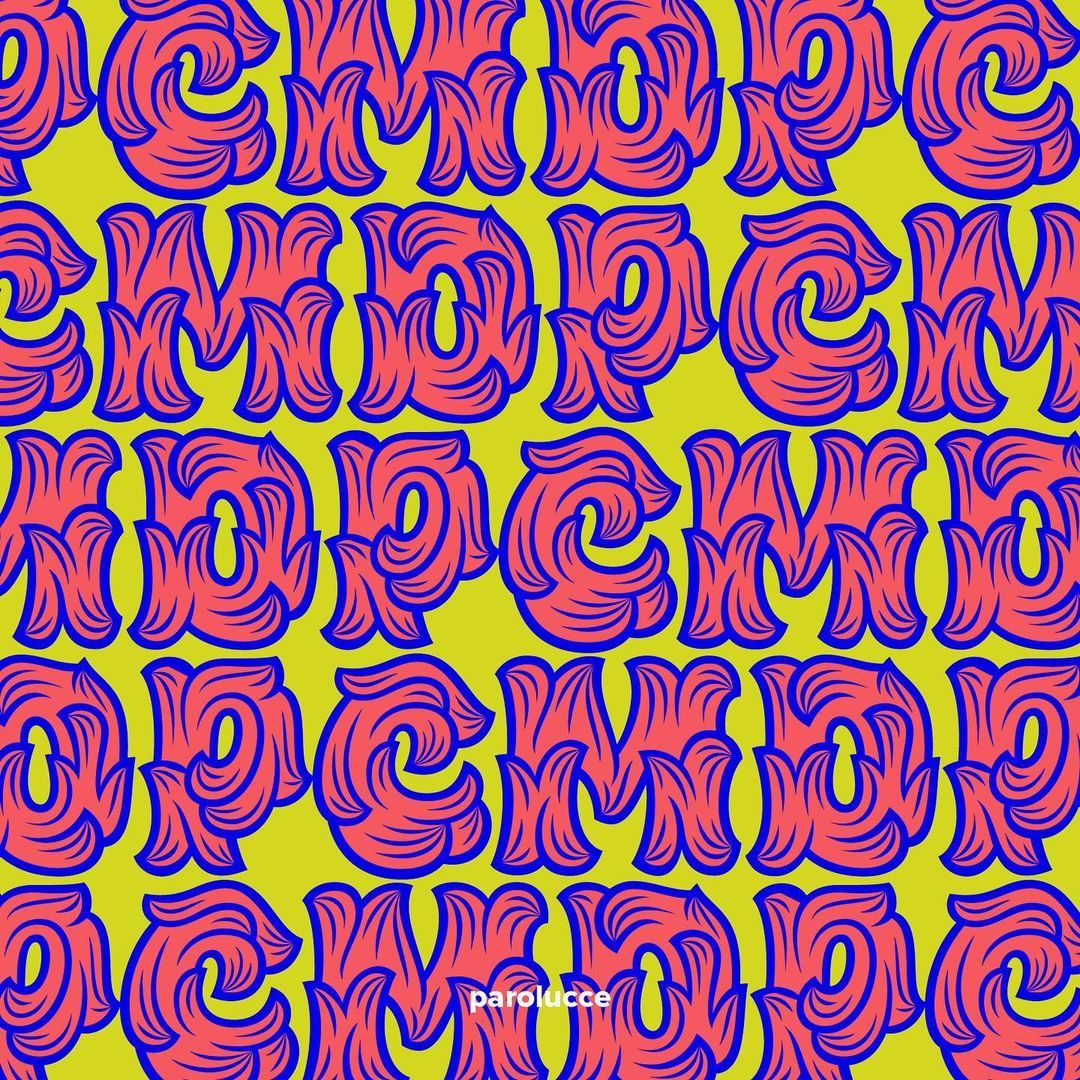
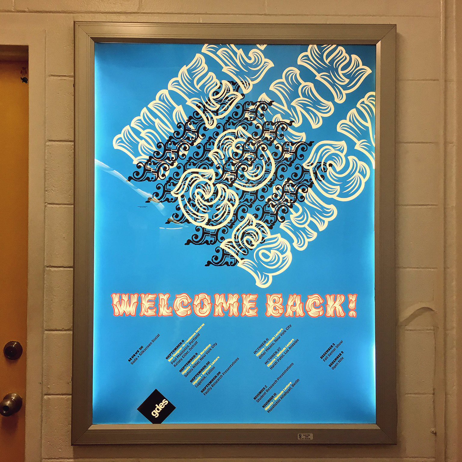
While working for Photolettering in the seventies, Paul Carlyle designed many famously ornate typefaces. Among them, was the impossibly intricate Carlyle Roccoco. It was love at first sight. I knew a hybrid of Carlyle Roccoco and Hobeaux was in the cards. The scope is rather small—it lacks a lowercase, and comes in just one weight and width, but perhaps you’ll still find this little guy useful for short settings at large sizes. Whether it’s packaging, signage, or correspondance, Hobeaux Rococeaux will rise to the occasion, or rather, vice-versa. In addition to the basic style, Hobeaux Rococeaux Background is included to be used as a background color in multicolor settings. Ideally, this layer would operate well on its own, but alas, it makes absolutely no sense without the linework on top. As an added bonus, Hobeaux Rococeaux Borders is included, and can be used in any graphics application or with Drawbot. Another addition to this unique family is Hobeaux Sherman. Sherman is named after type historian, acclaimed designer, and famed pizza enthusiast, Nick Sherman, whose compact and efficient stature bestowed powerful influence on the forms.
24th Street
