During my year in the TypeMedia program, my classmate Mark DeWinne was exploring display styles for his soon-to-be-released Morris family. I was enamored with the callipygous stencil, and thought some ornamented forms would be a valuable drawing excercise.
Our instructor, Erik van Blokland, was unimpressed, and mentioned the distinction between decorative display faces that were simply old designs filled with pattern, and designs where the shape and construction of the letter were informed by the ornamentation. Indeed, the latter are almost always more challenging, compelling, and beautiful.
Later, when the opportunity came to take a second crack at an ornamented version of DeWinne’s Morris, I ommited the outline, allowing for the edges of the illustrations to define the letter.
Left: Morris out of the box. Right: a combination of flora and fauna filling the positive space.
Recently, a few display faces have employed programming to generate dazzling effects that respond beautifully to the letter shape. Andy Clymer’s work on Obsidian and Ben Kiel’s sublimely executed Dala Prisma are stunning and well crafted examples, using code to automate tasks, thusly turning the impossibly tedious into surmountable challenges.
Left: Obsidian from Hoefler & Co. Right: Dala Prisma from Commercial type.
Unfortunately, my programming abilities are not on par with these heavyweights, so in an effort to focus on my strengths, I searched for an ornamental style that could not or should not be programmed.
Rococco, Roccoco, and Rococeaux
While working for Photo-Lettering, Paul Carlyle designed many famously ornate typefaces. Among them, was the absurdly intricate Carlyle Roccoco. As soon as I laid my peepers on this remarkable beauty, I knew a hybrid of Carlyle Rococo and Hobeaux was in the cards.
Images of Jester Ornamental, and Carlyle Rococco (and Roccoco) from Photo-Lettering’s One Line Manual of Styles. I enjoy how Jester Ornamental comes with a warning against use in small sizes, and Carlyle Roccoco does not.
Creative Freedom: a Blessing and a Curse
A while back, I was tasked with creating a poster to be given away at a lecture. Occasionally, a designer is faced with the horrifying prompt of “do whatever you want.” Because most designers thrive on constraints that narrow the realm of possibility, complete freedom only induces anxiety and paralysis. Luckily, when you have nothing to say, you can just take something someone else said.
Regular, shadow, script, balloon, horror, icey, inline script, chrome, paint, drip, script (again, hey, I was running low on ideas ok?), mosaic, overlap, highlight and outline, drop line, dots, top heavy horror, tiger wood, and finally, rococo.
For this poster, I went back to basics. My first reading assignment in art school at California College of the Arts was Beatrice Warde’s The Crystal Goblet. Her essay argues for the invisibility of type, and as someone with a deep adoration of emotionally expressive letters, this quote stood out.
As a personal challenge, I attempted to choose a different display style for each word in the quote, and fit it over a skeleton of Hobeaux Black. Needless to say, by the end of the citation, I was running dangerously low on ideas. That was when I remembered the fantastic work of Paul Carlyle.
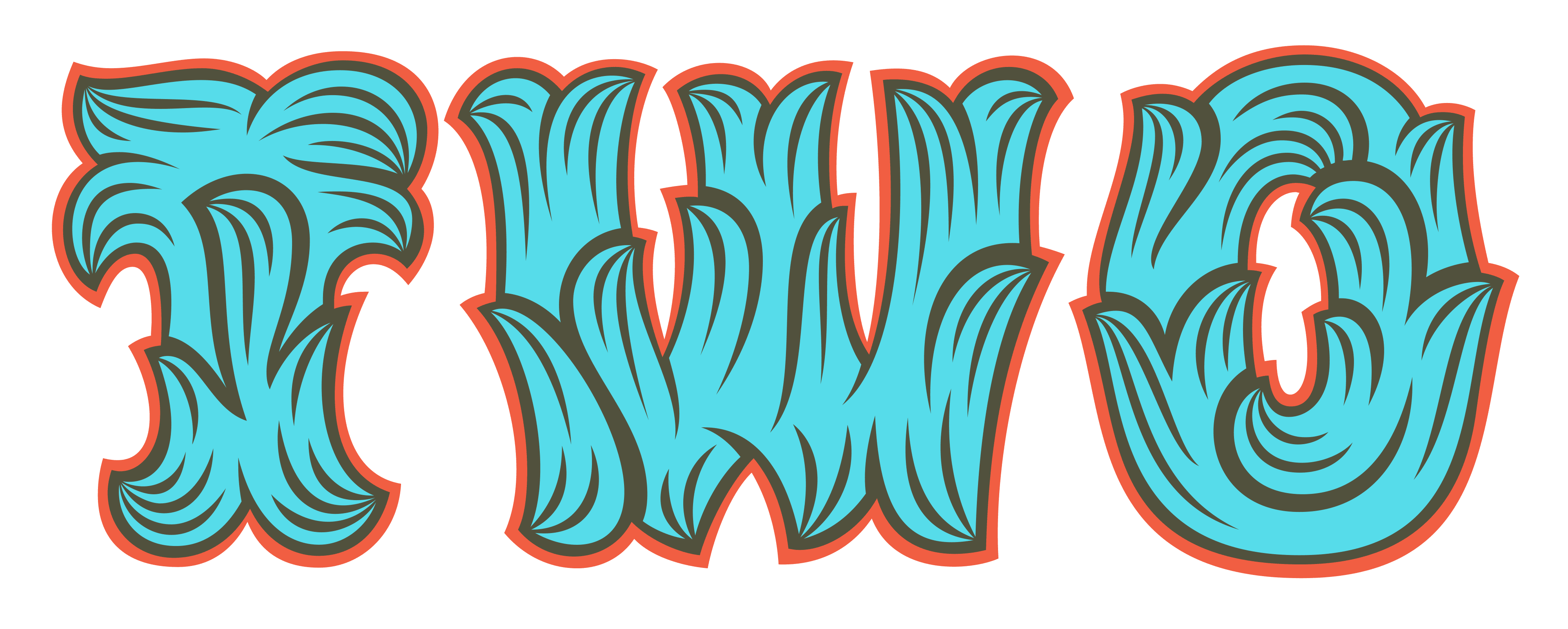
The initial attempt at this style reveals many inconsistencies in stroke width and style. The outline on e is too thin compared to W, and the r is too elegant compared to a and e’s haphhazard twists and turns.
After the poster was complete, the response to the Rococco style was unexpectedly positive. Because I am a slave to praise, finishing the alphabet seemed like a good idea.
Pencil, Ink, Vector, Repeat
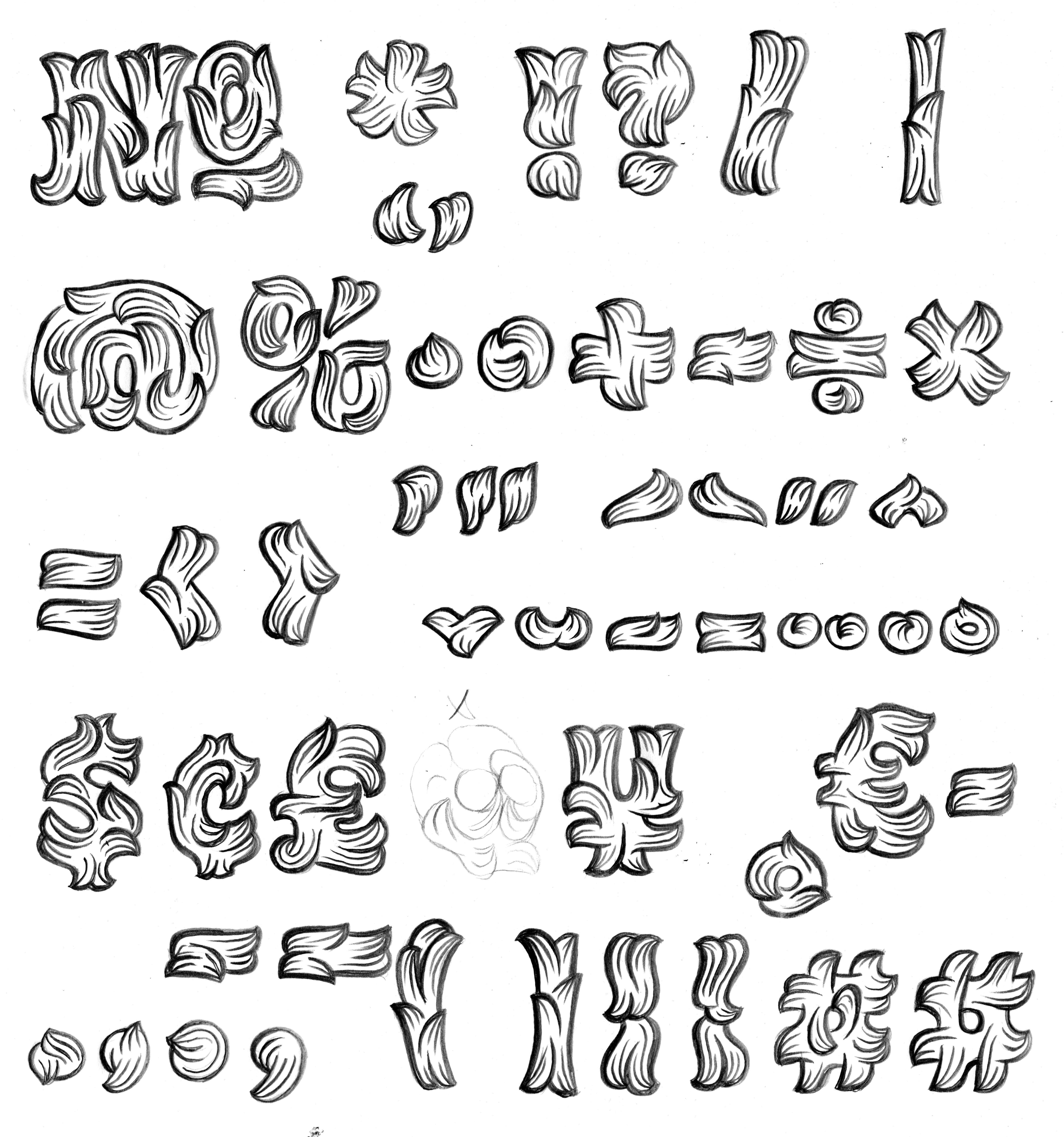
Sketches don’t have to be pretty.
Sometimes these tasks seem overwhelming. If one character takes upwards of three hours, you know you have your work cut out for you. Fortunately, as you gain momentum, one can develop processes and techniques that minimize the headache as the flow takes over.
After struggling with the letters, the figures revealed themselves with considerably less torture.
Many typefaces can be somewhat componentized—there are serifs, stems, bowls, or other features that can be copied and pasted, or otherwise shared between glyphs. Unfortunately for the batteries in my mouse, this was not the case with Hobeaux Rococeaux. Most characters needed to be drawn from scratch, scanned, vectorized, and tweaked one by one to produce adequate results.
The sheer amount of bezier drawing encouraged a reevaluation of the character set. Thus, the lowercase was ditched.
Designing the System
In addition to the basic style, Hobeaux Rococeaux Background was drawn to be used as a background color in multicolor settings. Ideally, this layer would operate well on its own, but alas, it makes absolutely no sense without the linework on top.
Hobeaux Rococeaux Background in blue, with Hobeaux Rococeaux Regular on top, in red.
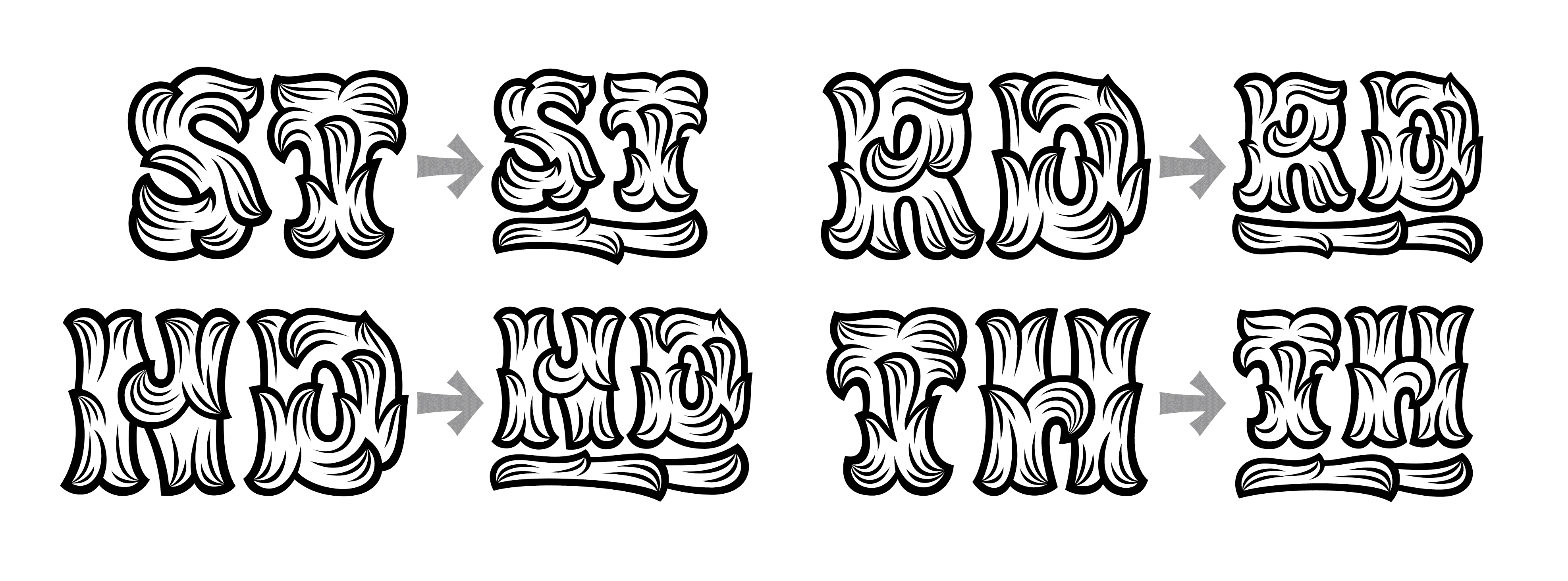
Repeated testing revealed something lacking. The essential idea behind the Rococo movement was that more indeed is more—the frame becomes as important as the art itself. I began imagining what the ideal border for this style could be. A quick round of experiments lead to a system of repeatable horizontals or verticals, corner pieces, and center pieces.
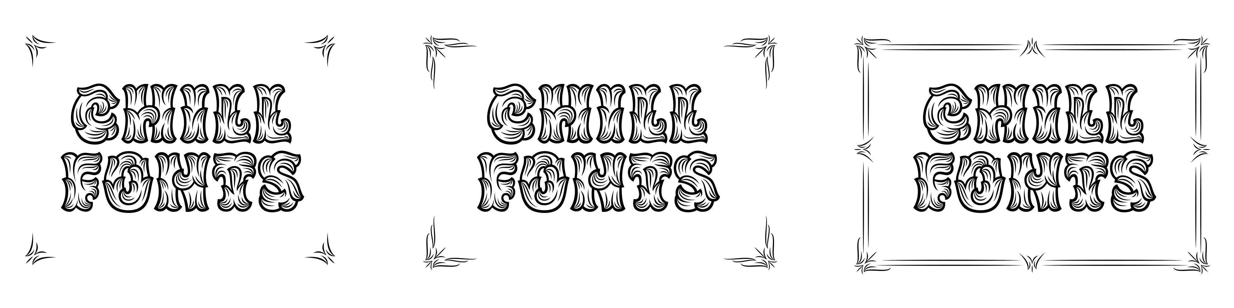
The system of interchangeable corners and borders could allow for a dynamic system that could achieve absurly ornate or toned down results.
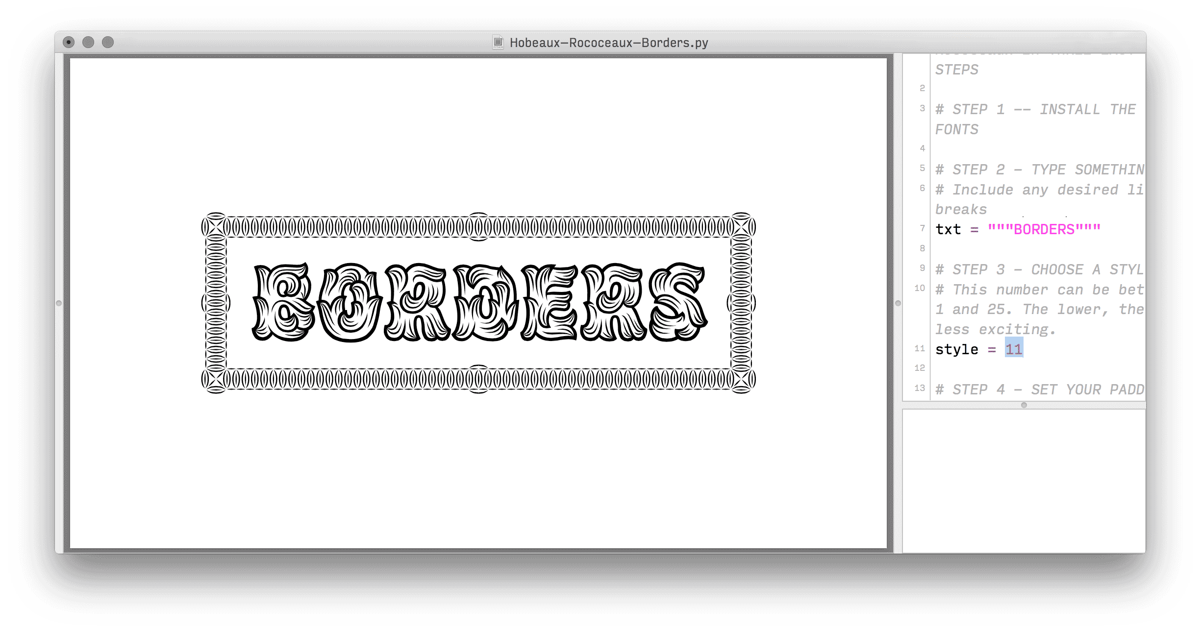
The only caveat was what a pain in the ass it is to typeset the border in Illustrator or InDesign. Enter Drawbot, a simple yet powerful application that take Python code for input, and outputs graphics. Using the small amount of Python I’m comfortable with, I could write a simple script that allows these 25 border styles to be painlessly typeset for any word or phrase. The borders automatically adjust to fit the size of the word or words, and once you’re satisfied, Drawbot can generate PDFs that can be further manipulated in the graphics application of your choosing.
Another addition to this unique family is Hobeaux Sherman. Sherman is named after type historian, acclaimed designer, famed pizza enthusiast, and friend of Ohno, Nick Sherman, whose compact and efficient stature is reflected in this member of the family.
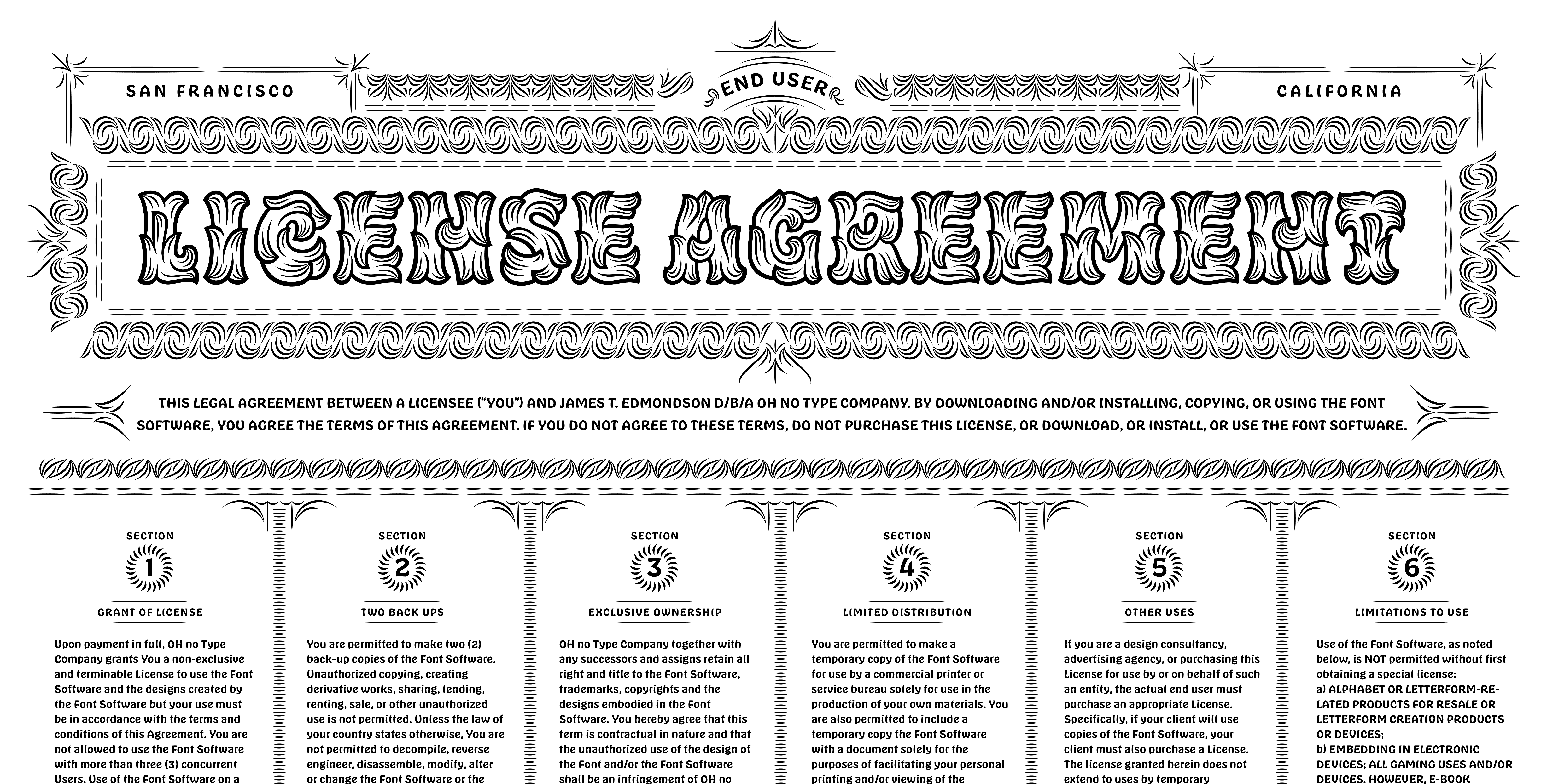
Hobeaux Rococeaux Regular, Borders, and Sherman. All three voices singing in harmony. Perhaps the most absurd EULA in existence.
Instead of drawing Sherman from scratch, I came back to the original version of Hobeaux, widened the proportions, altered a few forms, and straightened out all the rounded corners to make it relate more elegantly to Rococeaux. Though Sherman isn’t intended for captions, it can certainly be set way tinier than Rococeaux classic.
Hobeaux Rococeaux doesn’t go overboard with OpenType features, but these superiors were added to spice up the figures. Other ligatures or alternates were not necessary because the letters do not touch, and repeated letters do not cause the same hesitation and disappointment that they do in handwriting fonts and the like.
When to Say When
It’s funny to think about how a simple idea can quickly get completely out of control. There are no doubt other styles and additions that would be fun to design, but after a certain point we must call it a day, and see if this is actually useful to anyone. This miniscule drop in a sea of type will almost certainly not be a best seller, but it can perhaps show that the horizons in type are more vast than one might think. We are only at the tip of the iceberg in terms of what is possible, especially with typefaces for display.
If you choose to purchase the fonts, have fun! Play and experiment! I have put a lot of love into these typefaces as a system, but rules were made to be broken, and nothing would thrill me more than to see this family used in unexpected ways.
Finally, to those that say, “James! You have wasted a lot of time here. Your typeface is hard to read!” Remember, it is not a matter of whether or not they can read it, it is a matter of whether or not they want to.
Update
My former instructor from TypeMedia, Peter Verheul was doing some research on the effect of art nouveau ornamentation in mid-century type designs. He came across this image of a typeface called Olivia in the Swiss series, Lettera, No. 1-4 by Armin Haab and Co.
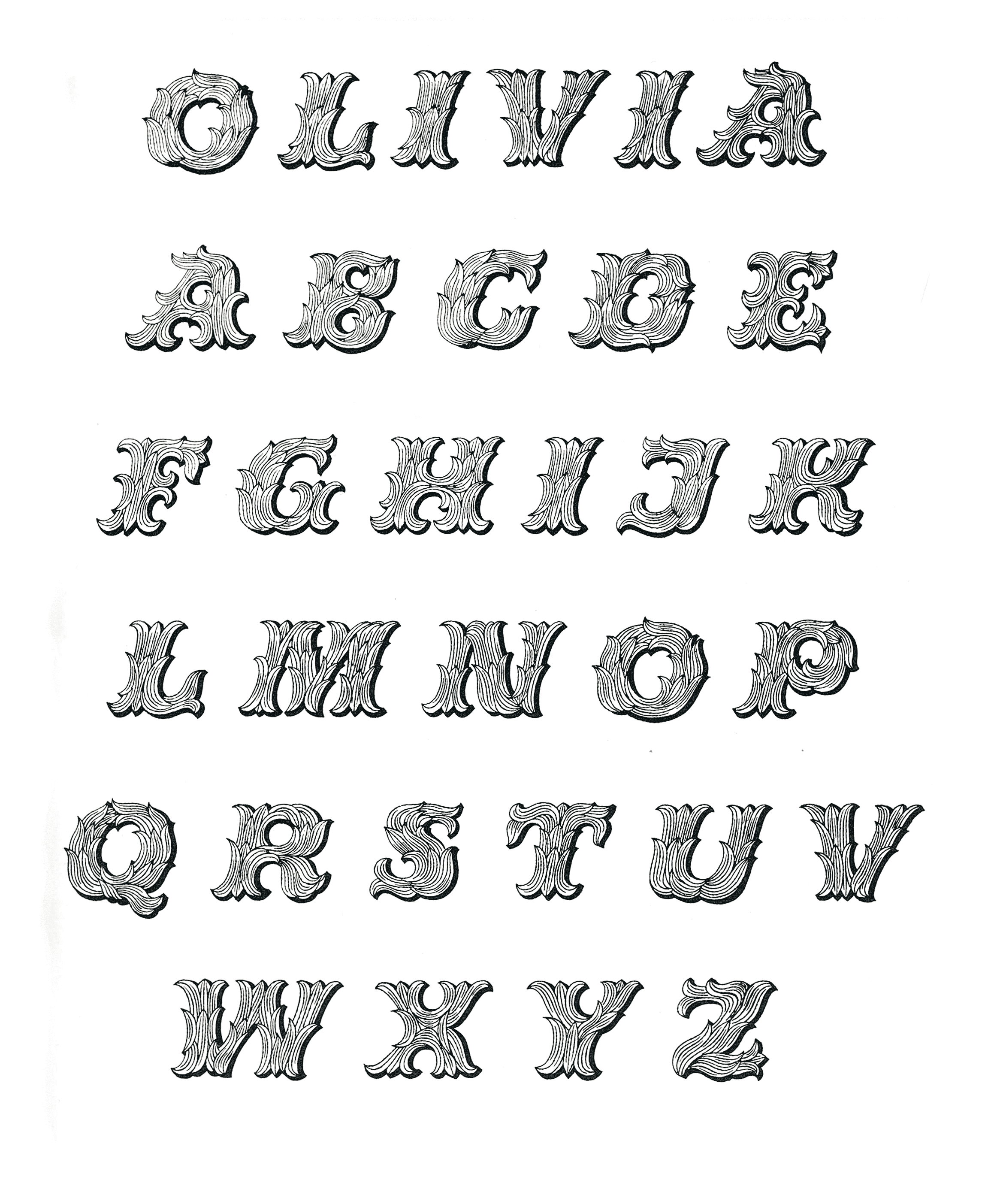
Olivia came out in 1954, and was designed by Alex Stocker.
Previous to Peter sending this to me, I had only seen a single word of Olivia set in a Solotype catalog (with typical Solotype resolution) after Hobeaux Rococeaux came out. It seems as though there is nothing new under the sun. I don't recall seeing this prior to the design of Hobeaux Rocoeaux, but did I somehow save it in the Evernote of my subconcious? Who knows? It’s funny though! Even the most outrageous typefaces have a precedent. The good news is that this does very little to take the wind out of my sails. The bad news is that I can’t go have a beer with Alex Stocker.