Taking a year off to study typeface design in another country, under a few of the world’s premier type designers sounds great, right? Well it is! But it’s not all fun and games.
Disclaimer: This is my experience, told from my own personal vantage point, because that is the only material on which I have the authority to speak.
Every blue moon I get an email from an acquaintance that is curious about this unusual program. Hopefully, this article can satisfy at least a bit of their curiosity. The number one question I get is, “Should I apply?” The answer is simple: Of course. There are hundreds of applicants each year, but many are not seriously interested in type design, or are otherwise unqualified. This narrows the list down to a group from which twelve students are selected, but exactly how that process works is mysterious. It’s part based on portfolio reviews, and part driven by a desire for diversity among the students both in terms of country of origin, and skill level.
Should you apply? My advice: it’s a crapshoot! You might as well apply and decide later.
My application included samples of typefaces and lettering I’d worked on at that point, as well as some lettering. Looking back on that portfolio now, I have no idea how they deemed it acceptable. In addition to the portfoio, I had a letter of recommendation from a previous instructor, and an essay on why I thought I was a good fit for the program. I knew from my own personal research that TypeMedia places a great deal of importance on hand skills (sketching, calligraphy, stone-carving) as well as toolmaking—both things that were and are very interesting to me.
If you’re academically inclined, and unafraid of reading, writing, and scripts other than latin, I recommend looking into the Typeface design program at Reading. If you would prefer to stay in the US, and you’re interested in a program that works around professional obligations, I recommend Type@Cooper in New York, or San Francisco. There are a few other great schools, but I am not qualified to speak on their behalf.
Although I graduated in 2014, the experience is still fresh in my mind, and the effects of the program on me as a designer have been profound. A quick look at my work might make you think I studied type design in a Fresno strip mall, but I promise I took school very seriously.
What are the Practical Concerns?
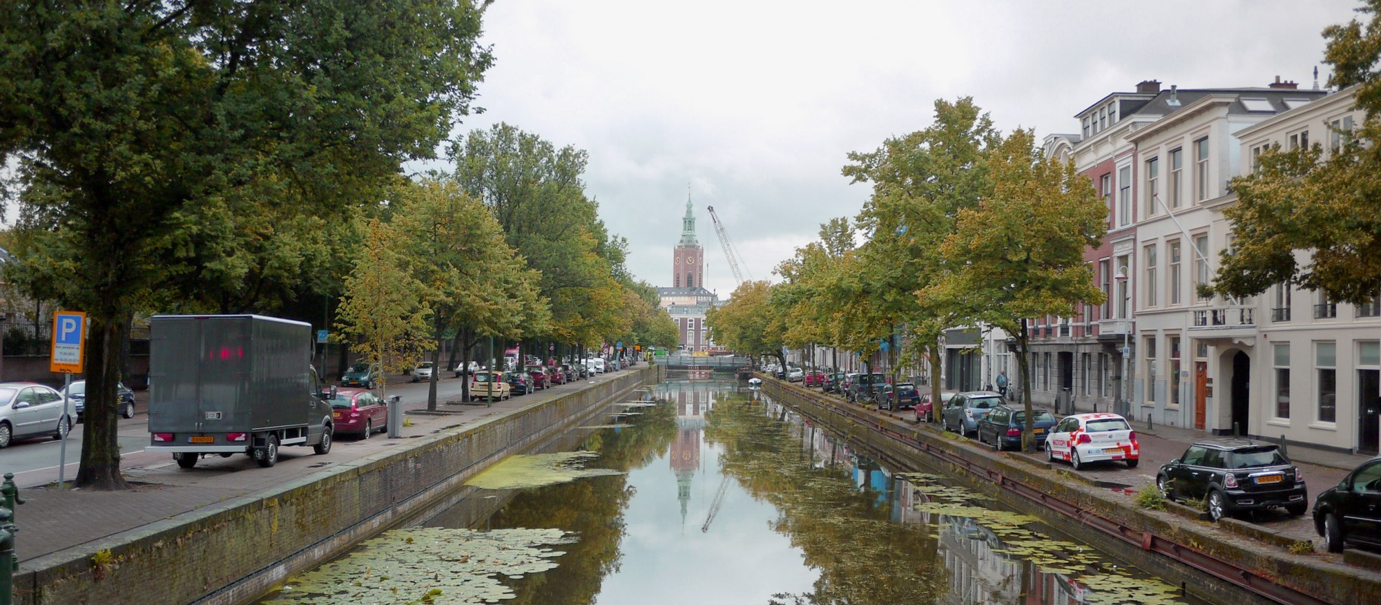
My old neighborhood. Holland is lovely. It’s as if they make every city planning decision based on how cute it will be.
Money
One of the greatest things about going to study in Europe is how inexpensive tuition is compared to the US. At my alma matter, I was paying around $40,000 USD in tuition per year. That’s roughly normal for good private art schools, but insanely high compared to the $6000/year I spent during TypeMedia at The Royal Academy of Art (or KABK). Europe has figured out how to make education much more affordable than us miserable yankees. I see a great opportunity for Americans to take advantage of that.
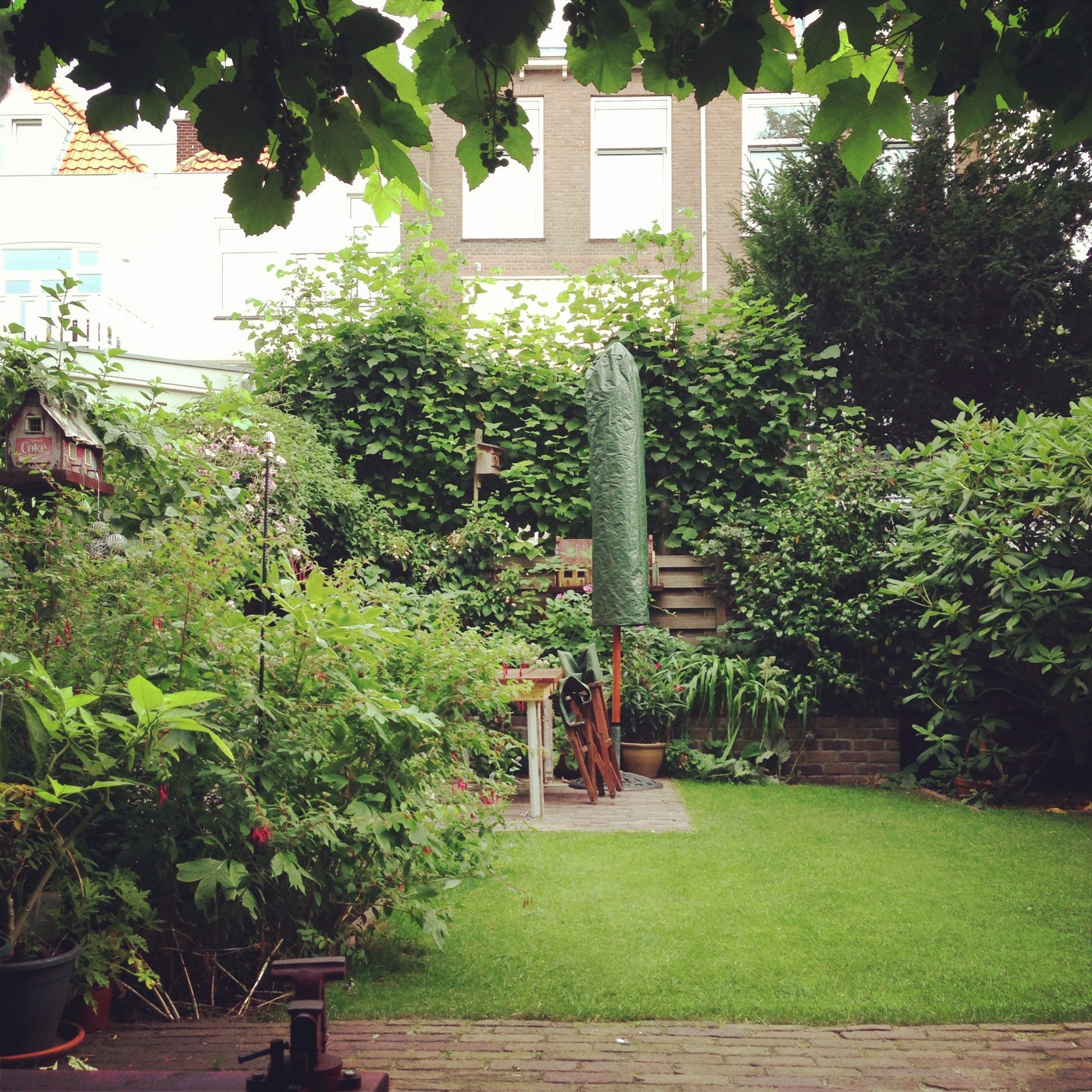
The garden view of my room.
The cost of living in The Hague was a bit less than my previous home base of San Francisco. I was paying €500 in rent each month for a lovely little room with a nice garden view on the bottom floor of a Dutch couple’s home. I was having coffee and a pastry from the canteen for breakfast, €5 kebabs during the day, and PB&J’s at home for dinner. It was a depressing diet of cheap food that could be consumed quickly with almost zero thought. Classic grad school!
Save up a nugget in preparation, and be aware that you won’t have much time or energy for freelance work after the second or third month of school.
Culture
There is a tremendous creative and developmental benefit to immersing yourself in another culture during studies, especially considering the rich typographic history of Holland—a tiny country disproportionately famous for exquisite design. The reality is that school was bootcamp. The workload was intense, making opportunities for uninhibited exploration quite sparse.
Make some Dutch friends! Take a language class beforehand! I regret not doing these things. It would have taken some effort and time, but exposed me to way more Dutch culture.
Relationships
I was in a long distance relationship at the time which turned out to be a huge mistake. If you are going to move to Holland with a partner, make sure they know that the class time requirements are bonkers. Your partner would have the best chance of not going insane if they stay busy with their own interests and activities. If you are going to go on your own and begin a long distance relationship, understand that an LDR is at best, a bummer. At its worst, a long distance relationship can steadily erode the healthiest of relationships while distracting you from school, and all the beauty of your new country of residence.
Being a part of the program drained me not only of my time and physical energy, but also my emotional and social energy. If I had been living with a girlfriend at that time, I probably wouldn’t have been much fun. This is only my tiny perspective here, and there are many examples of couples that have navigated the choppy waters of love during grad school with grace and relative ease—even students that have transitioned into parenthood during the year!
If you seriously trust you partner and you have a loving and sturdy relationship, you’ll be fine! Disclaimer: I am in no way qualified to give relationship advice.
Homesickness
This was the biggest issue I was unprepared for. My life in San Francisco was very comfortable, and I had great friends and family around constantly. Coming to a new place where I knew no one was a devastating shock. Almost everyone I talked to before moving to Holland mentioned how much fun I’d be having, so when the fun didn’t immediately come, and instead a wave of loneliness and depression swallowed me up, I was completely confused.
Growing pains are par for the course, and you shouldn’t be upset with yourself for missing your old life. As with most things, it gets better.
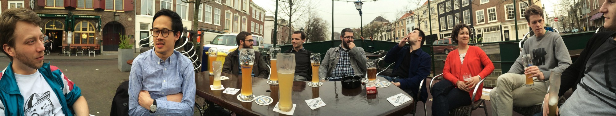
Chillin at De Paas with Christian Schwartz, Kai Bernau, Susana Carvalho, and some of the TM crew. Apologies to Mark DeWinne’s face.
The thing that helped me the most to get passed that feeling of isolation came in the spring. The seasons changed (that alone being something completely alien to my Californian frame of reference) and The Hague was reborn. All of a sudden, the rain lessened, and there were festivals every weekend. The general mood of the city shifted in a way that felt more optimistic, and in tune with West Coast sensibilities. Suddenly, I had more friends, and activities for my sparse free time. I had also picked up yoga, which got me out of the house for something other than school. The only unfortunate thing about spring was that school was nearly over.
Course Content
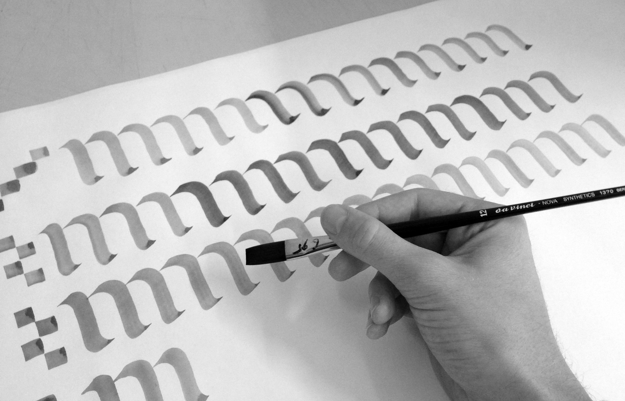
Calligraphy and stone carving. Just two of the many different things we explored in the first semester.
The reality is, even if life outside of school had been completely miserable, the program still would have more than made up for it. I’m not quite sure what I was expecting to work on upon coming to The Hague, but everything immediately felt like a perfect fit. The whole program, which begins with calligraphy, stone-carving, and a revival typeface, felt like Harry Potter stepping into Hogwarts. I was at my dream school, and putting everything I had into it. I had never put more of an effort into coursework.
The People
The teachers are nothing short of world class. Slowly, we learned how to see what they were seeing, how to navigate their feedback, and enjoy their individual sense of humor.
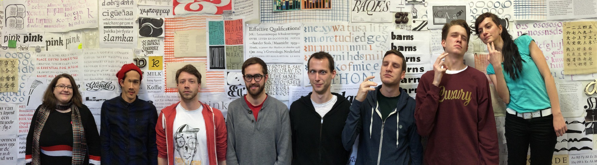
The whole crew, in front of our work from the first semester. Apologies again to Mark DeWinne’s face.
The unexpected virtue of the program was my peer group. There is something magical that happens when a group of enthusiast students are together in close quarters for a long period of time. Inside jokes, enduring friendships, and endless amounts of inspiration are inevitable. Throughout the course of the year, I discovered what about my interest in type design was unique, and by focusing on that, the work got stronger. There was some amount of competition, like “Oh you added small caps?! I need to add them too!” But more importantly, seeing friends you respect and admire pour their hearts into their work inspires you to do the same.
Many people are trying to figure out how to recreate the classroom experience online, and in my opionion, it is impossible. Finding a group to be a part of, in whatever capacity, will undoubtedly make your work stronger.
For how much time we spent together, there was an extremely minimal amount of conflict. Of course there were a few things that came up, or people that didn’t get along, but for the most part, we were happy campers.
What did you learn anyway?
Takeaway One: The Basics
We started with calligraphy and a revival, not because we were training to be calligraphers or designers that only worked on revival typefaces, but because establishing a knowledge of the conventions in type is imperative to the practice. Working within these rules enables one to break them deliberately, or follow them thoughtfully, allowing the designer to create work that is easily read, or intentionally not.
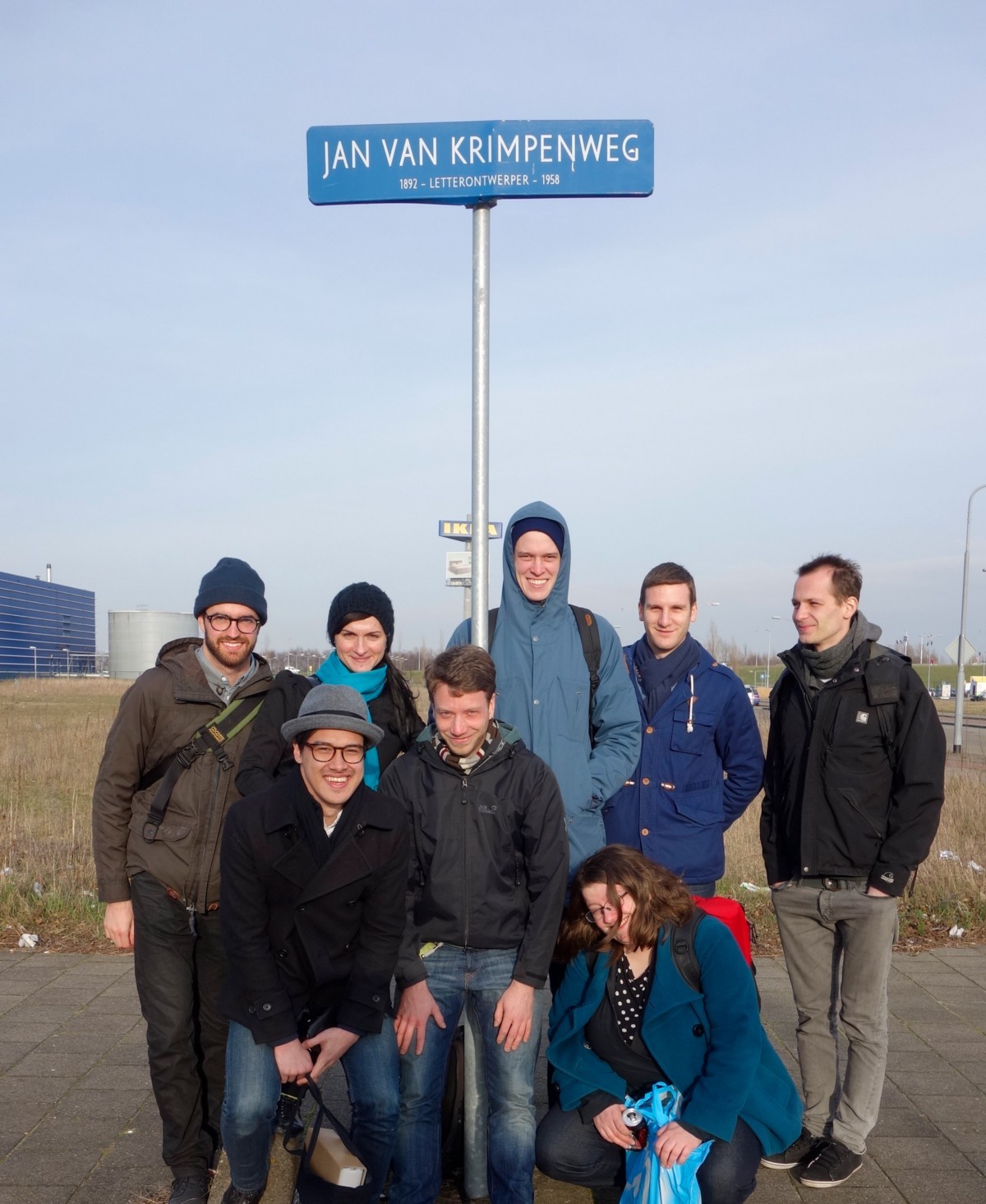
Only in Holland will you find a street named after a type designer!
Takeaway Two: Research
No matter the project you are working on, someone, somewhere, sometime, has done something at least a little bit similar. Backslanted reverse contrast? Been done. Stencil script? Been done. Backslanted reverse contrast stencil script? Probably been done. Considering historical reference is great not only for stealing ideas, but additionally for letting previous failures serve as a cautionary tale. I admit I was a lazy researcher before the program, but after the revival project, I learned how to be slightly less lazy.
Takeaway Three: Spacing
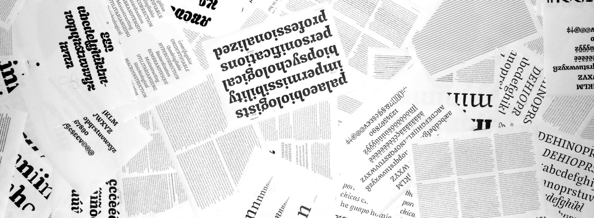
Immediately, the idea that negative space takes precedent over positive space, was stressed. Before going to TypeMedia, I would see a certain block of type or lettering and think, “It looks so perfect, but why?” TypeMedia taught me that mysterious magical ingredient was actually a harmonious and consistent ratio of negative space inside and outside of the letterforms. We learned to start projects by spacing the most challenging pairs, making them the rule, rather than the exception. The calligraphy taught us about rhythm in vertical stems, and the importance of the letters O, H, n, and o. Hmm.
Takeaway Four: Sketching and Pushing Ideas
Teachers response: “You clearly like display. Now make a text face.”
How bold is a bold? How compressed is a compressed? In the end, there are no hard and fast rules for these subjective adjectives, so one must test and see. To simply add an arbitrary amount of weight, or remove an arbitrary amount of width, and go forward, you are leaving a wealth of potentially viable and more successful solutions on the table. By pushing ideas to their breaking point, and visualizing the intermediate steps between, you can decide exactly where on the spectrum you’d like to drag the slider.
For this reason, sketching is invaluable. Working quickly and efficiently, with white-out, tape, scissors, and tracing paper is fast, allowing one to cover an impressive amount of exploration in a short amount of time. Doing tight drawings, with perfect curves, and fully realized details has its place, but personally, I believe the computer to be the place where the near-perfection is achieved. Even in the age of iPads and Cintiqs, there is no tool with less friction than pencil and paper. Leveraging old sketches to create something new and improved is a valuable skill for any sort of designer.
Takeaway Five: Testing
A classic “look how much work I did!” photo.
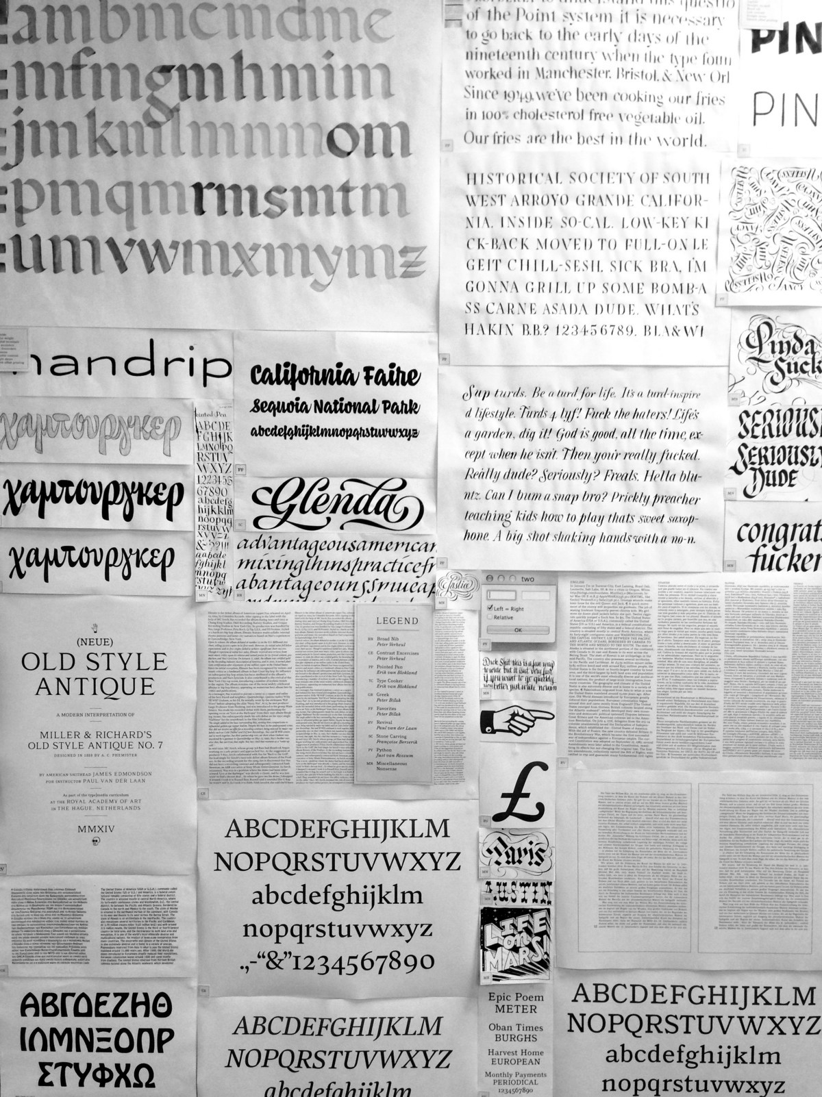
Proofing a typeface was a very mysterious thing to me before the program. What text is useful to look at? What size? All these questions are dependent upon the concept of the work itself, but there are good things to include in most every proof. To diagnose spacing issues, it’s valuable to look at miniscules between two sets of two ns, and two os (nn[x]nn and oo[x]oo), and majuscules between two Hs and two Os (HH[X]HH and OO[X]OO). Additionally, it’s convenient to have a print out of every character at a large size, for the instructor to make notes and corrections. Proofs should use the type at the size for which it is intended, and shouldn’t include so many pages that you don’t actually use them, and make responses to the issues.
Look at proofs from across the room. The room we were in had a long corridor connecting the two main hubs, and we were often using that space to mimic high resolution and tiny sizes.
Best practices in proofing are another article altogether, so I’ll leave that for now.
Takeaway Six: Showing Process
The final project was a semester long marathon punctuated by five presentations, showing the instructors where we were coming from, where we were headed, and what we were struggling with. Often, there was only a short amount of time to put together some sort of presentation in a way that made sense to the esteemed jury. This is a skill worth developing, and in the end, you’re left with a good amount of material that was very useful when we had to write and design our process books. Now, years later, I can look back on that process with an embarrassing amount of detail. It’s a nice keepsake.
Takeaway Seven: Toolmaking
TypeMedia is one of the few schools that stresses the importance of programming to designers. I admit I did not take to the code like some other students, but in the end I had what I needed to either cobble together some janky script that did the job, or knew to ask classmates or the internet for help. As a rule, if you notice yourself doing the same stupid tasks over and over, there is probably some way to automate it, leaving your time and energy free for the things that truly require it.
TypeMedia taught us how to work smarter, and mitigate feedback from several instructors with thoughtful and often contradicting opinions. There are many programs that teach those skills, TypeMedia is just one.
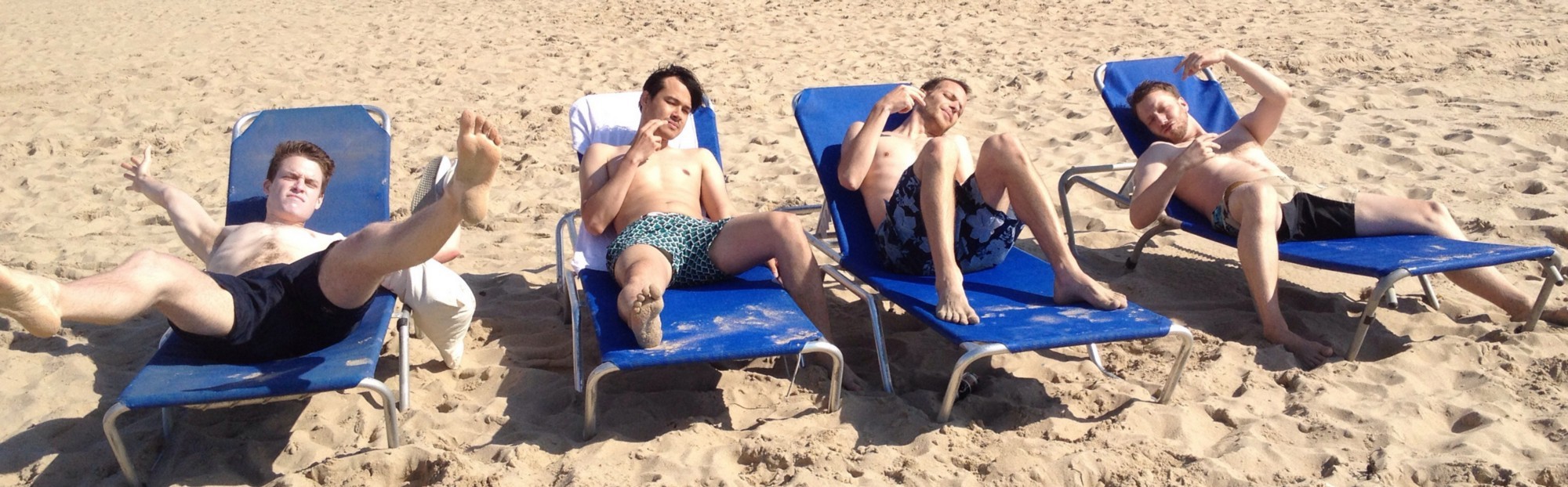
After graduation, our pale bodies hit the beach!
In Conclusion
I am a huge proponent of education in whatever you are interested in. Trade schools, YouTube, books, jobs, and traditional college all have the potential to be rewarding and enlightening educational experiences. Personally, I had the luxury to put my life on hold, take a year off paid work, and focus completely on school. If you are not in that position, don’t despair. There has never been a better time in history to study obscure fields, and everyone’s track is different. Whatever interests you, I hope you find a way to study it intensely, under great teachers, and with others that share your interests.