WAIT
slslslslslslslslsls
Why “Beastly”? Well, what else was I supposed to call it? Just like many of my contemporaries in font marketing, I lament the process of naming typefaces perhaps even more than the arduous task of kerning.
In 2011, the best band in the world released its first EP. “Mit Peck” by Vulfpeck was the delicately named culmination of six tracks, four insanely talented musicians, and just enough 2 inch tape. I can’t say why, but all songs were named after movies released that year. The first track, Beastly (named after a film with a 20% Rotten Tomatoes score), features one of Vulfpeck’s most recognizable grooves, and a mind blowing bass solo that single-handedly garnered the band their first wave of major attention.
7 years later, Beastly holds up as one of the funkiest things Vulfpeck has ever done, and it is my belief that Beastly (the song) will cauterize a permanent place of honor the history of funk. It is with the utmost respect for the band that I humbly name this riff on Lubalin-era typography in homage to their tune.
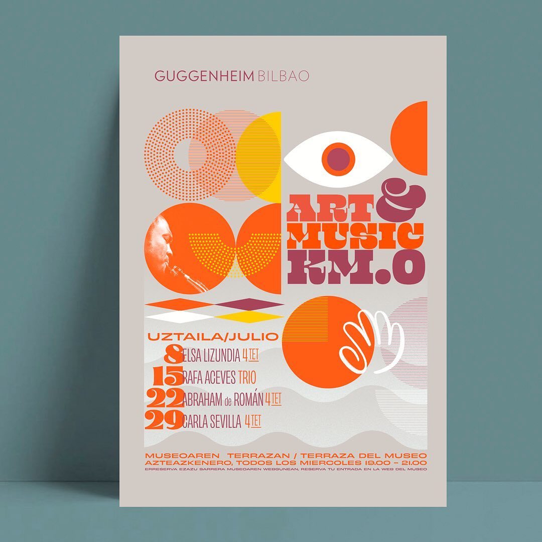
Beastly was the custom typeface designed for the Lubalin 100 project. While it imbues many of the qualities of Lubalin’s team of lettering artists’ signature styles, it’s a completely new design. When working with art director and historian Sasha Tochilovsky on the project, we agreed it was simply too easy to ape an existing typeface, so we tried to create something new. I should mention that this was all his idea.
LUBALIN 100
100 things over
One Hundred Days
celebrating H. Lubalin’s
centenary. Items selected from
the Lubalin archive that surprise and delight,
stories from past collaborators and current
appreciators all to celebrate the legacy he
left in design. *Text is taken from Lubalin100.com
