Beastly began as a simple suggestion from Alexander Tochilovsky while working on the Lubalin 100 logotype. While it imbues many of the qualities of Lubalin’s team of lettering artists’ signature styles, it’s a completely new design. Alexander and I agreed it was simply too expected to ape an existing typeface, so we tried to create something new.
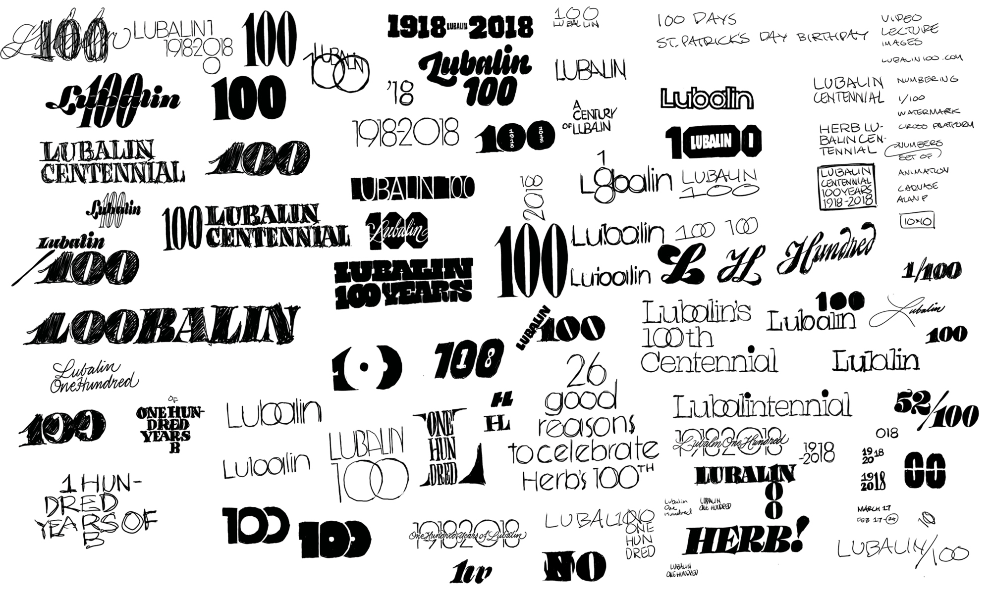
The gauntlet of obvious solutions we explored for the Lubalin 100 project.
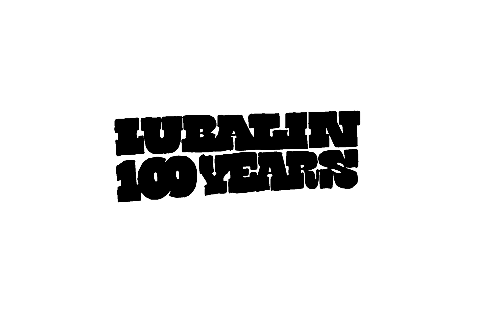
The kernal of the idea, hastily drawn in less than a minute.
The year prior, I had done some lettering for the Typographics conference, that slowly snowballed into several other ideas of typefaces. The most basic of those was something generically titled Ohno Fatface.

This was printed on t-shirts and sold around $20 a pop. It did not sell out.

The resulting display face from the Typographics lettering.

After Sasha suggested an Italian (which is an old school term for a reverse contrast slabby design) I simply squashed the middle, then pulled out the serif into enormous slabs. It struck the right balance of impactful and familiar, so we used it for the project’s logotype
Without much of a reason why, I started drawing out the rest of the capitals. My thinking at the time was that it might be useful to have a full alphabet for various collateral for the project. Also, numbers were needed in a smaller optical size so I took a crack at those as well.
Around this time, DJR’s Rhody came out, so I had a good reference for how a slab treatment could be applied to numerals. This was not the first time and will not be the last time I rip off DJR.

The wonderfully slabby figures from Rhododendron by David Jonathan Ross.

The also slabby figures from Beastly diverge from DJR’s model slightly.
I had nothing driving this project except for my own curiosity. I wondered what a lowercase for this super slab design might look like, so I played around with making the slabs absurdly enormous.

An early version of the slabs on the lowercase, which were so big, they were pushing other letters too far away.
In all of my classes, I like to talk about the “Counterspace Equals Letterspace” technique for achieving consistent spacing in type or lettering. Basically, this approach involves a blackletter-esque concept, where there is no difference between the space inside an n, and between two n’s.

A instructional image I show to students displaying the relationship between letterspaces and counterspaces.

Hearing your own voice in your head as a teacher talking to students is really annoying! I knew that in order to move forward with spacing that actually worked, my beloved monster serifs would have to be trimmed. This actually helped achieve an even bolder weight, so the works still looked monstrous. The switch in priorities here is pretty much the name of the game in type design. The word always trumps the letter, the paragraph trumps the word, and the page trumps the paragraph. Luckily, I’m not making a book face here.
Picking Up Speed
This project moved a lot faster than most of my typical original designs go. Usually, due to a lack of deadline, those projects can sprawl on for months and years with no end in sight. This design however was just too much fun to work on, and I couldn’t deny myself the indulgence!
For a brief moment, I explored a width change. I can’t quite pinpoint what exactly felt wrong about this, but after a few unenthusiastic hours of pulling points around, I simply lost interest. My gut was telling me this was a waste of time. Perhaps I could approach this again in the future, but also, just because something is starting out slightly wide, doesn’t mean it should get narrow. Maybe Beastly in the future will be a wide typeface that only gets wider!

An early exploration into the condensed side of things just wasn’t as interesting as I thought it would be.
The pinching was a tricky thing to navigate, and there aren’t really obvious conventions to follow for many glyphs. The 2 and N proved to be especially problematic, and I persistently banged my head against the wall until the correct forms were discovered. This part of the process requires a lot of patience and some brutal honesty. I’m still not sure about the final form of the J, but at some point, you have to move on!

I was trying waaaaay too hard with early versions of two.

N was one of those letters that I thought would be simple, but took forever.

A more in-depth view of some failures for other glyphs. Particularly humiliating are these laughable attempts at the S, $, and §.
I wasn’t quite sure how to handle the punctuation, but taking some notes from Tânia Raposo’s beautiful work on Coryn Didot, I utilized the hairline punctuation technique. Sometimes I wonder if I should include two sets of punctuation in an example like this, but eventually I settled on simply making it part of the design. At their worst, alternates are a way of saying “I’m sorry” or “This might be a mistake so here you go.” Beastly has no alternates, and makes no apologies!

For the hairline call, I had to go Goldilocks style on that shit. Also, a traditional italic style for the @ was swapped in last minute.
It was fun to see the type in use as I was designing it. During the time that type legend Jim Parkinson was working in-house at the San Francisco Chronicle, he used to test his typefaces daily in print when each day a new paper was printed. That sort of stress testing is amazing, but I had to settle for new versions of webfonts being loaded and used (in this case) on Lubalin100.com.
I delicately positioned all of these kerning proofs like a real jackass for this photo. Kerning comes late in the process, after the final shapes have been drawn and spaced. For a really heavy weight with such a large intended size, there can be a little less room for error, so you have to nail it.
The name
Why “Beastly”? Well, what else was I supposed to call it? Just like many of my contemporaries in font marketing, I lament the process of naming typefaces perhaps even more than the arduous task of kerning.
In 2011, the best band in the world released its first EP. “Mit Peck” by Vulfpeck was the delicately named culmination of six tracks, four insanely talented musicians, and just enough 2 inch tape. I can’t say why, but all songs were named after movies released that year. The first track, Beastly (named after a film with a 20% Rotten Tomatoes score), features one of Vulfpeck’s most recognizable grooves, and a mind blowing bass solo that single-handedly garnered the band their first wave of major attention.
7 years later, Beastly holds up as one of the funkiest things Vulfpeck has ever done, and it is my belief that Beastly (the song) will cauterize a permanent place of honor in the history of funk. It is with the utmost respect for the band that I humbly name this riff on Lubalin-era typography in homage to their tune.

Let’s wrap this up
Like all of the retail typefaces I release at Ohno, I am not sure how many people are going to pony up the greenbacks to license these fonts. But for those that do, I hope they do not think of my continuous sequence of failures that brought this design into existence. I hope the optical sizes make it useful, and I hope that interesting brands and organization want to align themselves with Beastly’s warm and aggressive tone. I hope it’s not simply nostalgic, but that it brings something new to the conversation. Lastly, I hope you like Vulfpeck as much as I do.