I always end my workshops by telling students that they are welcome to email me if they have any questions about type design and lettering in the future. My hope is that by maintaining some small dialogue after the weekend is over, their interest in this sort of thing can be fostered and developed the same way mine was. I always respond to those emails from students, but I think I’ll start publishing them here as well.
Kim was working on a low-contrast sans alphabet that took a few unexpected opportunities to add a curve, swash, or exit stroke in a way that added a bit of interest and humanity. She followed up after the workshop by asking:
I had a difficult time creating a family of letters based off one letter (like we did in class). Part of it was, I don't have the knowledge of the correct way certain style of letters are formed. Copperplate calligraphy, for example, I feel like I can create because I'm aware of where the thicks/thins should be and how the ends should look. Is there a reference book you can recommend where I can learn about all the other different type of letters (sans serif, serifs, etc), their rules, and correct way of construction? I don't even know where to begin!
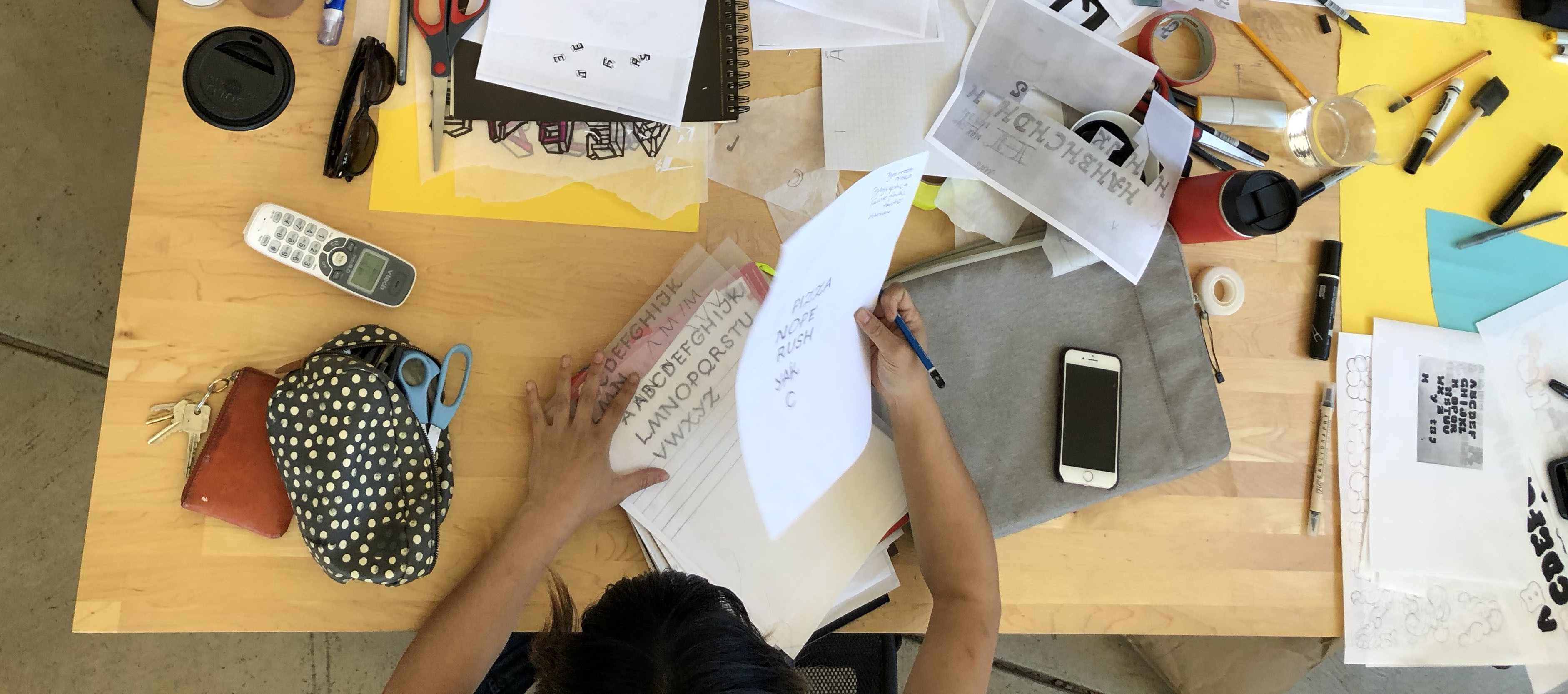
A tiny view of the letters in question, and an accurate portrayal of how chaotic desks can get.
Spencerian and other pillars of calligraphy are a great introduction to the world of typographic conventions. All the answers are laid before you, and parameters like x-height, weight, contrast, and width can easily be changed to create something more your own. In other genres of lettering and type design, the established conventions might be less obvious, but we can hopefully find something to work off nonetheless.
Your project was an all capitals sans construction, with rounded terminals, that took some interesting opportunities to introduce curves where there are usually straight lines. Let’s break that down:
Sans
- Geometric (Futura, Avenir, Gotham…)
- Humanist (Gill Sans, Optima, Frutiger…)
- Grotesque (Helvetica, Franklin Gothic, Akzidenz…)
Rounded terminals
- This is pretty simple, rounded terminals can be easily applied to almost anything.
Curves
- Looking instead at a sans italic lowercase.
- Taking inspiration from script capitals.
- Taking inspiration from swash capitals (see page 7).
So, for that reason, I think looking at a few things, and making a hybrid is the way to go. Spencerian will always get you to results that thousands of people have already achieved, but by taking the time to work on a recipe combining a few different things in unique ways will undoubtedly reveal something more interesting. This is more difficult, but worth the effort!
Kim responded, and informed me how I missed the mark.
Thanks for taking the time to answer my questions. I'm not sure if it exactly answers what I was asking but I will take your suggestions and see how it helps :)
I replied again, and mentioned how there is not a single book or reference that has every model you’ll need, but developing a taste for research is a good idea.