Sometimes it’s hard to resist a quick job. My long time friend Brad Wrage was helping out Wahl Surfboards with some graphics, and they had this old t-shirt graphic that had seen better days.
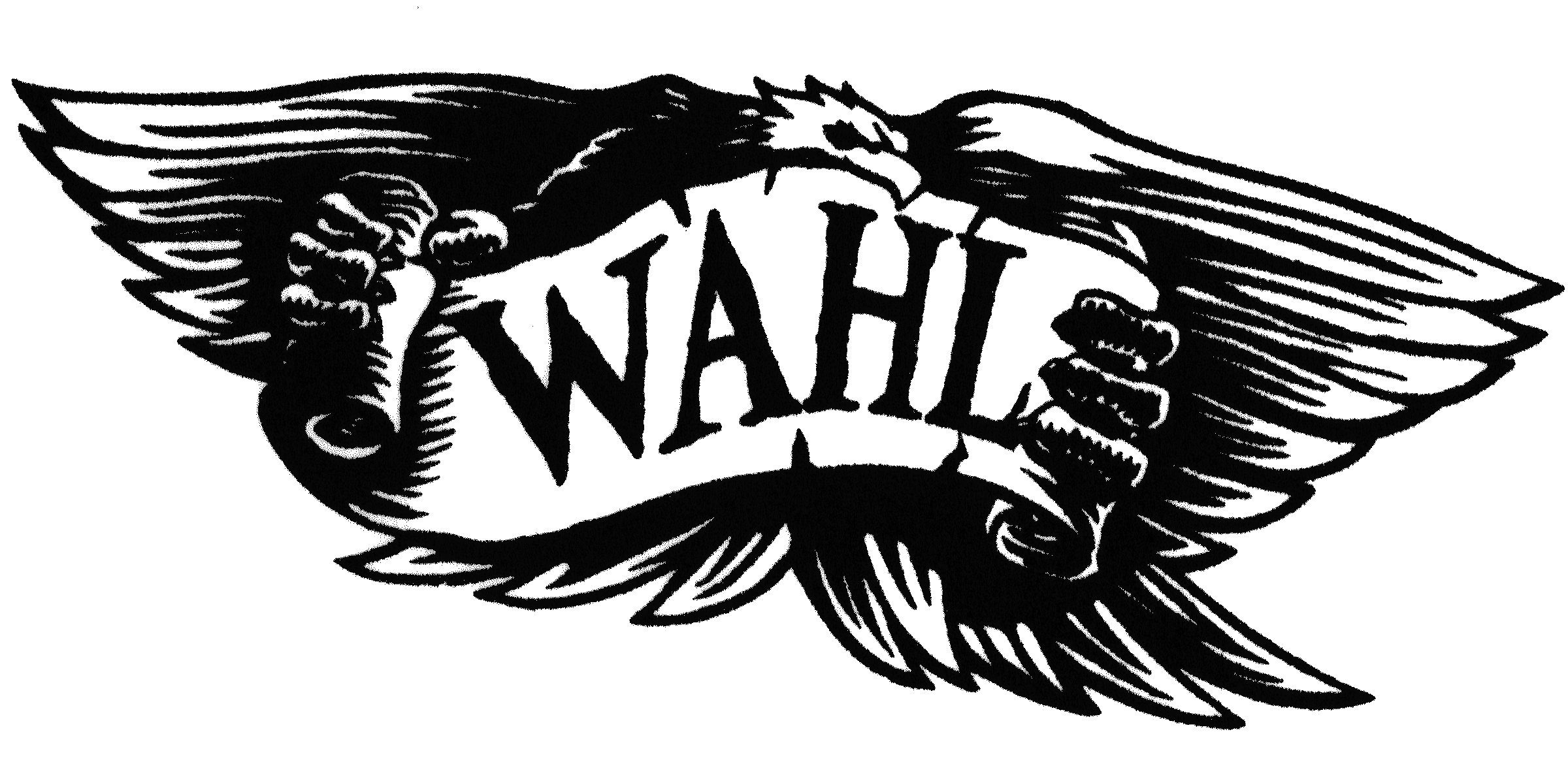
This looks like a photocopy, of a scan, of a fax, of a smoke signal. It needed help.
I actually really enjoy this sort of work. It’s barely creative, but that doesn’t make it easy. The challenge is to restore all the beautiful detail that was once there, or is supposed to be there, while maintaining all of the grittiness that makes it authentic. Also, there’s obviously some opportunities to improve the letters and spacing.
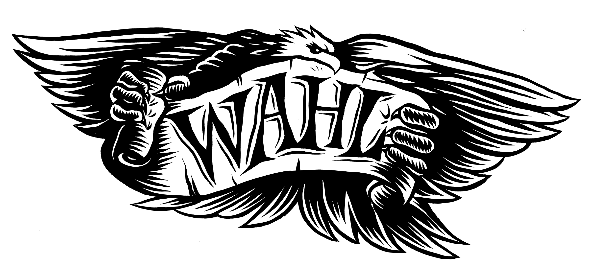
The Windsor Newton Series №7 watercolor brush is a little beast. After a little warmup, I can lay down some semi-convincing lines. I’ll be honest, there was some cleanup in Photoshop as well.
To vectorize, or not to vectorize?
In this case, I think it’s best to just leave well-enough alone. One could quickly lay down some vectors to get this looking more “perfect”, but I think that would fly in the face of what made the original compelling. Roughness is really laborious to achieve in a digital setting, but when it happens naturally, it seems fake to even it out.
Also, I forgot to add a drop shade below the A and H. Should I fix it? Is it laziness talking if I say, “The missing drop shade makes it better!”? I doubt it, since laziness probably would have kept me from picking up a brush in the first place.