Back in July, I had the distinct pleasure of teaching a Psychadelic Lettering workshop through Type@Cooper West. The Letterform Archive was the ideal location for the workshop, and legendary poster artist Victor Moscoso stopped by.
It was one of the most thrilling teaching experiences I've had, not only because we got to meet and hang with the cream of the crop representative of that genre, but because the output produced was completely fresh and unpredictable. Like usual, I structured the class into one day of many short assignments, and the next day spent on a bigger, more developed undertaking. The results, however, were quite unexpected for an introductory lettering class. Maybe there was something about the music being played, or simply the sort of designers the class attracted, but the overall vibe was a celebratory embrace of experimentation, unique styles, and a casual disregard for legibility.
I did my best to give the students a concise history of how Fillmore posters changed between 1964 and 1967, but truth be told, I don’t really know. I wasn’t there. I’ve learned what I can from books and looking at the material, but there is something almost fictitious about that period. Posters really looked like *that*? People actually read them? It’s certainly hard to believe these days.
Something I wanted to stress to the students is that these were not simply products of drug-fueled hysteria. They were as much a response to the political climate as they were influenced by substances. Reading this interview with Wes Wilson made me realize he was mostly concerned with politics, printing, budgets, and time management. It wasn’t at all the hippie attitude that has been popularized—which is probably the root of Moscoso’s distaste for that term.
Day One
One of the most interesting exercises started by giving each student a sheet of paper with some warped text. It was then their job to consider what ”psychedelic” means (as it applies to graphic design) and apply that to the provided foundation. I love this exercise because it allows students to loosen up, and not worry about spacing, because the spacing is already done for them!
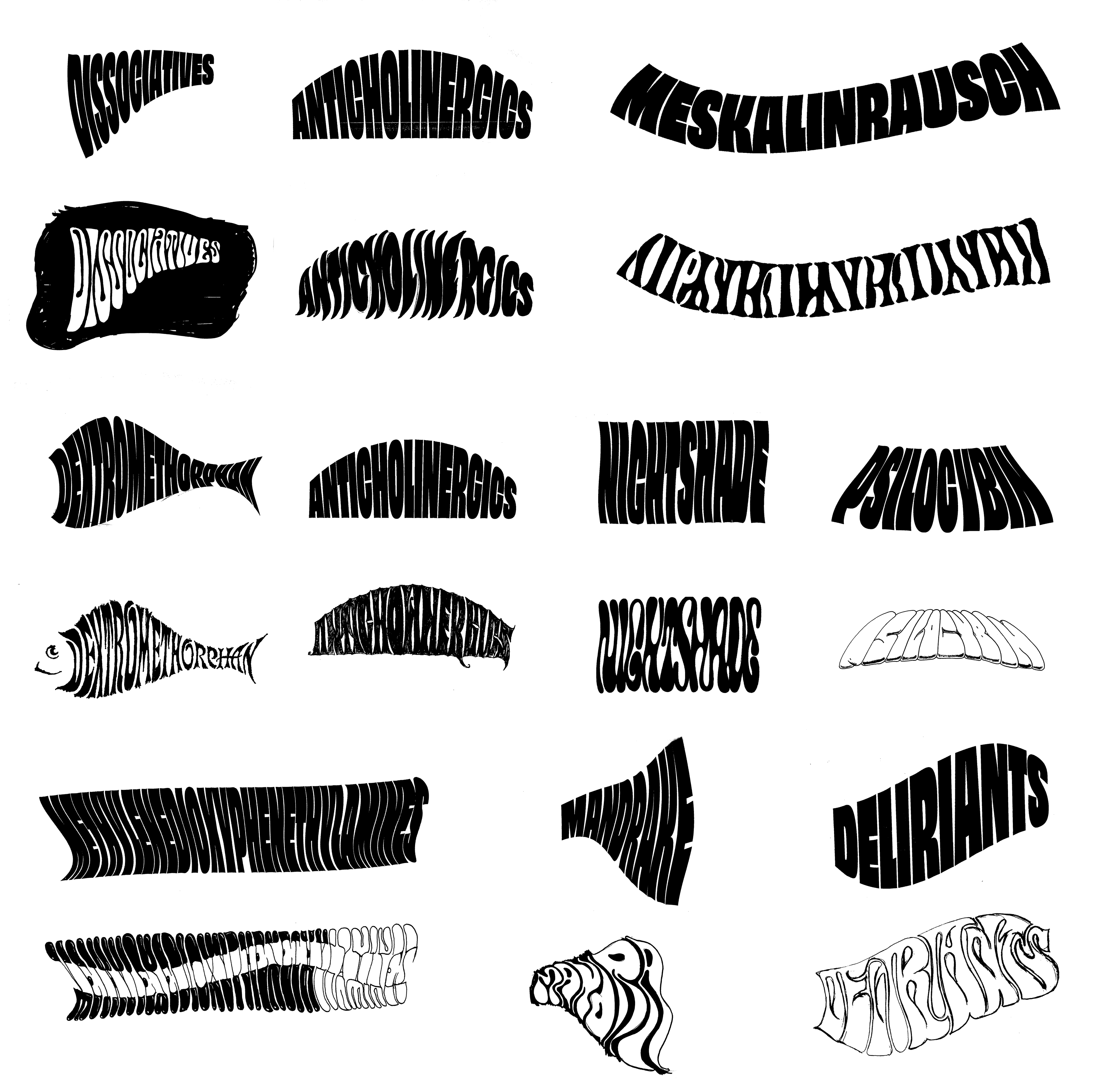
Work from the wonderful students Michael Start, Freddy Anzures, Radmila Zelic Josimov, Laura Bagnato, Jene Conrad, Mew Ophaswongse, and Daniel Castro. The sans serif print-outs provided skeletons for insane sketches done on top.
Day Two
If memory serves, the next day, we took what we had learned on day one, and applied those strategies of lettering to a band name. I challenged the students to break the proposed band logotype into a two-style composition. The first style would be the real hero of the design, and the additional style would be the significantly smaller optical size of the first—usually reserved for words like “the”, “and”, or “band”.
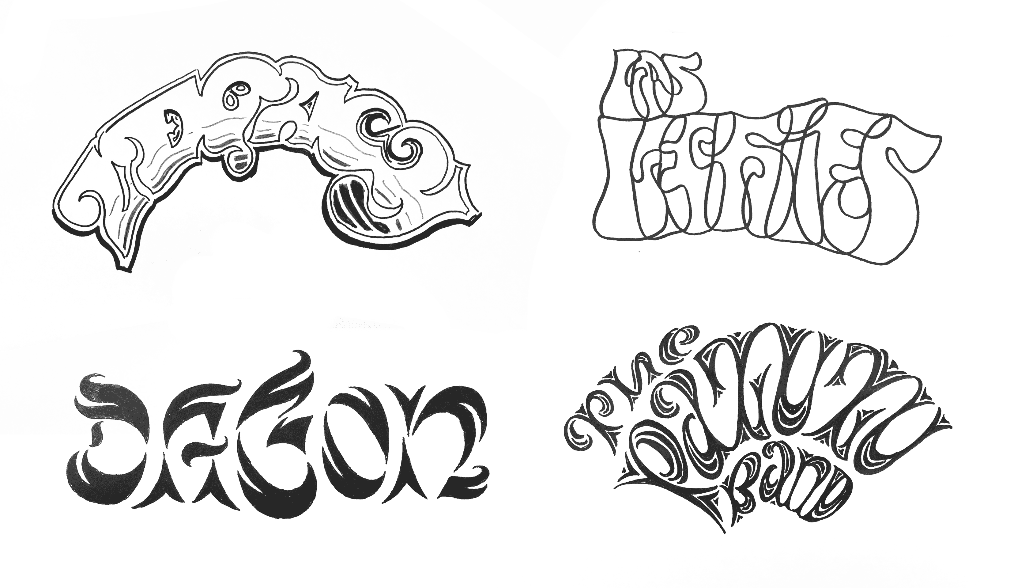
Top left: Daniel Castro. Top right: Radmila Zelic Josimov. Bottom left: I think Mew Ophaswonge but I could be wrong. Bottom right: Laura Bagnato, but again I could be wrong. This workshop was a while ago.
After lunch, Victor Moscoso showed up, and immediately entered a whirlwind of storytelling that enchanted myself and the students. It was amazing to realize not only the backbreaking one-poster-per-week pace of his career in that era, but just how long he maintained it. There was some bitterness about getting ripped off on certain gigs, and romantic tales of an era when you could sell posters for $1 out of the back of your car and make a living. Victor’s raw talent was evident not only in his signature work, but also in some colored pencil drawings, and Primus posters he did in 2012! At age 76!
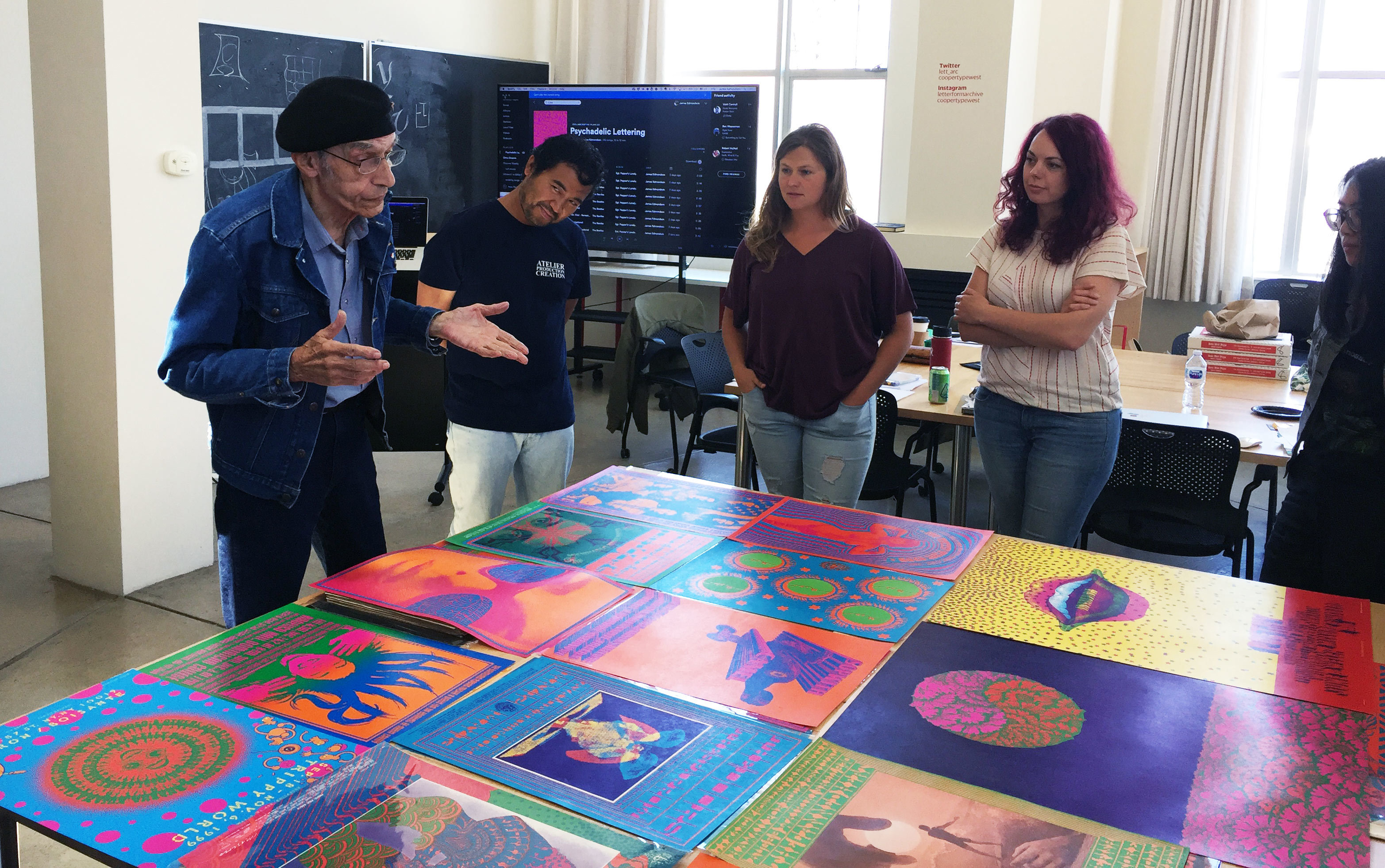
Victor Moscoso, gracing us with insane stories about his tremendous output in the late sixties, what an asshole Bill Graham was, and how many thousands of people have ripped him off (including me).
There were a ton of “Summer of Love” anniversary events and exhibitions in 2017, and I’m happy that ours had a true hero making an appearance, and some enthusiastic creativity from the students. It might not be one I teach again, but it was sure a fun weekend.