Guest author Erik Marinovich
Oh no, another script typeface *sigh*. Does the world need more? If you have five minutes, I have an answer. But first, here’s the story on how this one came about.
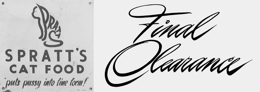
Three years ago I came to terms with the fact that a daily lunch diet of hamburgers was no bueno. Motivated to turn a bad habit into a good one, I began walking to work. My mile and a half trek takes me through the Mission district of San Francisco, which is home to a lot of crazy people, good burritos and hand painted signs.
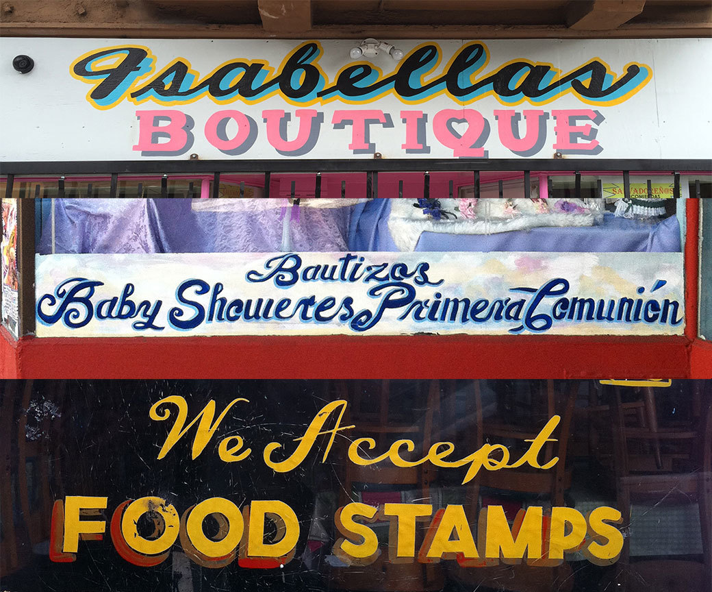
Selection of painted business signs found on Mission Street (between Cesar Chavez and 22nd Street) in the Mission District of San Francisco.
The signs became the highlight of the walk. An obsession emerged and I compulsively sought them out. There’s an alluring quality to each one that makes them appealing. Dissect each layout and you’ll find a simple pattern: a primary and secondary color palette, horizontal text and a loose cap and x-height. Each one seems to be designed on the fly and without a ruler, making the letterforms ooze with a genuine style. Eventually, this continual exposure began to affect my work.
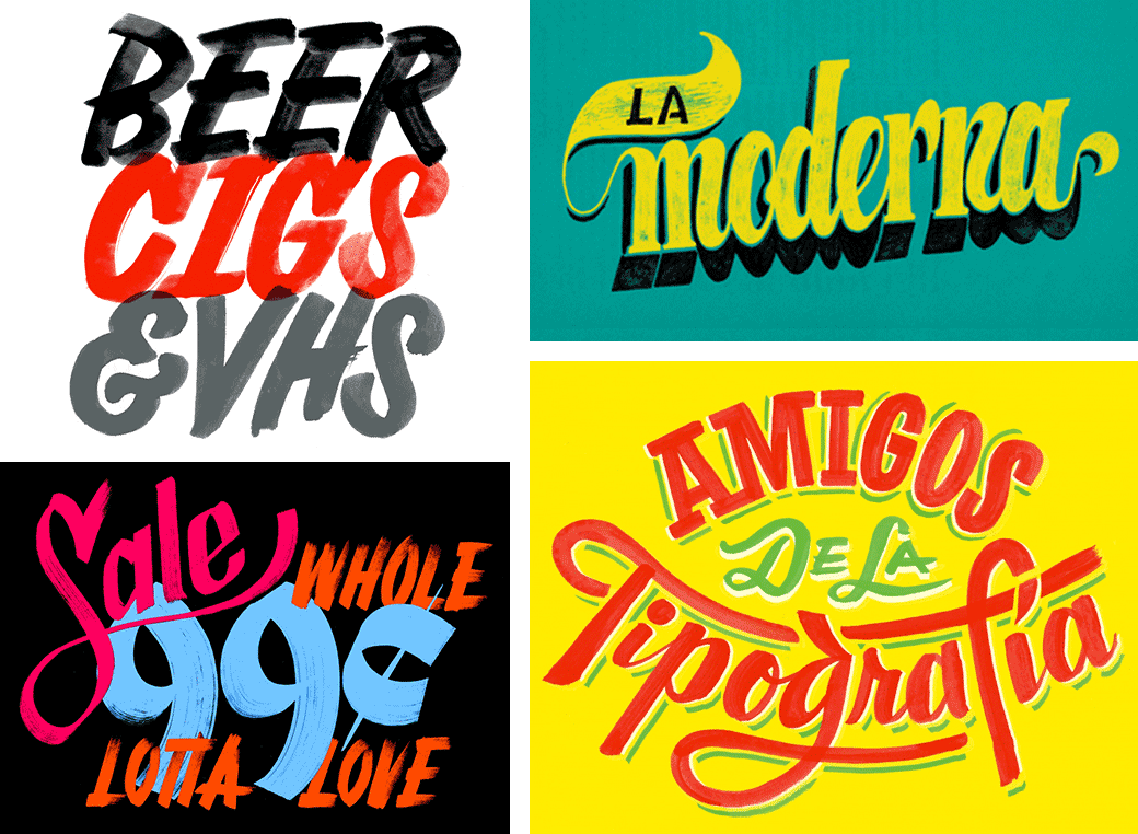
Assortment of lettering pieces created for Friends of Type.
Accepting the shift in style, I forced myself to loosen up in order to help my hand create letterforms that evoked a vibrancy similar to the signs. It was a valuable exercise.
Practice uncovered new ways of drawing letters and rekindled a love for casual scripts. Tracing paper and an assortment of writing tools are a lettering artist’s best compadre.
Left: Street Jewellry, A History of Enamel Advertising Signs by Christopher Baglee & Andrew Motley. Right: Basics of Lettering by Bill Boley.
This sparked an interest to dig deep and find unique examples of quirky script specimens, confirming my ‘weirder the better‘ addiction to odd letterforms.
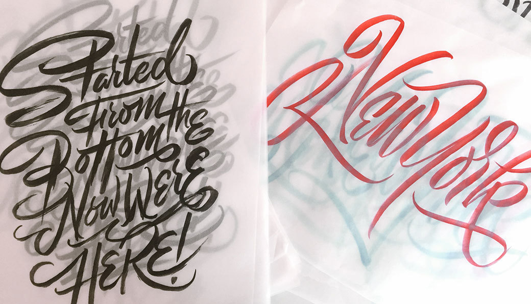
The first sketch of what would become Viktor Script.
Two years into my quirky lettering fetish, I applied my little secret to a lettering workshop. I pieced together a quick script specimen to be shown as a reference for attendees. It was the first complete character set I’d drawn. Typically, I only illustrate words and phrases, but never translate them into proper alphabets. The deeper exploration gave this script more personal meaning.
The script embodied characteristics of signs I admired in the Mission. Each letterform had individuality and complimented each other together and apart. The only problem was it existed as a layered photoshop file and any attempt to manually typeset it became mind numbing.
Luckily, James pitched the idea of a collaboration to help make it real. Seizing the opportunity, we began turning this odd fella into a functional typeface. We quickly developed a productive workflow. He’d digitize while I focused finishing the remaining glyphs.
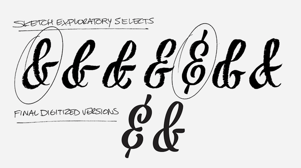
An example of Viktor Script’s development during the ampersand exploratory between James and I.
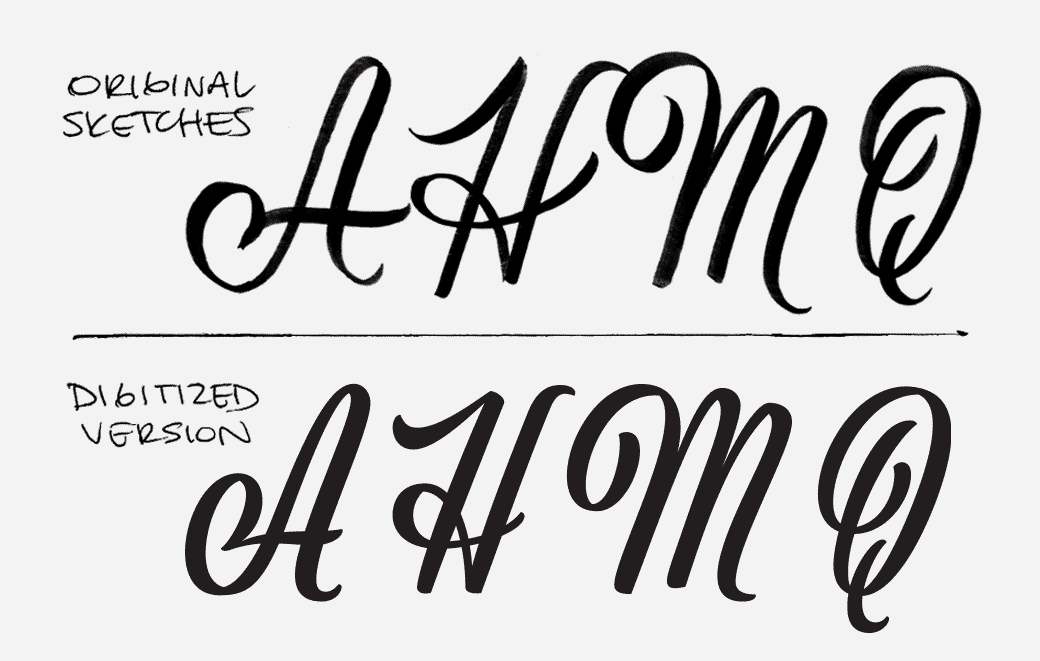
A glimpse of what the process looked like. Gradually, the script took on an improved look but kept true to the original personality.
Knowing it needed a name, I wrote a short list of attributes that defined the script’s character: honest, imperfect, and can party all night. Somehow these three traits made me think of my Uncle Viktor, who is by far one of the coolest dudes around.
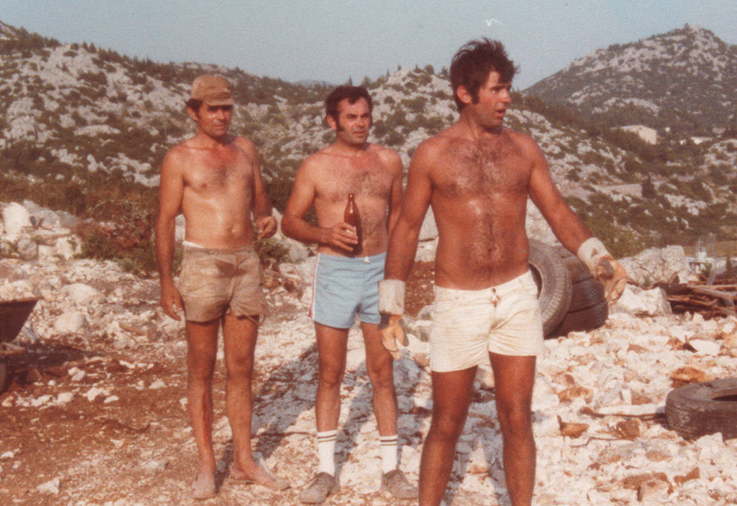
Uncle Viktor on the left next to my Dad and Uncle Zoran. Doing what men do… breaking rocks and drinking pivo (Bacina, Croatia circa 1965).
Plus, it made his day having a typeface named after him. Who is the favorite nephew now?
We’ve made this typeface to be a good companion for any well deserving designer, cultural curator, or celebrity like yourself. Here’s a quick overview of its finest features:
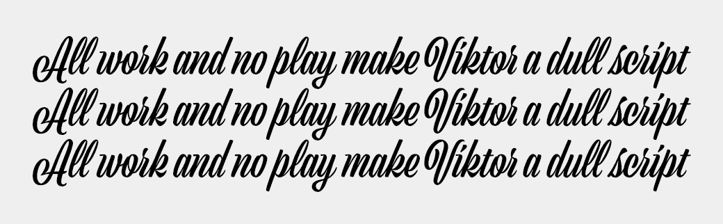
With a 22 degree slant and narrow proportions, it’s flexible in tight situations.
Especially tasty when stacked on a diagonal.
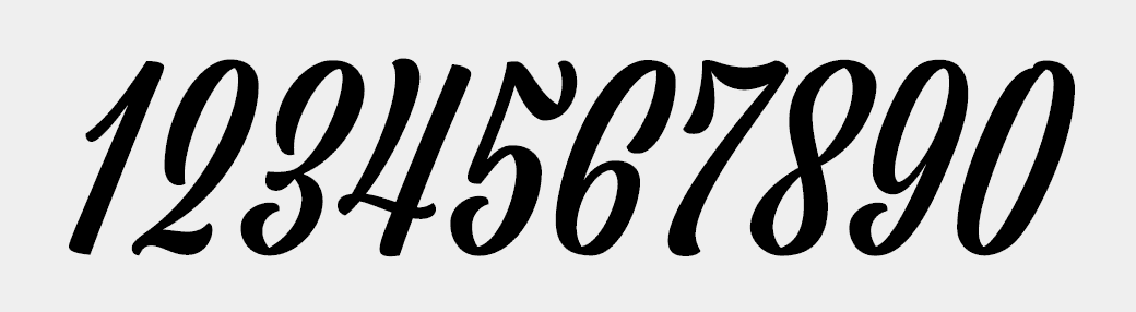
Lining figures carefully crafted and suitable to work at large and small sizes.
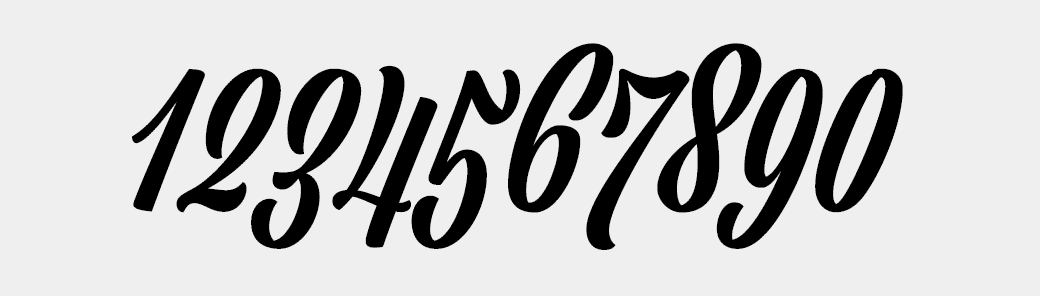
A rule of thumb, old style figures look better typeset on price tags with many zeros.
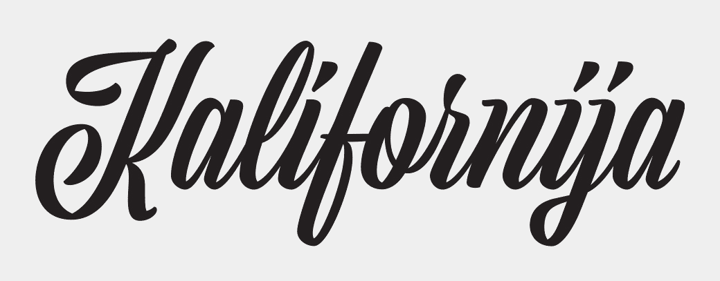
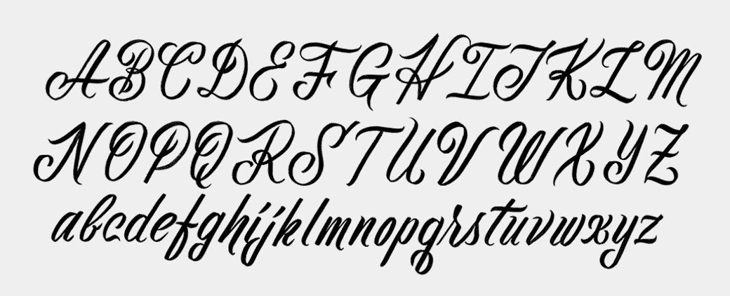
At 897 glyphs strong, Viktor Script has all the alternates to ensure smooth connections no matter the word you’re setting.
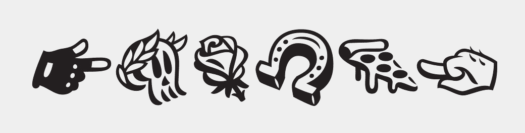
A small sampling of the lightly provocative 40 dingbat set.
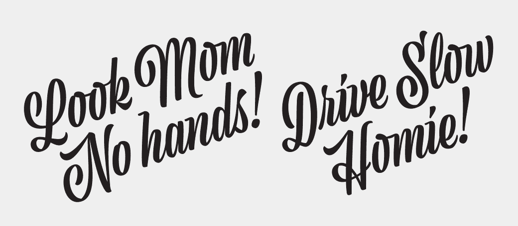
Viktor script is not your run of the mill display typeface. It’s working class roots make it a dependable font capable of being styled for any occasion.
Oh and for you patient readers awaiting an answer to the question posed at the start (Does the world need another script typeface?). Here’s my answer: Viktor Script is a unique collaboration between lettering artist and type designer. Every opportunity to instill this design with life, emotion, and excellent quality was taken.
— Erik Marinovich