A few years ago, Facebook alerted me to a family member’s birthday. My go-to on such occasions is to illustrate a talking penis saying “Happy Birthday”, and post it to their Facebook wall. Which typeface might best suit a penis? The answer, was obviously Hobo.
This was at a time where Hobo didn’t mean much to me. I had no idea it had art nouveau roots, or that it was originally drawn by Morris Fuller Benton and others at American Type Founders in 1910. I simply associated it with unprofessional graphic design, or lame attempts at fake psychedelic posters ineptly mimicking the style of Wes Wilson.
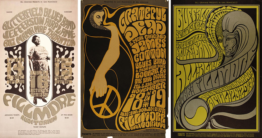
Fillmore posters from 1966–67. The Hobo influence on Wilson’s work is positively undeniable. Just look at that first one.
But as time went on, and more talking penises were posted to Facebook, I gradually grew to love Hobo’s je ne sais quoi. I even discovered it was already a sort of typographic guilty pleasure among some respected and talented type designers.
It was striking to me that even though few consider it a favorite, Hobo has somehow survived every technological leap in type. It started in metal, maintained popularity in the photo typesetting era, was digitized in the ’80s, and now comes pre-installed on almost every personal computer — an amazing feat considering its name is derived from the fact that no one wanted to care for it in the first place.
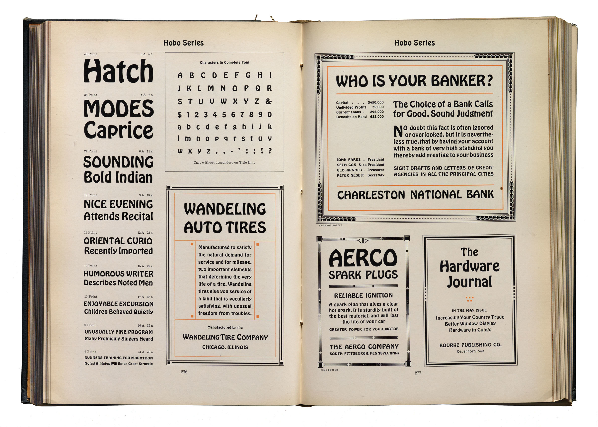
Hobo in the 1923 ATF Catalog. → Larger photo. Image courtesy Letterform Archive, photographed by Sun Helen Isdahl Kalvenes.
Hobo’s lack of straight lines and right angles is also a breath of fresh air. I later realized it was the softness of Hobo’s curves that provided the human emotion I was in search of when I wanted to compliment a talking dick. In an age where cold precision is default, what is there to remind you you’re human?
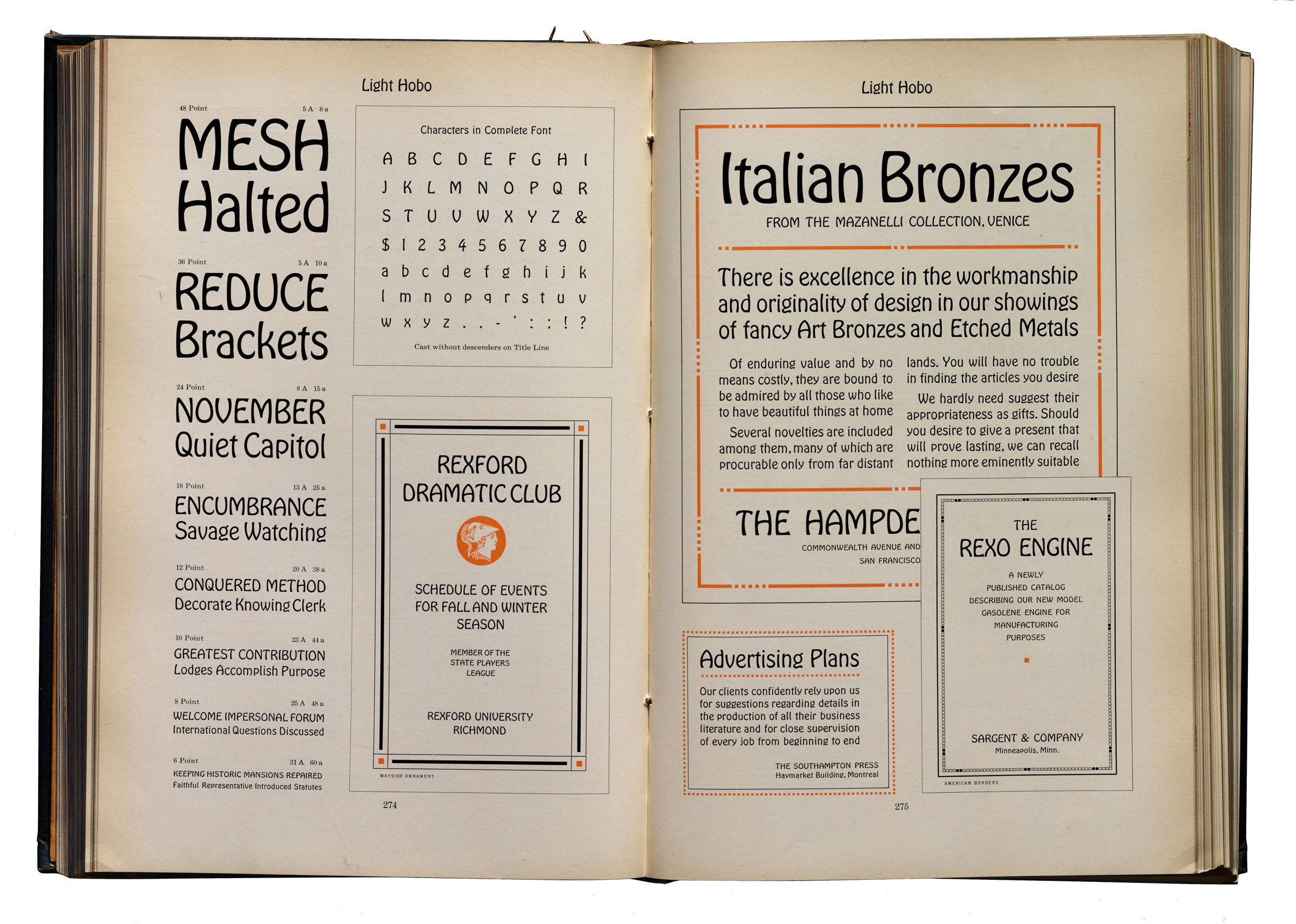
Initially released in 1910, a 1915 expansion brought this light weight.
In graduate school, Hobo provided a nice distraction. When the grueling task of managing contradicting feedback from half a dozen esteemed professors was insurmountable, I’d turn to my sketchbook to attempt a new version of this old typeface. At their worst, these explorations were a fun distraction, and at their best, my heart pounded with joy and a profoundly deep appreciation for this remarkable and descender-less typeface.
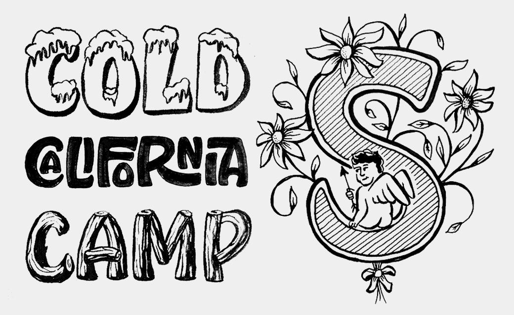
Early attempts at, ornamented caps, Snowbeaux, interlock, and log styles.
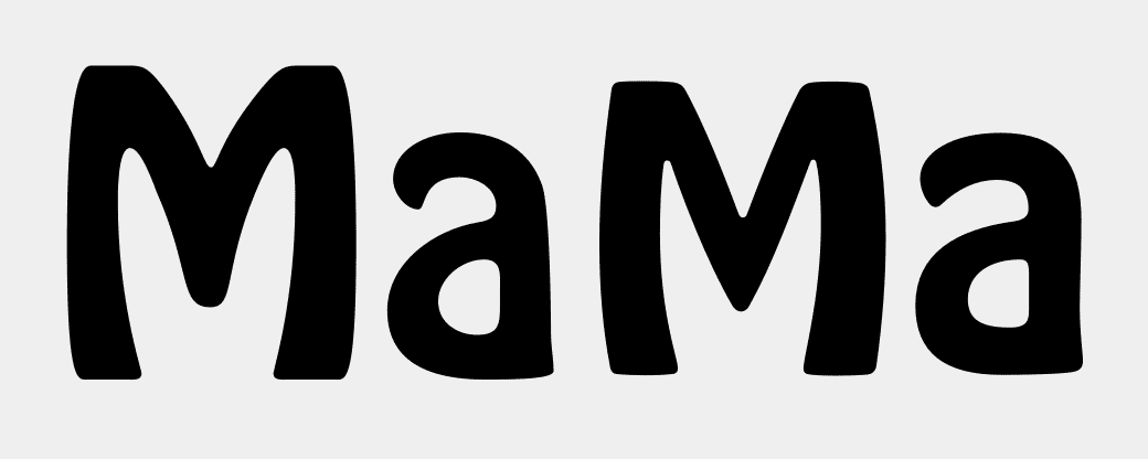
After graduation, with nothing but time and an open heart, I began the process of playing with the forms in a real way. I took the basic shapes, and plumped them up as much as I could, creating a never-before-seen Hobo Black. With each experiment, the desire to turn it into a real family grew ever more irresistible.
At first, my heart was in the novelty styles like the blood drip and log. Beyond those, the possibility of turning Hobo into a connected script fascinated me.
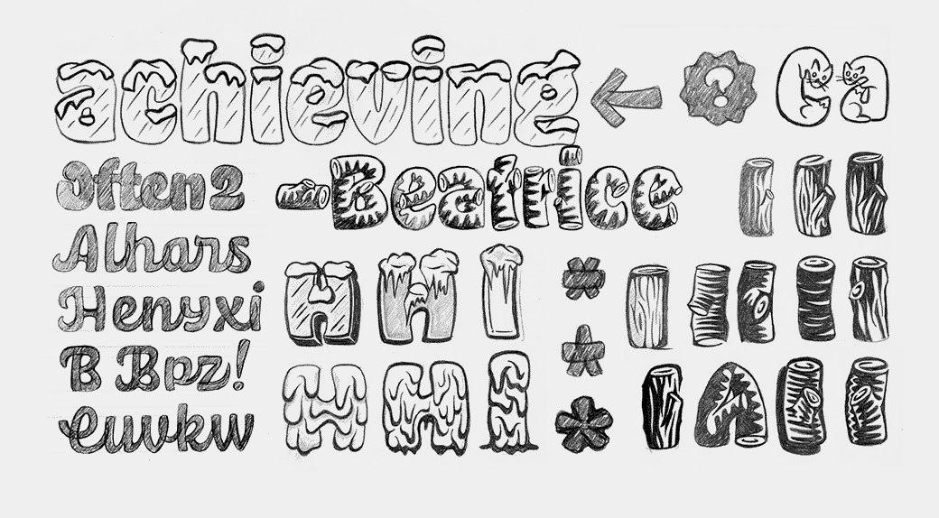
More developed Snowbeaux, script, log, blood, and cat styles.
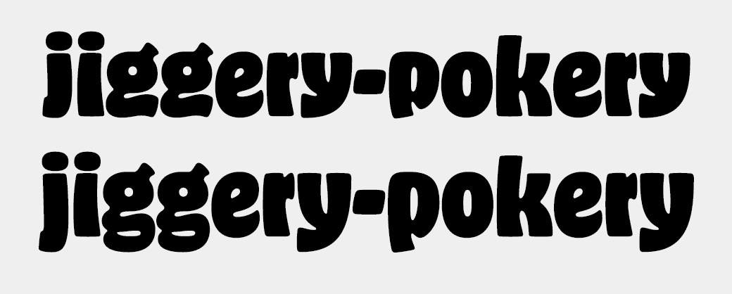
Ultimately, the best starting place was obviously a refinement on the basics. So I asked myself, “What does Hobo look like 100 years later?” This project was always more of a modern interpretation rather than a steadfast revival, and lucky for me, there was much room for improvement in the readily available digitizations.
Hobo Std, the one that probably came installed on your computer is on the left, and Hobeaux is on the right.

There are many schools of thought on how to draw good curves, but Hobo Std follows none of them. Well placed points and proper curves ensures that Hobeaux will look great even when scaled to enormo sizes.
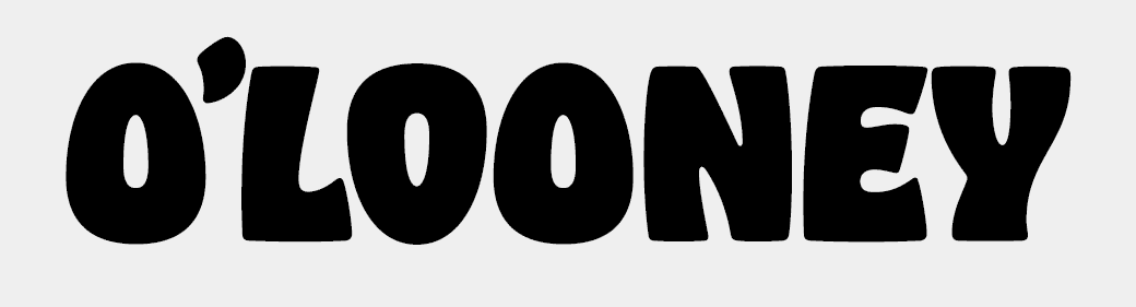
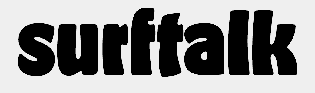
Hobeaux (pronounced ho-BO, a name ingeniously coined by my former roommate Diana Ovezea) has five weights and several features for the designer seeking a high performance type family.
For readers that favor tradition, there are descending alternates, though I don’t advise their use because that implies that Hobo fails as a design, which it doesn’t.
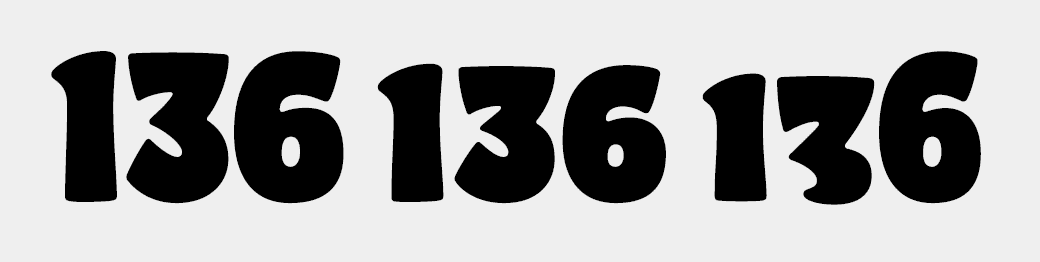
Lining figures, an in-between style, and descender-less old style figures (a brilliant idea provided by Jackson Cavanaugh, come in all five weights.
In the Photolettering One Liner, I noticed that their typesetters were flipping the capital O if it followed a letter that filled more space on the bottom right. This was built into the fonts with OpenType so it happens automatically.
In the bolder weights especially, there was occasionally too much space to the left of t and f, so alternates with a shortened or severed crossbar were introduced.
I could go on, but this is probably more than anyone will want to read, and at the moment, I’m tired. To the designers that scoff at such audacious curves, and prefer the sterile rigidity of geometric sans serifs: go suck an egg. But to the humans with kindness in their hearts and adventure in their souls, why not consider purchasing?
Please know that a lot of love went into these fonts, so if you are a designer that puts a similar passion into using them, let me know what’s cookin.