Beginning in the (early) 1800s, the Fann Street foundry in London produced a few designs in the brand new genre of “fatfaces.” They were intended for short words to be printed HUGE, and for this purpose, they worked quite well!
In the 1970s, everything old was new again, but this time the exaggerated proportions of the era infected the x-heights of many well-trodden styles. Weight was pushed to new extremes. Negative space in and around letters shrank to minuscule specs of white.

Tom Carnese’s lettering. A pinnacle of fatface design, under the art direction of Herb Lubalin. 1968. What made Lubalin’s work so great? The artists he employed? The copy? Nope, it was all in the exclamation points.
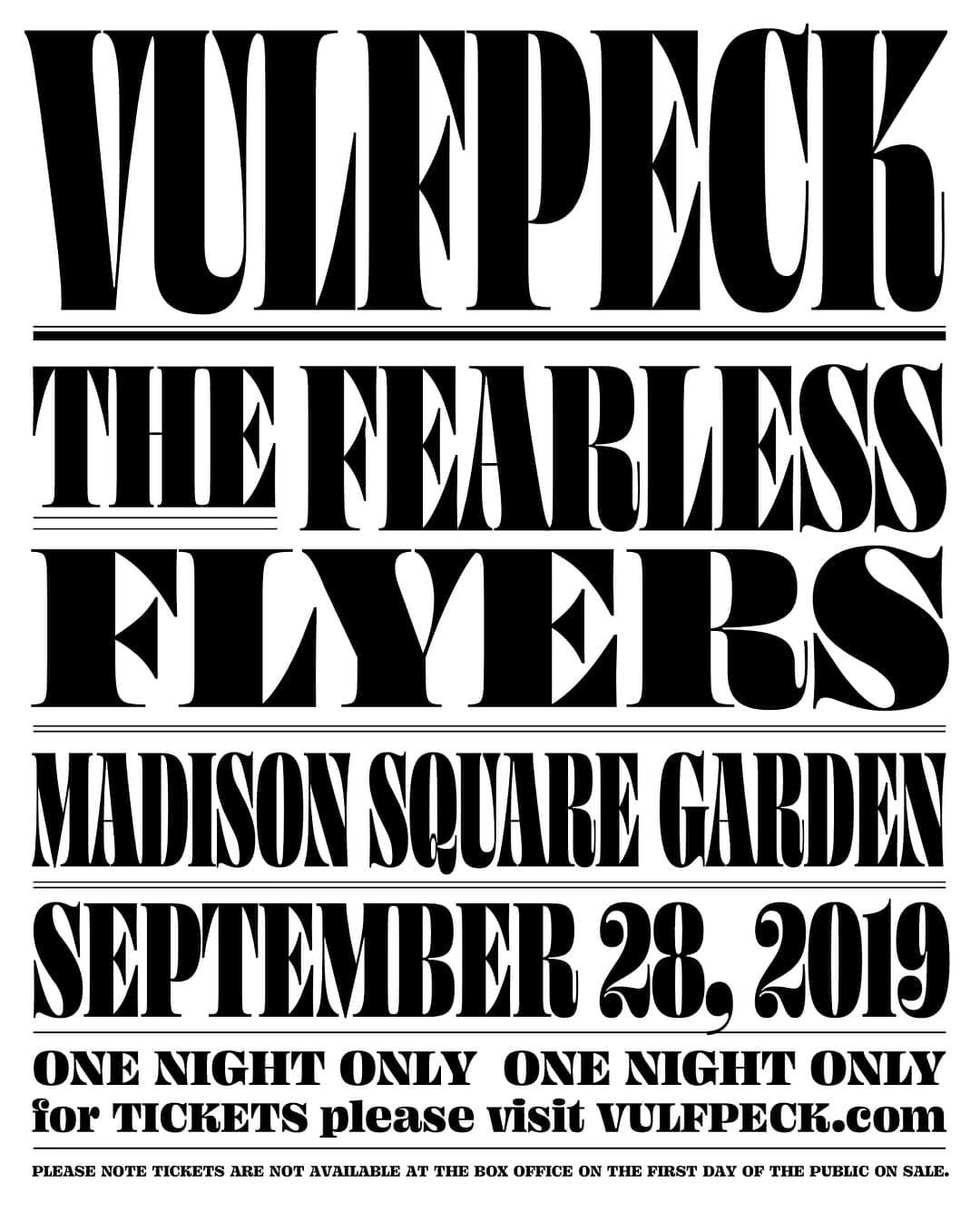
Back in February of 2017, I created a graphic for Typographics. It was based heavily on the famous “Oh!” and “Ah!” lettering for Lubalin’s identity work for photographer Anthony Hyde Jr. Tom Carnese, a master of high-contrast fatfaces, deftly handled the lettering.
I used that lettering as a starting point, but it’s much more fun to get an image of something in my head, and then go draw it myself. The results are of course different than the inspiration, and I learn more in the process. It feels less like a ripoff, but it’s still totally a rip off.

The Typographics ’17 lettering. This was fun to draw, in large part thanks to the challenge of squeezing the descender of g, making an ra ligature, and finding a solution for y that didn’t create any large pockets of whitespace.
Turning the rules upside-down
A great deal of type design revolves around making positive space consistent—for instance making sure all your verticals are exactly 90 units wide. But as type gets into the bold, black, and ultra weights, it becomes more necessary to make sure that your negative spaces are as consistent as possible. This allows an even texture where no one letter or pocket of whitespace stands out more than any other.

In normal weights, keeping positive shapes consistent is paramount, but as things get really heavy, keeping negative spaces consistent takes precedent.
This is totally fascinating to me, because I'm a human, and not a computer. Computers are great at straight lines and geometry, but humans are great at emotions and acting irrationally. One must really rely on their eyes, and sometime throw the ruler out the window. Blindly doing what the numbers tell you can lead to brutal, sterile results. Sometimes those results are appropriate, but not in the case of Ohno Fatface.
The extended family
Building out the characters from the Typographics ’17 lettering became irresistible, and by March of that year, I had a lowercase alphabet. After posting some images on Instagram, I saw they were getting a bigger reaction than normal. I don’t want to run a foundry that is dictated by likes and comments, but to be completely honest, it does mean something to me when followers respond with a lot of positivity around a work-in-progress. Over time, I’ve learned that likes do not equal money in the bank, but it still does a bit to maintain my own energy around a project.

The earliest digital version of Ohno Fatface.
My attention deficit for finishing fonts is more devastating than I’d like to admit. After a bit of noodling, this principally classical fatface morphed into something different, and substantially more psychedelic. Ohno Blazeface was the new shiny object, and I decided to invest my time in that, since recreational cannabis branding was the hot ticket at that time.

Although the seeds for Ohno Fatface were planted earliest, it’s the last one to see the light of day.
It took years to come back. First, Ohno Blazeface got italics, and then Beastly distracted me. Finally, after doing an inventory of my entire backlog, and using Ohno Fatface in a lot of presentations and Instagram posts, I came back to my plump little baby.
Why bother?
I am always fond of the jolly attitude fatfaces connote, and there are quite a few great digital incarnations. Oban from Alias, Ingebord from Type Jockeys, and recently Isambard from Commercial Classics and Montage from House Industries all bring something great to the table. What could be offered from yet another contribution to the genre?
Coming back to Ohno Blazeface, that was fun to design with thanks to the juicy x-height, and extensive set of optical sizes. For big display settings, lines stacked really nicely on top of one another, and the additional styles intended for smaller sizes came in handy a lot when I was making specimens. I decided to bring those ideas back to Ohno Fatface.

Having all the sizes, from 72 points to 12, made complex lock-ups really easy and logical.

No, this is not a word, but it illustrates the limitations of many super bold designs. Ideally, the AA should not stand out any more that the HHs, but there are inherent considerations of legibility that stand in the way of perfectly even texture. I tried to minimize that with a flat-topped A (instead of a pointed one) and overlapping the outer extremes.

This ideas goes way beyond the A, of course, and any letter that doesn’t naturally fill out a rectangle can be fudged to do so as much as legibility permits. The overlapping is made possible by keeping the terminals at the baseline, x-height, and cap-height completely flat. In T and L (and C, G, E, S) the vertical serif is blown up as much as possible without making it any weirder than the other letters.
Broadening horizons via narrowing
Remembering my work on Obviously, I came to the idea of a width axis. Fatfaces can look so insane when super squished, and with Obviously I learned that these condensed style are super handy, too. I wanted to see how much I could condensed Ohno Fatface and maintain some semblance of legibility.

Top: Digitally condensing the normal width. Bottom: After corrections. After squeezing the large and small styles as much as possible, I discovered a set of condensed styles around a third the width of the originals was about the narrowest I could reasonably go. On letters like a and g, the narrower styles have some weird solutions to keep the negative spaces tiny. g gets a big head, and a gets a big bottom. It’s an odd, distorted look, but I think with extreme proportions come extreme solutions!
It came as a complete surprise how much fun this made the design process. I generated a variable font that combined the optical size and width axes, and stacked-and-justified layouts were a total breeze. As it turns out, the combination of width and optical size variability is like being able to not only steer your car, but to suddenly drive it straight up into the air.
With options in width and optical size, a block of text can fit into many differently sized pockets of allotted space.
Bringing it home
Ohno Fatface is the 11th family released on our little micro-foundry, and one of the more classically-informed members of our library. Letting go of the urge to be original or unique, and just going where the genre is telling me has proven to be a rewarding journey.
It’s nothing earth-shattering, just an ode to the early 1800s through the lens of the 1970s. We are reminded of the cyclical nature of trends, but also of the things that don’t go out of style: even texture, and high contrast. Where the typefaces of Fann Street were intended only for a short word here or there, we can now create the entire spectrum between display and text, providing designers with a Swiss Army knife for all their fatface needs. I can’t wait to see this suite of 5 widths and 9 optical sizes in the hands of designers that love fatfaces as much as I do.
