OH no Type Company.

Ohno Type School: E

E1

E is full of absolutely wild optical adjustments. The crossbar is slightly higher than geometrically centered, because if it wasn’t it would appear to be too low. Isn’t that weird?

E2

In serif land, E has horizontal serifs on the left, and vertical serifs on the right. Vertical serifs should follow the weight and width. If the design is bold and condensed so should be the vertical serifs!

E3

In the lowercase, e is a great opportunity to bring up a massively important topic in type design: contrast type.

E4

Gerrit Noordzij is the pioneer of type design that distilled the three spectrums of contrast type, contrast amount, and weight into a single educational diagram. He used the e to avoid any pesky serifs.

Ohno type school e

I think Noordzij is a genius for simplifying complicated ideas. Look at how he shows the difference between good (top) and bad (bottom) spacing. His diagrams are so good, they need no explanation.

E6

But back to the e! Translation and expansion have so many terms attached to them, it can get really confusing, but the simple trick is to look for the thins!

E7 1

Contrast type shows up in the rest of the alphabet in many different ways. Here’s an expansion lowercase exemplar loosely inspired by Noordzij’s typeface Ruse. Yikes, this lesson is getting more intense than I was expecting.

E8 1

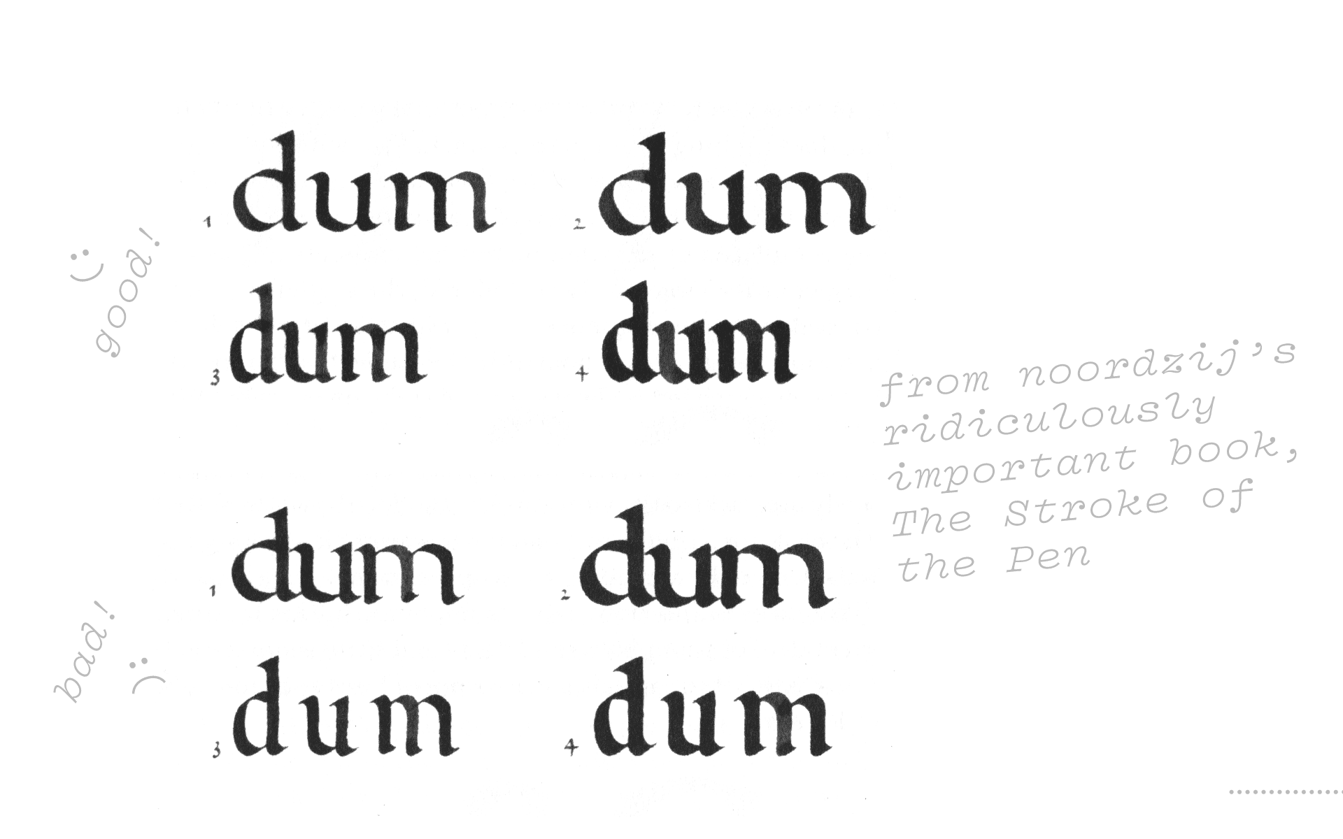
And here we see translation, where contrast is defined by how the pen, held at 30°, moves, or “translates” around the page. Noordzij’s theories about how type comes from writing are wildly powerful in understanding type.

E9

The e contains so much dna about the typeface — weight, width, contrast, contrast type — it’s like a good friend about to give you some juicy gossip! And you can tell, because it’s always smiling.✌

Review

  • Vertical serifs respond to weight and width.
  • Type is inextricably linked to calligraphy. Thank you Noordzij!
  • Expansion and Translation are the two main types of contrast.
  • I went to middle school and high school with Zac Efron.

Next up → F.

Covik Sans Regular
Covik Sans Regular Italic
Ohno Blazeface 18 Point
Covik Sans Bold Italic
Covik Sans Bold
Vulf Mono Bold Italic
Vulf Mono Light
Vulf Mono Light Italic