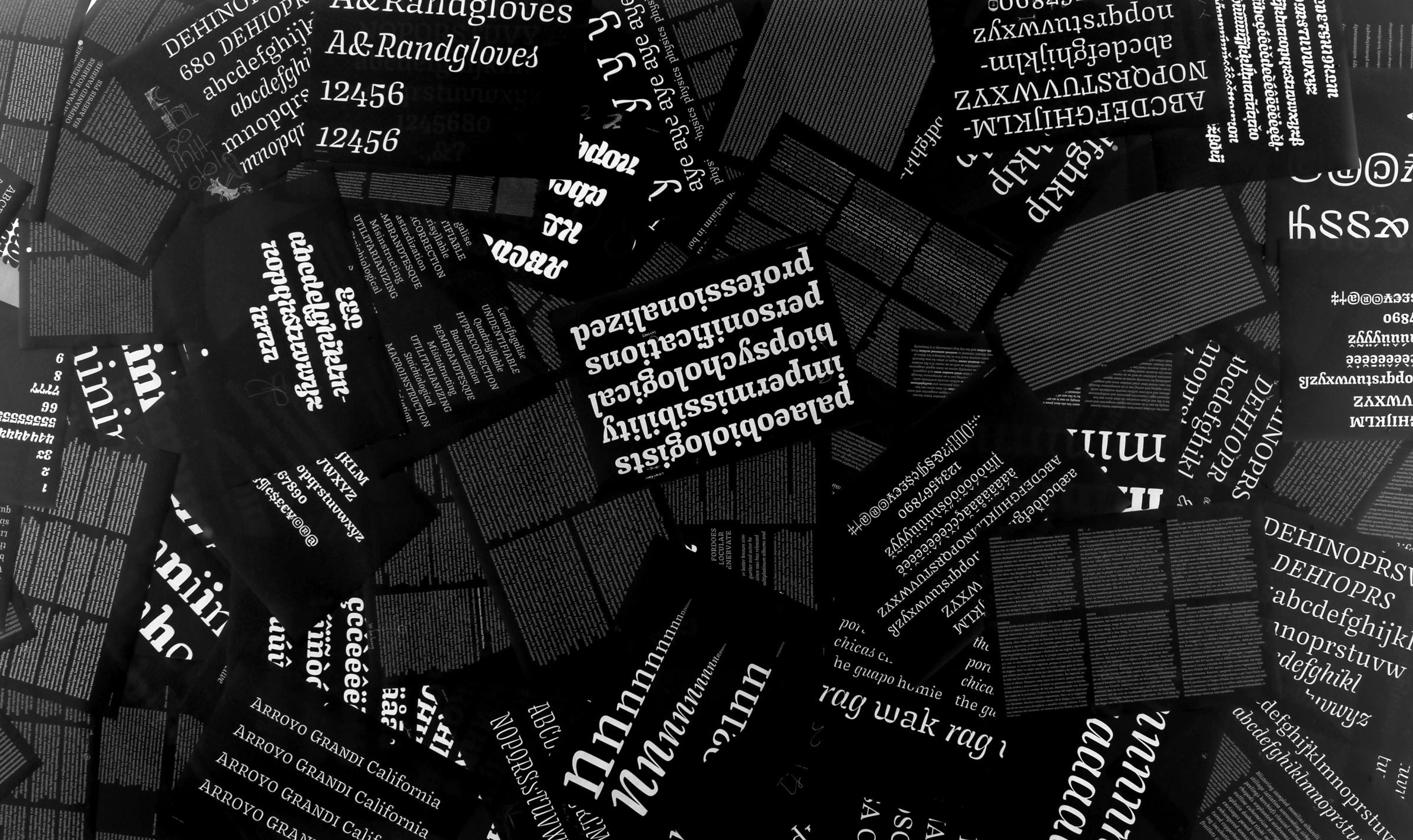
Proofs from the Type Media days.
Type design student: “Hey James, I’d love to get your thoughts on a new font I’m working on. Can I email you?”
Me: “You bet your sweet ass you can.”
But often, the resulting email includes only an .otf attachment, and little information about the intentions of the typeface. As a critic of the work, I really have no interest in the actual font file. I don’t want the recipe, I want to taste the food! Similarly, I don’t want the font file, I need a proof.
What the hell is a proof?
A proof is a document, usually in PDF form, that tests the typeface in question. A good proof answers the following questions:
- What problem is the typeface trying to solve?
- What are the problems with the typeface?
- What are possible solutions to those problems?
Like a sketch, a proof is simply a means to an end. It only exists to illustrate areas of improvement, and to test ideas. A proof with no mistakes is a waste of paper. Or, you could say that a proof with no errors is a specimen.

Testing alternates in context is the only way to make an informed decision. And proofs are all about informed decisions!
Give someone a fish and you feed them for a day…
I teach at Type West in the year-long type design program. Every year, we have some version of a discussion about whether or not we should provide students with an InDesign proofing template. Because the students aren't full-time (they have jobs and lives outside of school) we usually give them something. Also, when we don’t their proofs get crazy!
But creating a proof is an important part of the design process. Being able to think critically about what to include or not increases a student’s awareness of their project. Teaching a person to fish will feed them for a lifetime. Here’s a basic checklist:
- Every drawn character, large enough to make notes.
- Paragraphs or headlines at the intended size(s).
- Spacing strings.
1. Every drawn character
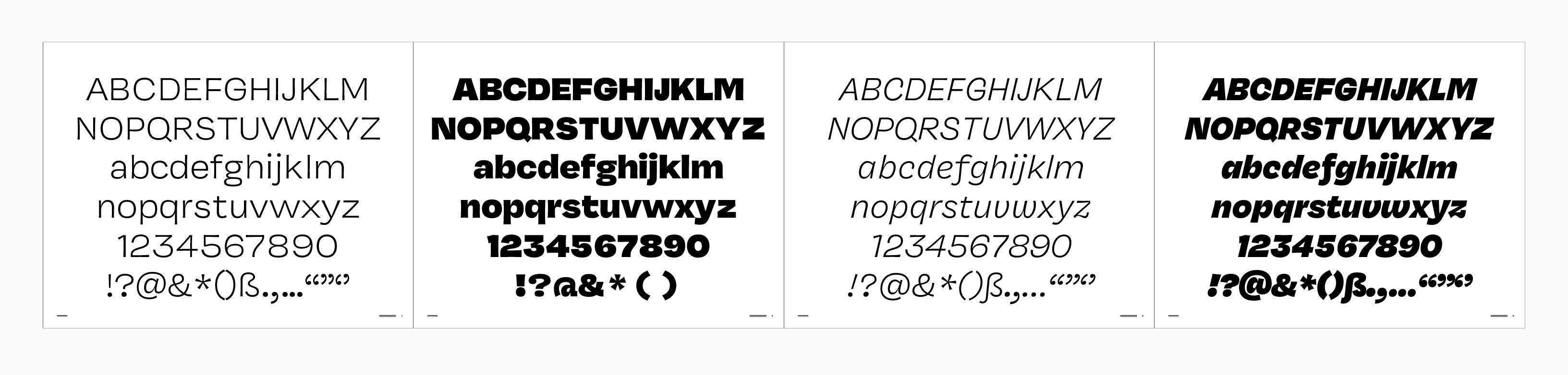
We can diagnose some problems from just the alphabet, but it tells us nothing about spacing.
Proofs are printed or exported as PDFs so they can ultimately be marked up. This means we have to have a nice place with room to write notes.
2. Paragraphs or headlines
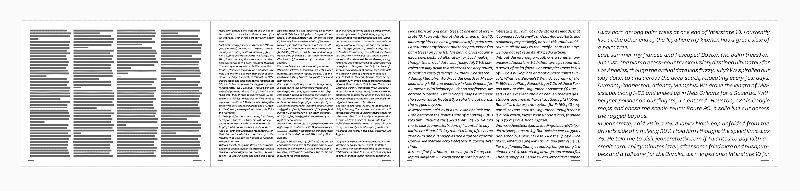
Seeing actual text tells us much more about spacing, texture, and inconsistencies in weight. Dark or light spots will attract your eye, and alert you to problematic glyphs. I always have to remind myself to read the text in a proof, because I am so often guilty of just looking at the text.
3. Spacing strings
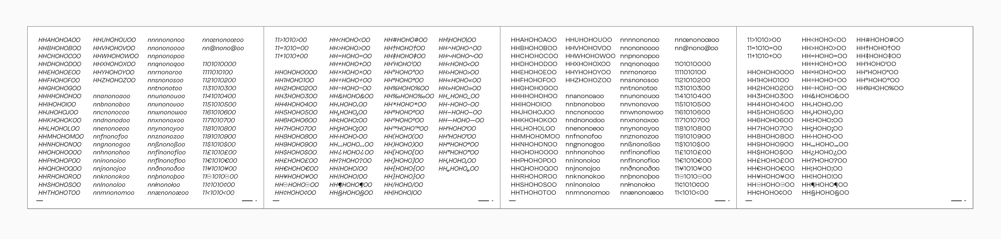
Spacing can be evaluated by looking at every glyph between control characters.
“Strings” is the confusing part of this one. In this context, a “string” is a programming term that simply means a bit of text.
When spacing the lowercase, we always begin with n (the most logical letter with two vertical strokes), and o (the most logical letter with rounds). These two letters serve as the foundation of the house—everything else is built on top. In the uppercase, the normal straight letter is H, and the round letter is still O. Side note: when there is a spacing error on a control character, there is a crack in the foundation. The whole house must be rebuilt.
For that reason, it’s helpful to see every letter between these two. With that in place, it’s easy to diagnose exactly where spacing problems occur, and how to fix it.
Going Goldilocks
I love a proof with a particular question in mind. For instance, “I was unsure about the spacing, so I made a proof with the tracking adjusted. Here are examples of six paragraphs showing the italic going between 0 and +20.”
It's always important when testing an idea to take it too far in both directions. That way, you know exactly where you want to be.
Testing spacing is just one example. You could just as easily test different weights, x-heights, extender lengths, or alternate forms as I previously mentioned. The important thing to remember is Goldilocks. Looking at too hot and too cold can surprise you, as there is often interesting stuff at the extremes.
Beyond boring
I like to see proofs that really show what the typeface is about. Nick Sherman takes a unique approach, and designs the proof from the ground up for the typeface he’s working on.
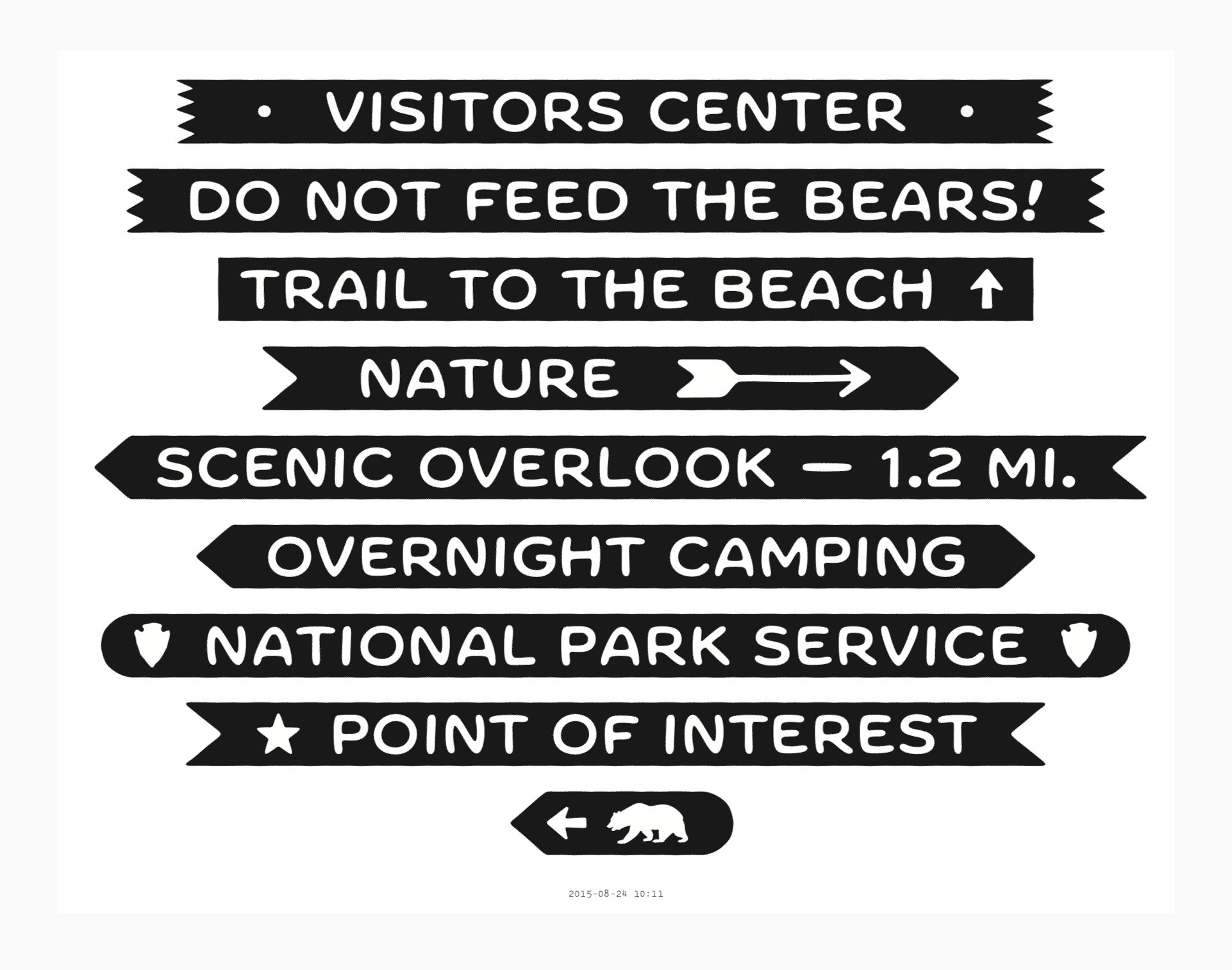
Nick Sherman’s proof of Forester shows the inspiration of the typeface, how he thinks about the typeface being used, and in particular, the cool “sign-plank” feature. Super fun.
Similar to this idea, I do a lot of proofing of my own typefaces in Illustrator. It’s terrible for looking at spacing strings and the like, but it’s great for getting a sense of what it feels like to *use* the typeface. I’m workin on mostly display typefaces, so I imagine Illustrator is the place where they are mostly put to the test.
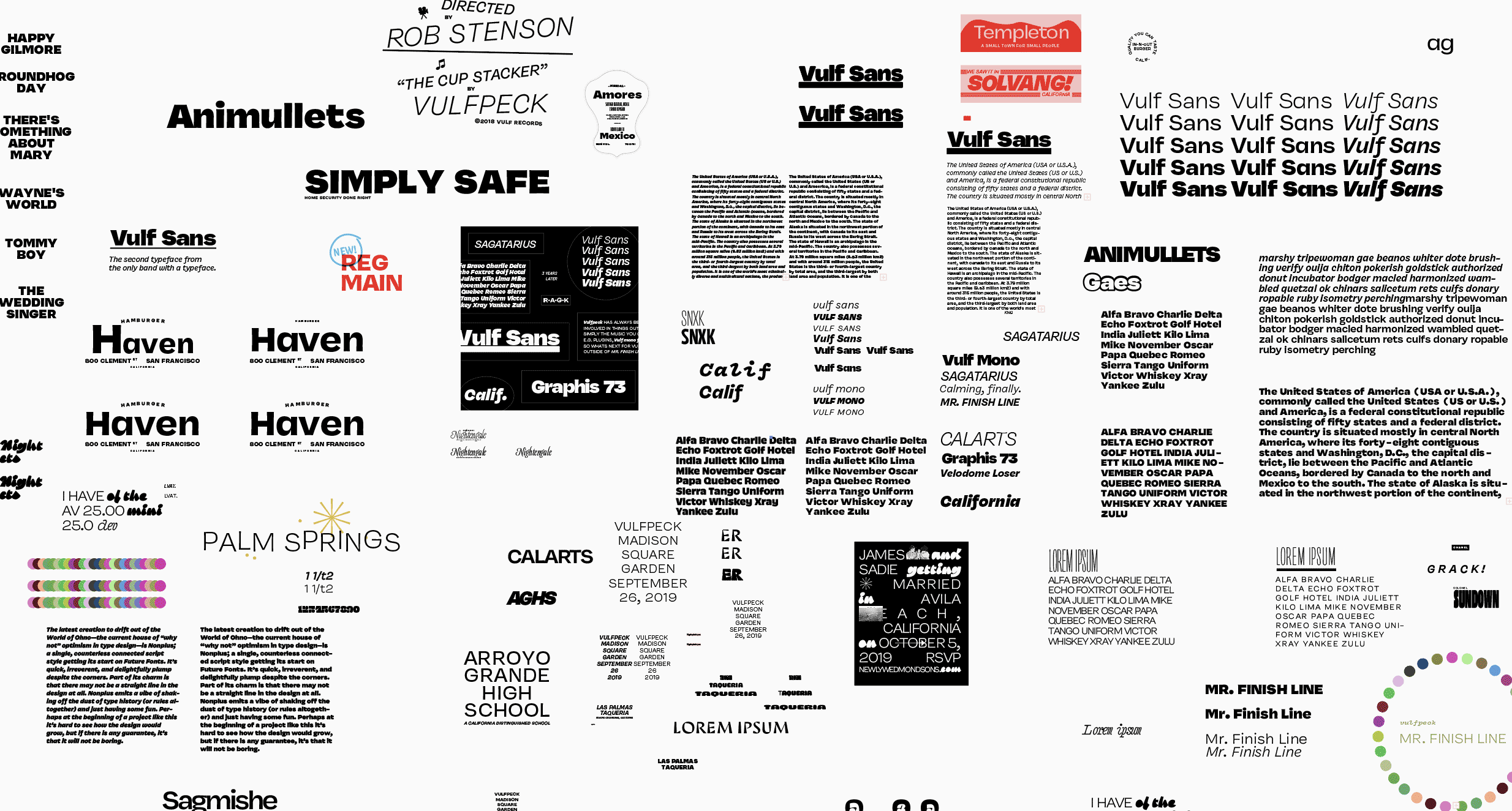
The Illustrator document of each typeface I work on has a smorgasbord of bullshit for testing.
Other resources
For text in a proof, I love using these things.
Typable: A tool for stripping out the glyphs that your typeface does not yet have.
Context of Diacritics: Another resource from Ondrej Job, but this one has a fantastic list of weird words in a bunch of languages.
Word-0-Mat: A RoboFont extension by Nina Stössinger for generating words.
TextExpander: A Mac OS utility that uses user-defined shortcuts to spit out text. For instance, I can type “,withae” and the computer will spit out “sverreættens hærstyrker kvartærgeologi taarbæk”.
Notability: A nice iPad app that I use for marking up proofs.
Idiot Proofed: A powerful tool from Kyle Wayne Benson and Jake Flemming that allows you to proof in a browser (and stay the hell out of InDesign).
Other tips
Not defined: If your typeface has a .notdef, in the early design stages, those startling glyphs can really be a distraction. But if you delete the outlines and set the width to zero, it won’t be a bother in the proof.
Keep it short: The best proof is no longer than necessary. If you notice yourself printing many pages that aren’t covered in red pen, you might be wasting paper.
Date everything: Go to your Master page in InDesign, and create a text box. Then go Type → Text Variables → Insert Variable → Output Date. That way, every time you print something out, the proof is automatically dated. This can be very helpful when putting a process article together at the end of a project, or when historians discover your incredible proofs hundreds of years from now.