Like many projects, the italics for Ohno Blazeface began from a bit of pure curiosity. This thought of “what if?” gets me down quite a few typographic rabbit holes of varying intellectual satisfaction. I was just wrapping up the romans, which is always a laborious process for any typeface, but in the case of Ohno Blazeface, cedilla, ogoneks, and other typographic appendages must be carefully drawn as an extension of the form, rather than two lazily overlapping shapes.

Left: overlapping shapes. How lazy! Right: a curved transition between letter and diacritic to produce a more convincing result.
This endless rounding of shapes takes some time, but without it, the result would be not worth getting out of bed for. As far as romans go, Ohno Blazeface is pretty round, but with italics, everything gets round. My curiosity was that maybe this would be the most heightened expression of Blazeface.
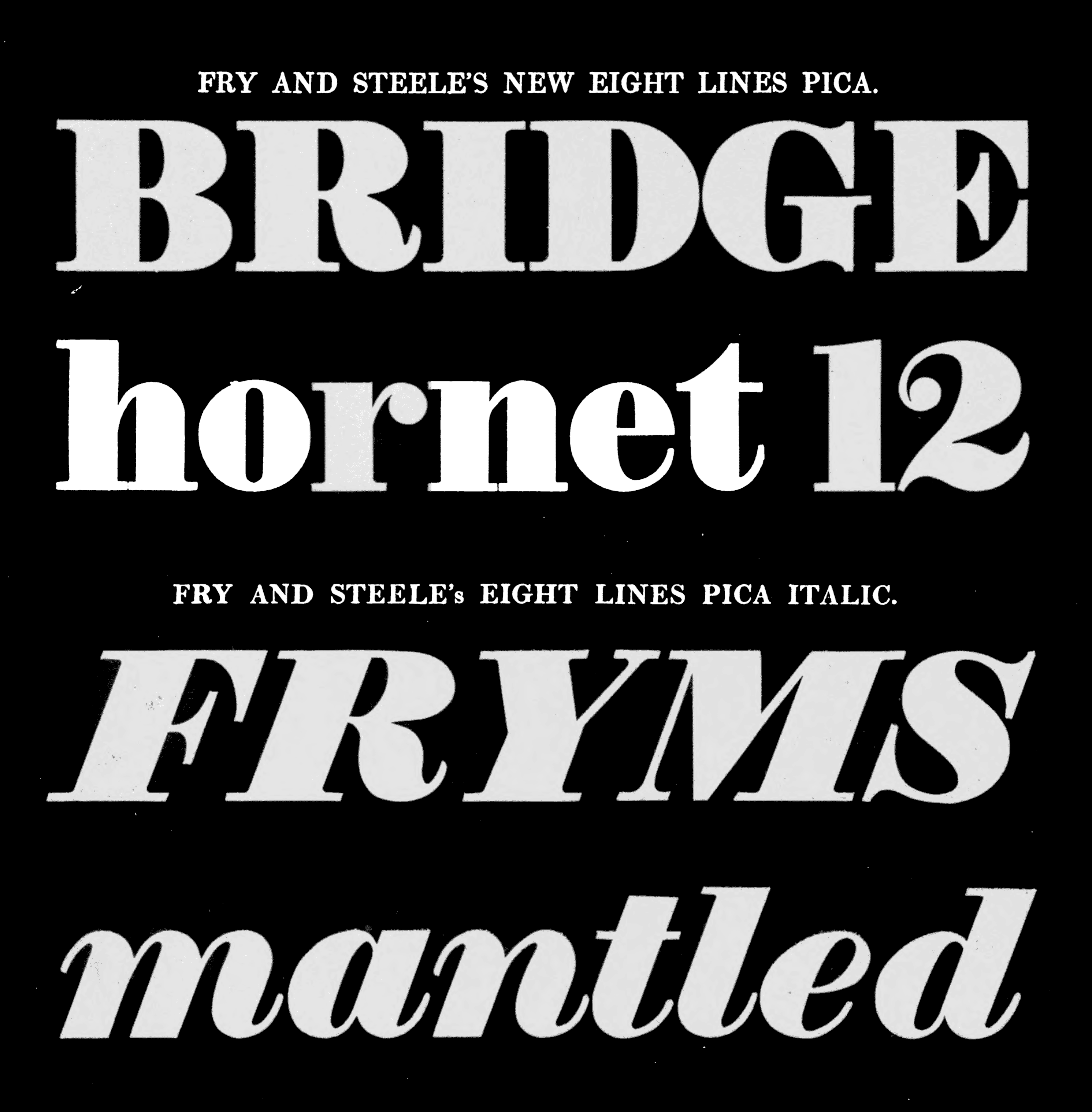
From the Specimen of Printing Types by Edmund Fry, 1816. Romans are so static and boring. Italics on the other hand embrace the groove of Ohno Blazeface perhaps better than the original sketches.
Italic capitals are often slanted romans. This felt too quick and easy, so to further embrace the stoney vibe, it made sense to switch out the slanted romans for swash capitals. A lot of doodling was required to get the shapes realized enough to bring onto the computer, and even after that was complete, a significant amount of iteration was required.
Once the capitals were doodled in a very casual and rough style, I could then take the roman form, slant it, and begin the transformation into the swash version.
The entry and exit strokes of the lowercase were something that got shorter and shorter over time. The first version had such exaggerated length, that some pairs were colliding. That could have been solved with ligatures and OpenType trickery, but I though it better to solve this problem without the crutch of alternate characters. It’s imperative to nail down these decisions while the character set is quite small. Nearly every part of the lowercase has some form of this entry and exit stroke, and once a change is made, that same move must be echoed globally. It’s a bit tedious, but what isn’t?

Version 1, November 22, 2017.

Version 2, December 5, 2017.

Version 3, December 18, 2017.

Version 4, December 22, 2017.
When looking back on this project, it’s amazing to see how many failed versions of typically trivial letters were required to arrive at the successful form.

The graveyard: many failed versions of the lowercase.
In the uppercase, this was especially true. Because there are endless options for swash capitals, it was difficult to settle into a system of forms that would work across the alphabet. N required the most exploration, but went quickly. J required only a few sketches, but was one of the most difficult.

The graveyard: even more failed versions of the uppercase. Endless options for swash capitals means endless failure.
Once the 72 Point master was in a relatively comfortable spot, I moved over to the 12 Point master, reduced the contrast, and increased the height of the capitals.

Although most of the vertical proportions are the same, the capitals of the 12 Point master are a bit larger. The almost comical difference in x-height and cap-height of the 72 Point master didn’t work too well when the type got smaller.
Nine subtly different optical sizes might seem like overkill for this family, and indeed (like many other aspects of this family), it is. While variable fonts can elegantly solve this need of dialing in contrast to be exactly where you need, the technology is not yet widely adopted. For this reason, on all these fat face projects I’ve been working on (Beastly, and some other unreleased designs), I’m packing more optical sizes than you might truly need. Still, I’ve found it useful for various typesetting experiments.

Nine optical sizes.
Future Fonts played a vital part in allowing this family to develop slowly over time. I will admit that this curvaceous italic is not the best seller, but the limited interest it got was encouraging enough to bring it to the finish line. Despite being 18 styles in total, Ohno Blazeface is not a workhorse. It is well suited to markets where a combination of seriousness, friendliness, and warmth are equally important. Luxury cannabis is an obvious candidate, but it would feel equally at home for chocolate or olive oil. It might not be great for a maps app, but if that app is specifically intended to locate a delicious hamburger, then Ohno Blazeface Italic clearly wins.
These generous curves are not for a the faint of heart, but like many of the fonts I work on at Ohno, it’s a product of curiosity, and simply…
