The impetus for a serif text face could come at any minute, and a type designer must always be ready.
Gen Ramirez had invited me to teach a workshop and give a talk at Letrástica, a three day type, calligraphy, and lettering conference in Guadalajara, Mexico. As a lover of all things Mexican (and with a wife that enjoys traveling more than I enjoy type design) we packed up our kid and headed south.
The first night of the conference, I was reunited with many old friends, met some new ones, and got the overwhelming feeling that Letrástica is the greatest conference ever.
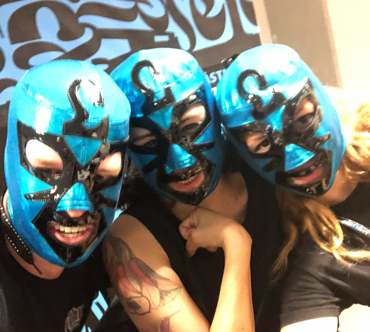
Only at Letrástica can will one get a photo with real luchadores! Sandra Garcia and Zrinka Buljubašić pictured here.
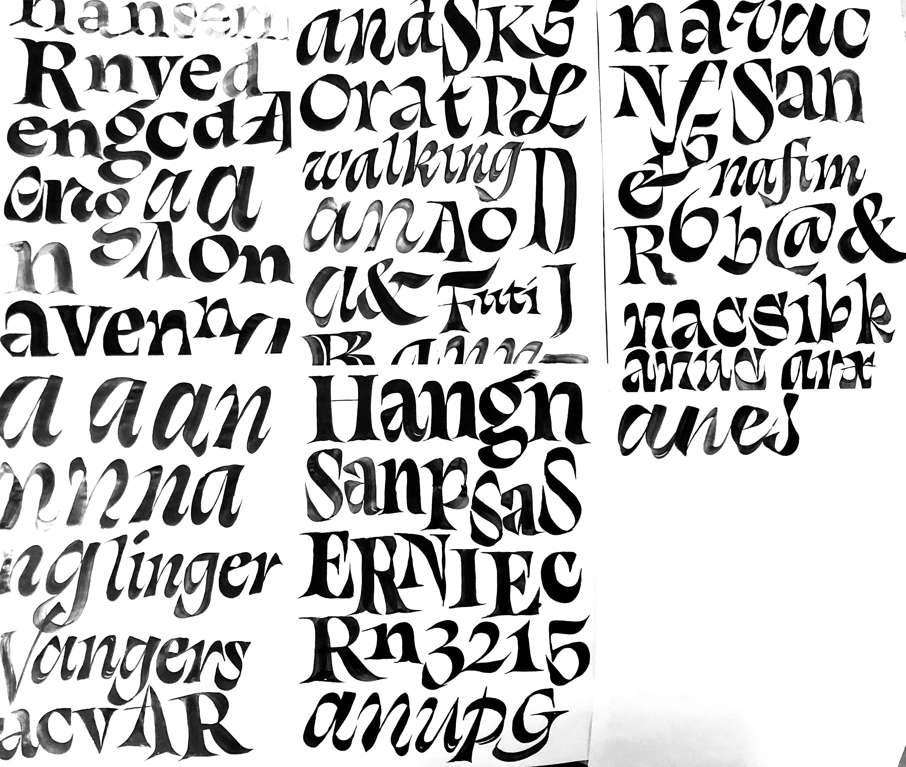
The students were hungry and enthusiastic, and a few of them had backgrounds in calligraphy that far exceeded my own. At various points in the conference, a fresh sheet of butcher paper was laid down on the tables, and Gen, among others got an opportunity to flex their brush skills. It was at one of these sessions where I learned how a certain twist of the brush could render an italic a with an unfamiliar contrast.
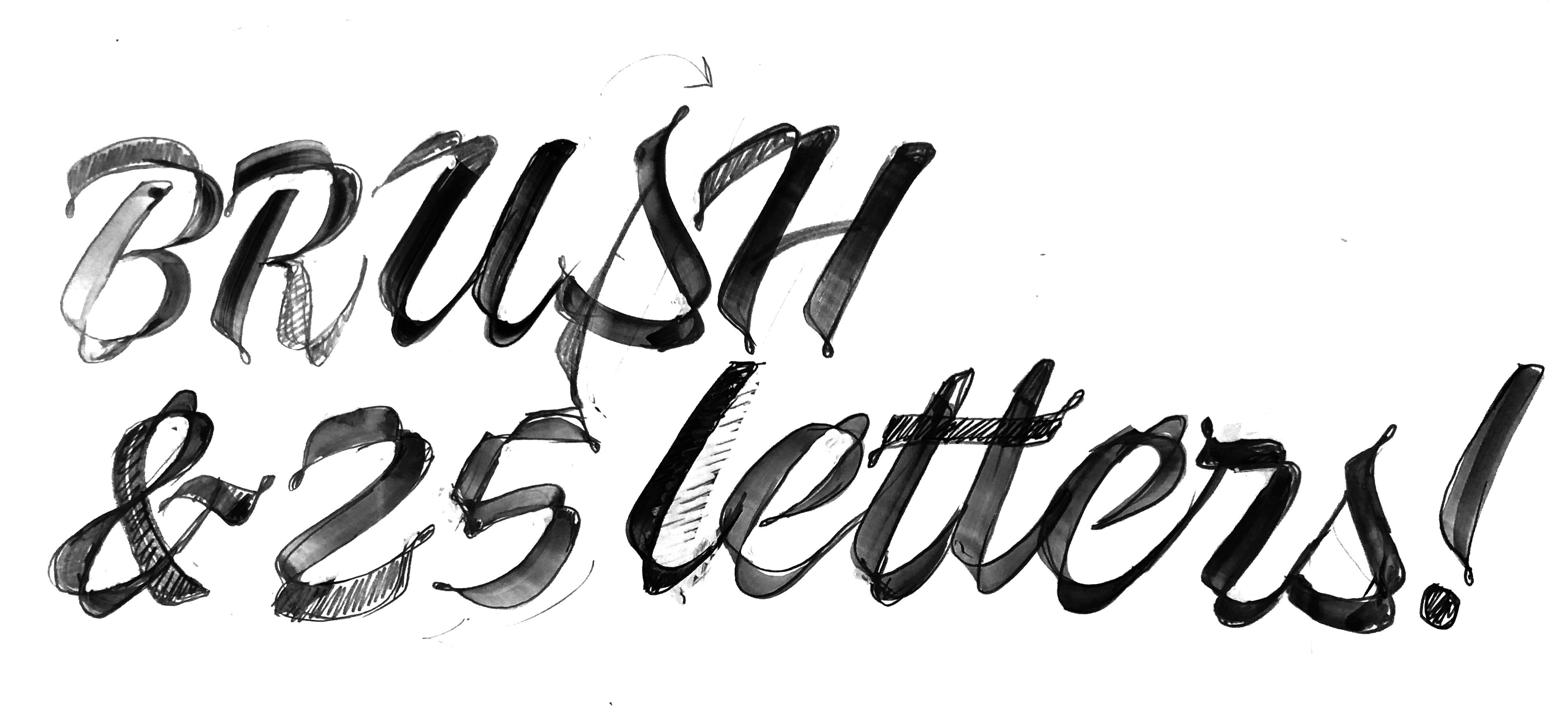
I was encouraged to take a crack at it, and of course fell on my face in front of everyone. But it didn't matter! I was too many Coronas deep to care. Suddenly I multiplied my already massive respect for Vincent de Boer, the avant garde calligrapher that takes the brush rotation to a whole other level.
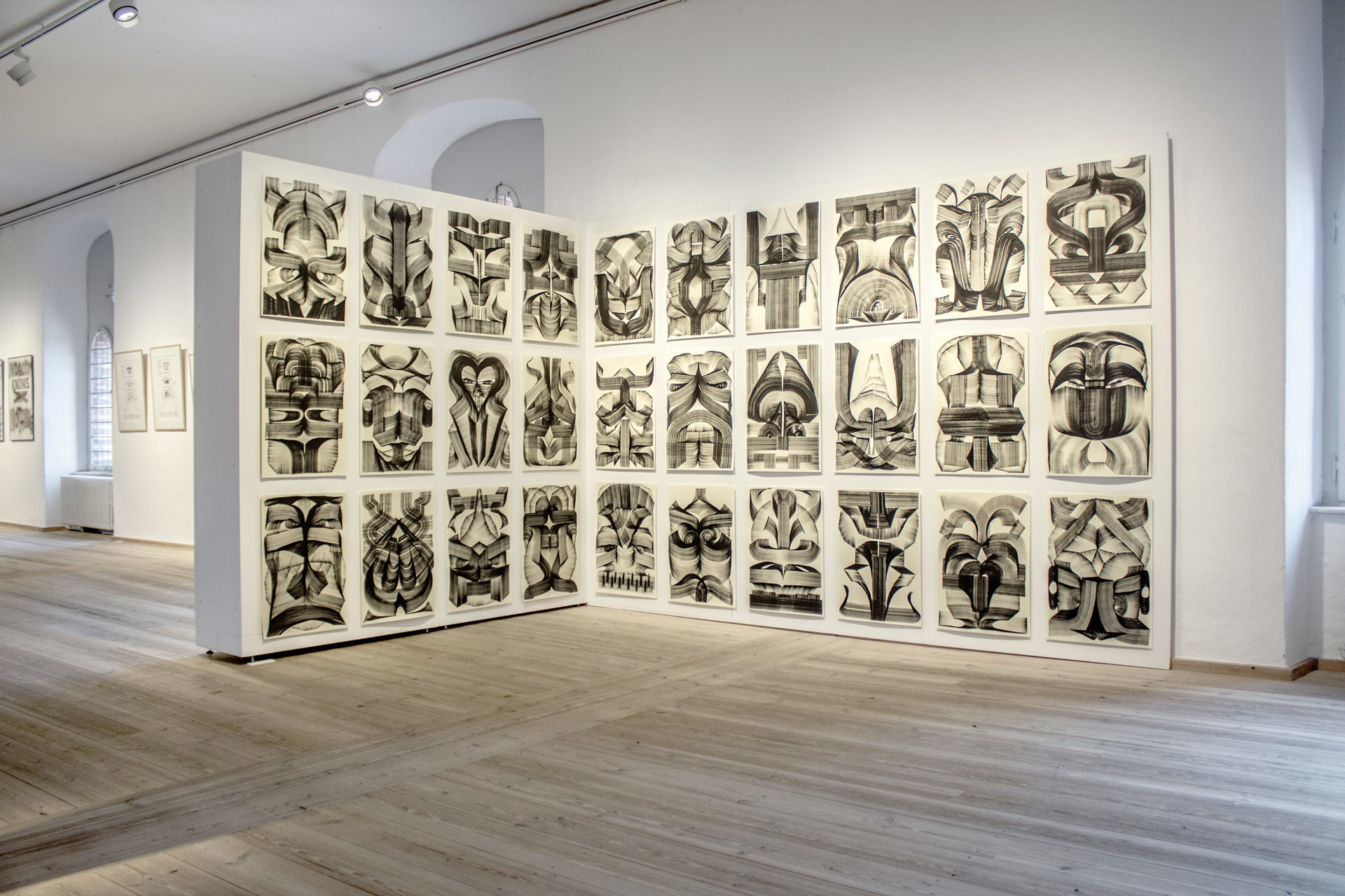
Vincent De Boer, from the Stolen Goods exhibition in Denmark. In both calligraphy and abstract expressionist art, Vincent has a way of rotating the brush like no other.
I shared a classroom with Vincent’s buddy (and another personal hero of mine) Julien Priez for the duration of the conference. I had met Julien a month prior in France, which quickly solidified my hunch that he might be the chillest dude around. Taking a look through his sketchbook left me speechless. This guy was also doing things with brush rotation (among other magic tricks) that were mind blowing.
God was telling me something during that trip—the flat brush was the tool that is capable of producing expressive forms like nothing else. Spending time with it became my top priority.
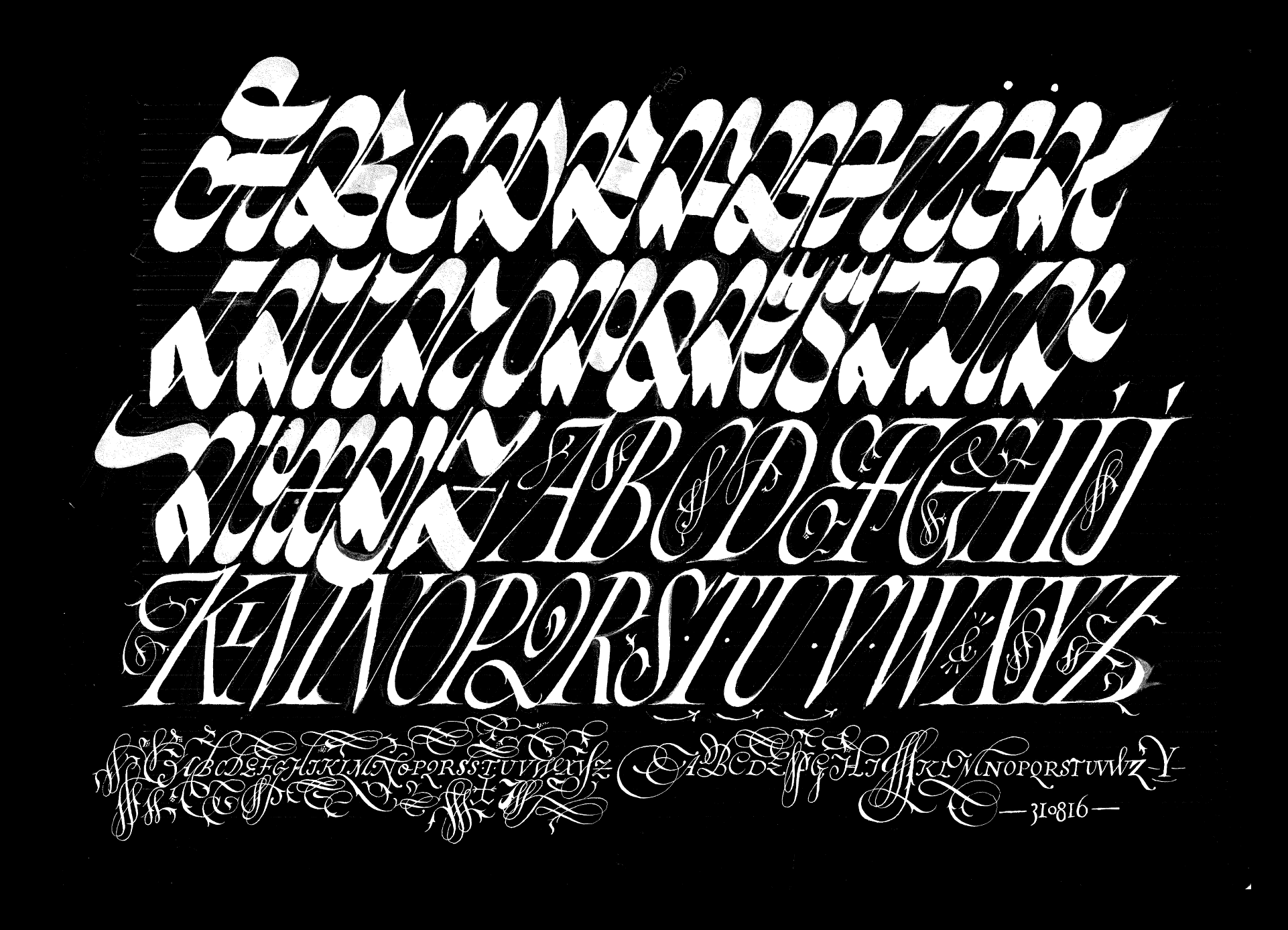
A humble page from one of Julien Priez’s magnificent sketchbooks. He indeed makes the paper boogy.
Sketching
The good news: the flat brush is capable of creating magical forms. The bad news: in the hands of an imposter, there is no such magic.
It wasn't long after I started practicing with the flat brush that I realized I was never going to gain mastery over this tool. Fun as it may be to practice, at the end of the day, I'm a type designer, and not a calligrapher.
In an attempt to crystalize some of the experiments, I began sketching in a more traditional way—building letters up as drawings and attempting forms with a standard broad nib. Unfortunately this mundane approach was producing mundane results.
Display first, text later
Drawing a text face is always impossible for me. I came to type design through logotypes and advertising, not through the higher brow path of text fonts and literature. Perhaps this is the reason my attempts to start a small optical size design failed in grad school. It was there I learned the lesson that for me, display comes first, and designs for smaller sizes can be born out of them.
Letting go of the need to create a text face first allowed me to ease up, have a little fun, and remember that way of twisting the brush.
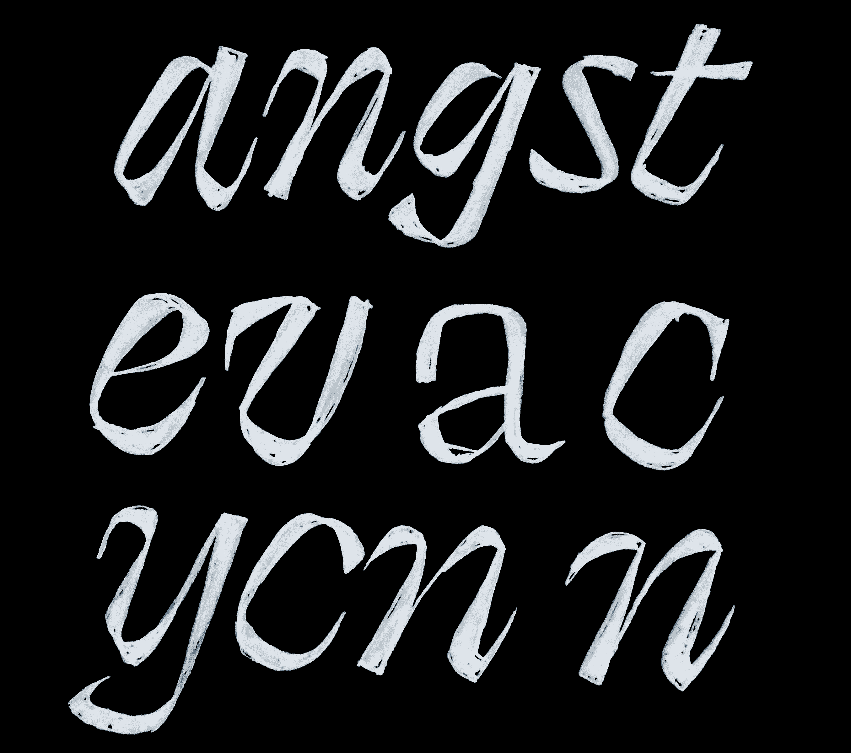
The brush twist became the bedrock of the design, and this crazy italic was the first digital incarnation of Swear.

Way too much. This is the definition of “try hard.” Swear had to feel less labored.

Maybe the entry strokes were a bit too much? By going with a flatter option, would the texture be tamed?

Finally, rounding out the downstrokes to be a more elegant shape gave me everything I was hoping for: a classic enough structure for legibility, with fun contrast modulations to make words sparkle.
I was curious if it was even possible to maintain such an intense flavor in the roman, and after a bit of noodling, it came out much more reserved.
Tariffs on serifs
A distinct feature of Swear came out of sheer necessity. I always appreciate the menacing effects of exaggerated, razor thin serifs, but they also cause a lot of problems. Particularly on letters like A, and V, the exterior serifs can push out neighboring letters to an absurd degree, creating large pockets of whitespace that distract the reader. I usually try to keep the interior serifs large, and the exterior serifs small, but here I pushed it to the extreme.

Top: Swear tries to solve the spacing problem by making the exterior serifs tiny fractions of the interior ones. Bottom: super exaggerated serifs unencumbered by the rules of spacing.
Pairing with Italics

The roman seemed to want to be a bit more normal. Maybe it was ok to have a standard roman, and a much more extreme italic.

When I first took a crack at adding weight, the roman was essentially standard, with a few moments of irreverence to balance out the weight.
Backpedaling towards the finish line
At this point, I had the first glimpse of what the family could actually be, and how it could work. I went to future fonts with the bold italic thinking, “Yeah, the italic is weird, but guess what. Some italics should be weird, okay?!" The wisdom of the crowd trickled in, as more and more users (who actually paid me money) began to request an italic that was more traditional. I was reluctant to the idea at first, thinking that would dampen the impact, backpedal on the concept, and water down the whole project. But after really listening, and seeing how folks were intending to use this typeface, I got to see things from their point of view, and thought a more normal italic might be cool. The new, more reserved Italic took the place of an “Italic”, and I renamed the previous italic, “Cilati” (italic spelled backwards), hinting at the reverse contrast and unorthodox forms. I was informed that it sounds very awkward in Italian. To be honest, it sounds awkward in English too. It feels justified, because it looks even more awkward than it sounds.

How many times must I learn that even when forms are not crazy, I still enjoy designing type?
At this point, the family was beginning to make sense, but it was time to return to my sketches of the small optical size, and see if it would actually work in paragraphs. Usually, I think about four things that generally need to happen when moving from display to text:
1. The x-height increases. In order for small shapes to not enclose on themselves, increasing the x-height can help provide a bit more real estate for countershapes to grow.
2. Letterspace increases. Similarly, the tracking, or distance between each character increases, also allowing for more whitespace. This seems to be especially the case for punctuation like the period, comma, and quotes.
3. Details get chunkier. In order for something to show up at a small size, it has to get clunky. Fine bits of elaborate ornamentation are simply not going to render, so we have to edit down the shape to the core of its architecture.
4. Contrast goes down. Similar to that, any stroke that was once quite thin, has to become thick enough that it is guaranteed to show up at 8 point.
Everything seemed to work in the interpolation department, with just a few exceptions. When the dollar and Euro symbol get really small, they're just unnecessarily dark. In order to fix this, we have to create an alternate version of those symbols, and have a way of automatically substituting out the correct version in the variable font. This was also the case on W, as the overlapping apex was just getting too complicated at smaller sizes. An alternate was drawn to clean up that mess.
As the text versions began to take shape, I committed to the decisions by adding small caps, old style and tabular figures, fractions, and various other typographic accoutrement to get it functioning as a real deal, workhorse typeface—even if it's a bit outspoken. It was nice to realize that the Cilati styles were working just fine, and surprisingly acceptable in text. Hopefully this can provide something useful for designers. I always enjoy playing with multiple italics, or experimenting with different ways of creating emphasis.

Seeing the smorgasbord of offerings come together was a thrill, and everything felt like it got along well, while also breathing some fresh air into our heavily 1970s reliant library of offerings.
That’s it
I’ve always enjoyed swearing. Using swear words intentionally can bring a bit of lightness and humanity to a moment, or put people at ease. Sometimes however they escape in times of frustration, and make people uncomfortable. Maybe this typeface can do the same. The flat brush is a versatile tool, and Swear only scratches the surface of potential. Vincent, Julien, Gen, and others all played vital roles in the inspiration of this typeface, and I’m indebted to them for their skill and commitment to the craft.