Ernie Ball has long been my preferred brand of guitar strings and accessories, so when they reached out to work on a typeface inspired by their iconic lettering, I thought it was another case of graphic design divine intervention. Not only was their company headquarted in my home town of San Luis Obispo, California, but the source material in this case was executed by the legendary artist, designer, and Imagineer Rolly Crump. We studied Rolly's forms in detail, began sketching in his style, and eventually created a variable-width typeface with all sorts of alternates packed in to authentically recreate Rolly's dynamic interlocking lettering through the magic of OpenType features.

Ernie Ball
Completed
2025
Client
Ernie Ball
Creative Direction
Jordan Minardi
Deliverable
Custom Typeface
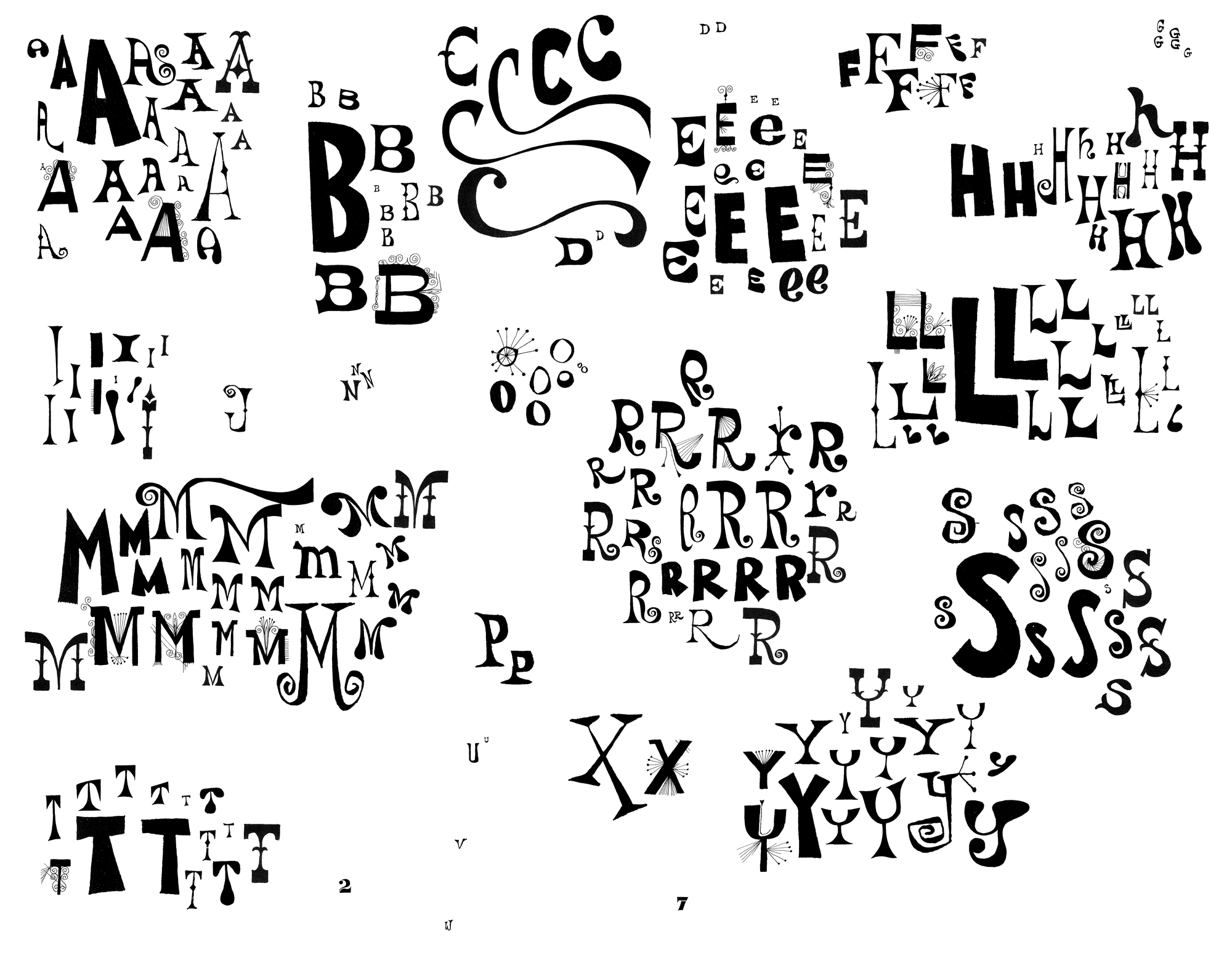
We began the project by intensely collecting as much source material as possible. We isolated the letters that Rolly Crump used on the Christmas Cards for the Ball family over many years.
Sketching out words allowed us to play with the interlocking feature from the outset, letting it influence many decisions early on.

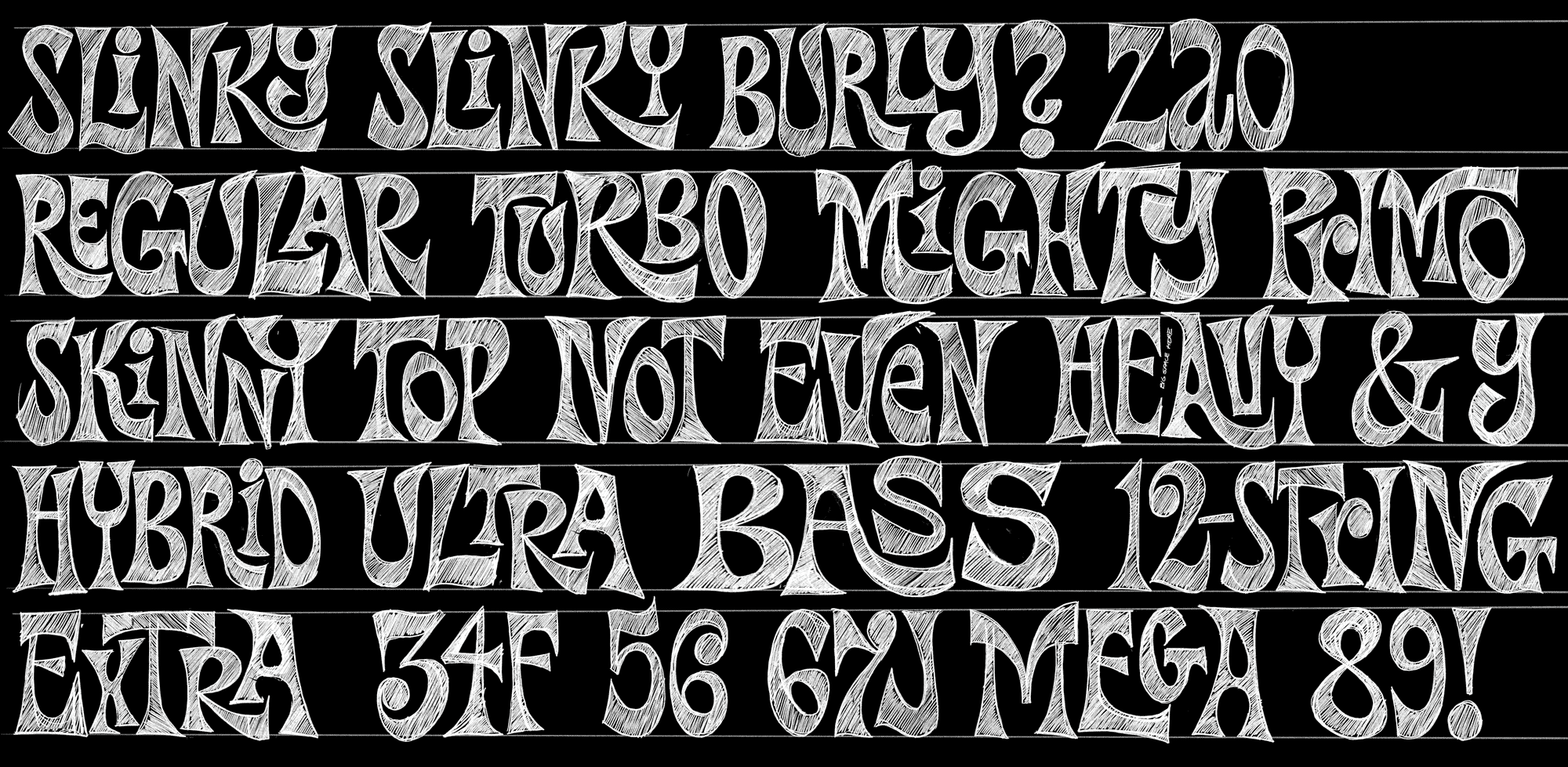
After the sketches were digitized, we created multiple widths of each drawing to make the different types of strings stack perfectly on top of "Slinky".

Once punctuation, figures, and all the alternates were drawn, the result was a dynamic collection of all the necessary glyphs for all sorts of marketing copy.

We included two sets of each uppercase letter and figure.

We created the interlocking feature by drawing a large set of two, three, and four letter combinations that were the most common in English, and specifically their marketing copy and string families.

Seeing the fonts in use is always a special treat because they use it alongside our retail font family Obviously.
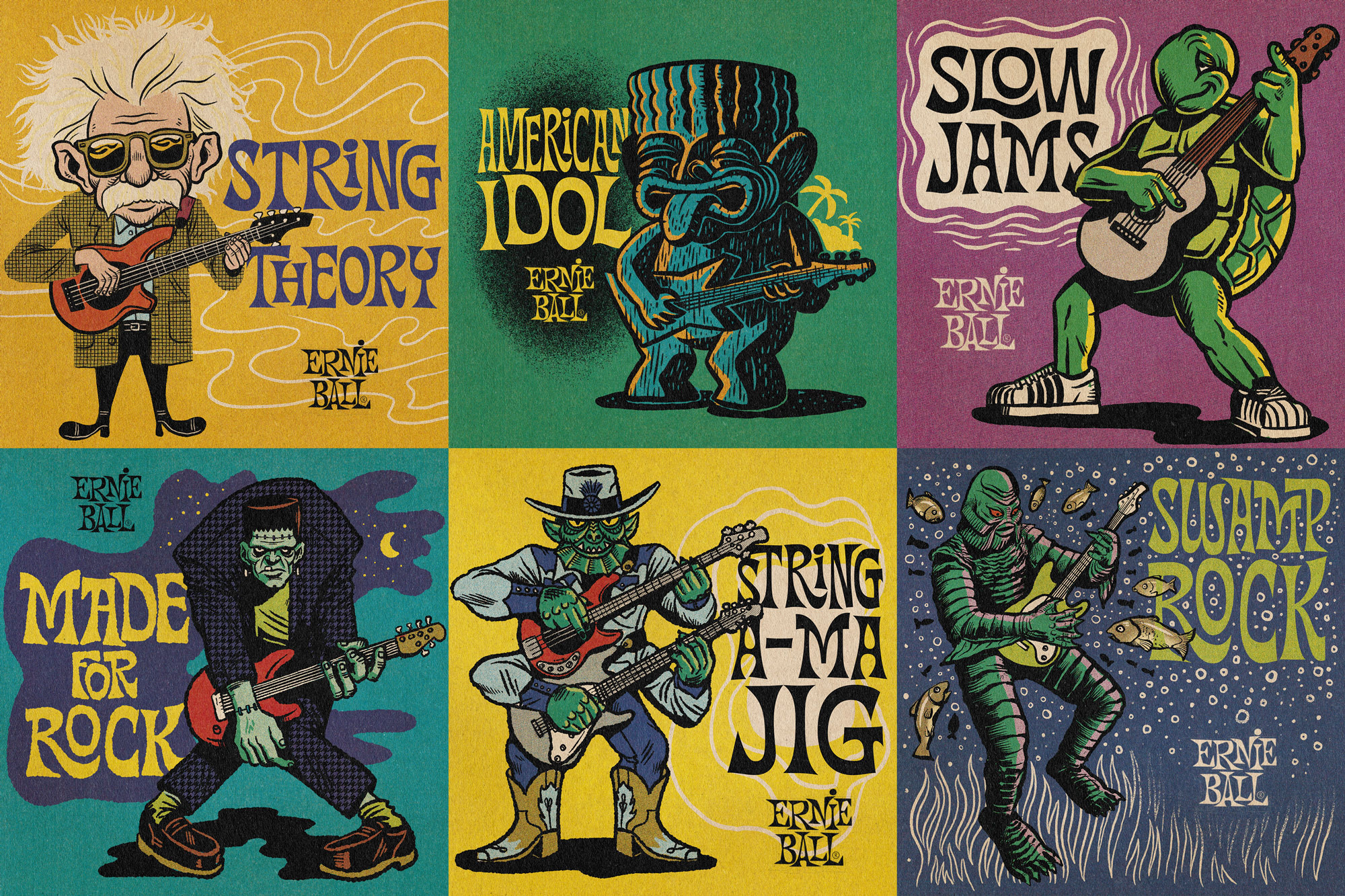
Beautiful illustrations from our friend Jon Kutt at The High Road Design.