Nothing can quite match the frequency with which low-contrast sans find their way into commercial graphic design. In fact, nothing else comes close! As a lover of all things slightly left of center, this was a hard reality to confront. But now that we have, lets take a moment to appreciate some remarkable contributions to this well-trodden genre.
Action Text by Erik van Blokland, released by Commercial Type had me saying, “Damn, wish I designed that!” when I first saw it in use on letterror.com. This thing is CRISPY, and the narrow proportions lend themselves surprisingly well to paragraphs. Action Condensed, the display-minded older brother packs a wallop as well. I would love to see this in use on interfaces and identities all over the dang place.
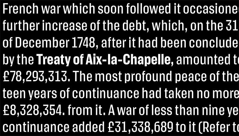
Action Text by Erik van Blokland
Juneau (pronounced “Juno” I think?) is the recent brainchild of another of my favorite contemporaries, Philipp Neumeyer. It would be smart to pay close attention to Philipp, as he not only creates the best typefaces, but also the best specimens around. Juneau has an impressive characterset, and I just hope it makes him a million billion dollars.
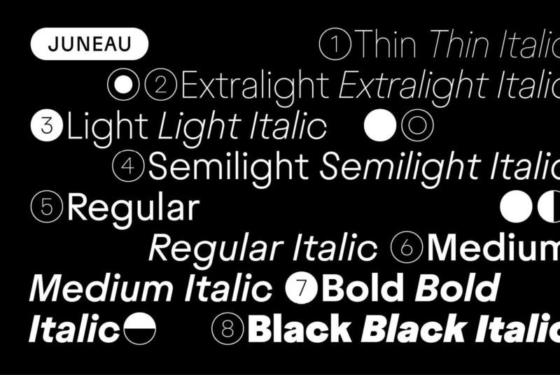
Juneau by Philipp Neumeyer
I will sing the praises of Magnet, and Inga Plönnigs until my dying day. Released by Frere-Jones, I was initially jealous of them for having the good sense to pounce on this arresting and hard-working design. Ultimately, I released that emotion from my heart, and saw it for what it was: a match made in type heaven. The end result is a sparkling dazzler, that has a few tricks up its sleeve. Bonus points for the reverse-contrast N, and a backslanted display cut. Damn.
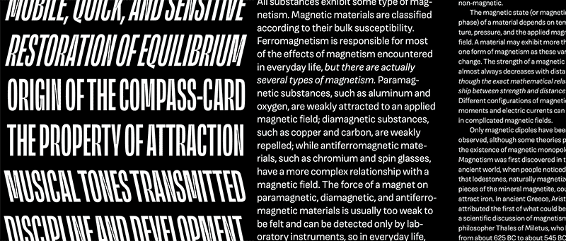
Magnet by Inga Plönnigs
Designed by God’s gift to type design, Maria Doreuli, CoFo Sans moves me in a way I thought impossible from this genre. Like Juneau, it includes an expertly designed Cyrillic, and has only the styles that are necessary for the family to thrive. No Ohno-style overkill on this one! Just a succinct concept, with a staggeringly exact execution to match. Use it. Love it. Move on with your life!
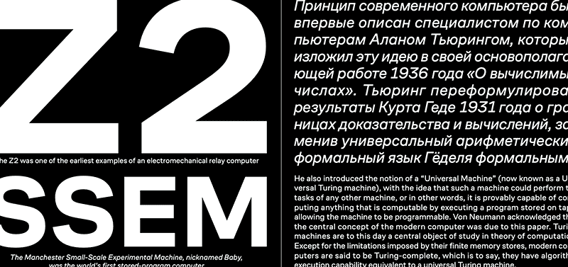
CoFo Sans by Maria Doreuli
MD System by Rutherford Craze should come pre-installed on every computing device on the planet. There I said it! It makes me truly happy to see Rutherford’s foundry Mass Driver just a couple years old, but doing everything exactly right. His intentions are clear, his trajectory is outrageous, and his work strikes a perfect balance between engineered precision, and enough heart to remind us we’re all human. Go license this beauty and do the world a service! You clients will thank you.

MD System by Rutherford Craze