Anagha Narayanan wrote in to say, “I wanted to ask if you could also share your constructions in future posts. Your beziers are killer and it would be a delight for the community to see them. It would teach a whole lot for those like me who wouldn’t mind framing these up on the wall - haha!”
There are already many great resources available for how to draw good vectors for type and lettering. There are even those who proudly display their drawings with points and handles visible to prove that their work is indeed technically immaculate. I don’t really get that, because the purpose of well-built vectors is to maintain efficient editability. They certainly aren’t there to look cool, but you can decorate your walls however you want!
I don’t want to overstate the importance of good vectors. It’s certainly necessary, but perhaps less important than a clear concept and good spacing. From my experience teaching, I’ve seen students grasp the best practices for digital drawing much easier than spacing. I am not sure why this is, but it seems like in type design education, good technical drawing isn’t the most challenging hurdle.
The fine-tuning required for a decent end result means the drawing should facilitate tinkering. If you can edit easily, quality is more attainable.
My starting point
I know how unintuitive the pen tool can feel. Everyone has gone through that awkward stage of drawing. Here is what mine looked like.
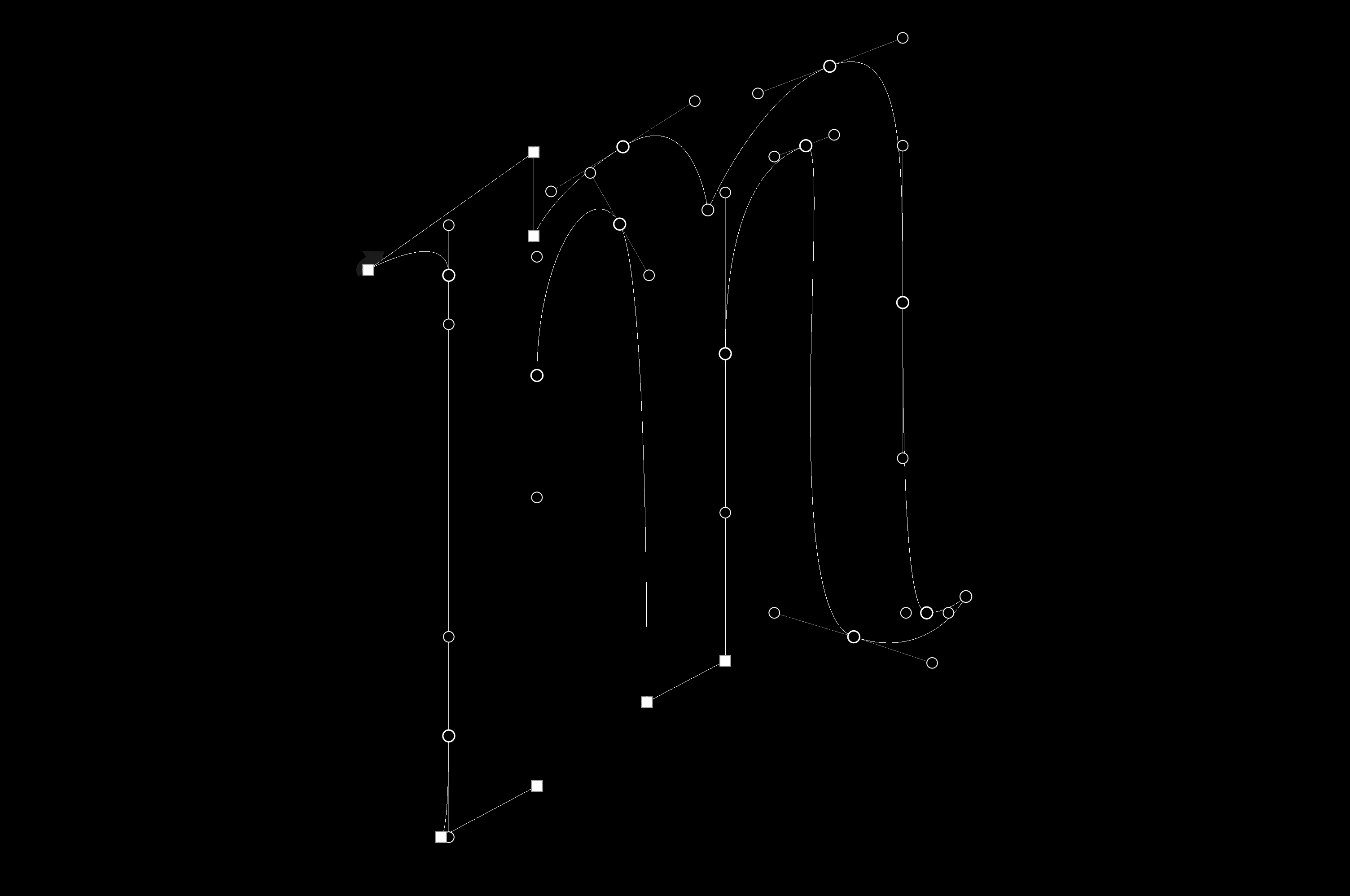
This is painful to show: vectors I drew in 2007. Somehow, in one letter, I have made pretty much every mistake possible.
The infinite potential for error is intimidating to many folks starting out. I’ve seen students afraid to make any changes on the computer because the fear of screwing it up paralyses their progress. But not to worry. Solid drafting is a simple as two things:
1. The Right Points
As a rule, it’s a good idea to keep the number of points as small as is necessary. Extraneous points makes everything a huge pain in the ass.
2. In the Right Places
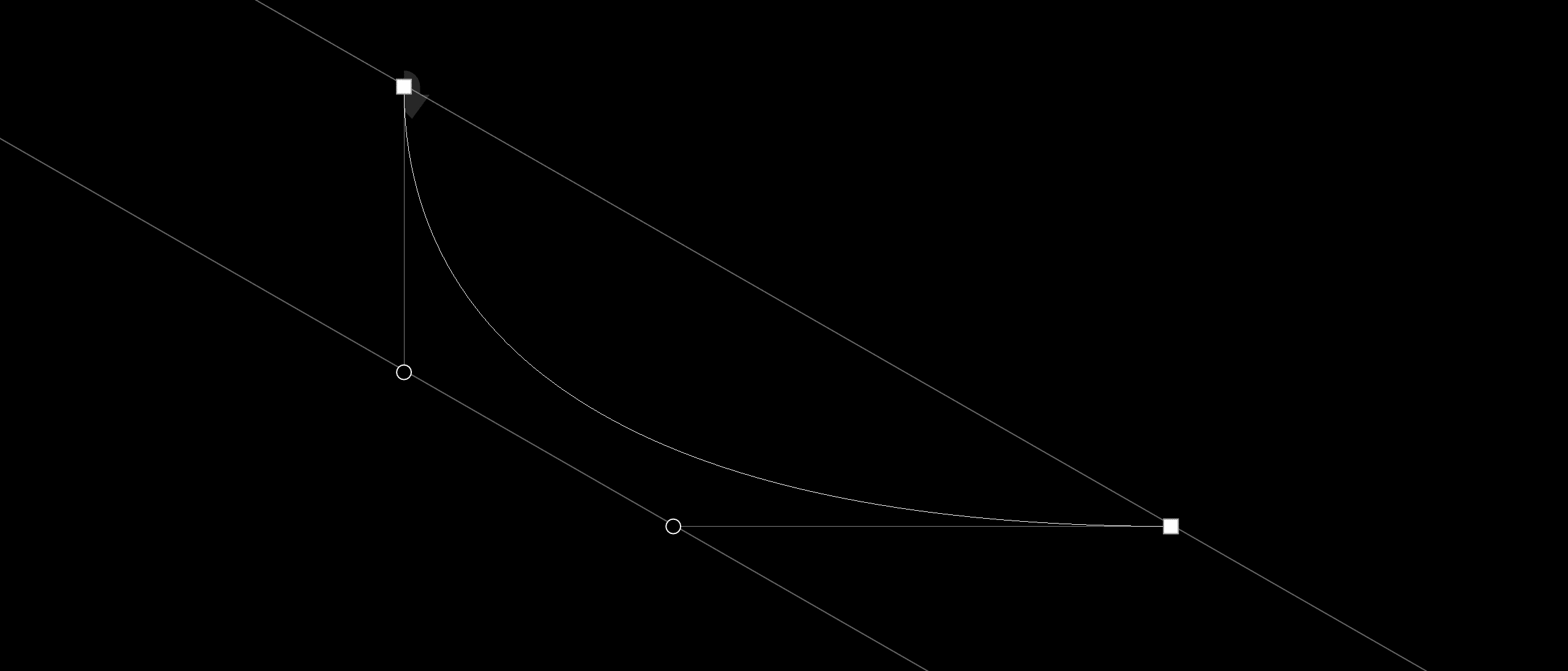
Here’s the first weird vocabulary term you might be unfamiliar with: extrema is the plural form of extremum. Math people will understand this to be the maximum or minimum value of a function. For our purposes, the extrema are the highest, lowest, farthest right, or farthest left point on a curve. That verbal definition probably doesn’t help at all, so here’s a graphic.

Points at the extrema. Type design is extreme!
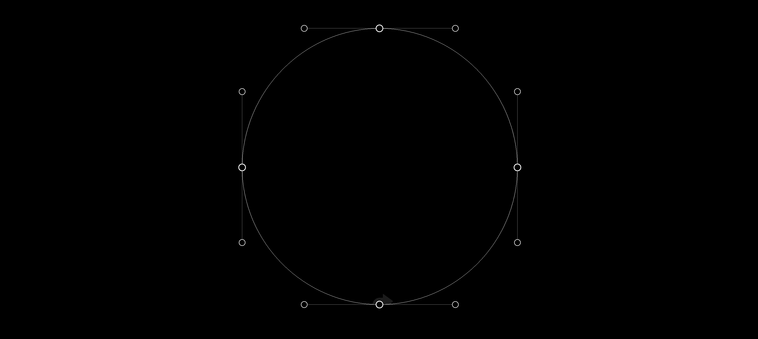
Having point on extrema means you will have horizontal or verticals handles coming off your points. That makes it really easy to edit, because you can hold shift in most drawing applications to lock onto 90° angles.
The exception to this is where you have a point on the corner of a shape, and there is no way that you can achieve the desired shape with a handle shooting off at a 90° angle.
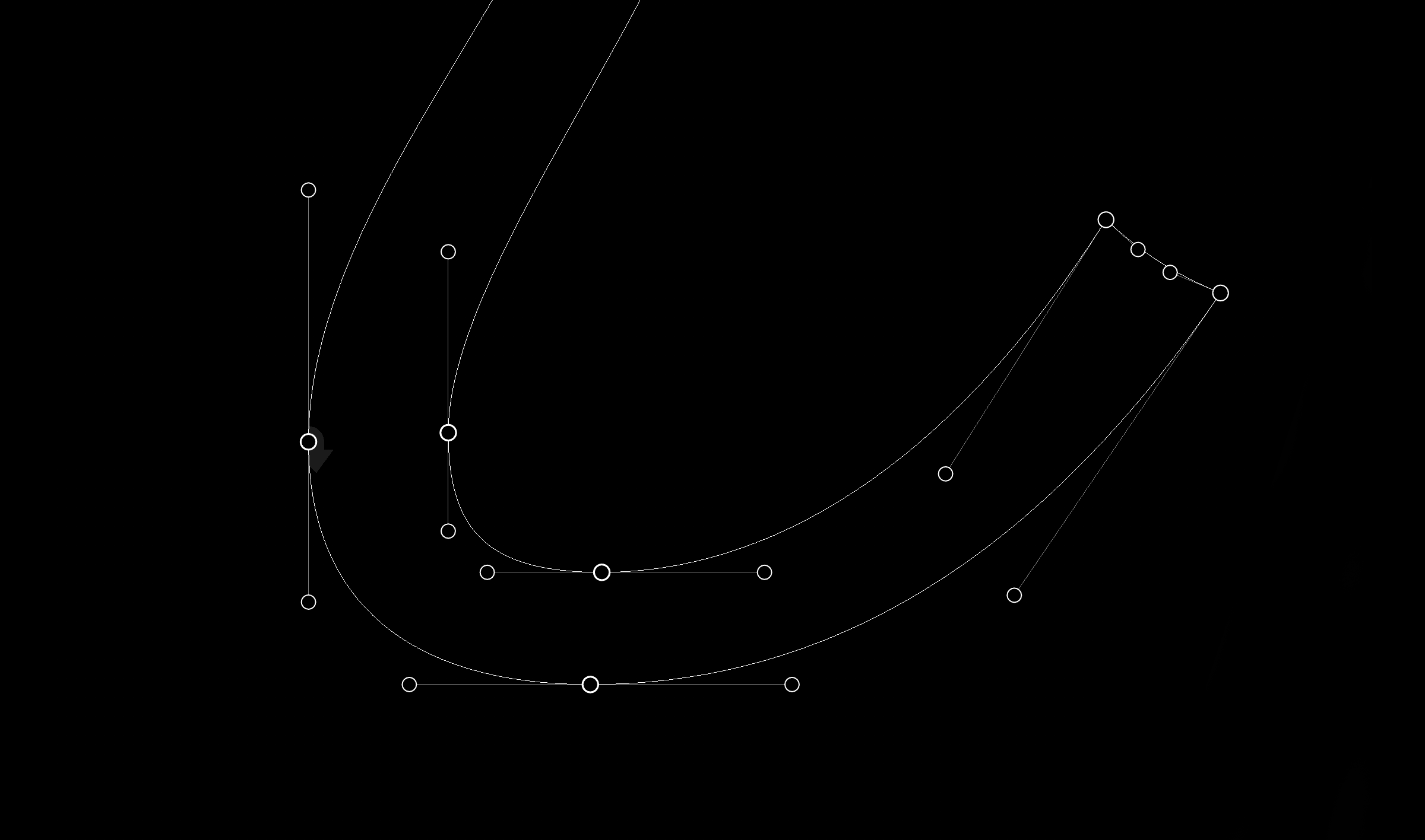
The bottom half of i in Vulf Mono Light Italic. On the terminal, we see a good example of handles coming off at weird angles because the points define a corner. Sometimes I hear a student say, “I can’t keep my handles on 90° angles and get the shape I want!” That’s when I say, “Ok.”
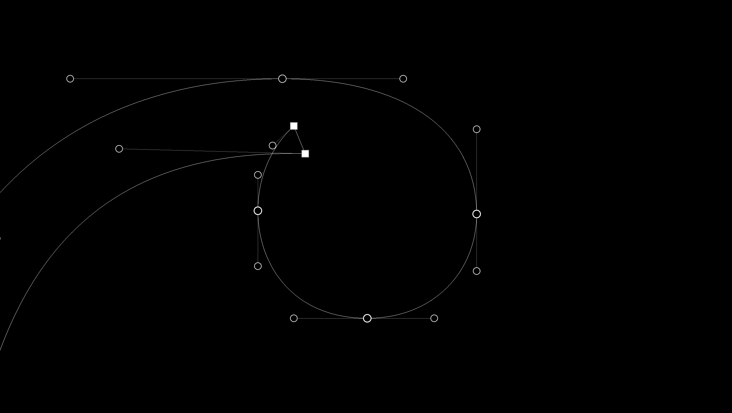
Another exception would be points at the inflection of a curve. Imagine you’re driving in a car along an S, starting at the the bottom. You immediately begin turning left, but at some point in the middle of the spine, your steering wheel will be at exactly twelve o’clock. This is known as the inflection point, and it often helps to put a point there to achieve the desired curve.
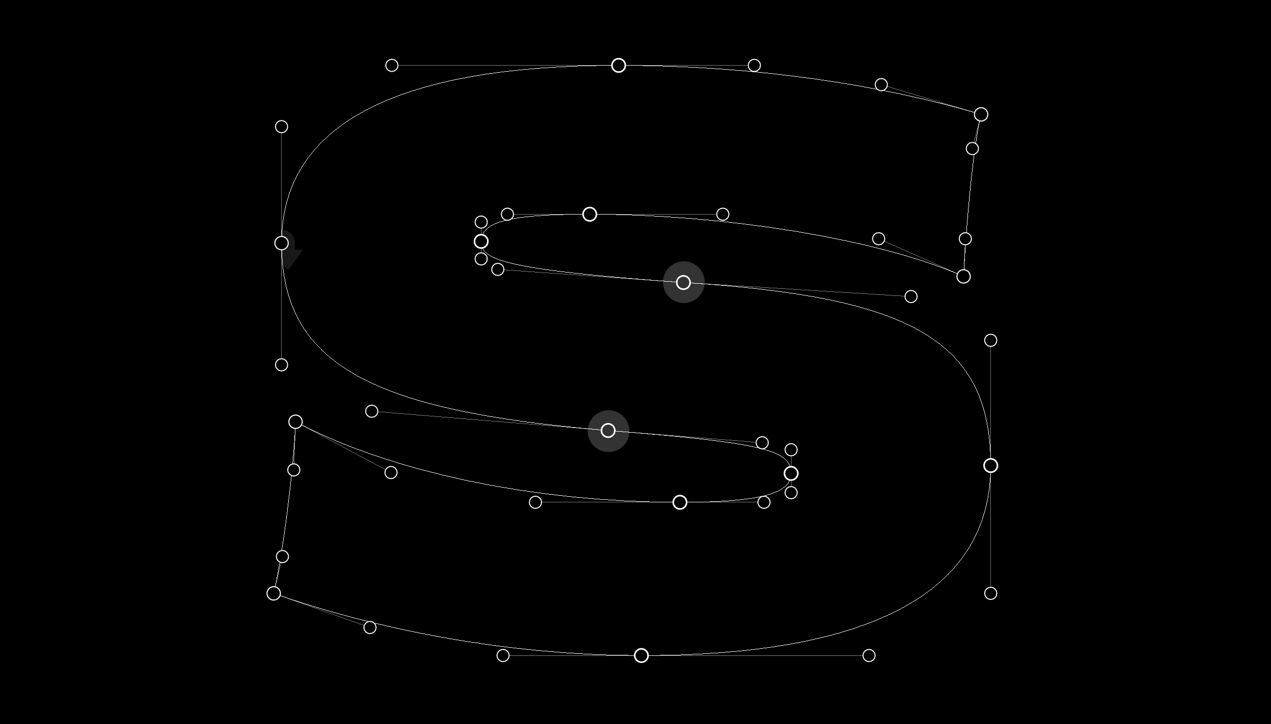
The inflection points on the s are highlighted. Notice how the handles shoot off with one side being inside the shape, and one side being outside the shape. Could you achieve this curve without that point? Doubtful.
What I learned from Rod Cavazos
While still in undergrad, I had the good fortune to take a type design class with the world’s kindest type designer, Rod Cavazos. That was the first time I learned about sharing curve tension. To achieve a smooth curve, there is a relationship between the points, and the handles. It isn’t always perfect, but it’s often close.
If you draw a line connecting two points, and then a line connecting two handles, the two lines will often be parallel, or pretty close.
What I learned from Jesse Ragan
A few years back, I saw Jesse speak about the process of digitizing Showcard Stunt. In his presentation, he showed the way he vectorized being similar to how the strokes would have been painted. If a signpainter would complete a T in two strokes, he would outline one as a single shape, and then the next. It’s an excruciatingly simple idea, but still powerful: trace the stroke, not the shape.

I implemented Jesse’s ideas in a typeface designed to teach people how to write a brush script. This is an extreme example.
What I learned from Type Media
Years after I saw Jesse talk, I got to learn about proper drawing in grad school at Type Media. I got a couple of hot tips from my teachers over there.
Ball terminals can be the trickiest things to draw. By including a little triangle of overlap, you can change the shape of the ball without affecting the stroke leading into it, and vice versa. This idea is seriously powerful, and my typefaces are riddled with little triangles of overlap all over the place.
Here we see more triangular overlaps, that allow editing on one side of the stroke, without affecting the other stroke. Video here.
Drawing for interpolation
All of these techniques allow for easy editing, but the added benefit is that the shapes are already optimized for interpolation. That’s a whole other can of worms, so for now I won’t get into it.
See if you can find the mistakes!
Killer tips
When you’re getting started, sometimes it can feel impossible to get the curve you want while following the rules, so here’s a couple tricks I use.
- Forget the rules, and draw it however you can. Then, hit the “Add Extreme Points” command in RoboFont or Glyphs. (Illustrator doesn’t have this, but you shouldn't use Illustrator to draw type anyhow). Once you have points on the extrema, copy the current shape to the background, then delete the unnecessary points, and change curve tension to match the shape on the background.
- Move the point, and keep the handles in the same place. You can do this by holding option in RoboFont.
- Use the Add Overlap extension by Alexandre Saumier Demers in RoboFont. It’s fast and simple, like all my favorite extensions.
Additional resources
- All you need to learn about drawing could probably be picked up by following FF Hertz on Twitter.
- Look at existing, quality typefaces. Production OTFs are not useful, as they already have the overlap removed, but Adobe has amazing open source UFOs ready for examination.
- The Drawing for Interpolation Superpolator guide by Erik Van Blokland is probably all you need to look at. There, he has a single page PDF available there that is probably more useful than this entire article.
To reiterate
- Place points on extrema.
- Share curve tension.
- Trace the strokes, not the perimeter.
- Overlap with triangles.
Note: I have avoided using the terms “beziers,” and “on-curve points”, and “off curve points” in this article, because they are confusing. I think “vectors”, “points”, and “handles” are much more intuitive, but indeed, they are the same thing.