As a design student in my undergrad years, I spent more than a healthy amount of time in a state of confusion about the lettering I loved. I wondered why were certain wordshapes made my heart sing, while others commanded nothing more than a passing glance. For years I was clueless, desperately searching for the secret ingredient was baked into the work of my favorite type designers, that I had yet to gain mastery of. It wasn’t until grad school that it was pounded into our brains by every one of our many instructors.
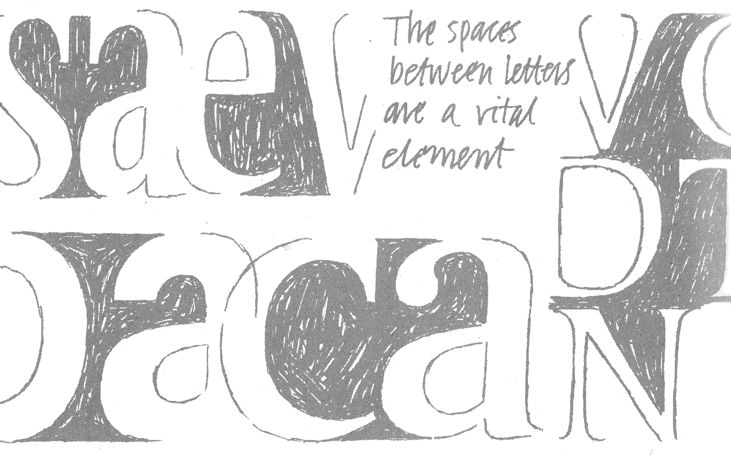
A scan from from Michael Harvey’s Lettering Design. Well said, Michael!
Spacing: get it right or pay the price
It wasn’t the smell of the paper, the opacity of the ink, or the fidelity of the impression that had the final say in the quality of a word (although those things can help). It was simply the negative space. The answer had been in front of my face the entire time, but I was too focussed on the black shapes to realize.
The more I questioned it, the truer it became: divine spacing is perfect balance. The mind can rest, knowing that no possible improvement to the shapes can be made.
After many teaching experiences trying to explain this in the most clear way possible, I have broken the techniques for achieving desirable spacing into a two-pronged approach.
Counterspace Equals Letterspace
When studying pointed pen calligraphy with Erik Van Blokland at Type Media, he would glance over our practice sheets, and simply draw a red dot within the counter of a letter, and another one beside it. “You should make those two equal.” he’d say, and despite having no idea what he meant, I would nod furiously in agreement. Luckily, after seeing a similar mark on everyone else’s sheet, I slowly got the picture. There was supposed to be a relationship between the space inside of n, and the space between two ns.
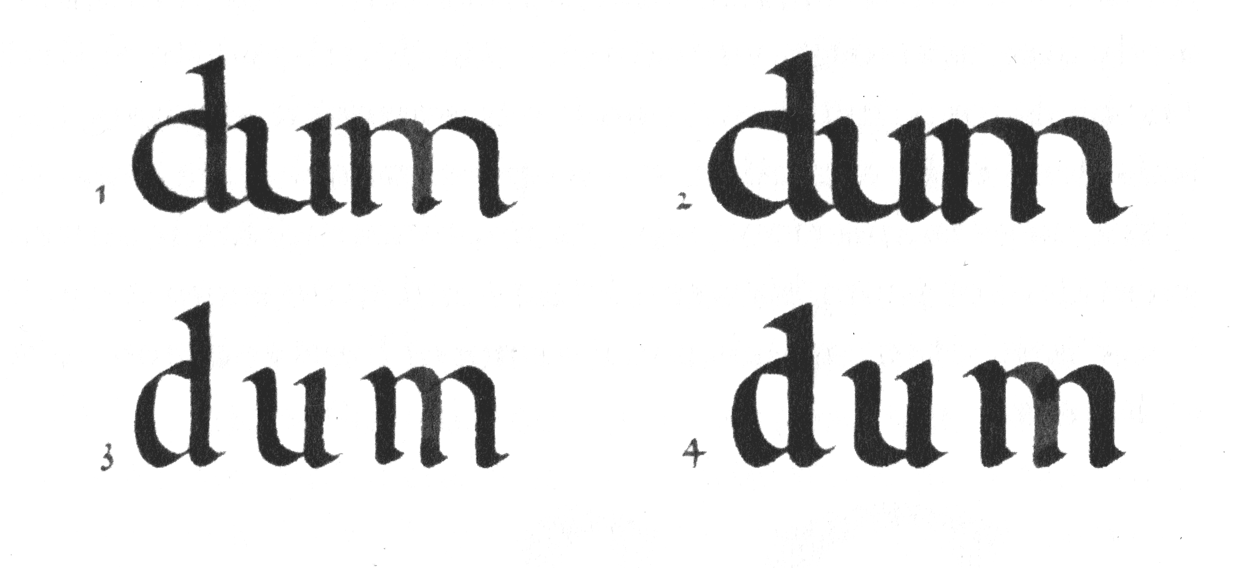
Gerrit Noordzij exemplifying bad spacing in his book, The Stroke. Notice the lack of relationship between the spaces between letters (or “letterspaces” as I refer to them), and the spaces inside of letters (or “counters”). This image gives me a panic attack.
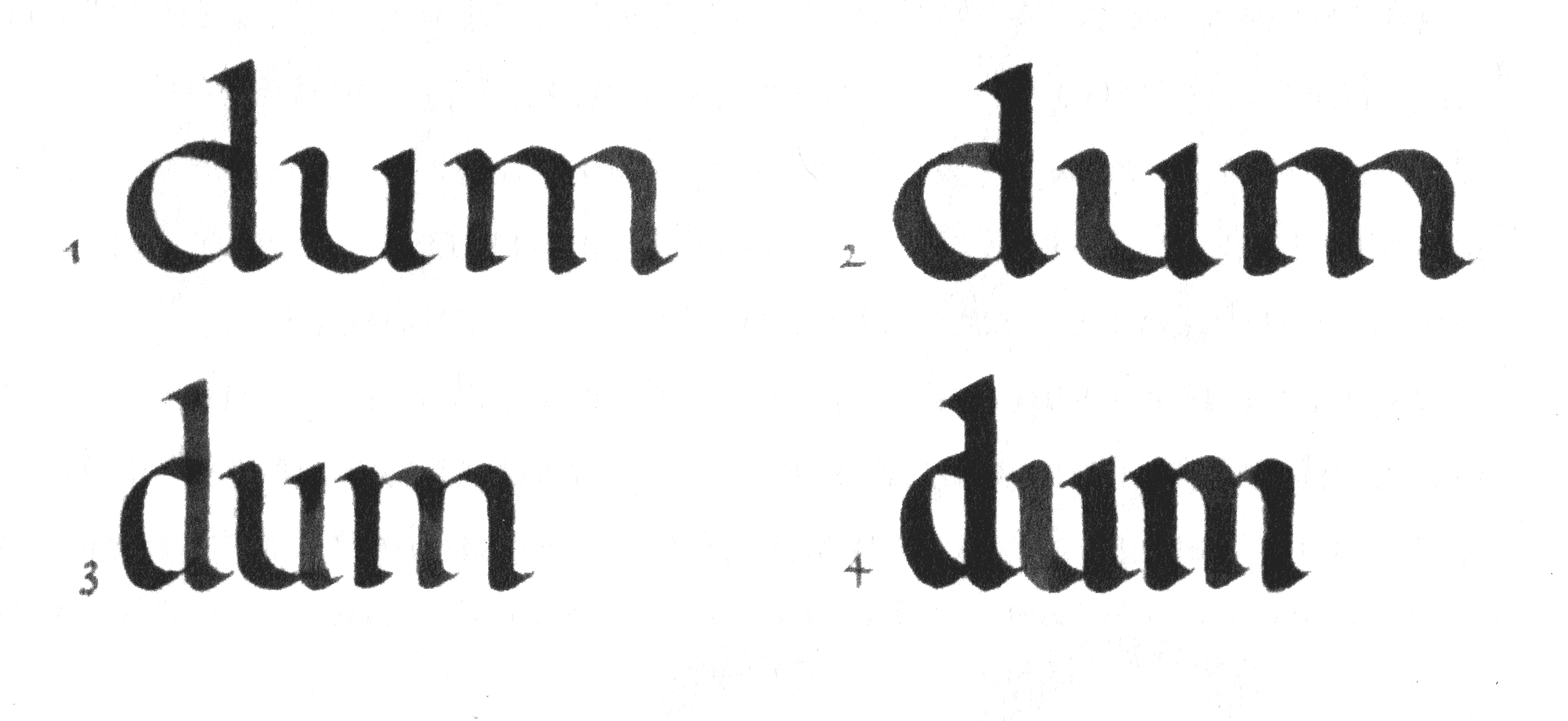
Another scan from Gerrit Noordzij’s The Stroke. Ah, so much better!
When I started teaching, I thought I’d better name the thing I was referring to so much. I started calling it Rule 1 of Spacing, or the Counterspace Equals Letterspace technique. In some styles, it’s incredibly obvious. Blackletter, for instance, thrives on this grid.
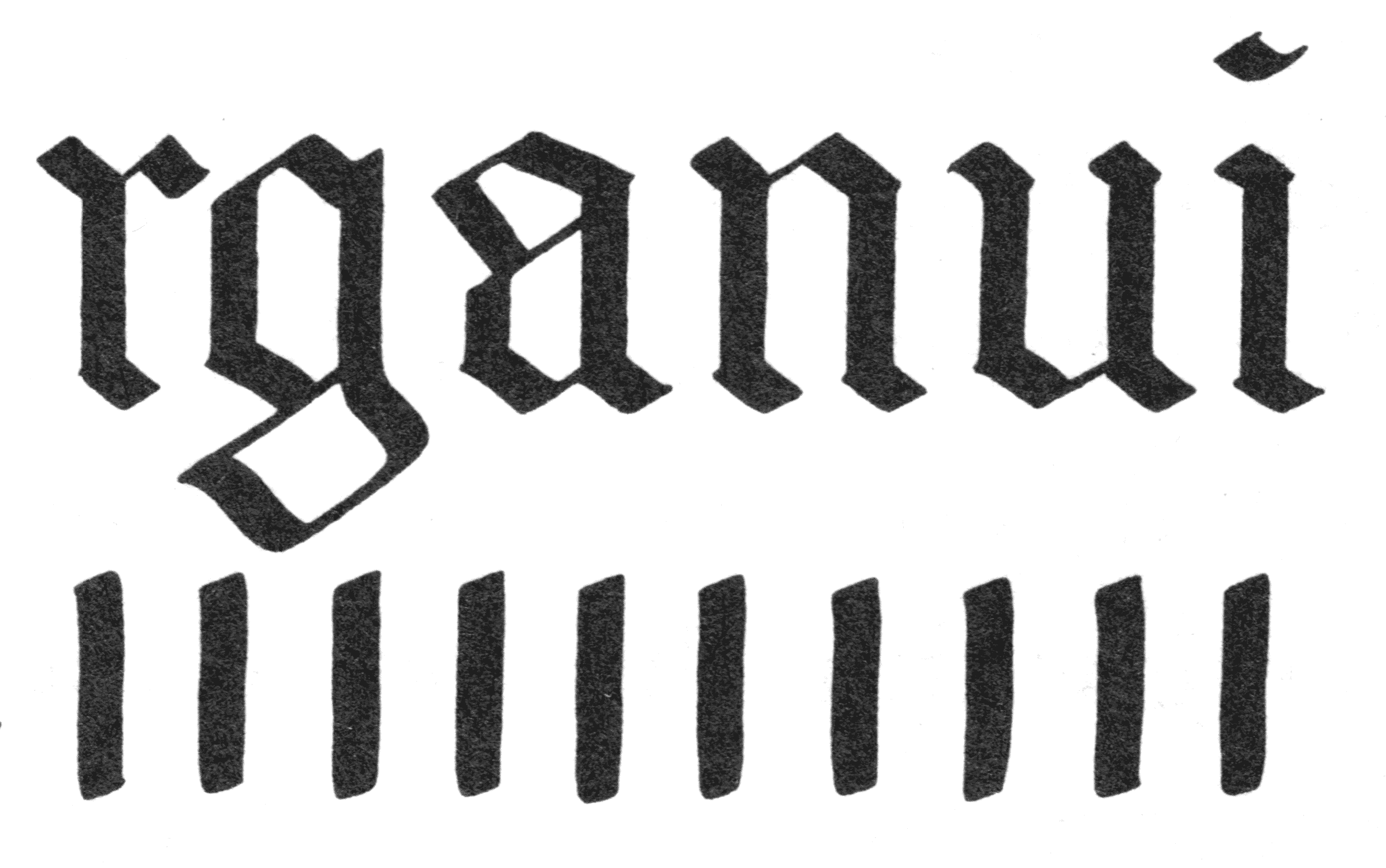
A scan from Alexander Nesbitt’s “A History and Technique of Lettering.” The caption for which reads, “Gothic miniscules were designed and must be used, according to the concept of evenly spaced strokes.”
There is perhaps no lovelier example of Counterspace Equals Letterspace than in script. The rhythm of movement pounds the rule into your brain quite effectively, and your eyes are free to cascade along the measure with ease and delight.
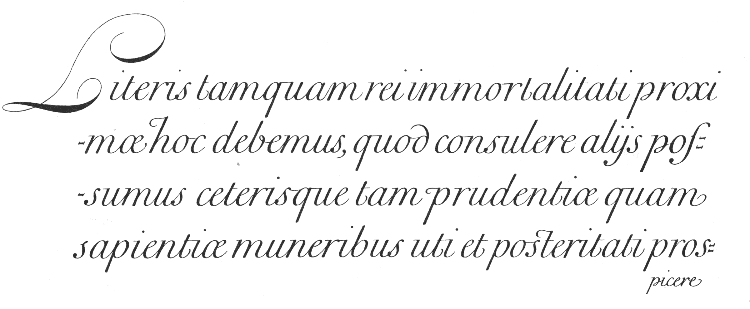
This example of John Ayres’ “Italian Hand” was also scanned from my copy of “The History and Technique of Lettering”, but the original appears in “A Tutor to Penmanship.”
The beauty of this technique is how truly all-encompassing it can be. Whether it’s capitals or lowercase, roman or italic, the Counterspace Equals Letterspace strategy for achieving spacing enlightenment goes a remarkable. distance.
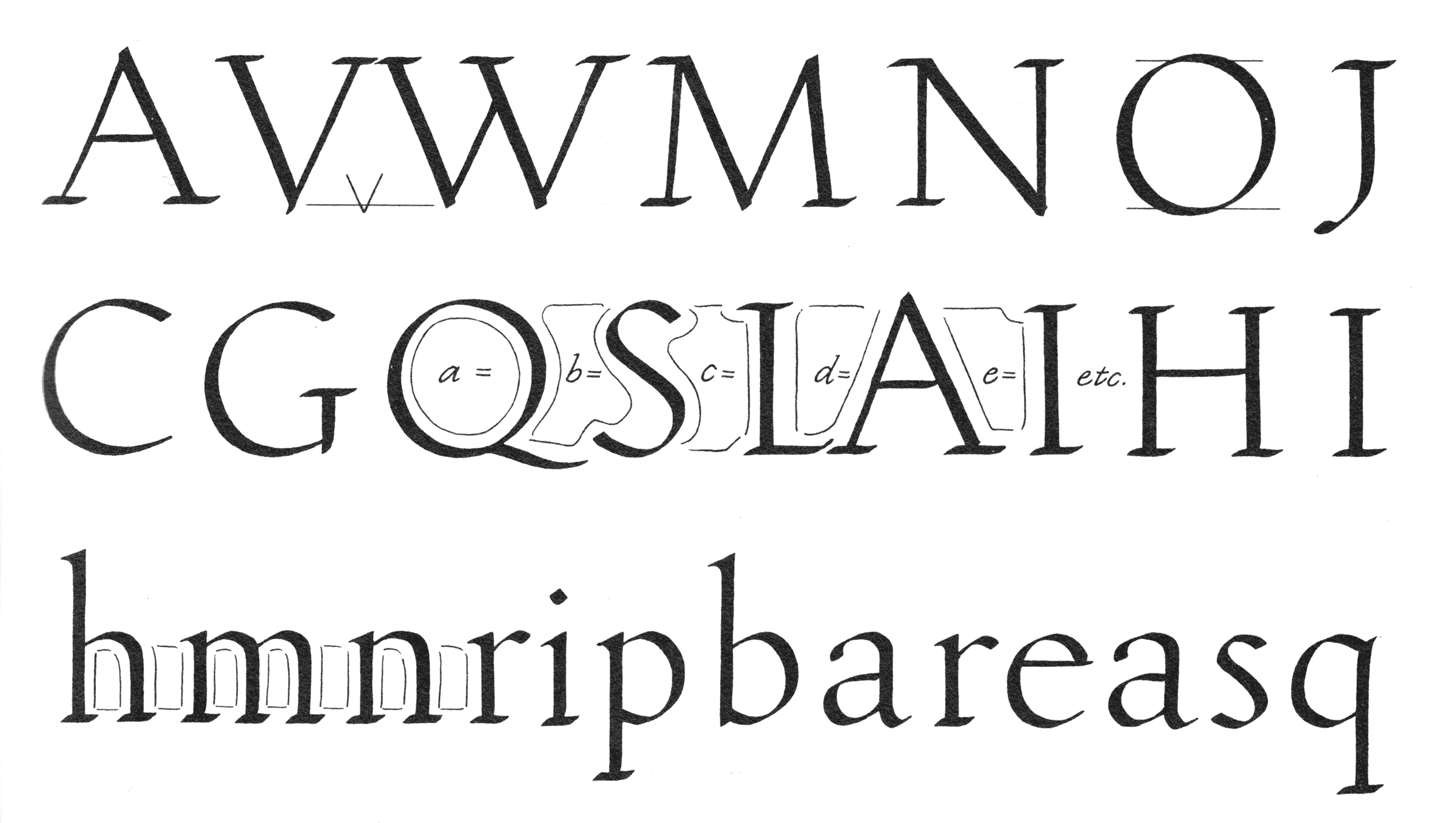
Yet another scan from our friend Nesbitt. Capitals or lowercase? Doesn’t matter. Maybe all I should have done for this entire article is post this diagram.
This is simply a long way of saying “bold letters need tighter spacing.” or “dont’t track out lowercase.” We hear many truisms like that during our typography education, but rarely talk about why. Now we know. Bold letters need tighter spacing because the negative spaces inside them are smaller. We shouldn’t track out lowercase because the grid upon which they are built is decided both by the letters, and the spacing. You cannot change one without changing the other. Once often can increase spacing in capitals, because the counters are larger, lending themselves to more generous spacing.

One: It doesn’t matter how bold, or what style. The Counterspace Equals Letterspace technique often applies. Two: As letters get more bold, the spacing between them decreases. Three: By focussing only on the vertical stems, a picket fence rhythm should appear. Four: Counters isolated, to show that when looking at capitals, the whole cap height is examined, but when looking at lowercase, we focus on the area between the baseline and x-height.
Three at a Time
You might be saying, “Don’t try and sound like you know everything Edmondson. I’ve seen some stuff that looks great and doesn’t pay any attention to your rules.” Wonderful. Let’s examine one of the ways in which the Counterspace Equals Letterspace rule can fail.
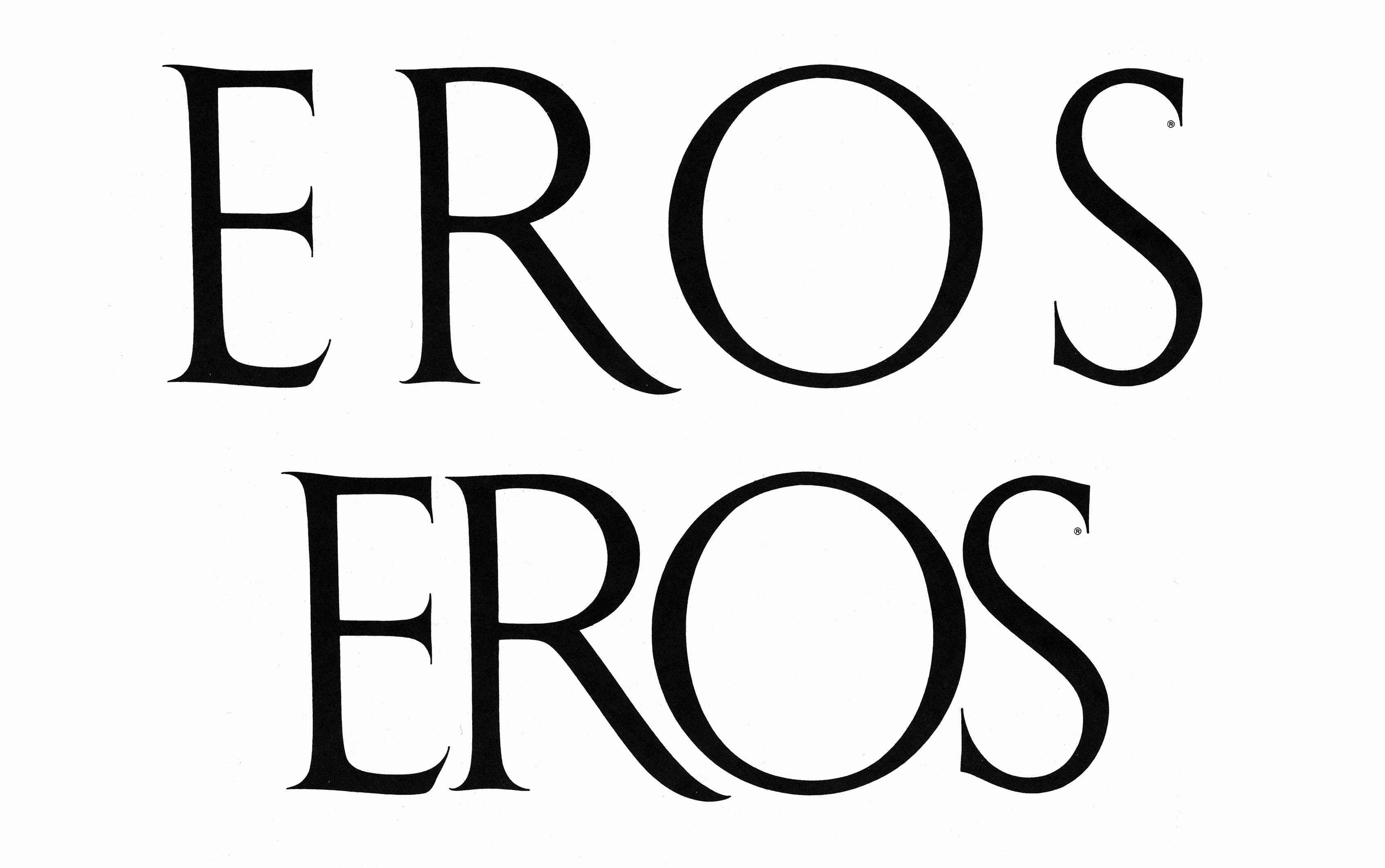
Top: Manipulated spacing to reflect Counterspace Equals Letterspace. Bottom: The unedited original. Scan graciously provided by Alexander Tochilovsky at the The Herb Lubalin Study Center of Design and Typography.
I am not a dummy, I know the tight spacing for which Herb Lubalin and his associated colleagues were famous, creates a marvelous impact. But why? My guess: consistency.
To space anything, all one must do is *group three letters at a time, and judge whether the middle letter actually feels like it’s in the middle.* Not geometrically in the middle, or mathematically, but optically.
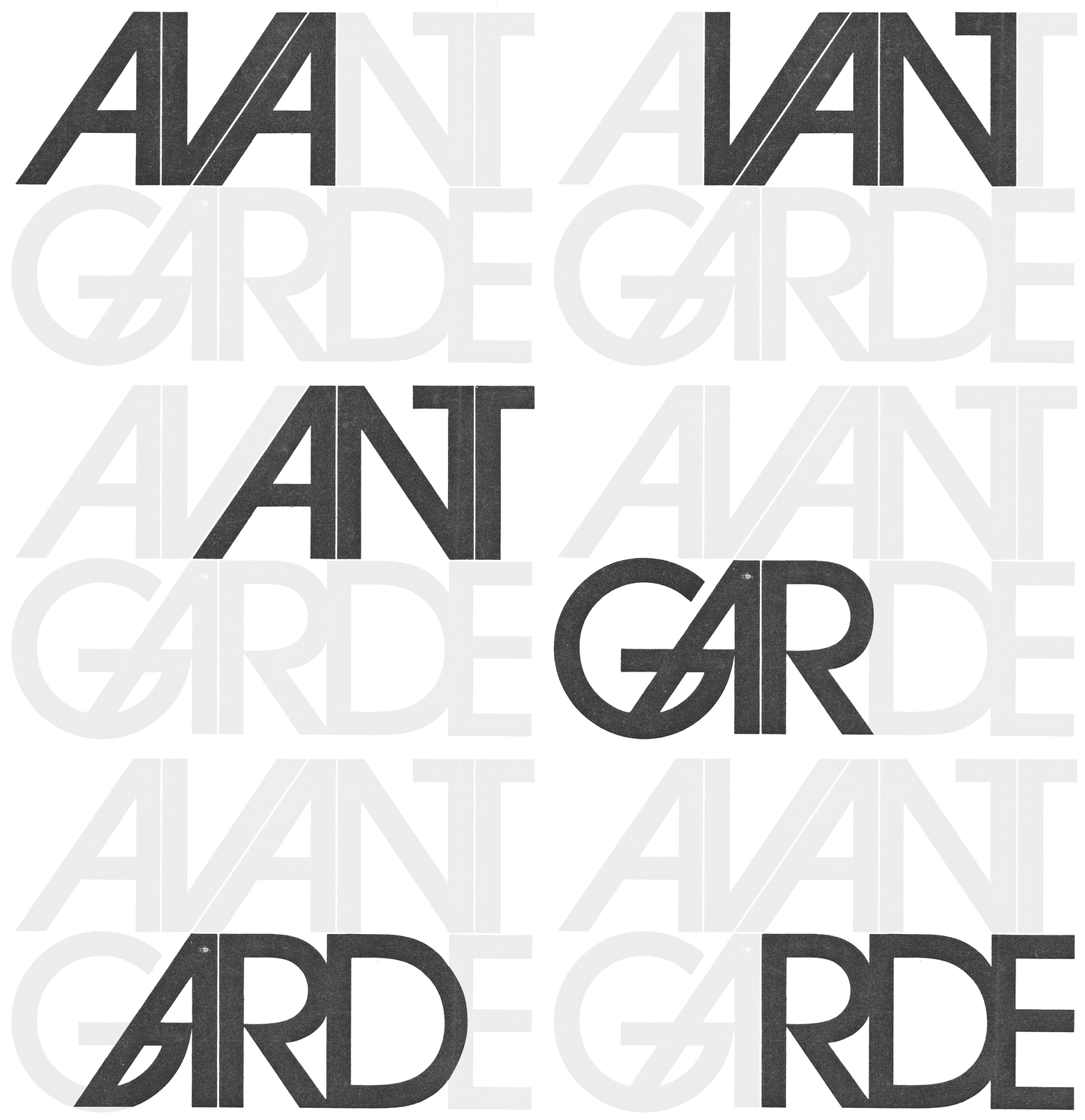
The Avant Garde logotype also by Herb with Tom Carnese. Spacing the AVA or the VAN is of course very logical; the same channel of white space is used for consistency. But how much should the GA overlap? What about the RD? The DE? These are all questions that can be answered by utilizing the Three at a Time technique.
What I love about Three at a Time is that is works all the time. Script? Three at a Time. Hairline super extended non-lining figures? Three at a Time! In the Latin alphabet, there are almost no cases where it can’t be used. Even with very informal or casual styles, Three at a Time lets the spacing be great while allowing the positive shapes to be as irregular as you like. No matter how bizarre the letters are, the spacing should always be consistent. Legibility is improved, and fewer pockets of whitespace distract the eye.
Consider the Opposite
Sometimes I have said, “Spacing is the most important thing, in type, and in life in general.” That might be overstating things, but I do believe it is paramount to consider. Alan Watts wanted us to think about death not for us to enjoy being dead, but to make the most of life. Musicians have often remarked how it is not the notes, but the space between them that makes a successful melody. All cooking is based on the balance of opposing flavors. In countless disciplines, thoughtful consideration of the contrasting element informs its partner in a powerful way. For that reason, a design decision that allows for better spacing is a good one indeed. ✌