In March of 2017, I spoke at the San Francisco Public Library for Type@Cooper’s lecture series. My presentation covered the lack of typographic distinction in the tech industry. I included one slide that looked like this.
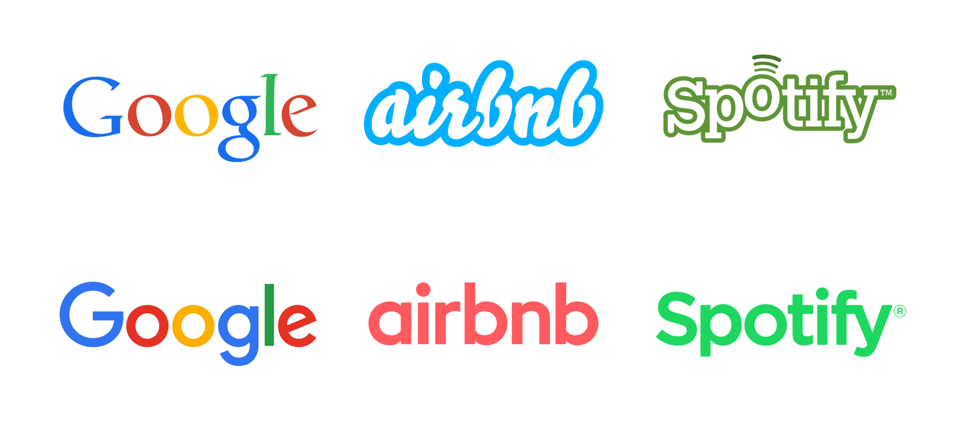
From my 2017 talk at SFPL.
Roughly a year later, I wrote my one and (presumably) only viral tweet. It was a version of the talk, but tailored specifically for the medium.
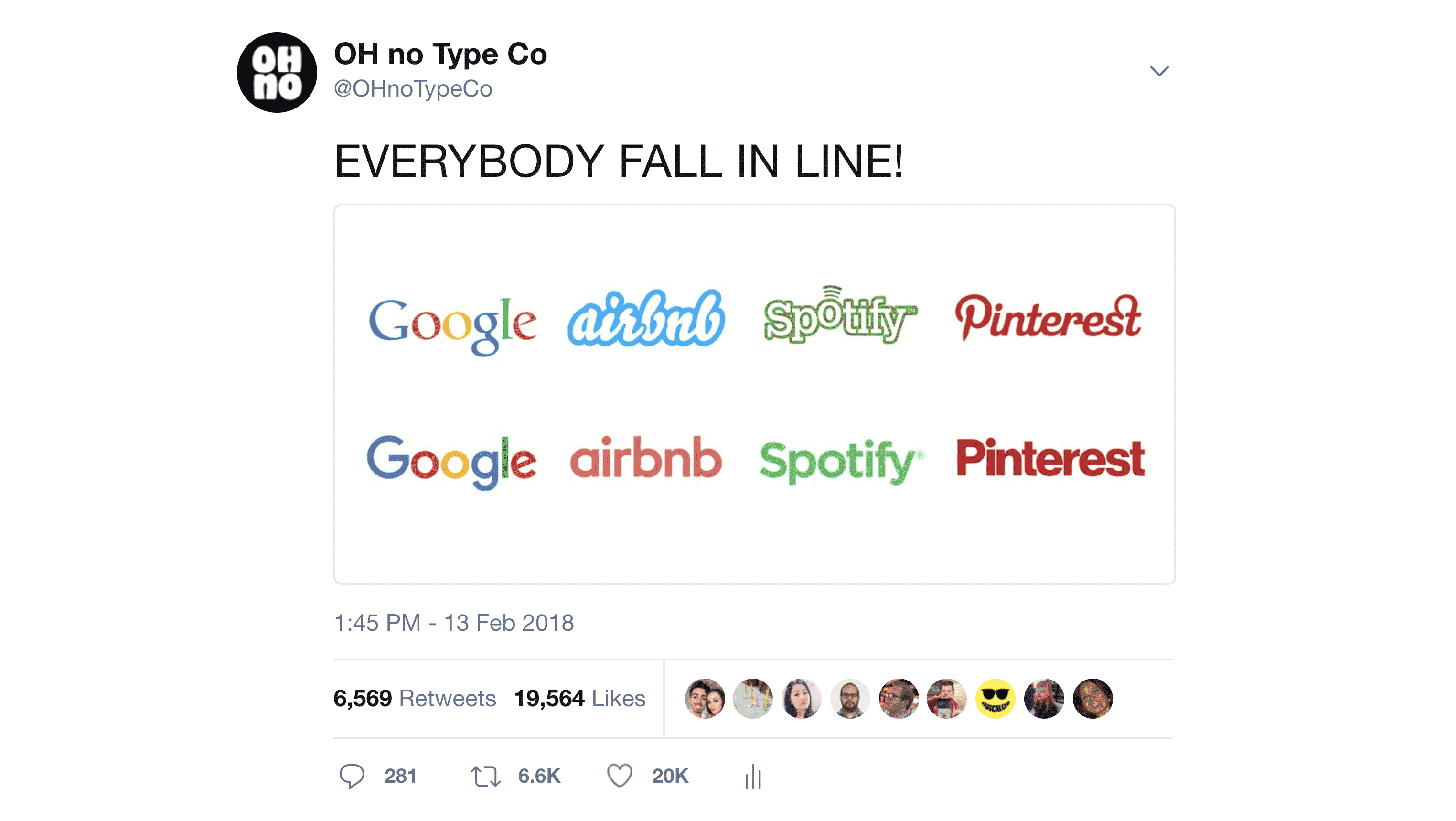
If only likes were dollars.
Soon enough it had a lot of attention. A little while later, the replies were getting lots of attention. Later, it was a web of discussions with plenty of people talking about the success of individual redesigns, and why they were or weren’t successful.
A couple thoughts quickly came to mind. First: I guess this is the first time I’ve said something that resonates. It’s amazing that I’ve posted to that account about 2000 times, and this is the first time that a contribution of mine had struck a chord. Second: the same image, or a similar image had been posted to Twitter before, without getting any attention. I suppose it was the right sentiment, coupled with the right amount of brevity and bluntness at the right time.
Don’t @ me
The responses began floating in, and in typical internet fashion, they weren’t super constructive. I was surprised to see folks jumping in to defend the push toward monotony.
“Those original logos make a classic mistake: thinking they need to BE the personality of the company on their own. That’s not what logos are for. They should symbolize every experience people have with an organization, not try to actually be the experience.” —ryannee
“Those original logos make a classic mistake” seems pretty bold, but I think I understand the sentiment. Question: does Leica make a classic mistake? What about Coca-Cola? I think the only mistake here is backpedalling on something ownable.
“The realisation here is that a brand is not defined by the typeface / logotype. Visually each brand's universe feels very unique and more than anything the experiences of using those products are not alike at all” —@gabrielhl
Each of these brands aren’t that unique. When I think of unique brands, my mind goes to See’s Candy and Tony’s Chocolonely. Two fantastically type-driven chocolate brands that, have absolutely nothing visually in common.
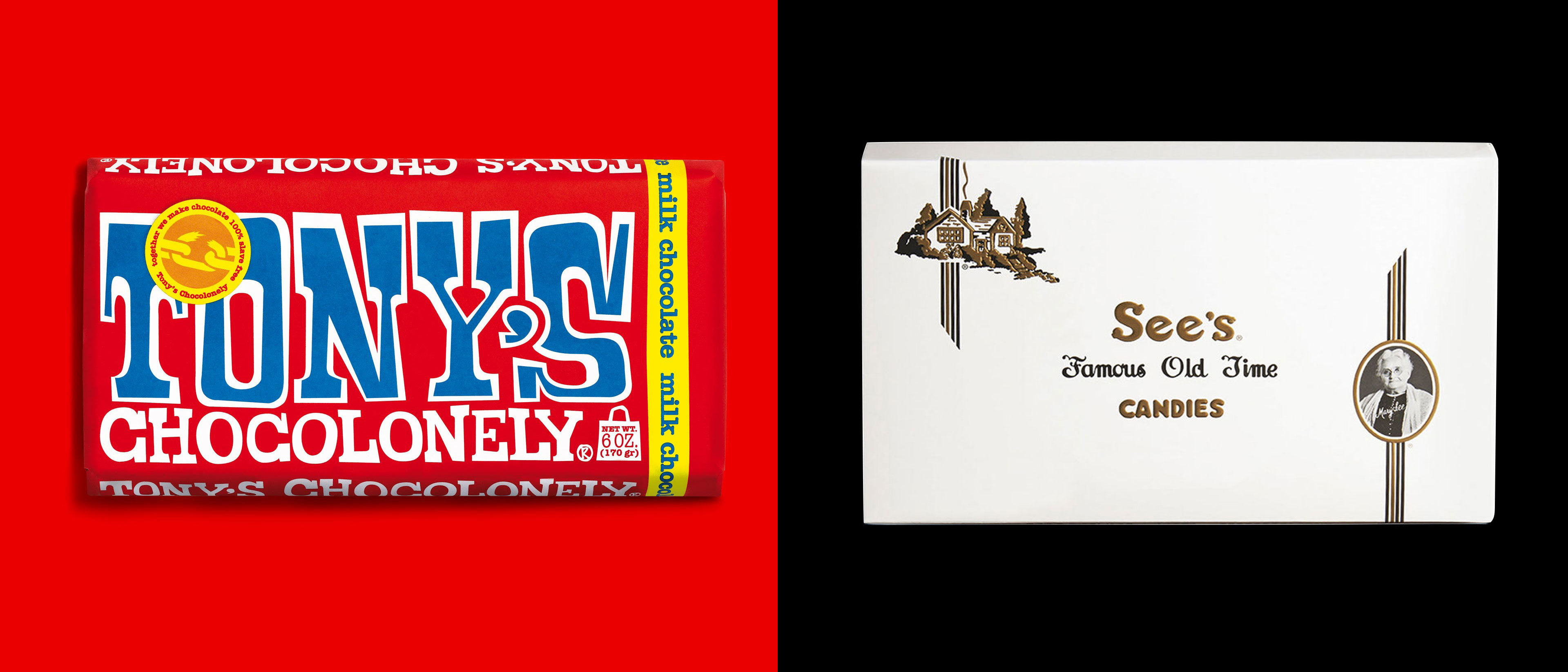
Two absurdly different brands selling chocolate. Don’t tell me that Uber and Google are that different because they are not.
Other good feedback to my tweet centered around the idea that all of those logotypes exist alongside a more distinct and recognizable mark. That’s definitely true, and exposes an interesting thing about Twitter. The people that follow me are pretty aware that I’m a type designer that I was making a comment about the homogeneity in the type selection of those brands. My (only) area of expertise is type, so I won’t be making a lot of comments about color, marks, photography, or illustration. But as a tweet’s visibility snowballs, it becomes distanced from any context. Some responses were basically saying, “Branding not just about type!” To which my response is, “I’m not talking about branding at large, I’m talking about type selection as a facet of branding,” but it’s hard to figure out if you don’t know my whole deal.
My absolute favorite response came from my good friend Helen Ip.
“i'm really not digging tech companies co-opting the roundest sans-serifs. Being round used to be fun and annoyingly non-serifed.
let's be honest: underneath their cushy sans-serifs lies the true darkness within Silicon Valley: Burning Man.” —@herroherren
Another, longer response in the form of a blog post from Khoi Vinh caught my attention. In his article, he poses some interesting questions.
“As practitioners of design we’re most comfortable asking questions like “How do we implement our brand’s design language, propagate and scale it, and make sure it’s consistent?” We’re much less comfortable asking questions like, “What’s the larger context for the brand we’re building? Are we making a unique and worthwhile contribution to the value of our company, to the world at large, or even to our profession?” It’s the difference between merely executing ideas and really understanding them.” —Khoi Vinh
In the time since this tweet, Uber has redesigned in a similar vein. In the future, we’ll see more. This is the style du jour, and these brands are just trying to look current. I think we can aspire for so much more that simply being current. Type can do a whole lot more than that. If you’re a brand designer in this wacky world of tech, now is a great time to stand out. ✌