There was a Spanish foreign exchange student in my Typography 3 class. Her type combos were wild, original, and exotic. By her own account, she had “stolen fonts from ever major studio in Madrid.” I was mystified by her dazzling compositions. Years later, the secrets of pairing fonts began to unlock, only after I had designed enough of them to play with. Here’s what I found:

Eckmannpsych and Degular.
Step 1: Take a font. Step 2: Take another font. Congratulations. You did it!! Joking aside, font pairing is an art that can be delicious or disastrous, but there are a couple of strategies to make the process a bit less painful.

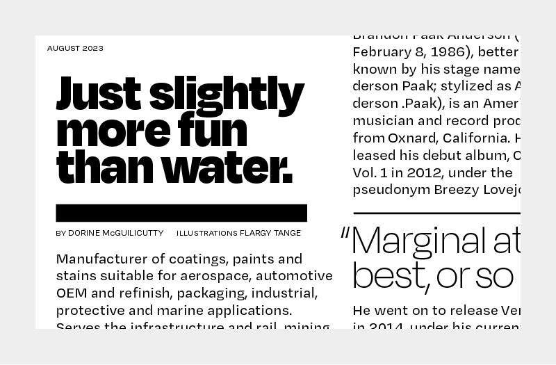
This is just all Degular!
1. Stay in the superfamily
No matter what superfamily you’re using, there are often styles designed to excel at large and small sizes. Using a few of them will pretty much always work. That's a little boring though, huh? Let’s take things a step further.

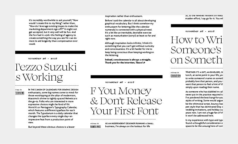
Swear Display Light for headlines. Retail Text Regular for paragraphs. Vulf Mono Light Italic for dates. A bit of Obviously sprinkled in for categories.
2. Define the style sheet.
By locking a particular font with a particular size, you can juggle a few different hierarchies as long as everyone stays locked to their particular role. It helps if there is significant differentiation between the various sizes. Ok, this is also fairly timid.

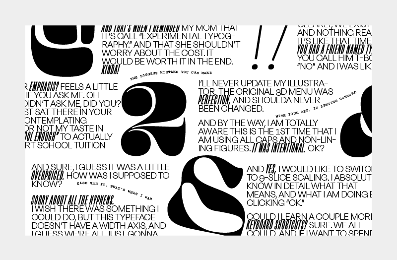
Let’s see, here we have Ohno Blazeface, Degular, Eckmannpsych, Swear, Obviously, Irregardless, Ohno Fatface, Beastly, and Hobeaux!
3. Lock the cap-height, and stay in the same foundry.
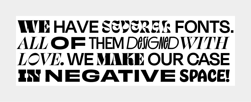
By using all caps, and keeping the cap-height locked, you can mess with a few different styles even in the same headline. It might end up looking like an ad for that foundry, but the only people that know about foundries are graphic designers, type designers, and their mothers.

Cheee, Degular, Ohno Fatface, Vulf Mono, Eckmannpsych, Beastly, Obviously, and a little bit of cropped Irregardless.
This is the most underrated strategy! Too often I see people scared to make bold choices in type combos. Type is not clip art, it’s a raw material designed to be messed with! So have fun, use type you love, and if someone ever tells you not to combine typefaces, tell them their outfit stinks and walk away!