As the zeitgeist around variable fonts builds, people are falling into a few different camps. There are those (like myself) that are stoked about the possibilities and new types of fun to be had. Luckily, Future Fonts has arrived at a perfect time for designers like me to begin not only building variable fonts, but actually getting them in the hands of designers who can use them. At the moment, Illustrator and Photoshop are the only Adobe applications that support the variable-ness, but that’s a lot better than nothing, and more are on the way.
The opposing camp is full of people that sincerely do not give a fuck. I completely understand this, as most people are just trying to be good employees. At the end of the day, what is the incentive for understanding and using this new technology? It will not get you a raise, acclaim at the workplace, or even respect from your peers, because they also do not give a fuck.
With that in mind, I wanted to outline some possible benefits for designers to use variable fonts in ways that are practical and exciting.
The AIGA logo seems like a nice place to start, as most designers are familiar with it, and perhaps even aware of its pitfalls. The logo is quote sharp, but by the looks of the thin thins, it is intended for an extremely large size. One might even go so far as to say it’s unfortunate that the American Institute for Graphic Arts has a logo that doesn’t work small.

The current AIGA logo, clearly drawn to look great at huge sizes, and not much else. When shrunk down to minuscule sizes, everything falls apart. How many times have you seen this bummer at the bottom of a poster?
One strategy might be to create multiple versions of the logo as separate vector files. I can’t imagine needing much more than about three: one for super tiny sizes, and low-resolution prints, one for medium size uses, like a nicely printed postcard, and one for when the logo is loud and proud, say front and center on presentation slide.

Three different versions of the AIGA logo intended for different sizes.
As many designers know, this is a huge pain in the ass. The different versions of the logo are prepared with usage guidelines outlined in some PDF that never gets read, and eventually, mistakes are made. But if the logo were a font format, you could quickly track the version number to make sure everyone had the right asset, and manage things in a single file, rather than a loose collection of unlabeled vectors.
This is where it gets cool! By making it a variable font with an optical size axis, you could quickly adjust the optical size depending on how big the logo is rendered.
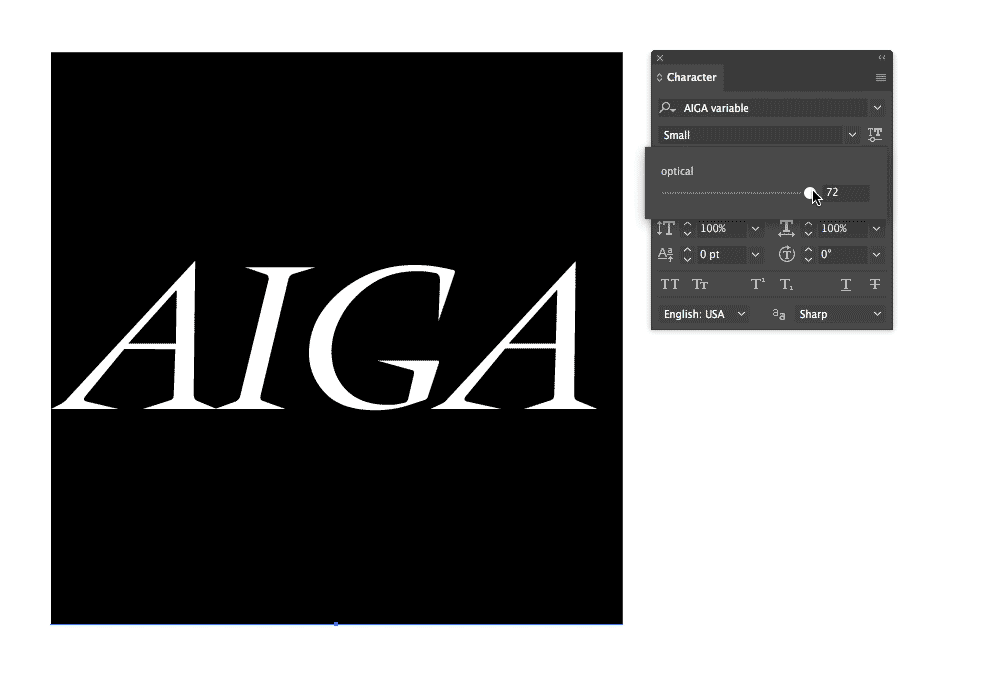
Changing the optical size is easy in Illustrator, and can be done on the fly as the design and layout changes. In this font, the logo is assigned to the A. Perhaps there are more semantic ways of encoding the logotype, like as a ligature for AIGA or something similar.

Success! With a variable logotype, one could have a size-appropriate image for any situation.
Screen
You might be thinking, “James, you dumbass, I haven’t done any print graphic design since college.” Well guess what? On the web, things get even easier because browsers have been quicker to adopt variable font standards than the Adobe Suite. One could easily imagine the same use case as above, but rather than manually setting the correct value by hand on a slider, it was done automatically with a tiny amount of javascript. Everyone has seen a website where the logotype transforms into a compact size as you begin scrolling down the page. Should those letters that are a small fraction of the size of the original really be the exact same? Such extreme scaling is a bit crude if you think about it. Surely, an adjusted drawing could excel.
But even that might be a bit boring. Let’s brainstorm some more fun stuff:
- A weather app where the logo gets bolder as the temperature gets hotter.
- A Medium logotype where the width of the logotype on an article was an indication of the article’s length or read time.
- A Gofundme logotype where the ascender and descenders grew according to the money raised.
- A social media app where the lettering on an icon became bolder depending on the number of notifications (instead of the anxiety-inducing red circle with a number in it)
- A video conference app whose logo’s x-height changed with the level of audio recorded, or even making it work like an EQ.
- A desktop app where the text on the icon had a degree of slant that was an indication of CPU power being used.

Imagine a budgeting app where the logotype on the icon changed depending on how much money you had left that month. The app then becomes useful as a quick reminder even when it isn’t open!
My hopes are that these silly ideas, while useless on their own, might inspire you to think about some fun possibilities, or simply ways of leveraging variable fonts to increase quality or fun in a project. This is simply the tip of the iceberg, and the possibilities are truly endless.