Eckmann Schrift was of course originally drawn by Otto Eckmann, but the seeds were planted in 1899 as the masthead for the magazine Die Woche, an illustrated weekly newspaper. Eckmann then translated that lettering into a full typeface, but it seems that type was just a single facet of his many skills. Trained as a painter, Eckmann ditched his purely artistic pursuits later in life to focus on applied design. It’s wonderful to see the influence of a true artist on his type. His eponymous work remains one of the most original and enduring art nouveau contributions in type design history.
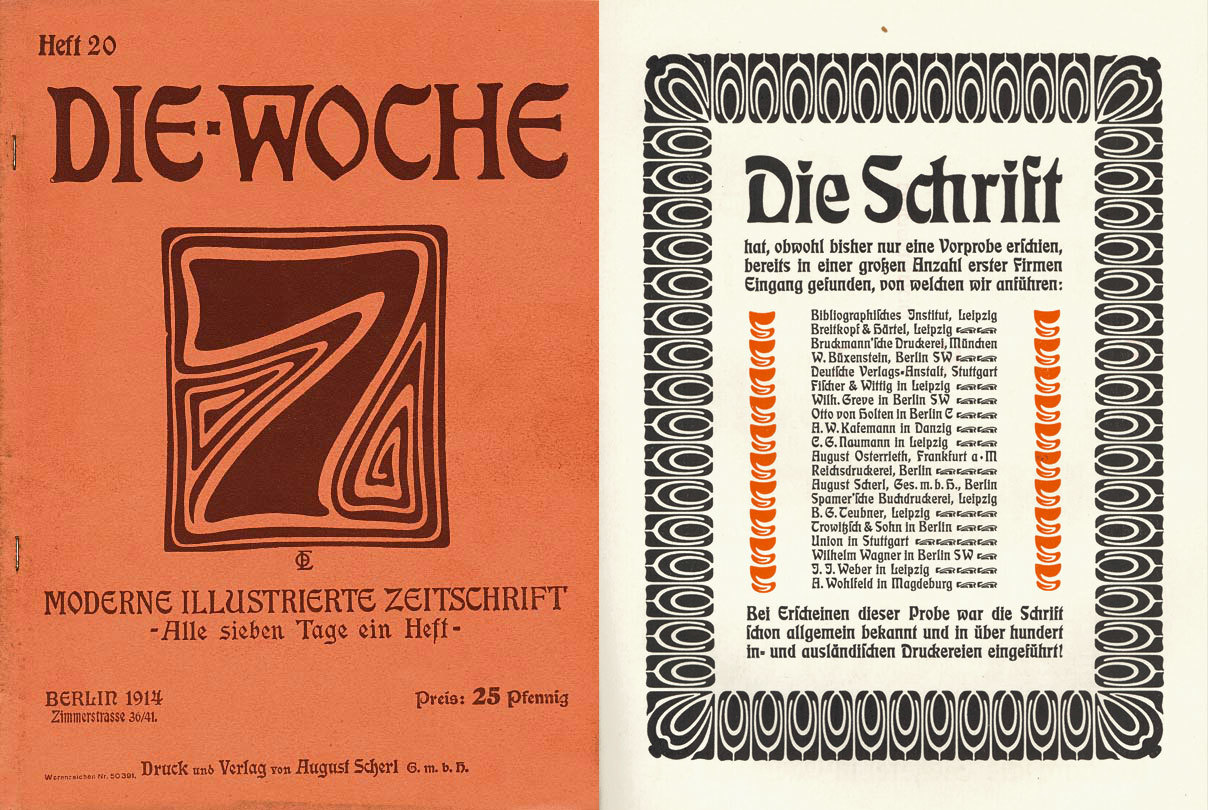
Left: The masthead of Die Woche (German for “This Week”) and other type used on the magazine’s cover appears to be a prototype of Eckmann Schrift. Right: An image graciously provided by Florian Hardwig. He states, “In a way, the original Eckmann was a Future Font itself, too. In the first official specimen, Rudhard’sche Gießerei proudly mentions that the typeface was already acquired by a large number of companies, although it had been advertised in an advance showing only, and lists twenty of the early adopters, with several leading printers among them. “By the time this specimen is released, the typeface has become a household name already, and has been introduced by more than a hundred print offices in Germany and abroad!” On the next page they add: “While this specimen is being printed, the typeface has been acquired by the following companies, among others”, and lists another 18 addresses from Brussels to Riga.”
The psychedelic poster artists of the late sixties had a way of swiping art nouveau and vienna secessionist work, and tailoring it to fit their needs. I was particularly inspired by their adaptations while working on the Vulf North American Tour posters a few years back. I got to explore some of my favorite display faces all throughout history, reproduce the letters to excel at huge sizes, and fit justified across the entire 24” × 36” sheet.
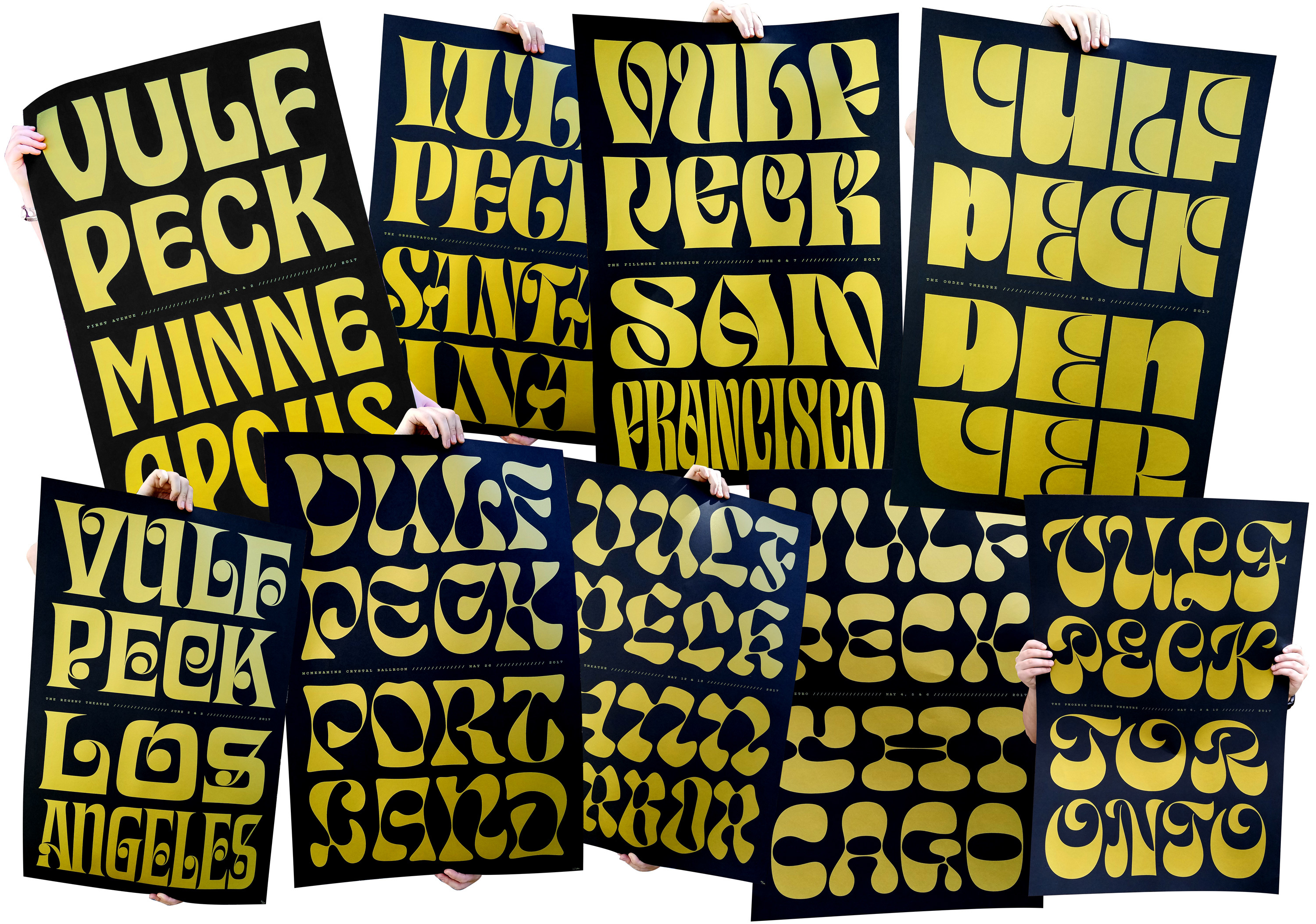
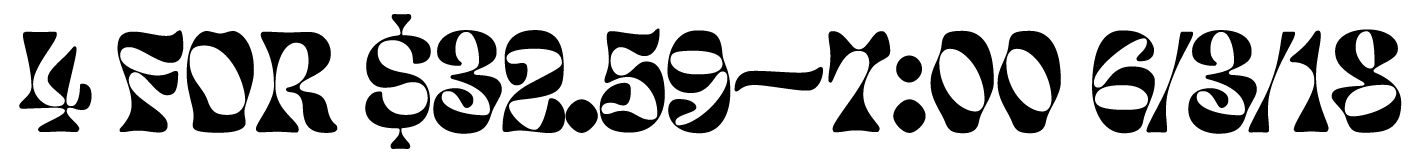
Eckmann Schrift was chosen for Portland, which seemed to be a nice fit for a city that celebrates idiosyncrasies and individuality.
The process for actually translating Eckmann’s work was embarrassingly simple: I drew his version, pinched the middle, and rounded every corner. With surprisingly few moves, the dust was blown off a turn-of-the-century German relic, and a surprisingly funky child was born.
For a while, my psychedelia-infused version of Eckmann sat dormant on my hard drive until a friend asked for a customization with a few more letters. I was happy to oblige, and even made a little animation for a project that never got off the ground.
A simple interpolation between two funky drawings makes one funky animation.
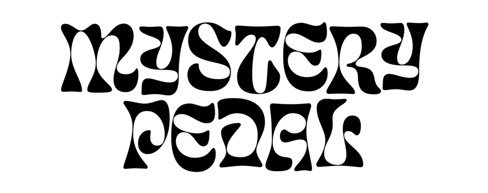
At that point the working title of Eckmannpsych was assigned to this bizarre design, and it went back into hibernation again until Future Fonts started getting closer to launch. I wasn’t sure exactly what typefaces I wanted to put up there, but I tried to include a mix of things that covered a diverse range of style. Our goal was to make Future Fonts the home for more daring designs, and Eckmannpsych fit the bill perfectly. All I had to do was finish the capitals.
The first version of Eckmannpsych on Future Fonts was extremely bare bones. There weren’t even numbers, but it was only six bucks.
The immediate response was way more positive than I ever could have expected. In the first few weeks, Eckmannpsych (the working title became the actual title because I couldn’t think of anything else) was my top earner, despite its meager price tag. The enthusiasm was very surprising considering just how crazy it looked, and how impractical it was to use. The first update came a few weeks later when I added some numbers to the mix.
If the letters were going to be crazy, the figures oughta be completely bonkers. I started playing with contrast a bit more here by illogically adding thins and swells where there were absolutely none.
Through the magic of at-mentions on Instagram, I started seeing people actually using the font for real work. Uses tended to be on the psychedelic side, but I was thrilled to see someone actually hand carving the letters out of linoleum for some letterpress posters. Seeing things like that happen while the fonts are still in progress is totally thrilling, and does wonders to maintain my own enthusiasm for the project.
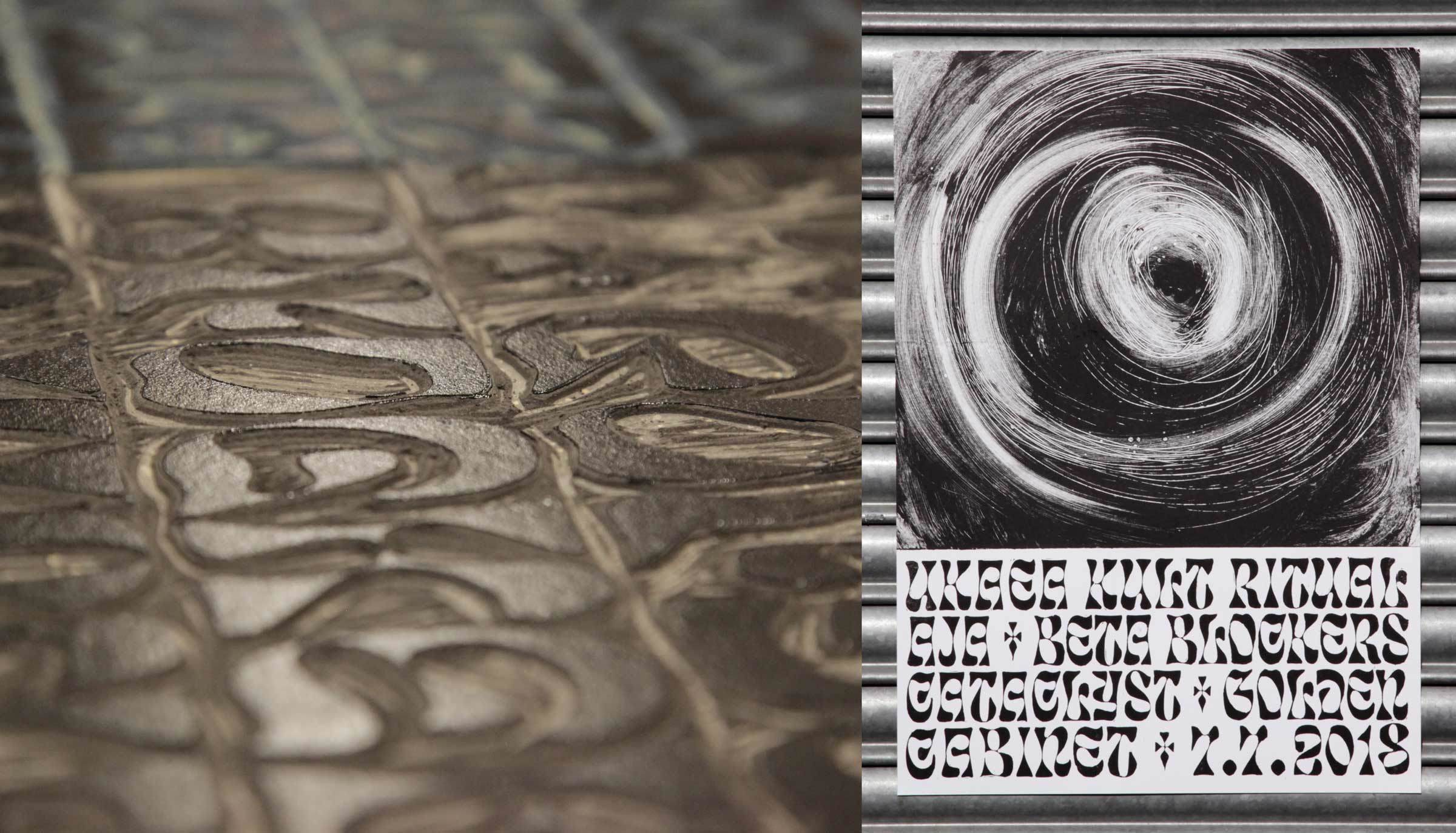
Hand carved Eckmannpsych. Hell yeah! By The Print Project.
Think Small
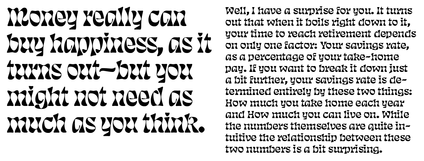
One annoying thing about single style typefaces is that they lock you into a very limited spectrum of use. Something with really high contrast is pretty useless for every size except huge, so I thought more control over the thins would increase the utility of this one-note-song. While decreasing contrast, I also increased the width to allow for larger counters that wouldn't be in danger of filling in when set at a tiny size. This gave way to an optical size axis that made Eckmannpsych quite a bit more useful. The character set was still tiny at this stage, so each update wasn’t an intimidating overhaul. This let me feel at ease to expand the family at a comfortable pace that wasn’t getting in the way of other work.
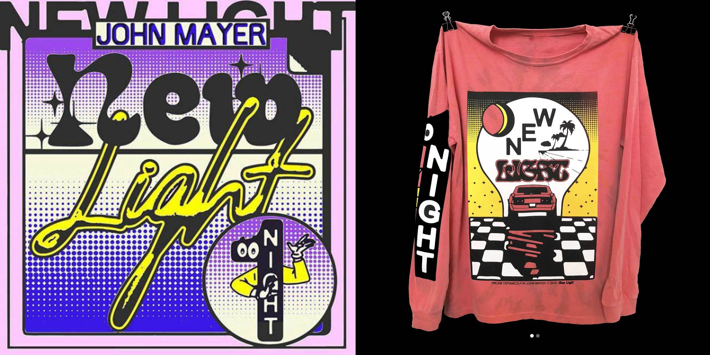
Around this time, the amazing design team Online Ceramics took John Mayer album cover design to unprecedented levels of absurdity, and the N from Eckmannpsych makes a cameo. Although most in-use cases fail to alter my heart-rate, I (without irony) love John Mayer, and was mucho stoked to see this.
Gradually, accented characters came into the mix, and my friend Dan Reynolds had some thoughts. Dan is a bonafide historian, and happened to be working on a dissertation concerning, among other things, Eckmann’s work. His email read:
“I love Eckmannpsych, but as I tweeted, I wish it had a Ü ;-)
Attached is a drawing in the Klingspor Museum from Eckmann for the Ü; it is probably close, but not exact, to what ended up in the original metal type. The idea of a little /e inside the /U was not as extreme as it seems today. Like other German founders, Klingspor cast its capital letters so that their tops went all the up to the top boundary of the sort. The German Umlauts … every typeface got some sort of individual solution. For foreign languages, other diacritics were made on little sorts that you had to put on top of the letters (and then you had to put spacing material on top of all other letters in that line), which the compositors must have totally hated.”
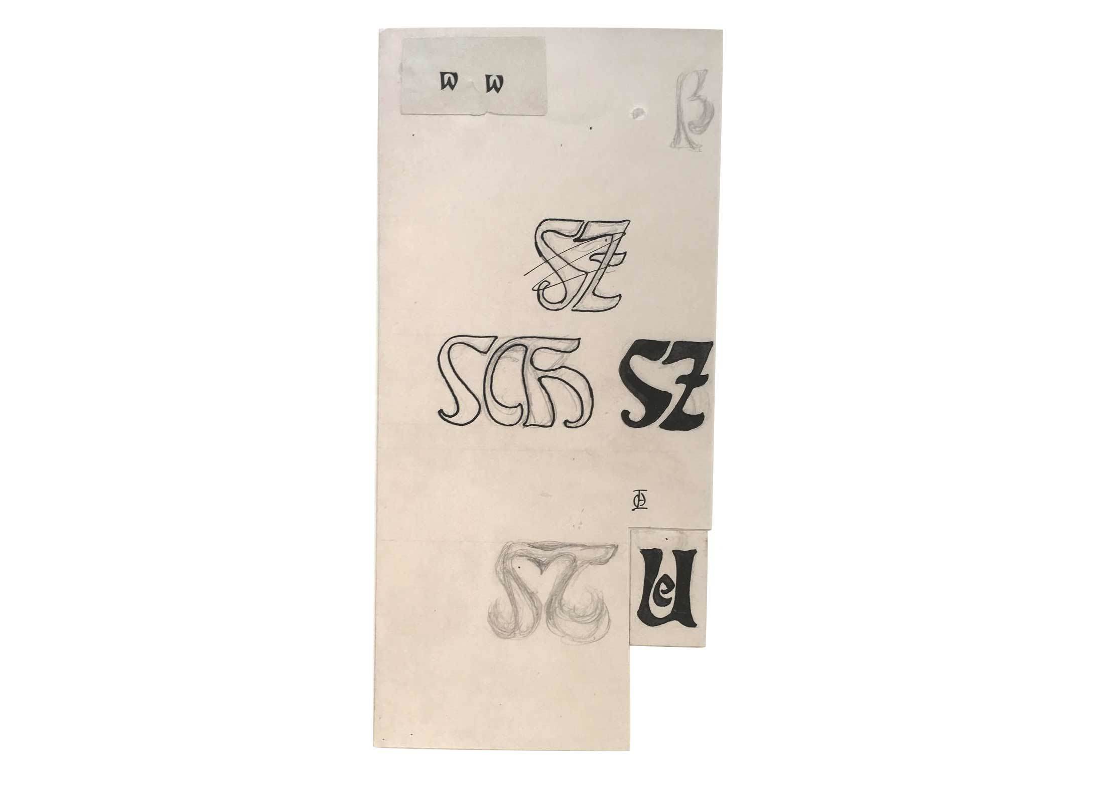
Dan Reynolds’ photograph of an original Eckmann sketch at the Klingspor Museum.
I was very grateful for Dan’s incredibly well-informed critique, and I happily added the suggested Ü as a nod to Eckmann’s original work, and the typesetting technology of that era. Also, in a design this far out, I feel like one has a bit of freedom. As a native English speaker, I’m always afraid to play with accents because I don’t want to look like an idiot. Dan might not be a native German speaker, but his German is certainly better than mine, and he’s no slouch when it comes to type. (Just some Matthew Carter collabs. NO BIG DEAL).
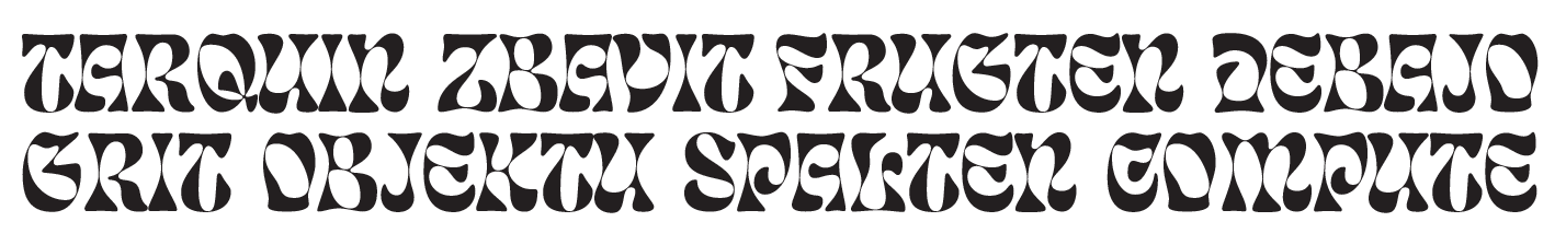
At some point a lowercase seemed to be a fun exploration. There is a huge problem with fun explorations: they can quickly snowball into a lot of work. I try really hard to keep most typefaces as minimal as possible, but the lowercase opened new possibilities of setting Eckmannpsych in (albeit challenging) paragraphs, and I was all about it
A lowercase is born from a more faithful adaptation of the Eckmann model.
Finally, I added a few alternates to make things a little less insane if desired. Just like the descending alternates in Hobeaux (a design famous for the lack of descenders), I don’t really recommend using these. I think if you want to use Eckmannpsych, you have to commit. On the contrary, I’m making just a small effort to be mindful of other people, who are trying to please other clients, that I will luckily never talk to. If one issue can get resolved by swapping in one of the boring alternates, then it was worth it.
Alternates are available, but I hesitate to recommend them.
Thanks Future Fonts, Dan, and Florian
Eckmannpsych would have never happened without the Future Fonts eco system. Dan would have never weighed in with his thoughtful suggestions. Worst of all, John Mayer would look like a complete moron with a different font for the N on his record cover. I hope this family of fonts continues Eckmann’s original vision of art influenced by humanity and nature, and turns on the current generation to his amazing work.