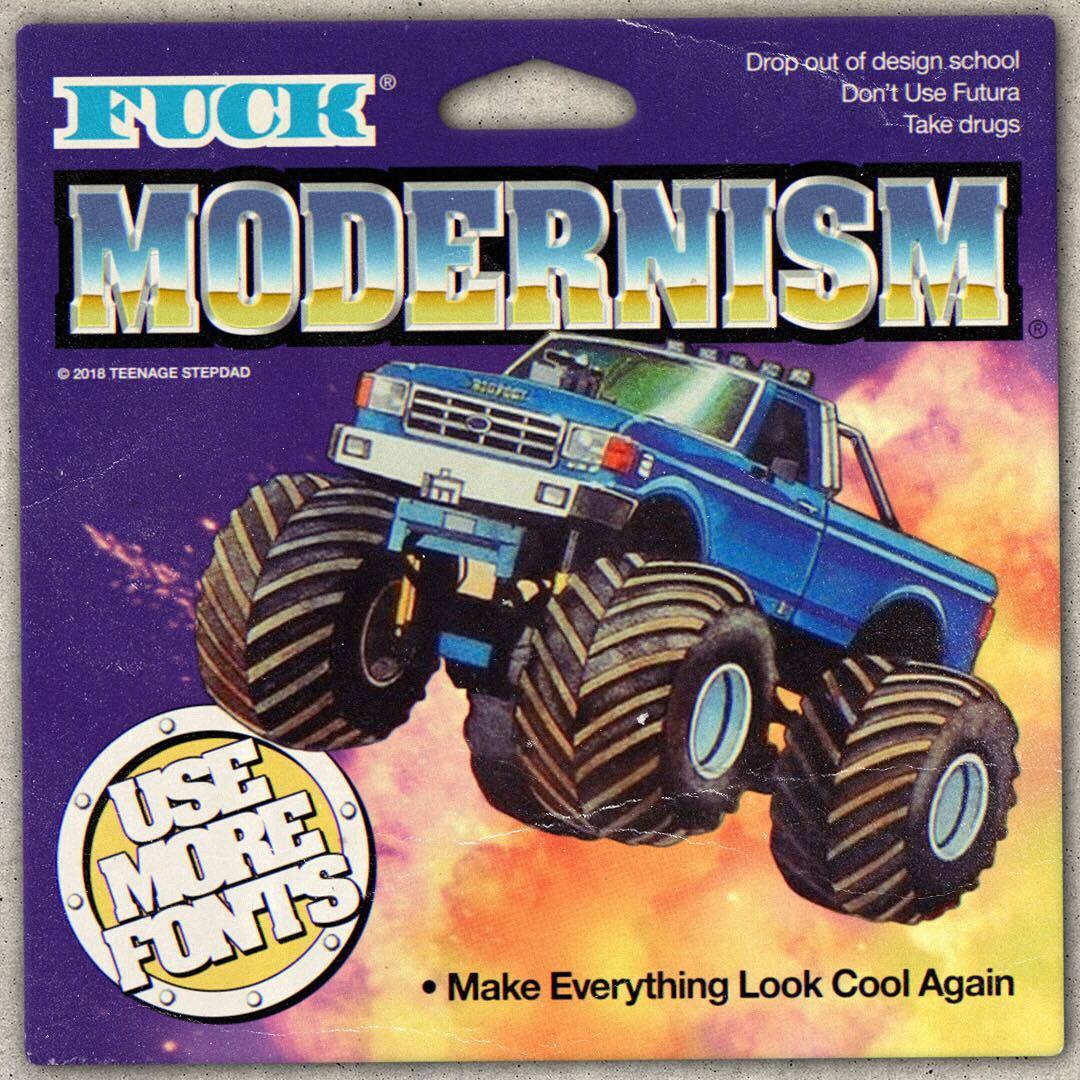
Recently, a graphic design meme has gone viral:

Image by Teenage Stepdad.
The designer is Teenage Stepdad, an Instagram meme account that creates posts with substantially more effort than is typical of the genre. Typical content take the low hanging fruit of pop culture references and jokes about childish rebellion. It’s not bad!
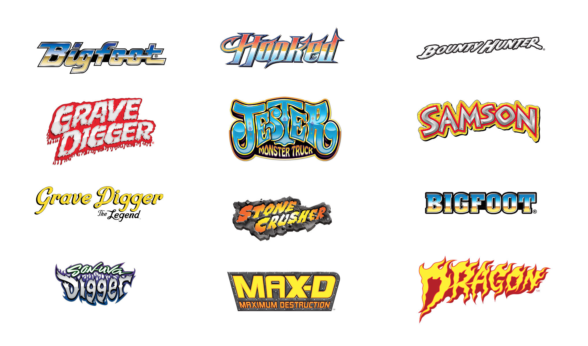
I have been thinking a lot about the monster truck graphic. I appreciate using graphic design itself to make commentary on graphic design, and though this is intentionally blunt, unsophisticated, and shallow, it still resonates.
Another kind of sustainability
Having spent a significant amount of time in design classrooms critiquing work and cutting my teeth, I sympathize with students who feel the pressure to create work imbued with austerity. Students easily fall into the trap of thinking that if something doesn’t feel clean, and professional, that it isn’t good. If it isn’t good, they won’t get a job. If they don’t get a job, they can’t pay off their loans. Obviously, I disagree. This notion is dangerous, and can strip professionals of the joy that is vital for sustaining careers.
On the other side, making something appear professional doesn’t make it good. What we need to concern ourselves with is impact. Many times in meetings and emails, clients have expressed concerns over legibility. I always point out that it is not whether or not we can read something, it’s whether or not we want to.

You might not be as big of a fan of monster truck graphic design as I am, but at least they are having fun!
What the meme gets wrong
It’s important to note that the text in the meme is immediately problematic. We should not forget the lessons of modernism. We should not drop out of design school. We might need to use a little less Futura, but whatever. The reminder that graphic design can be fun should only elevate the importance of succinct concepts and clarity. I can't disagree with the “USE MORE FONTS” bit thought. That’s definitely true.
We’ll see the real ethos behind the monster truck meme continue to develop in graphic design trends to come. It won’t dominate the landscape, but exist like all trends do: alongside myriad other trends concurrently all over the world.
It’s incredibly worthwhile to ask yourself, “How would I create this to my liking” rather than, “How do I leverage existing tropes to make the marketing department sign off?” It might not get accepted, but it very well will be fun. And the fun had in a job—the feeling of agency to create something the way you see fit—can do more to aid longevity than compensation ever could.