In the canon of calendars for graphic design enthusiasts, some big names come to mind: for those worshipping at the altar of modernism, Massimo’s shrine to tightly spaced Helvetica is the go-to. Folks who are interested in more expressive choices might be fond of Kit Hinrich’s or Pentagram’s Typography Calendar, which features a different typeface for each month. The Typodarium is a daily calendar that changes the typeface every single day—an impressive feat from a production point of view.
But beyond these obvious choices is a lesser known option that makes everything else look like a lazily cobbled together piece of crap: Tézzo Suzuki’s stunning effort: Calendar19.
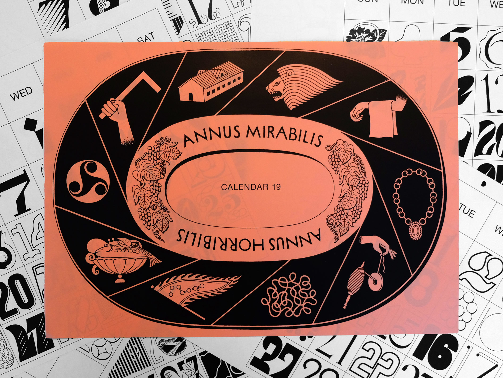
Beyond creating the numerals, each calendar gets an incredibly dope cover illustration.
I first stumbled on Tézzo’s work through the wonders of the yearly TypeMedia website. His graduation project, Groq, is nothing if not the product of a free thinker. It was amazing to see this reckless experimentation combined with the rigor and discipline. I was confused, intrigued, and had to learn more.
A quick perusal of Tézzo’s output is striking—not only for the dense, varied, and aesthetically refreshing body of work, but for a simple and rare addition: his references. Tézzo is completely transparent about where he finds his inspiration. It’s fascinating to see how a small bit of graphic language, when filtered through his mind and hand, can influence the work.
I wanted to learn more, so I emailed Mr. Suzuki and started a conversation.
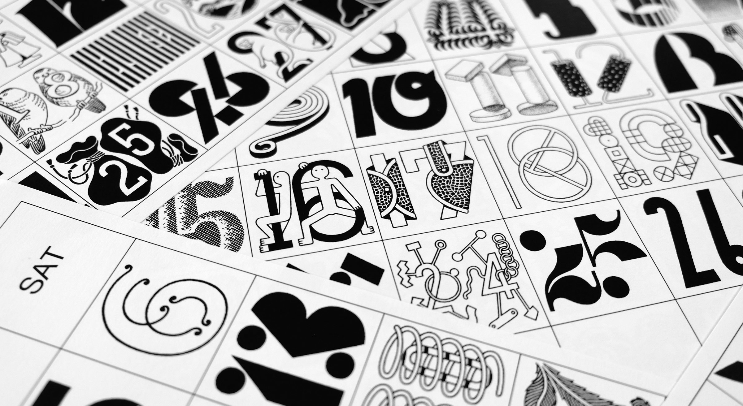
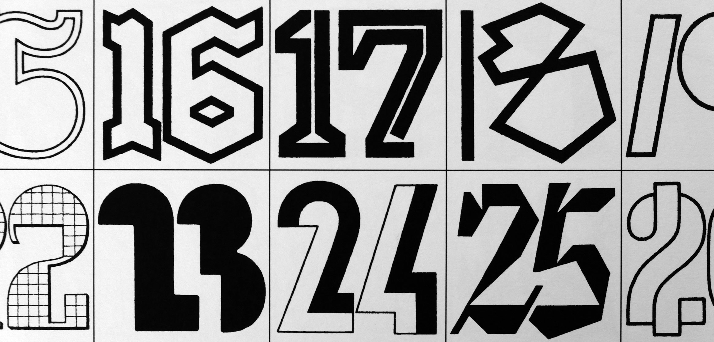
Each of the 365 days feature a unique, hand-drawn numeral.
JE: How did the idea for the calendar first come about?
TS: It was 2012 but I don’t remember exactly when and why I came up with the idea. Some people around me had been making zines or doing self directed projects, such as Kisa Miyazaki’s The Curry Note and Shishi Yamazaki’s Mask. I suppose, I’m naturally interested in working on a product I can deal in by myself without any clients. Maybe.
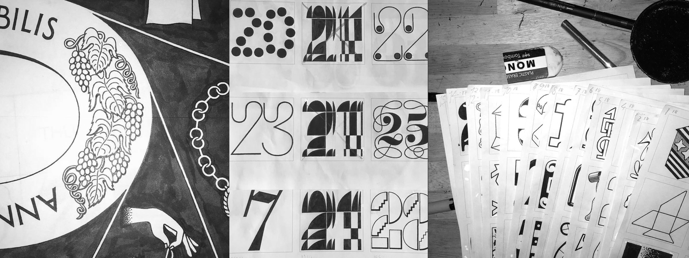
Tézzo’s process, which is honestly portrayed on his instagram, is mostly analog. Ink and white-out are the common raw materials he employs to produce exceedingly uncommon results.
Was it more work than you imagined?
I don’t think so. I’m enjoying every phase of making the calendar (especially drawing actual letterings and a cover illustration), and there's a whole year to prepare for it. It’s not hard work.
One thing I didn’t expect is how much I have to work on taking orders and shipping. Honestly I feel that kind of work is not for me. I'm always afraid of shipping errors…
Every year, I see you make huge efforts to create new drawings that replace old ones. How do you decide which numbers get replaced?
I always start from number 1, and after having done 150-200 numerals, I scan them, and put them on the outside of the art board of the former year’s calendar.ai. (By the way, for the coming year, I renewed all the numerals because I have plenty of time to work on it.)
Then, I choose some of the less well-drawn numerals from the former line-up and replace them with new ones.
One thing I really pay attention to is legibility. I’d like to all the numerals’ shape to be properly legible even though it’s heavily decorated or distorted.
Other than that, I think the criteria for replacement is obvious. I just remove things that look like they were done by someone with poor taste or poor skill. But, of course everything was done by me.
I think this project is a kind of training for me to pursue new graphical vocabulary, so it’s more important to keep drawing new numerals than to complete a sheet of calendars annually.
Closeups from Calendar19.
Your analog process—using a combination of good old fashioned ink and white-out—creates a really beautiful line quality that feels warm and inviting. Has every numeral been produced by hand?
Thank you, yes it has. I don’t intend to make them look old-fashioned or warm, but it's nice to hear that you said it's inviting.
Recently, I found some guys on instagram that are doing something in the same format. I don’t know how they got interested in lettering, but I think lettering (especially by hand) looks much easier compared to more professional and less accessible methods such as type design and typography.
Lettering encourages many amateur people to make crazy, clumsy, unconventional letter shapes without a historical precedent. I think that is one of good things about lettering. Although It’s funny to see that some of the guys put #typography on their interesting lettering works...
Yes, it looks like someone is taking your idea, copying, and being influenced by some of your forms as well. That’s a shame. Does it upset you?
If they are selling them it could be a problem but for now it’s okay! When I was young I did something similar as well lol.
What I really care about is how interesting and progressive each graphic style is. It seems that those guys are not curious about that, but just are interested in juxtaposing whatever characters in different styles. That has been done by so many designers and illustrators in history.
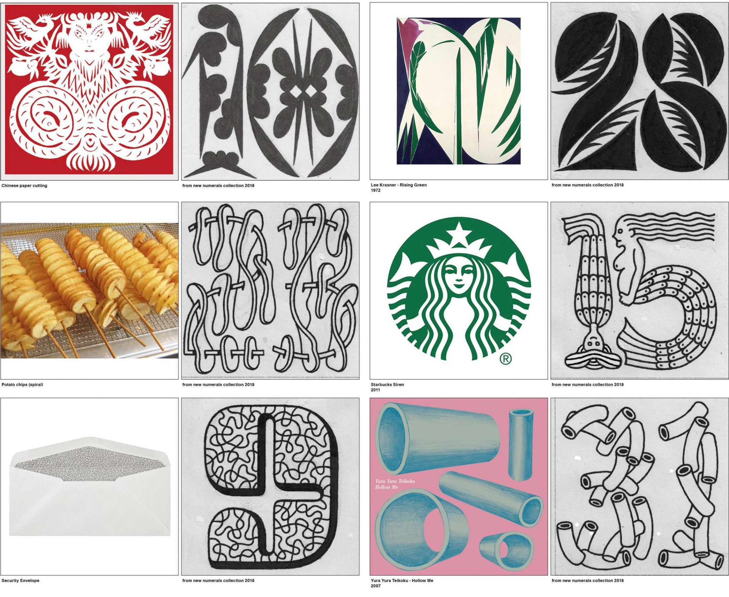
Tézzo candidly showing his inspiration and end result for a few numerals from Calendar18.
I am particularly impressed by the part of your portfolio where you cite references. That’s really cool! While inspiration might be infinite, do you ever fear you'll run out of enthusiasm for creating new numerals?
I think I’m afraid of running out of curiosity and inspiration rather than enthusiasm.
Before I said the calendar is all about developing graphical vocabulary. But I think somehow my enthusiasm for lettering (like the calendar numerals) is connected with a physical need. It’s a bit like an inevitable, desirable exercise such as masturbation (sorry!) at least so far and right now.
Although inspiration looks infinite, I think it’s something that you can’t get without curiosity and consciousness. It’s a bit harder for me to keep being conscious than keeping working on the lettering.
Indeed, consciousness is always a struggle. Thank you for the interview, Tézzo!
Information on buying Tézzo Suzuki’s Calendar19 can be found on his Tumblr.
This holiday season, give the gift of Tézzo!