In the process of digital type design, there is no physical limitation to stop you from taking an idea too far. The absence of these boundaries can often make concepts snowball out of control before you even place your first point. I can’t tell you how many times I’ve dreamt up a 200-style experimental variable font, only to lead up to the next thought: Nobody will want this.
Casserole wasn’t a big idea from the beginning. In fact, it started even smaller than type—simply as a piece of lettering for a Vulfpeck concert in Los Angeles.

The Los Angeles date of the 2018 Vulfpeck North American Tour poster series, designed by James Edmondson.
Cheee and Eckmannpsych had the same origin. While both of those projects explored additional styles through interpolation (placing the same points in different locations, allowing for a blend between styles), Casserole grew in another, even more labor-intensive way.
Louis Minott and his son David
We of course began with Davida Bold, an extremely popular font from 1965. Louis Minott, most likely inspired by victorian-era display fonts like Ringlet and Hogarth, lettered a prototype and submitted it to a contest by Visual Graphics Company (VCG). It won, earning Minott $1000. Unfortunately, zero royalties were part of the deal, and Davida Bold was a runaway success. Louis’ triumph of winning the contest and having his work published gradually turned into bitterness, with every use of his Davida reminding him of a lousy deal with VGC.
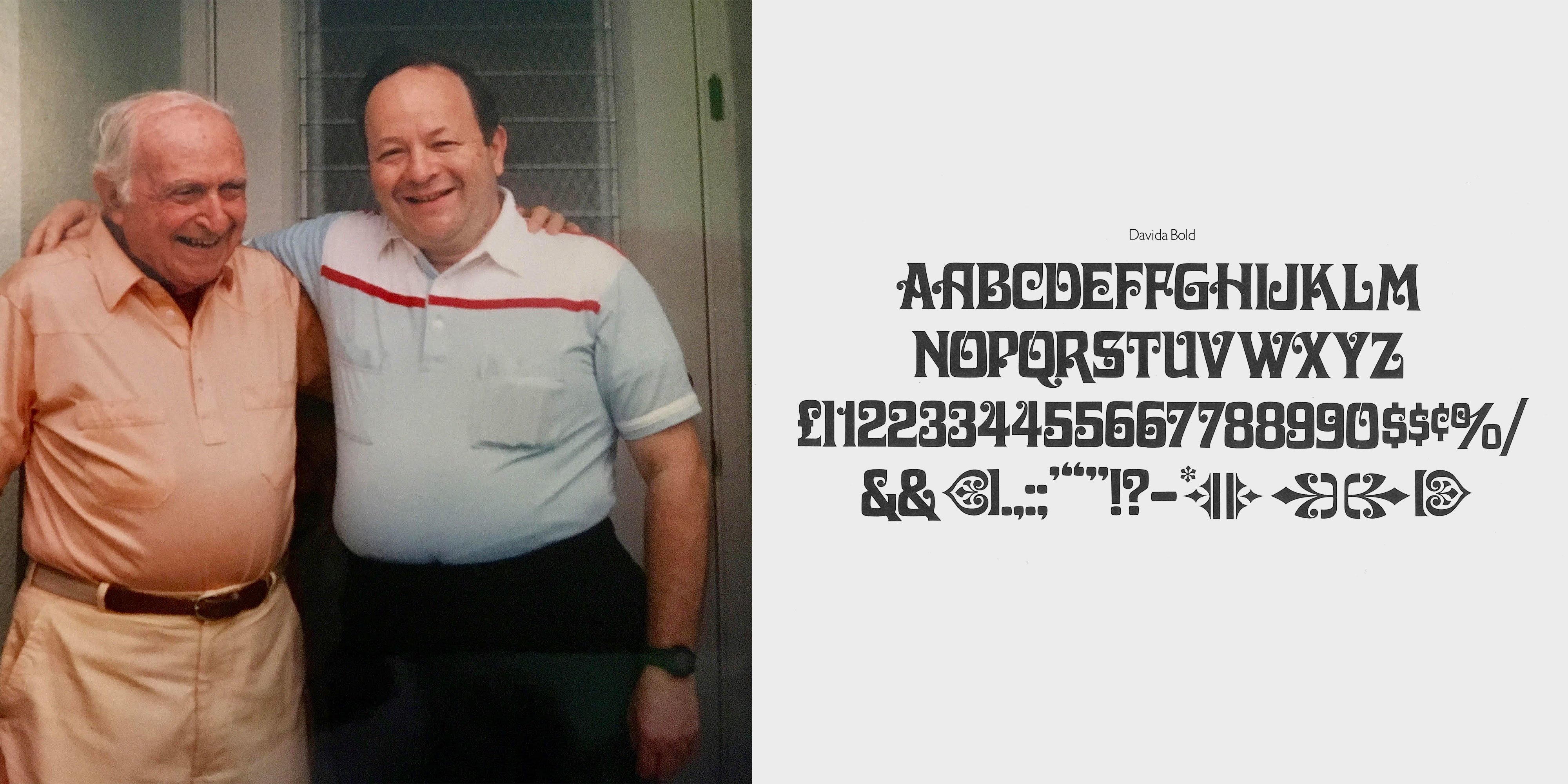
Louis Minott (left), designer of Davida, with his son, David.
Experimentation
The Vulfpeck poster series was an excuse to experiment with my own versions of a bunch of ornate display typefaces that I loved.
I got to experiment with tweaking many things about Davida. First was the width. Going super condensed like in “Angeles” wasn’t working, so I went slightly wider than the original. Because the poster used the type at such an absurdly large size, I got to add a bit of drama by emphasizing the contrast throughout. The serifs became razor sharp, and connections between branches and ball terminals got as thin as possible. We added a bit of gravity—emphasizing the trapezoidal nature of D, G, O, and Q.
I quickly began asking myself if the ball terminals were something that could be messed with. I attempted alternate versions that ditched the balls in favor of little shards of aluminum or other bizarre and illogical shapes.

An early iteration of Casserole where I began for a moment to think that my ideas were better than the original. They weren’t!
After I returned to the idea of classic ball terminals, the working files just sat on my hard drive for years. Every once in a while, I’d need to use it in a presentation and quickly add a handful of glyphs. Then on our holiday cards, and eventually over time, the classic style blossomed into an actual typeface, but only as a single style.

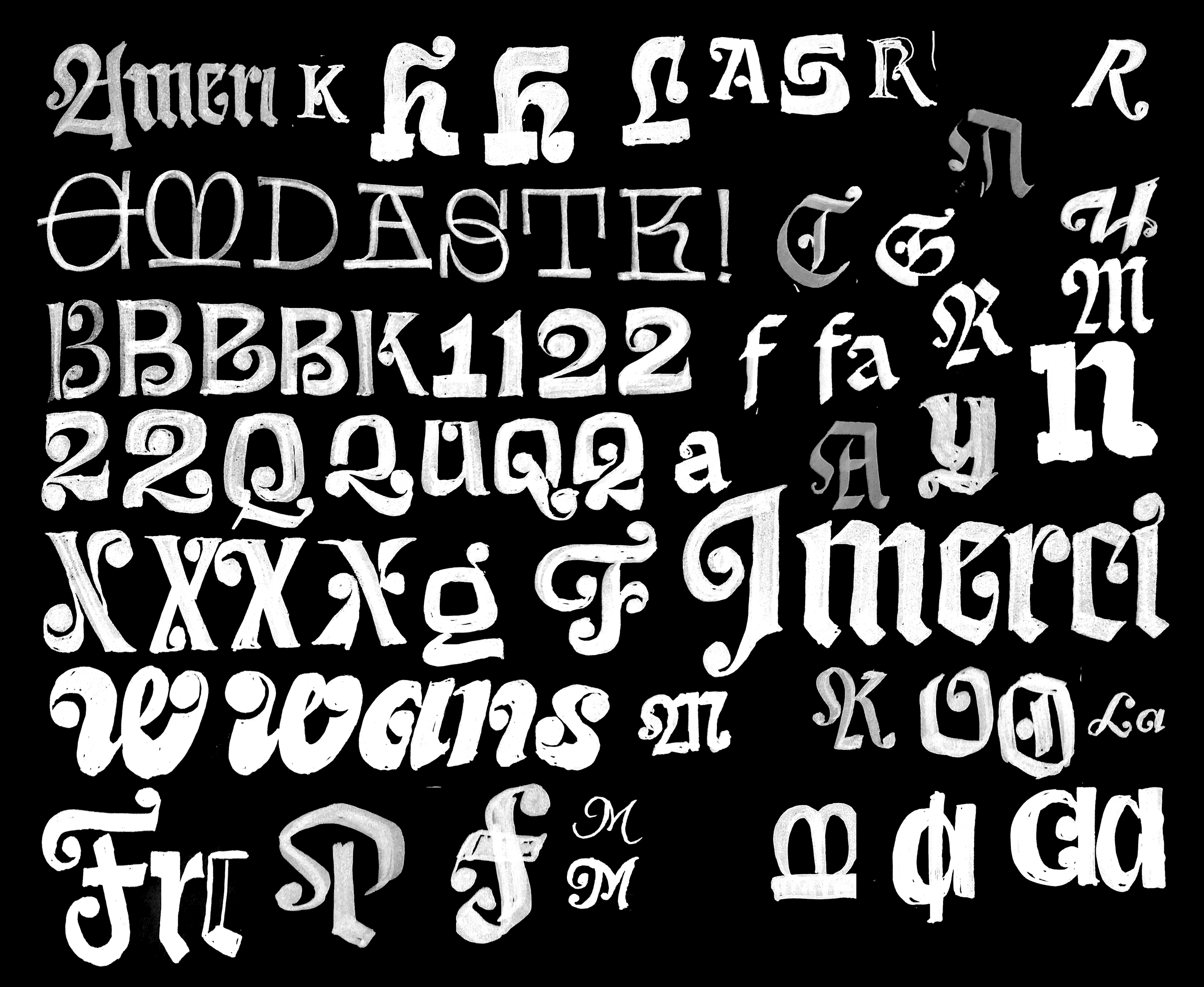
At some point I ventured into the lowercase. That’s where the real fun was! Davida never had one, so each glyph became a puzzle to solve, with no easy answer. Not every glyph needed a ball terminal, but some were too easy to pass up.
Normally, with any typeface that has thin thins, I’d add another small optical size (a redrawing of the same outlines intended to excel at around 14 points). Beastly and Ohno Fatface follow this idea, but it didn’t feel right for this. Variable fonts aren’t always the answer, after all! That’s when I got a really simple idea: What would happen if we just took off the balls? Would all be lost? Would the typeface make any sort of an impact?

The Flare style was simply a lack of ball terminals, with a few crossbars redrawn to swap in a conventional horizontal stroke.
Those two styles made for a nice mini family, but Ohno would not be Ohno if we didn’t scrape the sides of the can for every drop of cream of mushroom soup contained therein. The next step was to strip the Flare down to a Sans. This simple move was actually a more substantial undertaking because with no contrast to play with, accents and certain bits of punctuation had to be entirely redrawn.

The Sans required a bit more work and was spaced more generously to encourage use at a broader range of sizes than just the Classic and Flare styles.
It Gets Funkier
A family of three styles can be pretty useful, but there was still plenty of soup in the can. While we were adding lowercases to each style, it dawned on me that no genre is more hospitable to the ball terminal than script, in both capitals and lowercase. It seemed completely obvious that this was the new expedition on which to embark.
But there’s also a sub-genre of Blackletter that (contrary to how broad-nib pens work) actually embraces the ball terminal as a visual motif. We set out to accomplish both.
While I used to sketch mostly by hand, I’m totally comfortable doing loose drawings on the computer these days. I don’t recommend this, especially to students. Nonetheless, sometimes I just can’t figure out how to put an idea on the computer without doing a little doodle first.

The Script and Blackletter fully fleshed out the Davida-centric universe we were operating in.

The Script and Blackletter styles required many attempts at some of the glyphs before we got to a place that felt natural.
The family had a nice symmetry to it, with the Classic as the fulcrum, the sober combination of Sans and Flare balancing out the completely bonkers combination of Script and Blackletter. So, with absolutely no reason to add anything else, I delved into the most lawless genre I could think of: Lombardic Capitals.

Lombardic Capitals are a truly underrated genre and don’t have a ton of representation in digital type. They are found on churches, pubs, and Tolkien fan fiction but have generally been out of vogue for a few hundred years. Initially, they were intended to serve as drop caps. But I mean, cmon. These are a sample drawn by Frederick Goudy designed to compliment his blackletter, Goudy Text. I looked at them quickly, then forgot they existed.
Tightening the Screws
Everything was in its place, and we had a concept: A thorough exploration of the Davida style through the lens of Ohno, splitting off into six styles. It’s essentially a mixed bag of different flavors of varying intensity, all getting cooked in the same dish. Obviously, only a name like Casserole could bring everything together.
But despite solving the naming issue, we still had the arduous task of ensuring all the forms were correct. Classic, Flare, and Sans all had fairly easy answers, but Script, Blackletter, and Lombardic were chock full of question marks. Everything needed to be cooked from scratch, and we couldn’t just look up the answer in the back of the book.

On occasion, something would click on the first try, but more often than not, a few attempts were required before things started to make sense.
The Lombardic was frankly too insane, but extreme problems called for drastic solutions, and we were forced to play with the size of the ball terminal. Whereas in other styles, the ball hovered around a similar size, the Lombardic just needed another element that wouldn’t distract too much but still add a good amount of sparkle in an otherwise empty pocket of negative space. These came particularly in handy on X, V, and Y.
Not a Revival
Davida is a classic, and no one can argue with that. Its vast usage is a testament to how compelling and adaptable a mood Davida can create. But to honor this contribution to type history, a simple revival would not do! To “revive” is to re-live, or to look at the past. We wanted to resuscitate, bring new life, and put all of our love into every style, every glyph, and every curve of Casserole.
Louis Minott is gone. His son David is too. But Davida will continue to live on for decades to come. I haven’t given much thought to the fact that my typefaces could outlive even my children or me. My hunch is that they will be long out of fashion way before I meet my maker. But fashion is cyclical, and there’s nothing new under the sun. Casserole is a project about a combination of flavors, built around familial love. And those are both things that will never go out of style.