In early 2017, Jack Stratton of Vulfpeck got in touch with me to design a series of posters for the North American leg of their upcoming tour. As is often the case with Jack, the prompt was delightfully vague. I was able to employ my usual strategy in graphic design:
Boring composition, interesting type
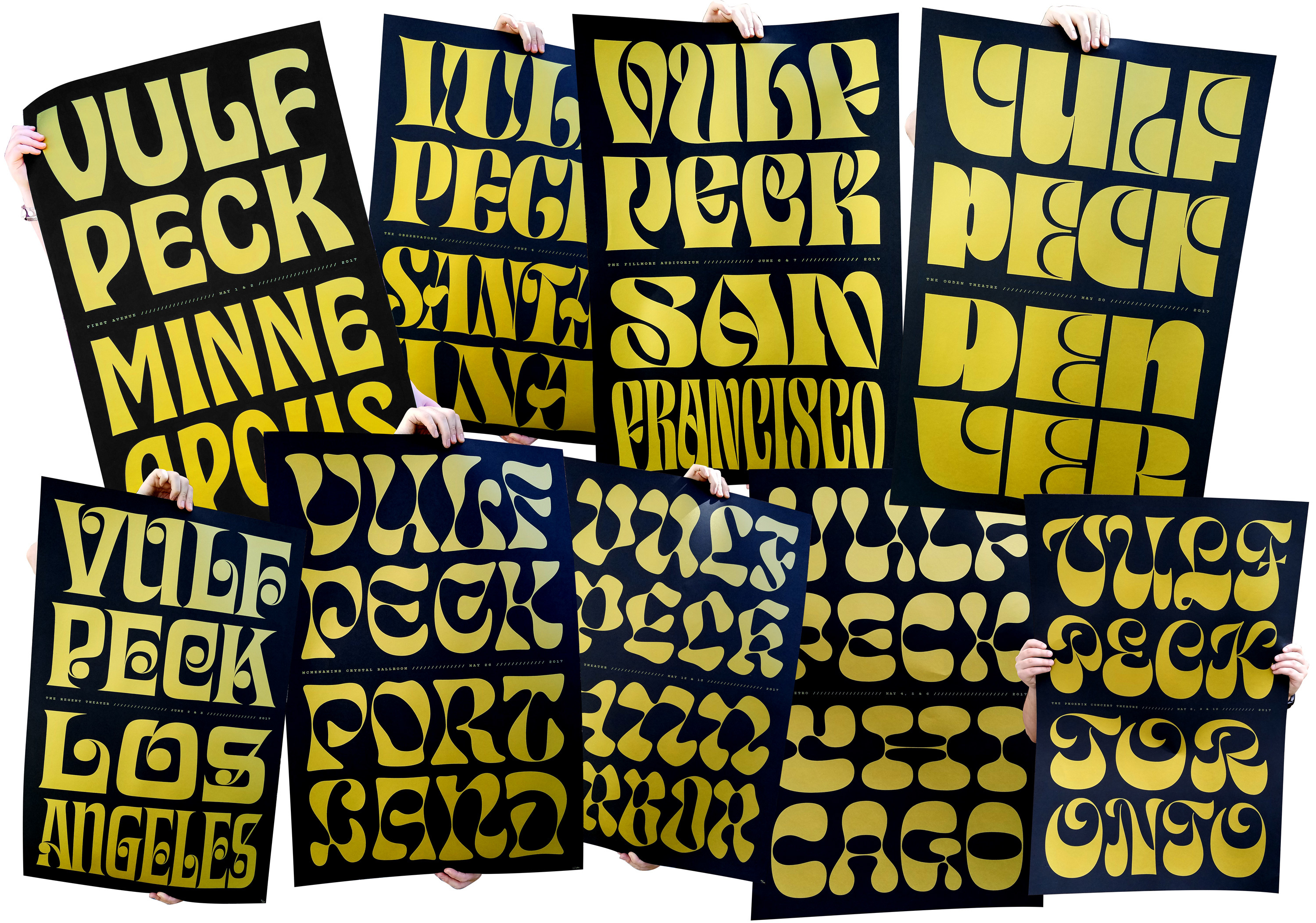
Chicago ultimately became Cheee.
“It’s easier to start with something than nothing.” This lesson I learned second-hand from Jesse Ragan, is as simple as it is profound. Creating nine interesting styles out of thin air would be a task too difficult for this job, and would ultimately lead to wildly inconsistent results. Instead, I began thumbing through my Photolettering and Dan X Solo specimens in search of my favorite fonts from the era in which Vulfpeck heavily mines. I was looking for things that were fun, but not insane, and had some amount of contrast that could be dialed up. If all the type in the series had the same thin measurement, they could read as a family of seemingly mismatched members.
Aldo Novarese: One of the dopest type designers that ever lived
Sintex is a design by the inimitable Aldo Novarese from the early 70s. I particularly enjoy the fact that Sintex occurs right in the middle of an insanely productive and diverse career. Looking at a list of his output from the 40s up until 1989 is like looking at a group of fonts designed by many people from all over the world.
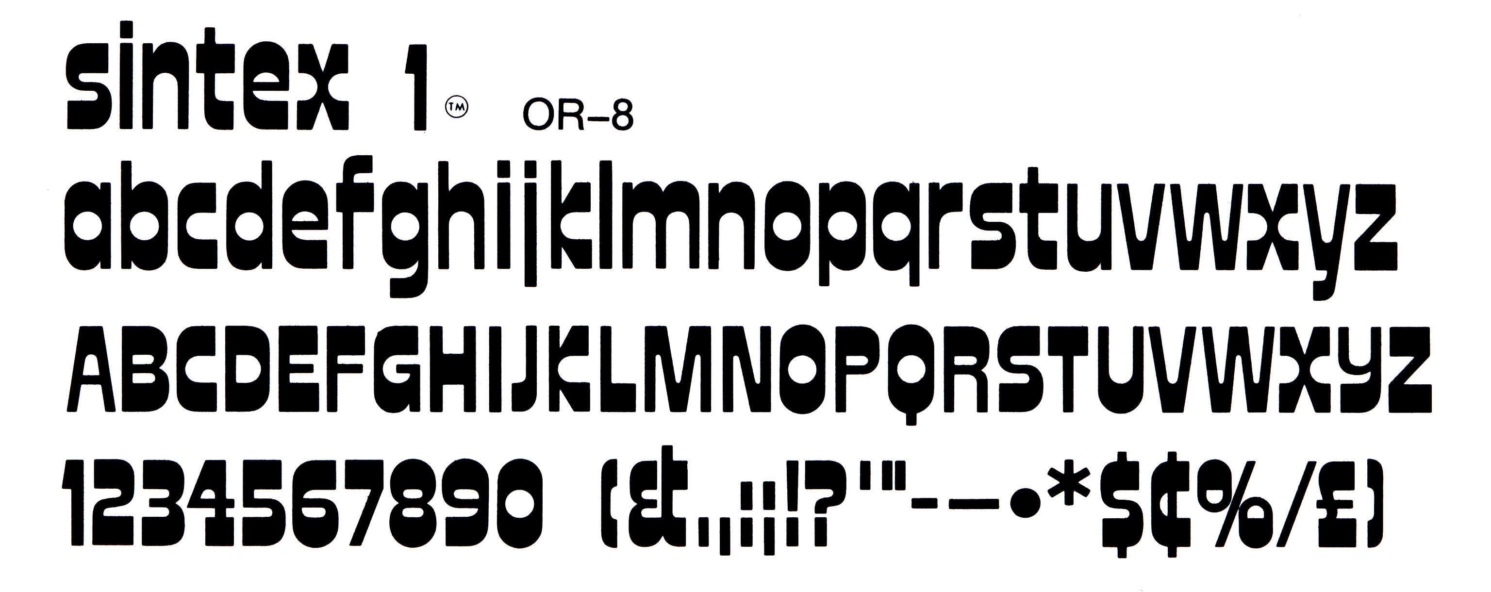
Sintex by Aldo Novarese, 1973. It was probably inspired by ITC Zipper, but with open more open shapes and vertical terminals on C, G, S, etc. Image provided courtesy of Letterform Archive.
The process with all the Vulf posters was to trace the source typeface in a way that produced some extreme thins. That seemed to not be quite enough in the case of Sintex, so the terminals were rounded as well.

The evolution from Sintex to Cheee is a leap, but super simple when thinking about the two steps involved: 1. Increase contrast and 2. Use only curves.
Future Fonts
The platform Travis Kochel, Lizy Gershenzon, and I had been working on for distributing fonts in progress was just getting off the ground, and I had a few things ready to go. Nervous about whether the library was big enough, I quickly began scanning my half-finished-fonts drawer for something that could expand into a full alphabet. The Vulfpeck Chicago poster seemed to fit this bill, and I threw together a set of capitals. Version 0.1 didn’t even have numbers. But it did have this alternate version of Y that was quickly deleted and forgotten about.

An early version before the Y was changed to a lowercase form for better spacing.
A Name
At this time, my nephew Clark was just beginning to talk, and pronounced the word “Cheese” as “Chee.” To name a font something with repeating letters is not ideal. Having those letters right next to each other makes it even worse. So to really make this name as terrible as I possibly could, I added a third e, and braced myself for the negative impact this could have on marketability.
Inspiration from memory
A few years back when I first read about Christian Shcwartz’s process of working on Duplicate, he described a process of recreating Roger Excoffon’s Antique Olive from memory. I loved the sound of that, because revivals that bring nothing new to the table seem less fun to create than solving some of the problems for yourself. With that in mind, I decided to not look at Sintex again, and let Cheee evolve into an expression of its own Cheee-ness.

Notable differences between Cheee and Sintex are evident in the F, P, R, 4, and &. It’s possible I would have just chosen the Sintex solution (if I had been looking at it), rather than finding the solution that is the most Cheee-Like.
Where do we go from here?
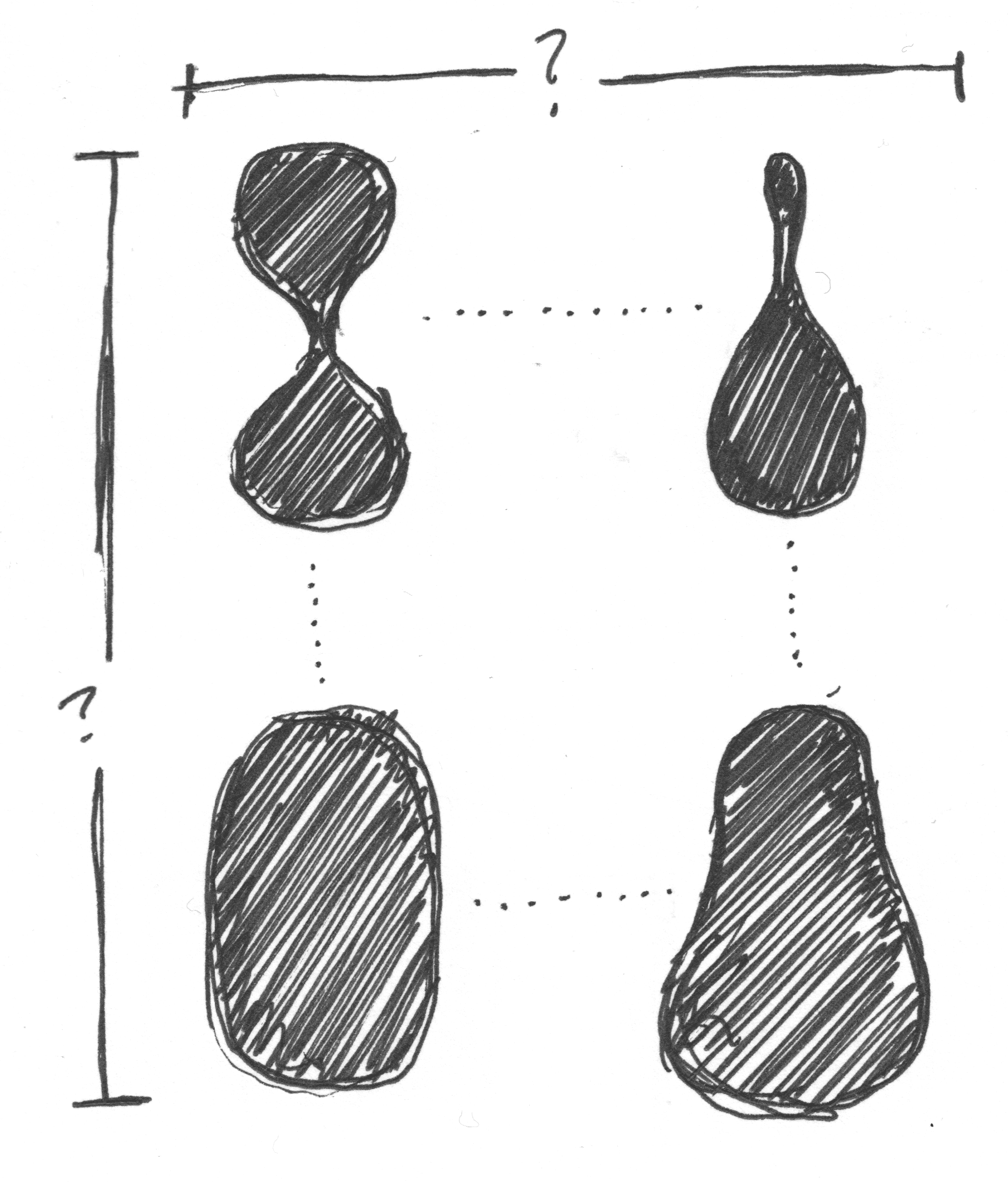
I began thinking about the most interesting axis for Cheee to have. The super thin verticals limited its use to exclusively huge sizes. Having control of the thins might make Cheee appropriate at not only humungous sizes, but also very large sizes. Then I got interested in
1. How much can I change the design with only two masters? (A “master” is a separate design that can “interpolate” or blend with another master to create intermediate styles). And
2. What also feels appropriate for a typeface already named “Cheee”? 3. How could I change multiple things at the same time? Weight, width, and contrast, or more?

For this exercise, I limited myself to using only the points that were already in Cheee, so the result could interpolate. With each letter, I tried to bring it the furthest distance possible away from the source.
The sketches that changed the feel completely were interesting, but I was actually just digging the H. It was simple, nice and plump, different enough from the first master, and gave thicker thins in the intermediate steps, making it useful for setting Cheee just a bit smaller.

This bold style seemed to be the furthest I could push another master while having it remain interpolatable with the original.

These two drawings (in grey) provided a nice gradation of adding weight, but my favorite thing was that it provided the ability to make the thins just a hair thicker. Having control over that axis greatly expanded Cheee’s usability.
Bottom heavy
When I’d look at things like Putty Bold, Scorpio & Hoopla, or Obese & Mania, I could see how close Cheee was to interpolating with a bottom heavy style. After a little sketching, I had a plan more or less in place, but I didn't know what to name the styles.
After posting this image to instagram, the winning solution came from my buddy Frank Grießhammer, who appropriately named the axes Yeast and Gravity.
Expanding the designspace
My personal hero, Florian Hardwig, took to Fonts in Use with this epic contribution featuring Mania with drips drawn onto the bottom of each letter. In the last paragraph, he had a very specific challenge for me. “Do you think we can talk James into adding a “Temperature” axis? After all, he likes his fonts drippin’!”
Florian was right, I have been and continue to be fond of dripping styles in all their variations, and I even once dreamed of a perpetually animating drip version of Hobeaux.
The problem was the workload involved. If this was to happen, it could only happen with Cheee, thanks to its capitals-only character set.
This was a fun exercise, and it remains the first variable font with a drip (or temperature) axis, but ultimately this drawing slog I set up for myself proved to be too daunting for anything besides the limited character set that Cheee supported.
Enlisting extra help
There was a ton of drawing to be done, but I was wrapped up in Ohno Blazeface, Vulf Sans, Obviously, and other typefaces that all stole my attention. Luckily, I was introduced to Alexis Boscariol, who deftly began extending the character set of all the masters.

We had to go through a couple different versions of glyphs like $ and {, but quickly enough, Alexis totally nailed it. It was the first time I hired some help this sort of work, and I was happy I did. I see this as a huge milestone in the history of Ohno.
Naming problems
Weight and width are the most conventional spectrums in type design, and they conveniently come with familiar names: Thin, Light, Regular, Medium, Bold, Black, etc. Unfortunately, for the Yeast and Gravity spectrum, there is no simple way to name the styles. At first I was using Lo Yeast, Med Yeast, and Hi Yeast to keep names brief. When the Gravity axis was added, this made names annoyingly long. Also, how would it work if we were going to have 5 or so instances on each axis?
To solve this problem, I looked to the recently released WHOA by Scribble Tone on Future Fonts. With style names like Shout, Groove, Slide, and Bump, it gives a clear sign to the user that this is not your standard Univers-style family. At first, I wanted to use only slang terms for marijuana for the 24 styles of Cheee, but I quickly realized there were not enough good ones. I remembered that some people called cannibus “sticky icky”, then thought of my friend with the nickname Sticky. At that point I decided to use nicknames from my friends and family. The names were almost completely random — the only logic is in the length of the names: as the style name gets shorter, the yeast goes up, so styles names written in their specified font can occupy a similar amount of horizontal space.

All these names actually belong to someone with the exception of Bingbong. I don’t know anyone named Bingbong.
A small addition
Although the designspace spanned a huge gamut of silliness, all the styles still needed to be set quite enormous to read well. When I teach at Type West, we often tell students working on display typefaces to include an additional style that can appropriately render the additional information required for logos, packaging, and the like. Establishment dates, addresses, phone numbers, websites, social media profile names, articles, prepositions, and conjunctions can all benefit from being set small. The problem was Cheee don’t do small.

I began iterating on an existing typeface that was low contrast and wide. First, rounding the terminals was a step in the right direction, but it felt so cold. Second, making those terminals more bulbous helped a bit. Third: Ditching everything, and instead starting with a stretched and rounded version of Hobeaux was hitting the right note, and made the previous iterations feel so sterile!

Finally, by adding a bit more mass on the horizontals, the Small style was hitting the appropriate weight, and amount of weirdness to be perfectly combined with the existing Cheee Styles.
The light at the end of Cheee Tunnel
Without Alexis’ help, this never would have been finished, and for that I’m incredibly grateful. Cheee has been fun at times, and other times nothing more than a test of my will. It’s taken much longer than someone might expect, given how silly it is. My hope is that Cheee is continues to be useful for years to come, and serves as a testament to taking dumb ideas seriously.
