In my head and my heart, the headline reigns supreme. I will never have a problem starting a display font, a logotype, or some huge sign with the sole purpose of commanding attention. Although it might not be obvious, I have just as much respect for the lower end off the hierarchy, and I desperately cling to the belief that everything on a page should get along in some way. That’s why whenever I have to add the “Established [date]” or “purveyors of” to some lock up, I can’t just set it in Sackers and call it a day. The typefaces that draw me in have a lot of soul, and their supporting cast should as well.
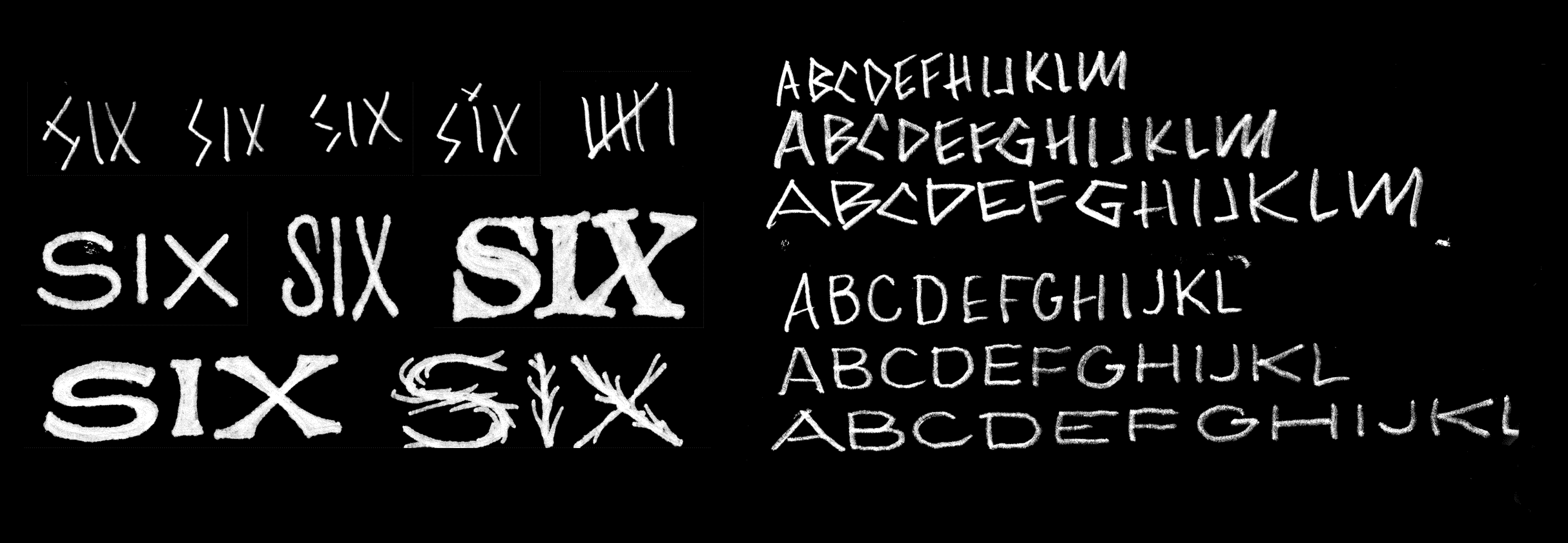
The first sketches that eventually turned into a multiple width typeface for chef Ricky Odbert’s Six Test Kitchen.
I first started playing with these sorts of wide styles when a new restaurant reached out in need of a custom typeface. We developed a five style family, ranging from extremely condensed, to extremely wide widths. The multiple widths could corresponded to the size off the dish in the menu, but be combined for stylistic reasons elsewhere in the identity.
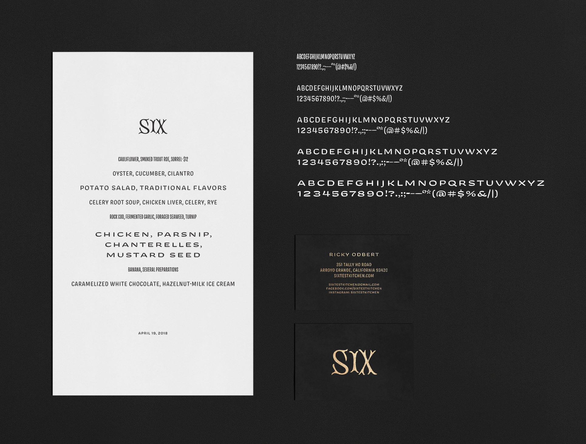
The custom typeface for Six Test Kitchen. Five widths of pure luxury!
Through this project, I fell in love with wide type at small sizes, and I realized how well wider styles can work when paired with display font set significantly bigger. The wide shapes allow the counters to breath, making it feel bigger because it is bigger. I transformed this project into a companion style for Viktor Script, and the two got along quite nicely. I loved that idea—that a typeface has the big, fully realized expression of itself, as well as a little buddy for smaller text. Hobeaux Rococeaux has a small style, as does Cheee. But when I started working on Beastly, things went in an unexpected direction.

I could talk your ear off about all the OpenType features required to get the nice little caps on the end of each line, but frankly, I forgot how they work.
The main objective for Beastly Rules was to get text appearing inside of the ornament. I hadn’t figured out what that style was going to be, until I started messing around with Viktor Script Caps, removing all traces of the pen, and getting subtle concavity into each stroke. The flared terminals were reminiscent of American signpainting, which helped it convey some much needed warmth.
To build that font, I had to first build a normal all-caps font before I resized it for use inside of a border.

The first version of Compadre Wide. The waist was still noticeably low—a trace of its previous encarnation as Viktor Script Caps.
I used this typeface a lot when I was working on random projects for friends, or in the event that I needed something to accompany a piece of lettering. I was amazed at how often it became a go-to. The best example of this was the Typographics graphic I did back in 2017.

This single lettering job was the impetus for years of type design.
I don’t know why that Typographics job seemed to launch so many type projects. Ohno Fatface was the first experiment. That quickly transformed into Ohno Blazeface, for which I also drew italics. Then came Beastly, which was essentially a reverse contrast version of Fatface. Finally, those have all been finished, but there is one supporting player that was collecting dust on my hard-drive for too long.
A small idea
After a while, it became painfully obviousl that Compadre is a useful typeface for me, so it probably could be for others as well. Unfortunately, there were limitless options. Do I add multiple weights? A lowercase? Does it need italics? Should I make a script version? After much deliberation, I decided it was pretty extreme in the width department, so I wanted a way to tone that down. I didn’t ever feel the need to alter its weight, so I decided to lock as many variables as possible, and just focus on a minimal family that would be incredibly simple to use. No alternates, no fancy ligatures, just four widths that did what you want them to.

Compadre supporting a bunch of Ohno Classics.
Compadre taught me that utility has almost nothing to do with scope. More bells and whistles does’t mean better, and I love to think about the concept of typeface as time saver. I occasionally indulge in delusions of designers scouring their font libraries for hours, with dozens of type specimens stacked high on their desk. The reality is less romantic: decisions happens fast.
Compadre isn’t right for everything, but it’s right for quite a bit, and could definitely find a favorable position in your list of go-tos. They have enough warmth to pair effortlessly with Ohno display fonts, and hopefully others you already have in your library. I hope you have fun putting these capitals to work. If I’ve done my job, it shouldn’t be hard.