Click here for the process of making Degular Mono.
In spring of 2019, I tweeted out a questionnaire that was as simple as possible: 1. Ever purchased anything from Ohno? 2. What the best thing about Ohno? 3. What’s the worst thing? I was most interested in the responses to question three, and one answer in particular echoed in my mind for months.
“It would be great to be able to use an Ohno font more than once.”
Ouch.
How do you name your typefaces?
My studio mate and long-time buddy Kel and I were walking out of Sparky’s Giant Burgers in Oakland, California. We had just polished off an extremely affordable lunch, and were singing the praises of this legendary East Bay eatery. Kel summed it up by saying, “The burgers are pretty good here, nothing incredible, just a good, regular degular burger.”
Kel’s affinity for and impeccable use of slang had stopped me in my tracks before, but nothing hit quite like this. Immediately, I knew I had to return to that unfinished sans project, and bring it to the finish line.
Becoming a hypocrite
It wasn’t so long ago that I made every effort to curb the use of grotesques in graphic design. From my perspective, their abundance is similar to turning on the radio, and hearing techno on every station. Sure, techno is ok, but why should a single genre dominate so heavily? I tried to translate this idea into a twitter-friendly format, and it became my only viral tweet.
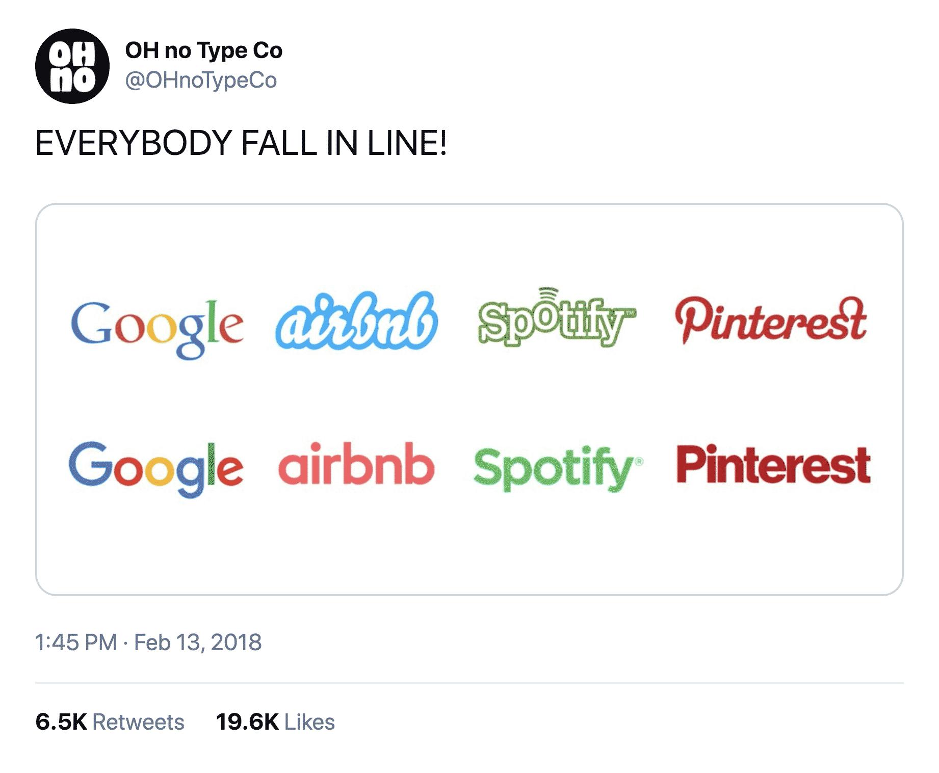
I have been on Twitter for 10 years, and have exactly one tweet that caught on.
The virality was inspiring to me. Maybe people were becoming more aware that mega-corporations assume similar voices to leverage the power of their peers, and maybe that could lead to a backlash of rogue designers embracing the chutzpah of the typographically adventurous. But one night, my mind was changed.
I had spent the day putting off lunch while feverishly trying to finish Ohno Blazeface Italic from a coffeeshop. Driving home, the hunger was too much to bear, but in the nick of time, the familiar glow of red Arial letters shining like a beacon in the night entered my periphery and I quickly u-turned, and parked beneath the TAQUERIA sign deep within a strip mall that had just executed its sole function. While inhaling my dinner, I confronted the harsh reality that Arial (and all similar grotesques) work. They work on tired and hungry drivers. They work from 100 yards away, with a terrible vantage point. Thinking about my distaste for conventional sans, I ate my burrito, and my words along with it.
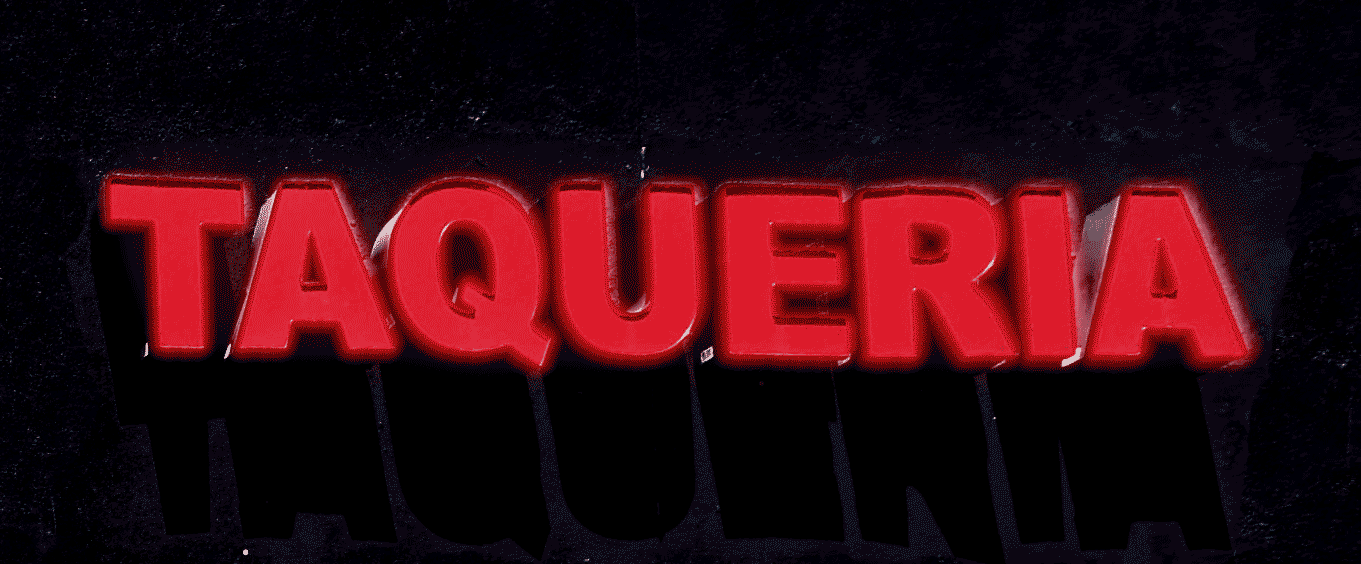
The backlit, Arial caps, dimensional sign that spoke to my soul, and speaks to me still. Recreated from memory.
Save As...
I came back to Covik Sans, which was already a distillation of many of the lessons I took away from Type Media. I did a Save As and began ironing out all traces of the pen in a new file called Foundation Sans. It was a boring name, for what I hoped to be a boring typeface.

I wasn't sure whether to go with joints that grew out of the stems, or joints that overlapped. In moments of self-doubt, I remember the mantra, “Don’t look aloof, make yourself a proof.”
I was trying to figure out how to approach the joints. The humanist method felt more interesting, and maintained a nice rectilinear texture in paragraphs, but at every crossroads, I tried my best to steer away from what I would normally do.
The most interesting part was that it was still fun. I was totally enjoying stretching my comfort zone, and drawing in a way that shunned attention, rather than commanded it. As it turned out, that agrees with the science. Cal Newport, author of So Good They Can’t Ignore You, puts it this way:
"We don’t have much evidence that matching your job to a pre-existing interest makes you more likely to find that work satisfying. The properties we know lead people to enjoy their work — such as autonomy, mastery, and relationships — have little to do with whether or not the work matches an established inclination."
My established inclination here would be unusual display fonts, but the autonomy and mastery required to produce them is exactly the same whether I’m working on that, or something decidedly more neutral.
With that in mind, I checked my ego at the door, and simply tried to do a good job of the first leg of work: creating the roman family. I renamed the project Disclaimer, in an effort to focus the project more on small optical sizes.
Save As... Again!

Here there are only two masters (complete drawings at either end of the spectrum), and you see some inconsistencies in the middle weights like the crossbars on e and a. Also, Kel (my former student) told me this is not enough difference between weights, and he was right! I later switched from 8 weights to 7.
When I paired this with Vulf Sans as the companion display font, the inconsistency in the terminals became really distracting, and I began thinking about how to reconcile that. My first inclination was to throw tons of alternates at it!

Three kinds of terminals that would be available via stylistic sets. 1. Completely horizontal. 2. More open, at an angle. 3. Very open, completely vertical. This kind of experimenting can be tedious, but it helps if I chant my mantra, “Make a proof, you frickin’ goof!”
This simple change was so fundamental to the feeling of the typeface, that it began to derail my initial plan of letting Foundation Sans be the most succinct expression of itself. And besides, I had already done this terminal switching move with Obviously.

Hold onto your butts, a monumental change here! I committed to the more-open-but-not-completely-open angled terminals that seemed to fit within the Ohno catalog a bit better.
Disclaimer sat on my hard drive for quite a while in its unfinished state, and although I wasn’t actively working on it, I did find myself using it from time to time. This is around the time that Kel took me to Sparky’s, gave me the name Degular, and my enthusiasm was renewed.
When coming back to the project with fresh eyes, I wondered if I could add an optical size axis, since the name was no longer married to the idea of small optical sizes.
My beloved optical size axis
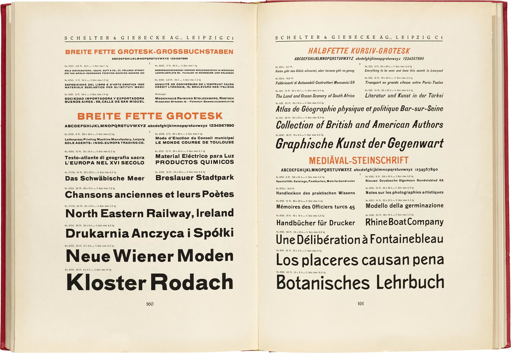
Why do the pages of old specimens look so good? Not just the samples, but the descriptions, titles, and folios too. One answer is the smell of the book. Another is the feel of the paper. A third answer: optical sizes. Breitte Fette Grotesk, Schelter & Giesecke, ca. 1925. Image courtesy Letterform Archive. Did this design influence the design of Degular? Only unintentionally.
I love designing type with optical sizes, and doing graphic design work that uses said fonts. A respect for the intended size of a font is something that truly separates digital design, performed with infinitely scaleable vectors, from analog design, performed with physical type at fixed sizes. I used to puzzle over why type specimens from the days of letterpress type look so incredibly good, while any piece of run-of-the-mill modern design paled in comparison.
Also, despite being big-time hater of all things Helvetica, I have to admit my fondness for its display usage. Specifically when it was super tightly spaced, with minimal leading.
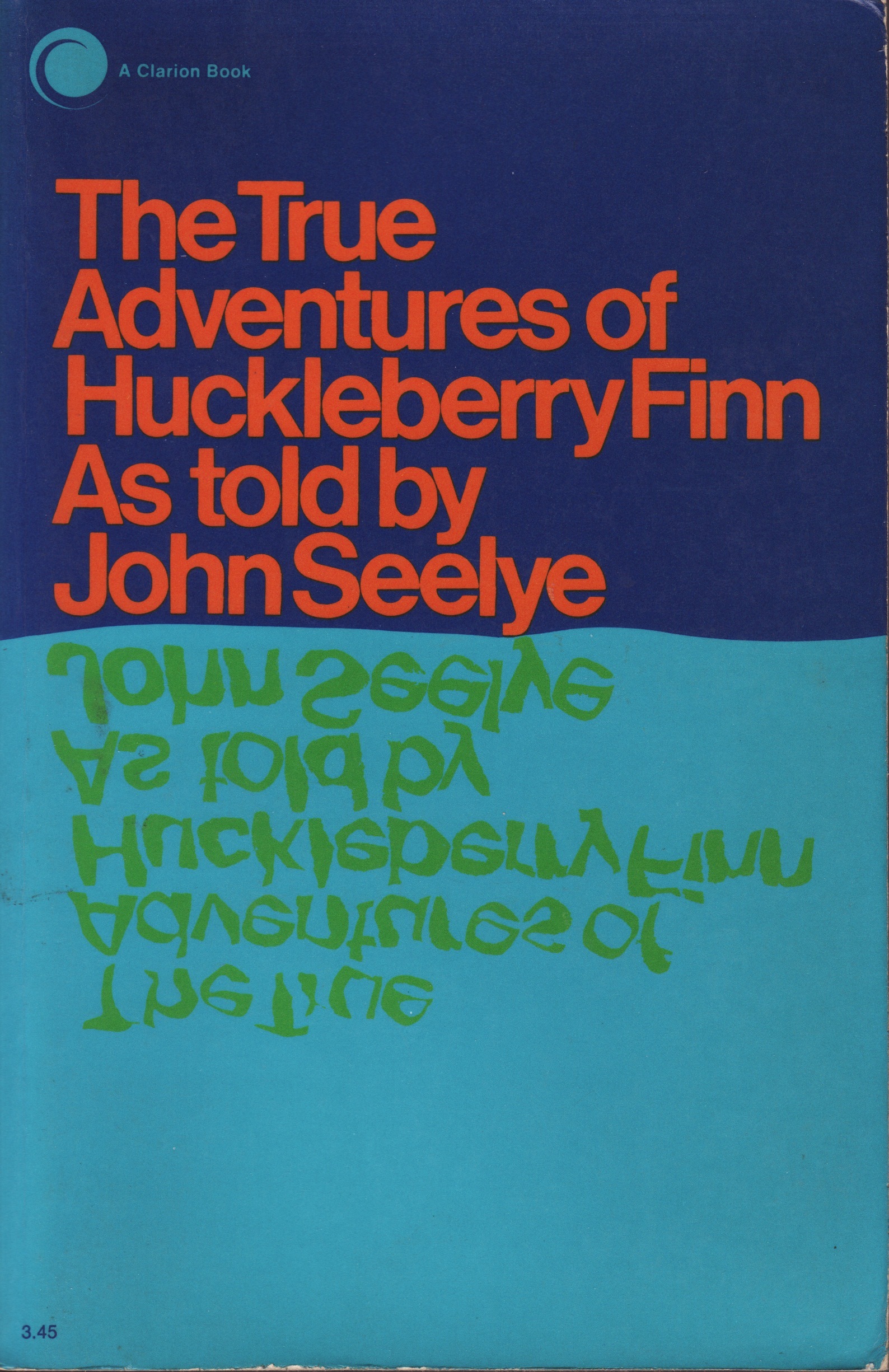
Helvetica isn’t all bad, in fact a ton of stuff from early on warms my heart as much as anything else. This particular use (contributed to Fonts In Use by Chris Parcell) is a perfect summary of Good Helvetica. Tight spacing, tight leading, printed around 1970, and a little reflection to fuck it up.

I found myself consistently tracking in Degular when I did my first tests of using it for display. So why not bake that super tight spacing into the font?
The big difference between the display and text styles in Degular came in the apertures, or open whitespaces found on letters like a, c, e, and s. I made an effort close them up to an absurd degree, and they created little shards of whitespace that seemed to dazzle up the texture of words. These tiny windows in the black weight made it feel even bolder, like the shapes were just about to close in on themselves.

The apertures, a main difference between text and display.
The ink traps are an exaggerated and hard-working feature of the text that is quite noticeable when zooming in, but hardly visible when reading paragraphs at actual size. For that reason, the ink traps in the display needed to also be hardly visible when viewing them at their actual size.

The size of the ink trap in the text styles is about 40 units, which shrinks to about 2 units in the display styles.
While the ink trap changed quite a bit, the joints stayed thin. This is a recent trend in type design that I'm quite fond of. I first saw this idea taken to the extreme with the fantastic typeface Media Sans from Production Type. I enjoyed learning that joints are different than the “thins” of a typeface, and can be treated as such. You can have something with low contrast, and super thin joints that shimmer like a lake under the midnight moon.

I love Media Sans from Production Type, I just wish the descenders were shorter!
Finishing touches
The only thing left to do was add a handful of alternates. It’s a slippery slope in alternateland, and as I previously stated, it was not my intention to solve problems via alternates. The single storey a and g were no-brainers, as I had to have them in the italic styles. After that, a simplified version of G and t was all that I deemed necessary. I wish I saw alternates in use more often, so please be aware that these are here awaiting your use!

Alternates for G, a, g, and t.
Variable fun
A huge bonus of working on a grotesque is the relatively minute differences between roman and italic. That means you can fit them all within the same variable font. With some substitutions the italic forms and a and g show up automatically, when you push the slant past 2 degrees.
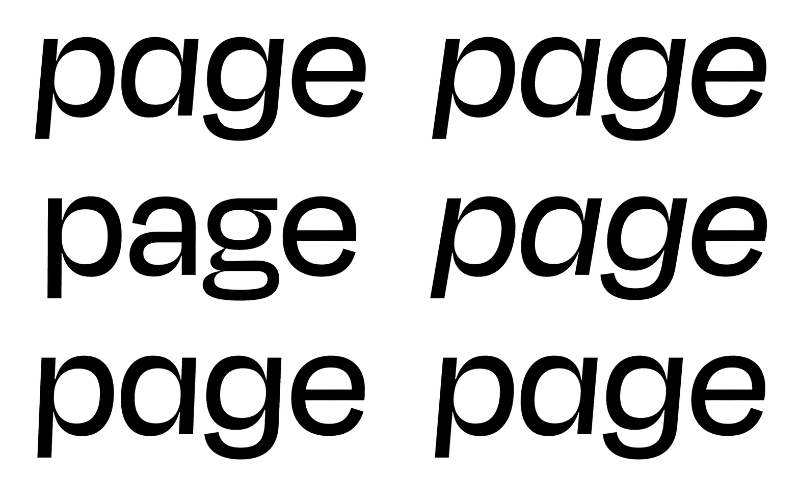
The italic forms of a and g show up automatically in Degular Variable when the slant is pushed beyond 2°.
Failure
When I began finishing up the work on these fonts, and showing them to my friends, their reaction was not at all what I had anticipated. They were saying things like, “Wild,” and, “I can totally see your hand in this.” In an effort to make something super bland and devoid of emotion, I had completely failed. I wasn’t able to remove myself from the work as much as Kai Bernau or Kris Sowersby, but in *trying* to do that, I hopefully created something barely unique.
I wanted to do a good job, and I would be lying if I said this project isn’t in some way financially motivated. Corporations big and small overwhelmingly favor low-contrast geo-grotesques, and as a small business, I have to throw my hat in the ring. Degular is a conventional typeface that subsidizes work on unconventional typefaces. The other bonus: it’s the first Ohno typeface you can use more than once!