What do you do when you have an award-winning*, all-time**, best seller*** like Degular on your hands? You make a darn sequel!
Have you guys seen Spider-Man: Into the Spider-Verse? Incredible film. Probably one of my favorites. When it came out in 2018, a lot of people were saying, "do we really need another Spider-man movie?!". But then they saw it. And even though we all knew the story, its fresh take and its absolutely ground-breaking visuals won us over. And audiences, myself included, were begging for more. And just a few days ago, Sony gave it to us. Spider-Man: Across the Spider-Verse is everything we wanted, amped up to 11. AND there's more on the way. I'm so excited. Anyway, what is this article about, again? Degular Mono. Right. 😉
There have been sequels and prequels to typefaces long before we started hearing the term "Cinematic Universe" ad nauseam. When a typeface is a hit for a foundry, it's natural to expand that franchise in new directions. Usually it means adding more weights, widths, or new language support, but sometimes foundries get real weird with it. Futura is one of the most notable examples; it was a massive hit when Bauer released it in 1927, and in the following years the various owners (or copy cats) of Futura kept adding more and more to it. In 1954, someone made an honest-to-God Futura Script. I'm not kidding. They took one look at the most noted geometric sans serif in history and thought "I can pull off a script version of that". That’s how powerful the franchise is! And the strangest thing is, it kinda works?
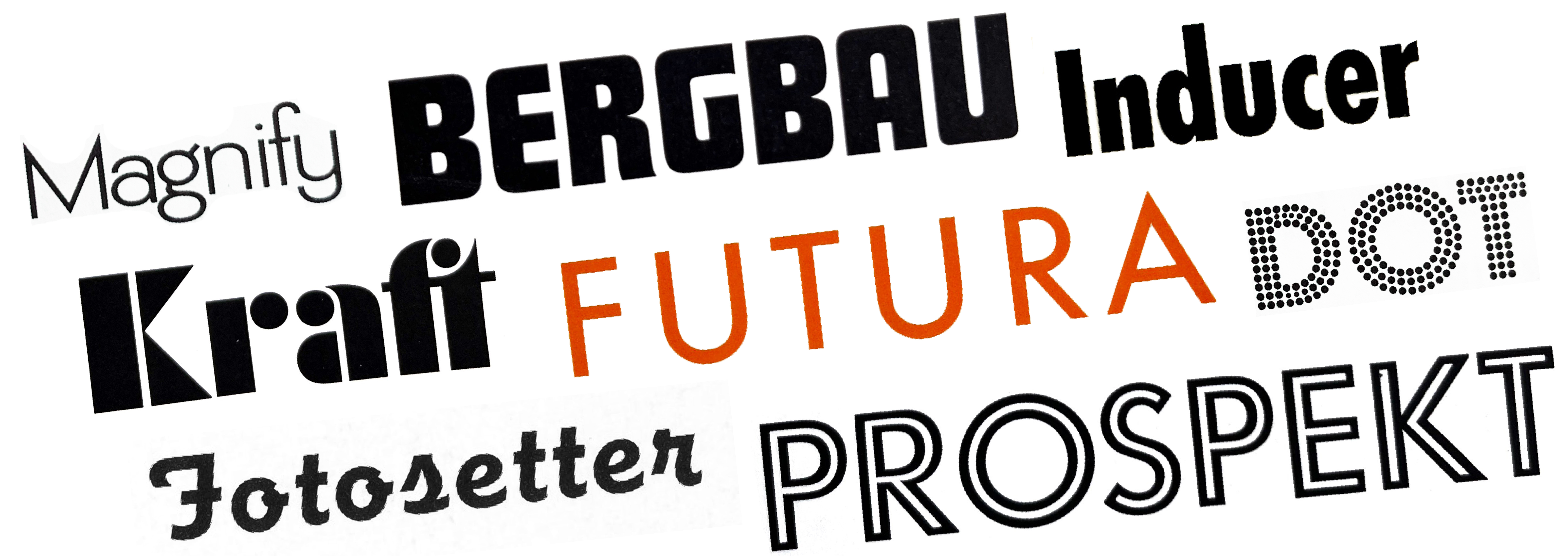
Can you believe all these are "Futura"?! "Kraft" is Futura Black, "Bergbau" is Futura Display, "Prospeckt" is Futura Inline and "Inducer" is Futura Condensed, which are all offshoots of the original released by Bauer. (Photos from the Antiqua und Kursiv-Shcriften specimen book by Bauersche Gießerei). "Fotosetter" is Fotosetter Futura Demibold Script by Intertype. "Magnify" is Futura Alternate 1 1/2, and "Dot" is Futura Dot, both of which can be found in the Alphabet Thesaurus Vol. 3 by Photo-Lettering Inc. (Photo credits: Herb Lubalin Study Center via Flickr, and us!)
Well, if we ever make a Degular Script I will eat my hat (just kidding, I'll probably just delete this sentence from our blog — no one will know), but what we are releasing today is Degular Mono. It's like Degular Text, but every glyph is all on one width. It has sort of a tech-y feel, a little bit of a typewriter feel, but it definitely still feels 100% Degular. It's the quirky off-beat sequel you've been waiting for from the Degular Cinematic Universe.
A Friend Indeed
When it comes to monospace typefaces, there are 3 different kinds. The first are typefaces that actually try to emulate the appearance of typewriter typefaces. We think the best entry into this category is LTR NCND by Erik van Blokland, but we also humbly submit our own Vulf Mono for your consideration.
The second kind are monospace typefaces specifically made for code editing, of which there are many to choose from these days. Many of them, like David Jonathan Ross’ Input, are customizable to the personal needs of the programmer, and some like Aaron Bell's Cascadia Code even include highly controversial code ligatures. We're not touching those. If you want code ligatures, please go check out some of the many, many other options.
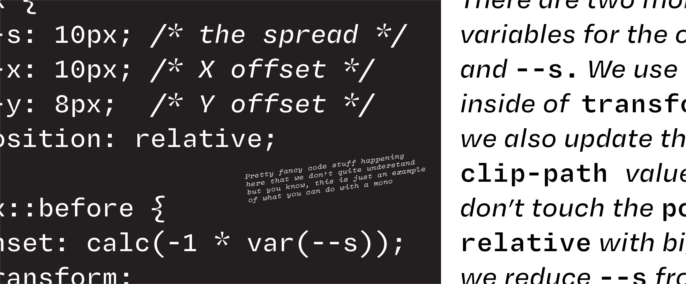
Sometimes monos are used for code... and sure Degular Mono can do that if you want, but it's better as a companion to Degular Text.
The third kind are what I call companion monos, which is the
category Degular Mono falls into. Companion monos exist somewhere in
between a brand new typeface and a variation of an existing typeface
used for emphasis, like an italic is for a roman. It’s pretty common
these days to have a “Mono” or “Code” option next to the standard B for bold and I for italic buttons at the top of a text editor or a chat box. In the Markdown syntax, it’s just as easy to use `backticks` to monospace something as it is to use **asterisks** or _underscores_ to bold or italicize it.
And so the requirements for designing a companion mono are not too dissimilar to the requirements of an italic — make it different enough so it can be used to differentiate information, but similar enough that it still has the same feeling. We think we nailed it with Degular Mono.
There are glyphs in Degular Mono that really don't look that different from Degular Text at all, but then there are some that needed a total overhaul, especially in the darker weights. Letters are all naturally different widths in a "normal" typeface, but when you're trying to fit them all into the same width, some need to get really really skinny, like the M and æ, and some need to get way wider, like the i, l and r. There’s also the fun part of picking the various “disambiguating” forms that are common in a mono, so check out how different IliO0 looks in Degular Mono vs Degular Text.
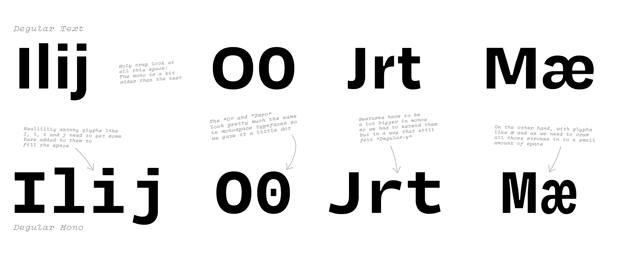
What do ya think? Are these disambiguated enough for you? (jk, we know they are, we just like saying the word "disambiguated")
Hail to Jelly Donuts
Making a mono all starts with choosing a width. You need a single width that would work for most glyphs; not too narrow so as to avoid squishing too many glyphs, but also not too wide. You also need to make sure you're choosing a width that works for all weights — in Degular Mono we need to go from a very light Thin weight to a very dense Black weight, all while making sure the Regular hits the sweet spot because it'll be used the most.
Finding the Goldilocks number can be a lot of work if you're starting a mono from scratch, but thankfully we had the full Degular design space to play with to help us rapidly prototype widths.
When you're first working out a typeface, rapid prototyping is key. It especially made a lot of sense with Degular Mono, because we needed to make choices on general width and tracking (the space between the glyphs), without wanting to do a whole lot of manual work. The idea was to get a prototype typeface that might be a little rough around the edges, but had the typographic color we wanted, and then we would go in and clean up afterwards.
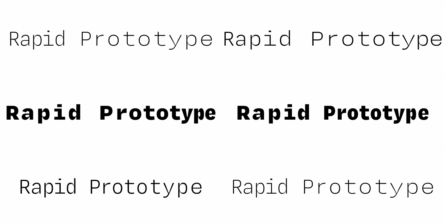
We built a variable font to rapidly prototype the weight, width, and tracking of our proto-mono in-place with the rest of Degular.
But we were not expecting how great the prototypes would turn out. Within a few minutes we had a full variable font that allowed us to adjust the different options in context. Within a few hours we had made our decision. Simple as that!
This was made possible by a severely underrated python library written by Loïc Sander called MutatorScale. Based on MutatorMath, it allows us to scale glyphs while keeping stroke weights constant, enabling us (in this case) to adjust the width of glyphs without the distortions that come from a standard affine transformation.
The last thing we noticed is that if we scaled all the glyphs in every weight to the same width, either the Thin wound up looking too wide or the Black was too condensed. Neither was great because we wanted all the weights to feel like they're about the same width as each other and to match their equivalent weight in Degular Text. But that's the issue with a mono isn't it?! They all have to be the same width! And unfortunately you have to concede to the darker end of the weight range because it needs all the help it can get with glyphs like m and W.
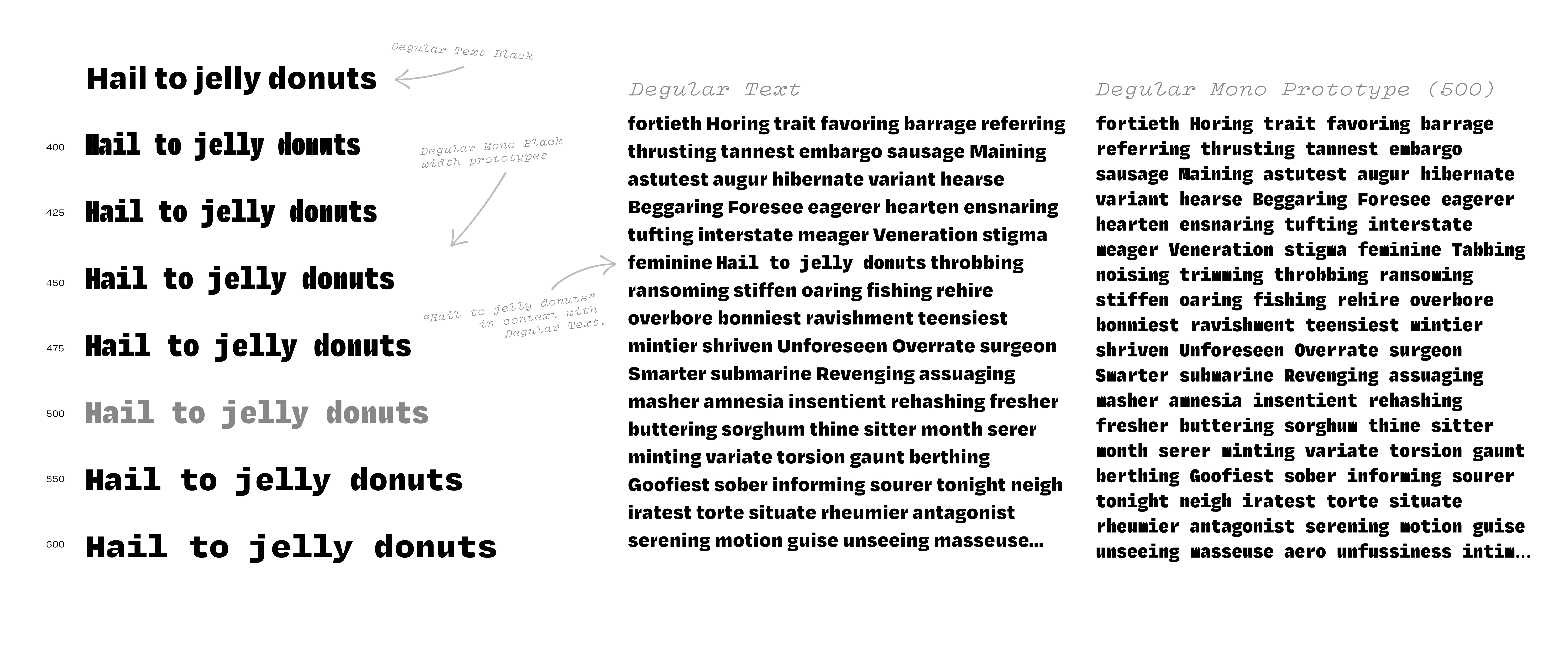
On the left side of the image are rapid width prototypes (the numbers indicating glyph widths). On the right there's one column of Degular Text and one column of a Degular Mono prototype. If you look closely in the Degular Text column, you'll spot "Hail to jelly donuts" in Degular Mono to see how the width prototype looks in context with the OG.
Our solution was to add some built-in tracking between the glyphs, decreasing as the font gains weight. So the Thin is set on a 515 unit width with +70 units of built-in tracking, and the Black is set on a 565 unit width with just +20 units of tracking, all still adding up to our final chosen width of 585 units!
The next step in the process is unenviable: adjusting all those glyphs that we just couldn't keep from getting stretched or squished in the process. And for that, let's throw it over to Jamie!
Squish 'n Stretch
Jamie: Well I can start off by saying that designing the glyphs like i, j, f and t to be wider was a lot more fun than getting the squished glyphs like m, M, w, and W to be more narrow, but that’s our job and we love our job!
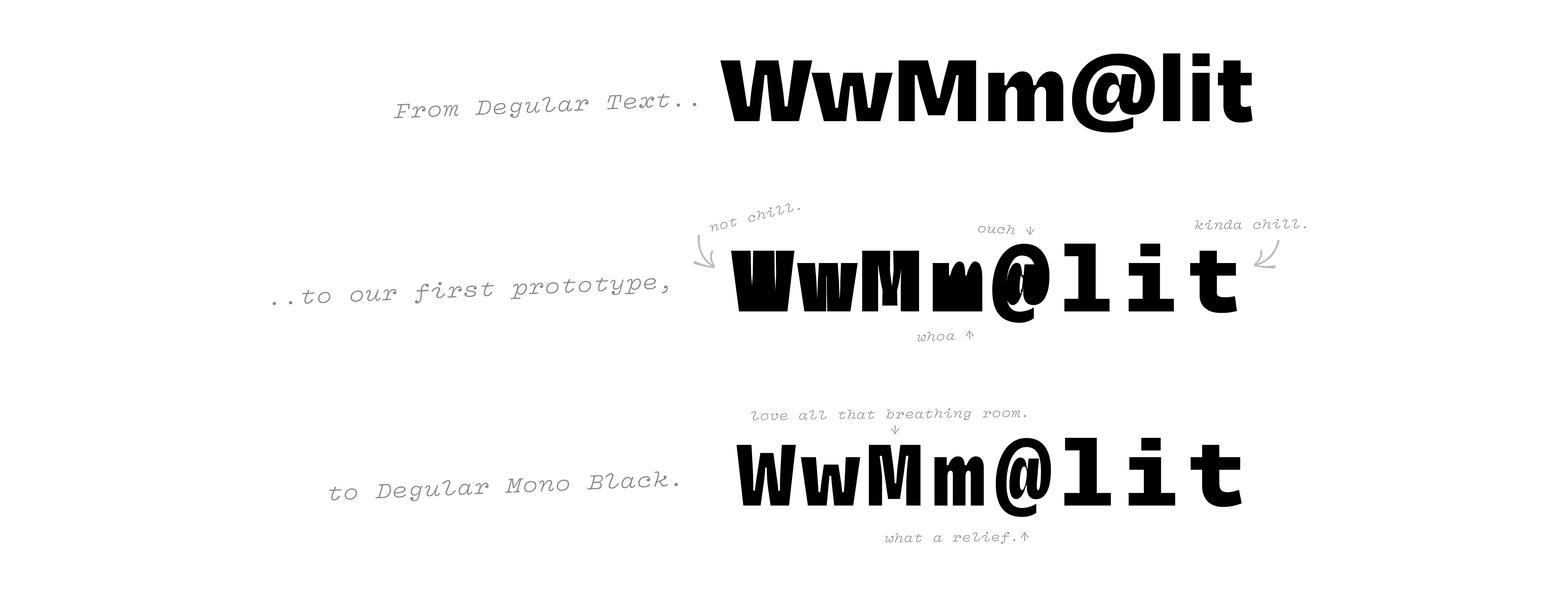
We were actually pretty impressed by that lowercase m in the prototype, but we will save that one for another day. This is still Degular, after all.
The real challenge in working with the wide glyphs is that you need to learn to trust your eyes over the ruler tool. The important thing is to make sure that they visually hold the same weight and space as the other glyphs while in actuality their stem weights can be much different. Getting the negative space in the interior of the M to be consistent with the rest of the font when viewed in context was really hard. The key to making sure it was working was to constantly have the RoboFont Space Center open, and to look at it in really small sizes while working. James, Colin and I all worked on these together, and there was nothing more rewarding than finally marking them in my favorite color green, for done. Then we had to do it all again for the small caps!
Back to you, Colin!
Colin: Oh yeah, did I mention this font has Small Caps?! Not a lot of monospaced typefaces have them. But, we find them extremely helpful for use in editorial contexts (as well as old-style figures, which Degular Mono also has) so we threw them in, just as a treat for you guys.
$> At your command(line) ▓
Speaking of treats, as a final cherry on top of Degular Mono, we included the full unicode block of box drawing glyphs. These allow you to create your own text-based interfaces perfect for use in your next “hacking into the mainframe” scene from a TV procedural.
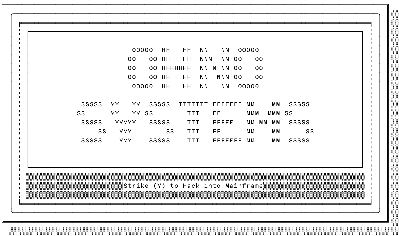
We highly recommend the app Monodraw by Helftone for making these sorts of assemblages.
Box drawing glyphs tend to look the same from mono to mono, but what is really important is that they conform to the specific proportions of your typeface, so you don’t get gaps or odd spacing that disrupts their appearance. The box drawing glyphs were made by a script based on the one Adobe Type made available from their Source Code Pro project. Thanks, guys!
The End?
We hope you liked this trip Into the Degular-Verse! It might not be the last installment! We really want to thank all of you who have bought Degular over the past 3 years, it really has meant so much to our growing company, and has enabled us to make many ill-advised typefaces (which we hope you also like!).
* Degular has won first place... in our hearts 🖤
** All-time... since 2020
*** Best selling… for us