Half of the the time, the origin of a typeface is really obvious. For instance with my first Ohno typeface, Hobeaux, I knew exactly what it was trying to do, right from the beginning. But as I work on more typefaces, like this one, our twenty-second, I’m finding it fun to have a more abstract or nebulous origin.
Lighter is the new Bolder
Around 2019, I started sketching in a monolinear fashion on my iPad. I was trying to see how quickly I could make a word that looked somewhat typographic—a sort of middle ground in between lettering (drawn) and calligraphy (written). I found the most effective trait to be confidence. A confident line is where it begins, and where it ends. Both things are clear decisions, and that doesn’t leave any room for debate. An insecure line wanders, wiggles with trepidation, and trails off indecisively. The shortcut to a confident line I found was to use Procreate and specifically the primitive shapes function, which allows you to quickly draw straight lines, perfect circles, and ellipses. Frankensteining these shapes together gets a word out was less effort than any other method I’ve had success with.
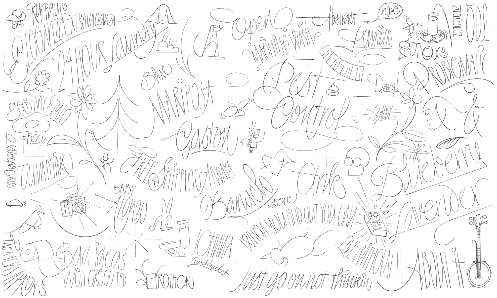
This method of digital sketching on the iPad in Procreate was also the genesis of our typeface Irregardless.
This sketching exploration coincided with a trip down memory lane of some of the display typefaces we have done here at Ohno. Everything was so bold! Why? Is it my fondness for the designer Othmar Motter aka Meister der Extrabold? Is it the fact that advertising and branding seem to prioritize positive space? Or do I simply enjoy the challenge of drawing things as boldly as possible? I had no idea, but whenever a tendency is discovered, it’s healthy to consider the opposite. My new challenge: To make an impact while keeping things light.
I immediately came back to my monolinear sketches and examined a few details that didn’t make their way into Irregardless: A broad nib contrast model, ornate detailing, and an art nouveau influence. That seemed to be enough to go on, and it was at that moment that my sister-in-law asked for a baby announcement.
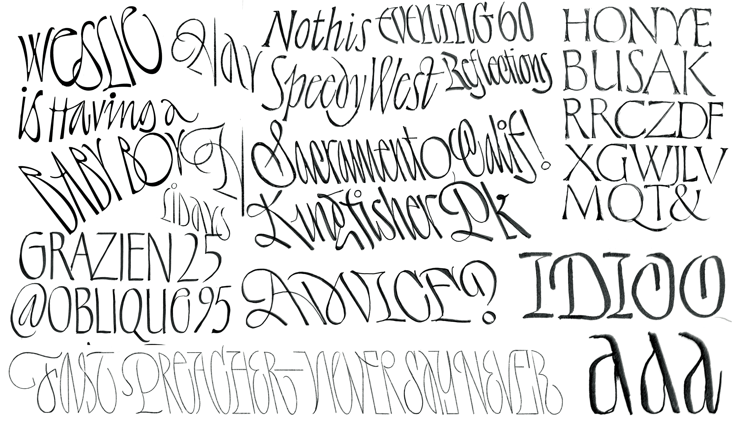
A more expansive iteration on the previous sketches, and an introduction of contrast and the pen angle.
It’s always funny when I go diving into my old sketchbooks to see at what point I thought it was best to jump on the computer and figure out these problems in digital form. It seems that more and more, drawing on the computer is so natural that it's easy for me to "sketch" in Robofont, even though at that point it looks more like drawing. It’s a shame really, that I have a job where I could be using analog tools, and I’m choosing to work digitally. The indulgence of analog work should be embraced! But eventually I get the feeling that things could go quicker on the computer, so I jump.

The capitals came fairly quickly, and each answer was obvious. The R was the only glyph that gave me significant trouble, as the first version created too chaotic a texture. The straight leg then pushed everything else too far away, and then finally the classic Art Nouveau or Hobo R seemed to space nicely, and fit stylistically.

After an expressive single style was created (left), I stripped it of all the frills, and made a companion style (right). It was still just as high-contrast and light, but everything got a lot more simplified.
A Regrettable Choice
This was one of the most difficult fonts to name in our 7 year history.
Our list of potential names included Ennui, Foible, Malaprop, Menthol, Misgive, Misanthrope, Xylem, Qualm, Impolite, Manners, Dissociate, Gravure, Calamity, Spite, Deceit, Contempt, Disdain, Diaphane, Casement, Gravicide, Lament, Feign, Dispirit, Pariah, Venge, Sympathy, Malinger, Slander, Rumours, Shade, Maladroit, Malevophane, Filament, Vanity, Attrocious, Fiend, Heinous, Unspeak, Philophane, Enclave, Ingrid, Rhain, Graves, Ageless, Apleat, Contraire, Ashade, Please, Desperate, Relax, and Fleetwood Mac.

At one point, the naming process became so bleak that I had to attempt a Venn diagram that combined a few of the ideas we were circling around. Ultimately, this led… nowhere.
It was too obvious to hint at an Art Nouveau or French influence, and I didn’t want something that sounded too much like a font name. Does that make sense? Eventually the word Regrets felt right, was a good combination of letters, and most importantly, was available. Our style names became Major and Minor, but there was still a missing piece of the puzzle.
If Ornament is a Crime, Lock My Ass up
A perusal of any type specimen from around 1900 will show you some of the sickest borders and ornaments you’ve ever seen, and we wouldn’t be the first person to give some of them new life as digital artwork, but there was a nice cohesion when brought alongside Regrets. A sad-sounding typeface needed some flowers to cheer it up! The motif, or rounding every interior corner in Regrets was a perfect detail to put into the drawing of plants, leaves, flower petals, and a few animals.
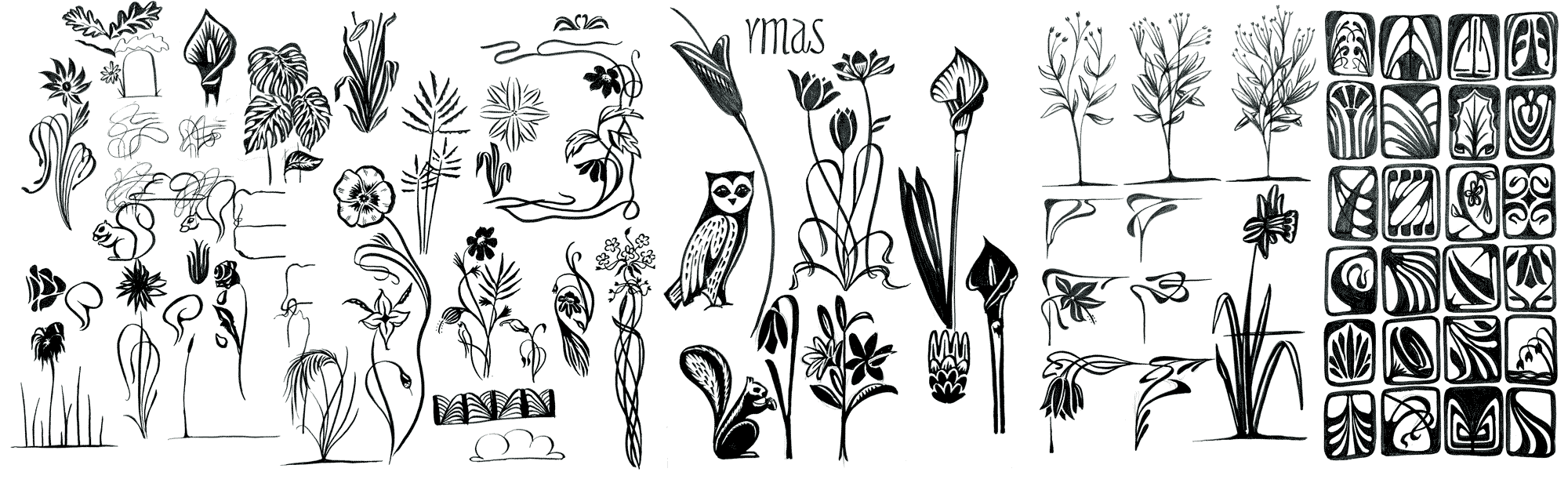
Working on the ornaments was a true joy and a good excuse to take pictures of flowers on walks. It made my daughter say, "Why are you doing that?" I told her I needed pictures to add to my collection. Now every time we pass a flower, she says, "Papa, do you wanna add this one to your collection?"
The digital expression of these sketches surfaced as a series of repeatable tiles, a series of plants and flowers on a common baseline, and about twenty different border treatments.
The End?
It wasn’t until three weeks before the release of this typeface that everything seemed to fall into place with the overall concept and the artwork. This is a bit unusual for us, but ultimately a testament to the fact that we were working in a slightly uncomfortable genre. Yes, there are other things in our catalog that share a 1900s organic looking influence like Hobeaux or Eckmannpsych, but this is a lot less derivative. I am hugely grateful to Jamie Otelsberg, who handled the accents and punctuation, and Colin Ford, who helped Jamie, completed plenty of countless improvements, including the final version of R, and suffered through the naming process with me. When I think about hiring those two, I have no regrets! Only Regrets!
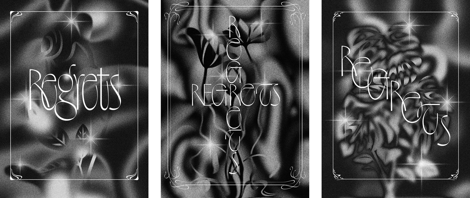
Making these images in Photoshop and not hiring a real airbrush artist to do them is my only regret.