Forevs began forevs ago. It was June, 2022, and I was sitting in my garage studio in Oakland with a simple prompt: Could I go from a completely blank slate to a totally digitized uppercase in one sitting? My afternoon was clear (as it often is), so I set a timer for 90 minutes, propped up my phone to record, and sketched it out.
No time to think
The question of what to draw for this exercise was simply checking off a box on my typographic bucket list. As a foundry, we haven’t really done anything with classical proportions, so it was time to give it a shot, and see if I could get the varied widths thing happening from memory alone. The extra light weight was also do-the-opposite-of-what-you-normally-do sketching technique. We had been firmly at home in the Extra Bold for a while, and I wanted to see something light make an impact.
Sketches are not drawings, and they exist solely to expose problems and issues. For that reason, I generally give myself license to keep things very rough. I know that any line can be made perfect on the computer rather easily, so with the sketch, I’m just putting together a rough prototype that hopefully captures the vibe. You can fix a line on the computer, but it’s harder to fix a vibe.
Because the sketch is a prototype of how actual words will look, it’s pretty useless to draw the letters in the order of the alphabet. The order of the alphabet is mostly problematic because of how diagonals tend to group together. I find it much more realistic to sketch out the necessary characters in word-like groups, but they of course don’t have to be actual words.
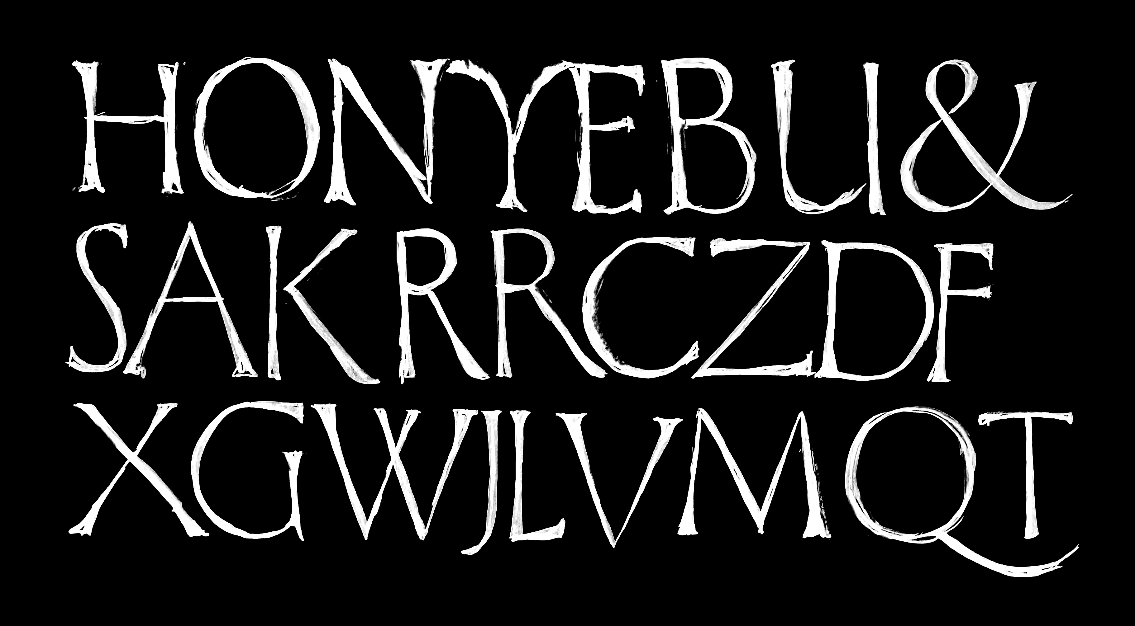
The inital sketch for Forevs.
But if I’m being honest (which I am), looking around my sketchbook from this period will show that it’s not too surprising to see the above style pop up in a timed drawing excercise.
It’s really difficult to draw and pretend like no one’s watching you. Am I staying in frame? Is my head blocking the drawing? Are my letters completely wrecked? It’s annoying! In the end, I don’t think it actually makes for a worse sketch, but it’s absolutely more exhausting.
After my alphabet was sketched out, I propped the notebook against my monitor and got to work digitizing. Over the years, I’ve gotten out of the habit of scanning and tracing my work, and instead just glancing at it while I do a first pass on vectors. This has become pretty comfortable, but I wouldn’t recommend it to students.
Bringing the sketch into a new digital format is a happy place for me. I still get a thrill when I see a new design come to life, and get to type new words with every additional glyph. It’s something I haven’t gotten tired!

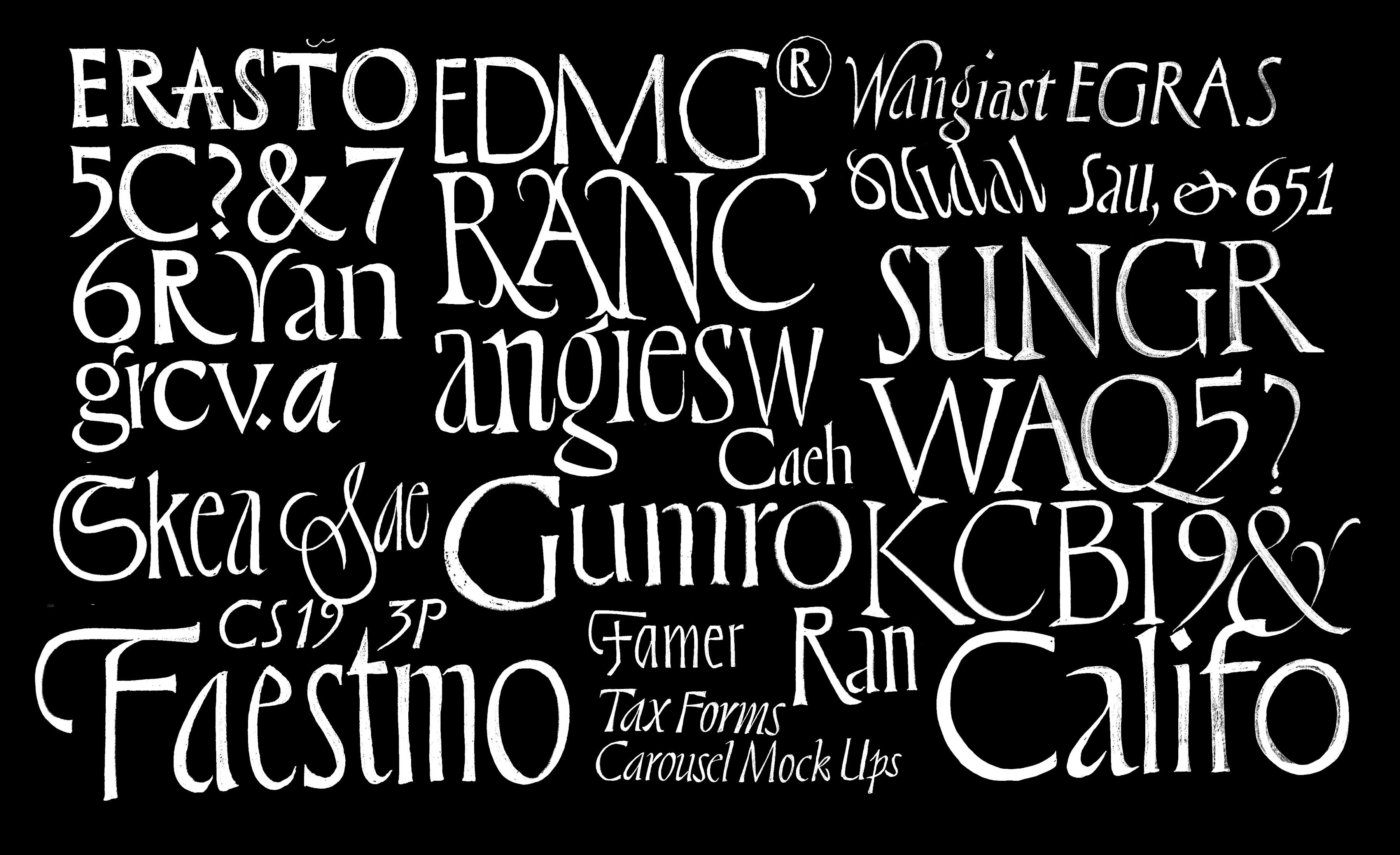
The first digital version of what was then called Timelapse Serif. That parseltongue Y was about to head to the chopping block.
Albertus and The Friz
The project could have simply ended there. I start lots and lots of these experiments, prototypes, and unfinished fledgelings that generally just pile up on my hard drive. The Drawer was one effort to make some of those realized, but even for The Drawer we have the same quality and characterset standards as any other Ohno project.
For some reason, this was around the time that I started paying attention to Friz Quadrata and Albertus absolutely everywhere. Of course there are other great titling fonts, but Friz and Albertus always just look so good! Trajan definitely deserves a mention, since it’s pretty much the OG classically proportioned serif, but more often than not, Trajan feels too default when you see it in public.
I was just walking through the grocery story tuning out everything that wasn’t set in Albertus or Friz. It’s remarkable just how much those two dominate.
At some point I came back to my Timelapse Serif, and wanted to draw the Bold. Regrets had come out already, and I was forced to confront just how little cash a super light display font generates for our foundry. Maybe giving some more heavy weights is the way to ensure that my mortgage gets paid!

The first interpolation of weights revealed that you could travel a pretty massive distance in weight with just two sources. This was also the first look at the lowercase, which seemed very obvious to make the light super narrow, and the bold more normal width. It can be hard to trust your gut when it’s telling you to do something a little out of the ordinary, but it just seemed like my best shot at an even rhythm.
Most often when I’m deciding how bold or black the heavier end of the weight spectrum should go, I try to push it just a little bit past where my first thought it. It’s so fast to correct the middle of the spectrum late in the design process, but pushing the design further in any direction later on is tedious enough to make me give up before I start.
This is Taking Forevs
Again, the project sat while we brought other things to life. Casserole, Degular Mono, and the first five Drawer projects all got released. Jamie Otelsberg, who was intimately involved on all of those projects was finally ready for her first big family with interpolation. She took my initial drawings, added more punctuation, fine-tuned the OpenType features and got everything working.
While Jamie was handling production, she and Colin Ford (the type director here at Ohno) suggested we add italics. Old James would have already added them, but the longer I do this, and see fonts that took a lot of time to make just sit on our shelves, the more I’m skeptical when projects start snowballing out of control. Yes, italics make a project more useful for a broader range of projects, and yes, the capitals are often as simple as performing a few digital operations that then need correcting. But italic lowercase is beast all it’s own. On one hand it’s less of a challenge: there are more shapes that can be copied, pasted, and slightly tweaked to arrive at a desirable result. On the other hand, it’s a whole new round of sketching, ideating, and eventually arriving at a companion style that relates to the origin, while still providing enough new steez for emphasis.

The first pass on italics in the light and heavy sources. It’s amazing to me how well the middle interpolation worked between these two sets of drawings. What a relief! That meant we could simply make some corrections, and get a solid span of about six or seven weights.
Many of the salient contributions to the titling genre don’t feature italics—some don’t even have a lowercase! The italics in Forevs take cues from the mid century book jacket lettering artists residing in the recesses of my visual memory. Hans Tisdall, Helmet Salden, and even the lettering work from type design OG Gerrit Noordzij have a special place in my heart, and influenced Forevs. Again, I’m working from memory here, to hopefully not bite my heroes’ style too overtly.
Finishing Touches
We added a few too many alternates to this project. The first came from my neice Marlowe, who had a unique way of drawing her Rs when she was learning to write her name. Unfortunately, I think she grew out of this.
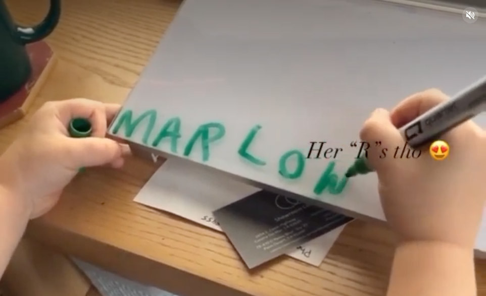
My niece Marlowe’s signature R made its way into Stylistic Set 08.
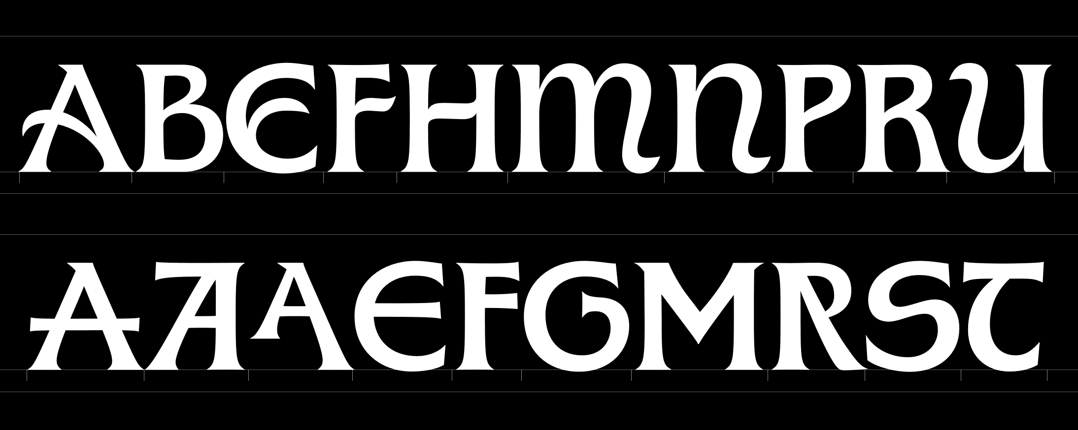
Top row: The art nouveau alternates. Bottom row: Some more alternates, with the infamous “Marlowe R” near the end. I am aware Marlowe isn’t the first in history to use this construction of R, but I for one am not going to be the person to tell her. Other ideas for alternate capitals came from forms seen in Weiß Initialen. I was also pretty inspired by the work of Gerard Unger, especially his typeface Alverata.
Making my buddy Sebi White a beta tester was a good decision. To my amazement, he made it all work without a lowercase j, because I had forgotten to put it in there!
To be totally honest, this genre is quite well-trodden. There are many that have come before, and many many more that will come after our humble contribution. But what I hope sets Forevs apart is the fun you have when designing with it. Trajan is ultra-popular, but pretty inflexible. Albertus and Friz have absolutely immaculate vibes, but lack a range of weights. I hope that the combination of weights, a companion italic, and a whole host of alternates make Forevs a super powerful tool that is equal parts fun and useful. Always and forevs!