This process article was written by Zrinka Buljubašić and Gen Ramirez, the designers of Yumex. Here, two of my good friends talk very casually about the blood, sweat, and tears they poured into this labor of love. Reading it now, I’m struck by how two of the best designers I know can make this process of collaborating as partners, honoring individual cultures, and creating an exceptionally high-quality design seem like a walk in the park. Everything they say about me in this article is true, and I can’t believe they got that picture!
—James
From Yu to Mex
Alright, so we'll tell you how the story goes—a Croatian and a Mexican walk into a typography class, and boom, love at first font! They start chatting about their cultures, and out of the blue, they uncover a musical masterpiece (definitely not) called YuMex that's been rocking the (ex) Yugoslavian scene since the ’50s. Who knew love and fonts could lead to a musical discovery and then back to fonts? Life’s stranger than fiction, my friends!
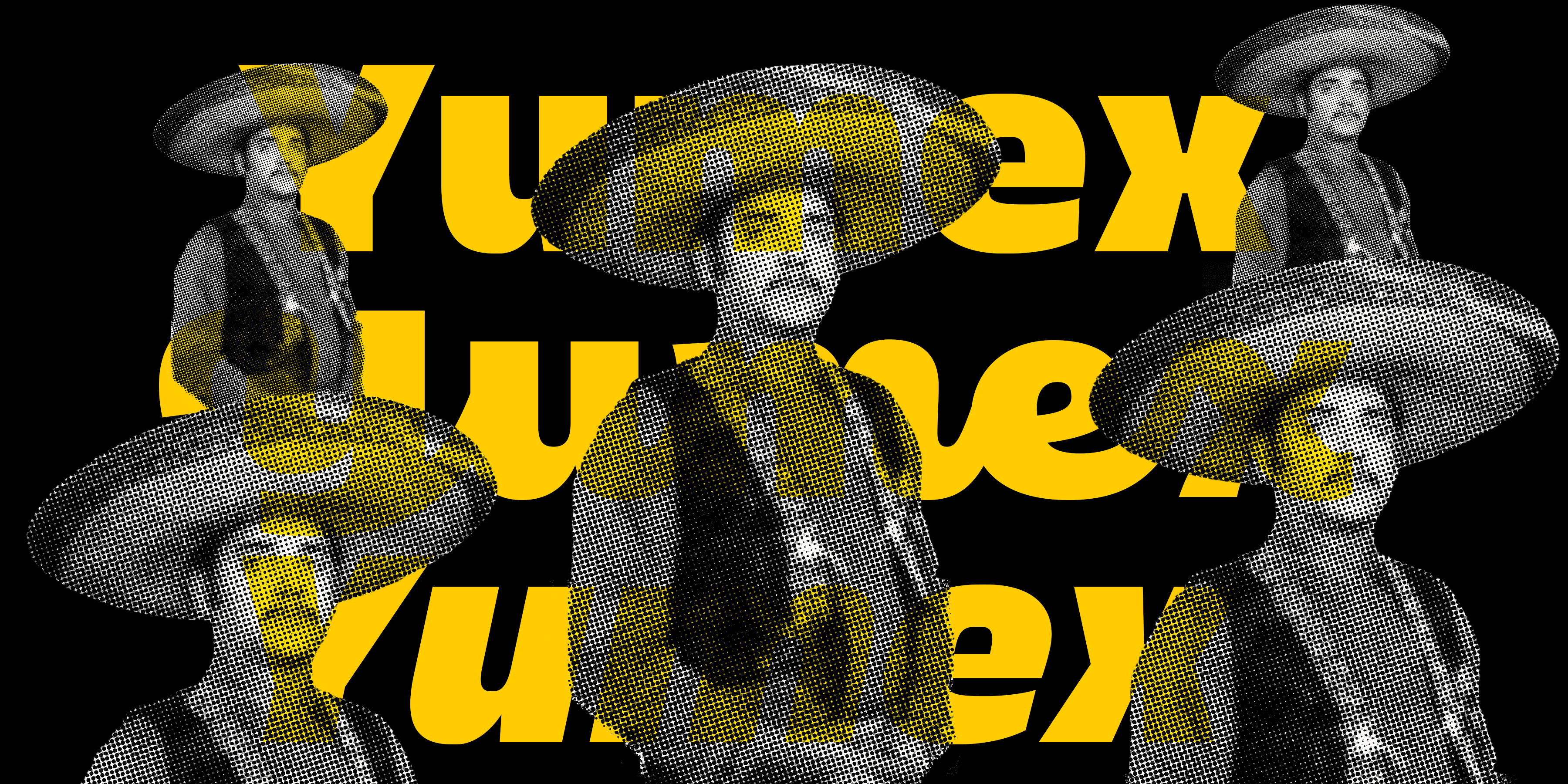
Back in 1950s Yugoslavia, they had a thing for Mexican movies. Why? Well, they couldn't import Soviet or American films, so they went all-in on the Mexican cinema. And guess what? It got super popular! Slavs desired to be Mexicans! Musicians even started rocking sombreros while performing Mexican tunes, either in Serbo-Croatian or the real-deal Spanish. Ouch!
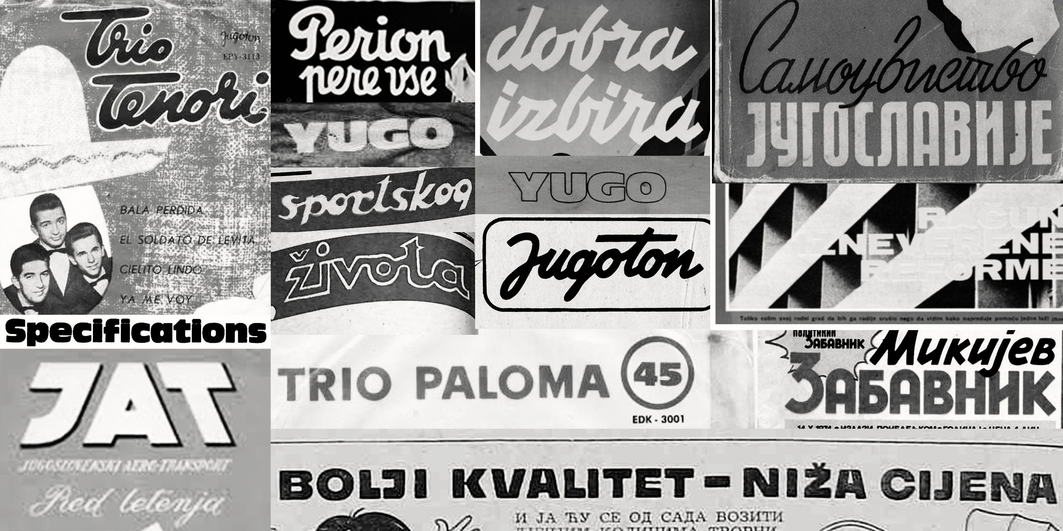
Now, where do fonts fit into this cultural tale? Well, back in the day (and we’re extending this day from the ’50s all the way into the ’80s), the graphics used in music, cinema, and cultural life were very often all about pairing bold sans-serifs with bold scripts. It was so common that this combo basically became the voice, style, and personality of an entire era.
So after having a good chuckle listening to YuMex music (with all due respect) and looking at a bunch of visual references from the era, we (Gen and Zrinka, the Mexican and Croatian) decided there’s some stuff that’s too good to not be brought back to life.
Should we or should we not?
If there’s absolutely no need to do things upside-down, we’ll find one. Given that our references leaned toward bold and black, we instinctively began sketching the black style and then progressed towards the thin one. It might seem a bit backward when you think of the compromises that heavy weights usually demand, but it clicked.
We played around with upright roman version first. Even though the connection to Antique Olive was obvious, we based our drawings on the vernacular use and rethought the shapes, metrics and spacing.
It was definitely going to be a display typeface, but we couldn’t resist trying to make it work well in text sizes, too. This led us to compromising metrics eventually, but it works pretty neat in smaller sizes.
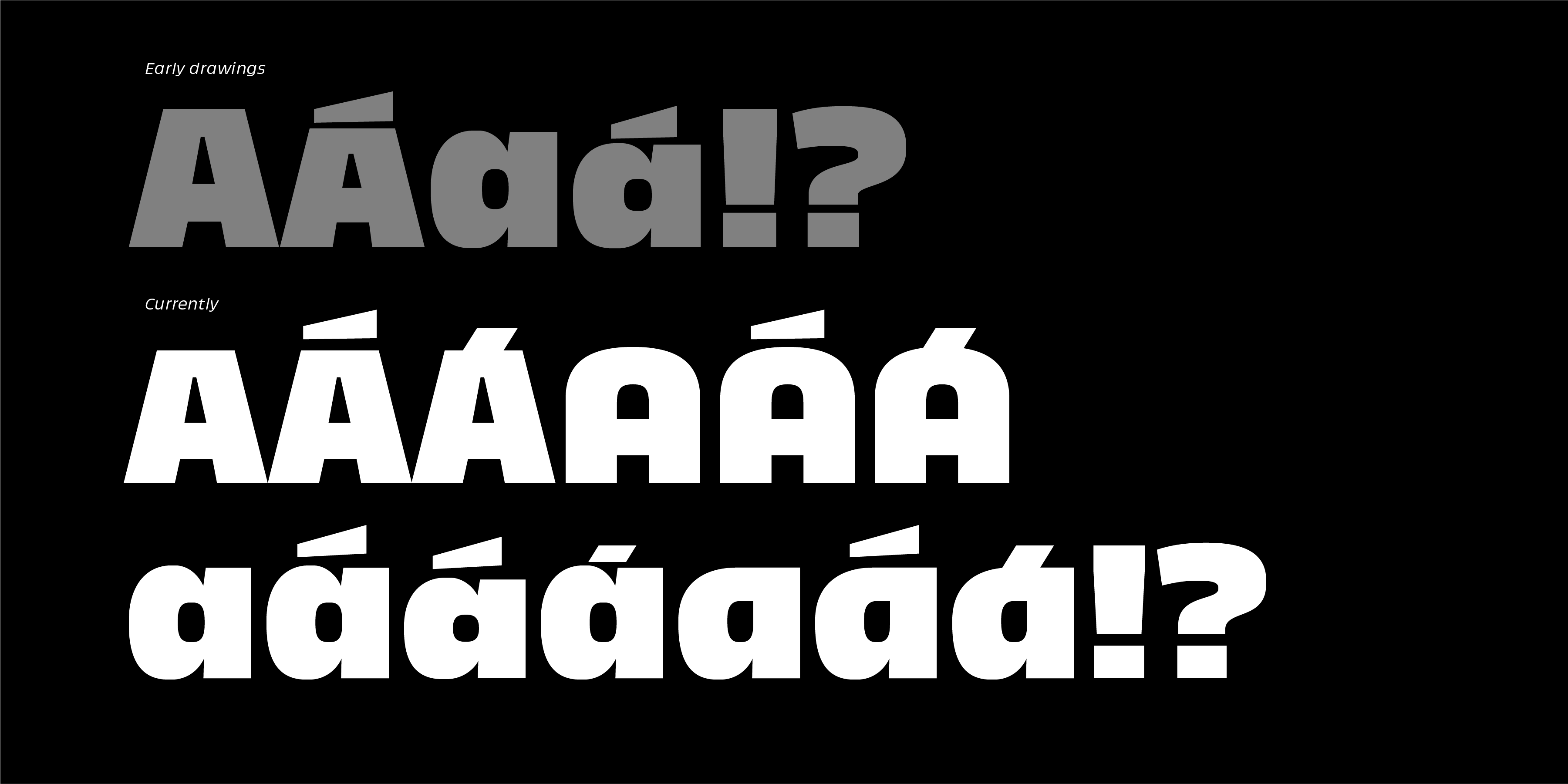
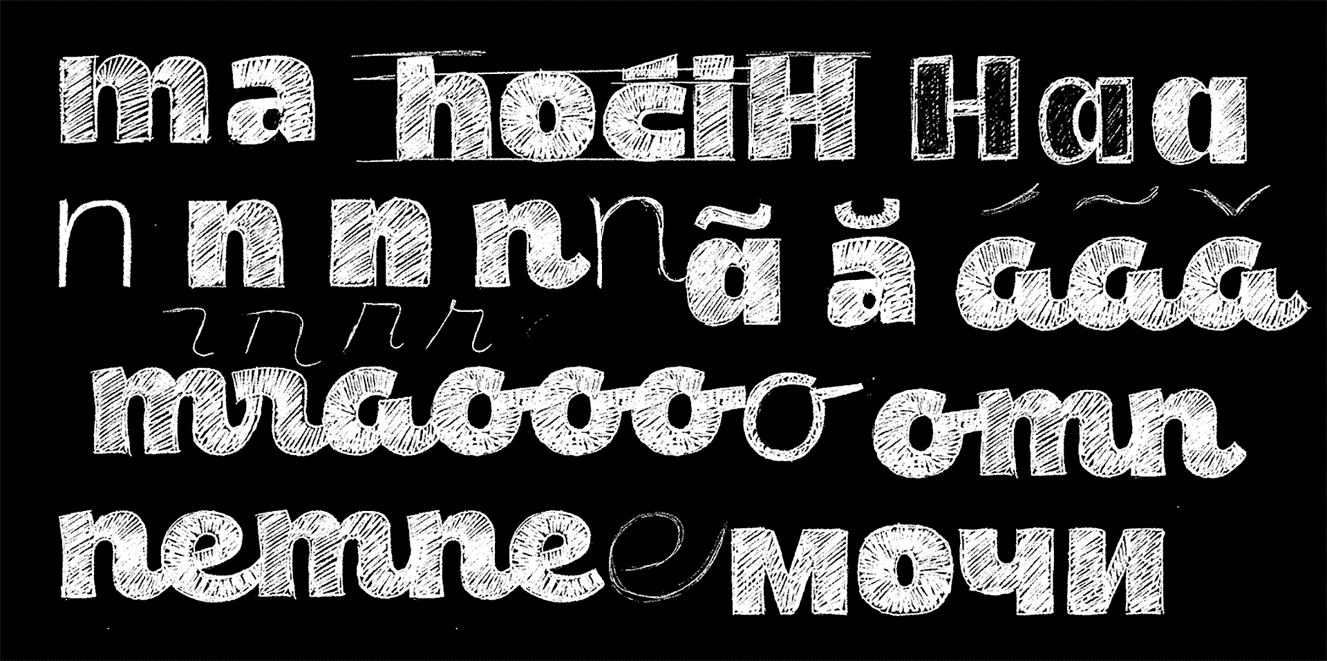
The original drawings had very short ascenders and a secondary x-height for all accented shapes. The visual play between two x-heights seemed fun but we were not 100% convinced so, of course, we let it sit in our folders for a while while we questioned its existence.
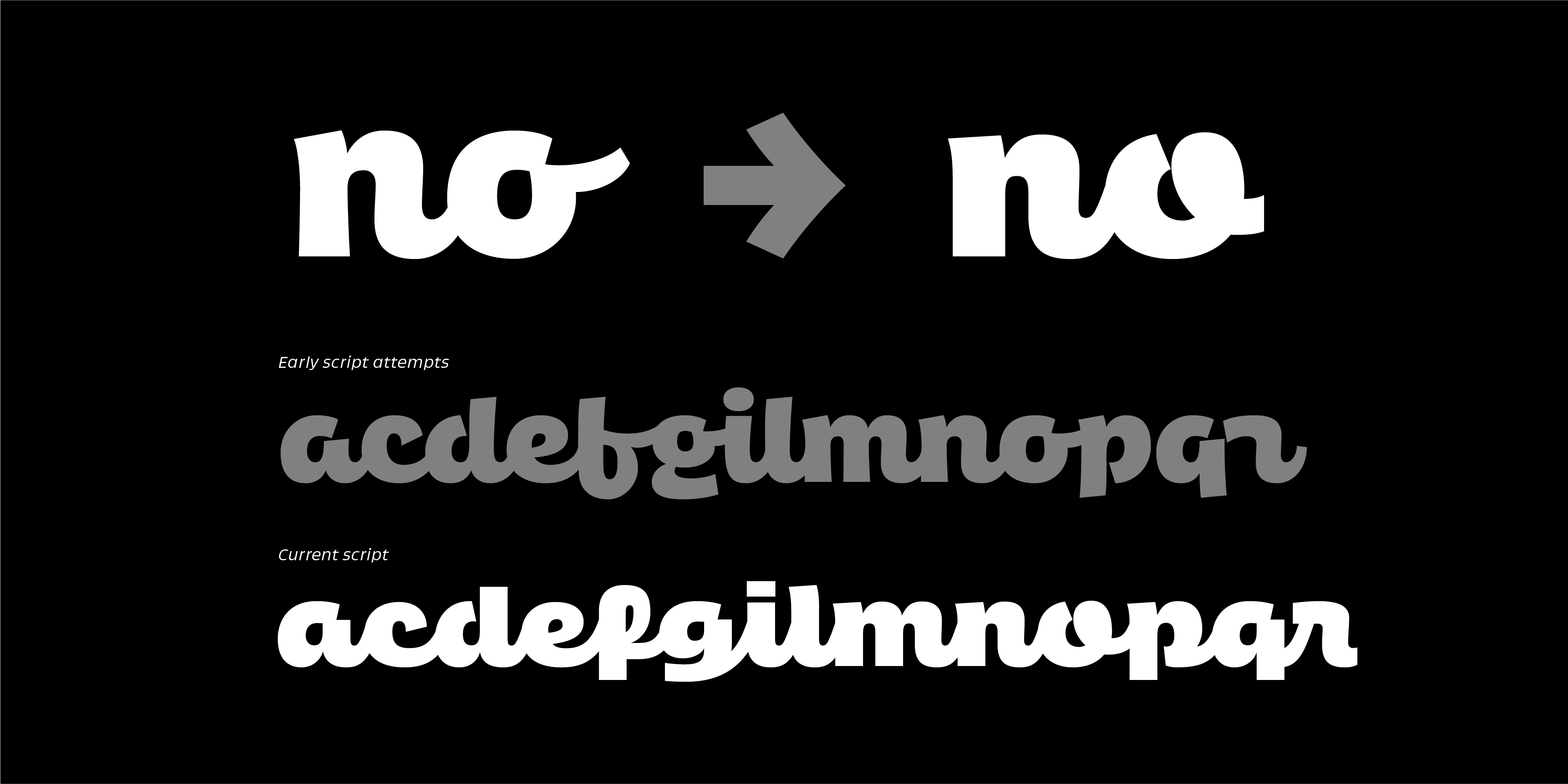
To be honest we weren’t quite pleased with the first attempts we took at the script sketches. We were getting there but not exactly where we wanted it to be. It seemed it could relate more closely to roman, following its curve dynamics and proportions. We wanted them to pair nicely but keeping the quirkiness.
OH YES!, said James
Now, zoom to 2019 and Letrastica 4, a type festival in Mexico where we gave a sneak peek of Yumex. Short version: James goes, "OH YES!" and gives it the thumbs up or two. We promised to work on it. Fast forward — life happened and we stepped into a time capsule. It was 2023 (or maybe 2024), and we were actually getting serious about finishing it up.
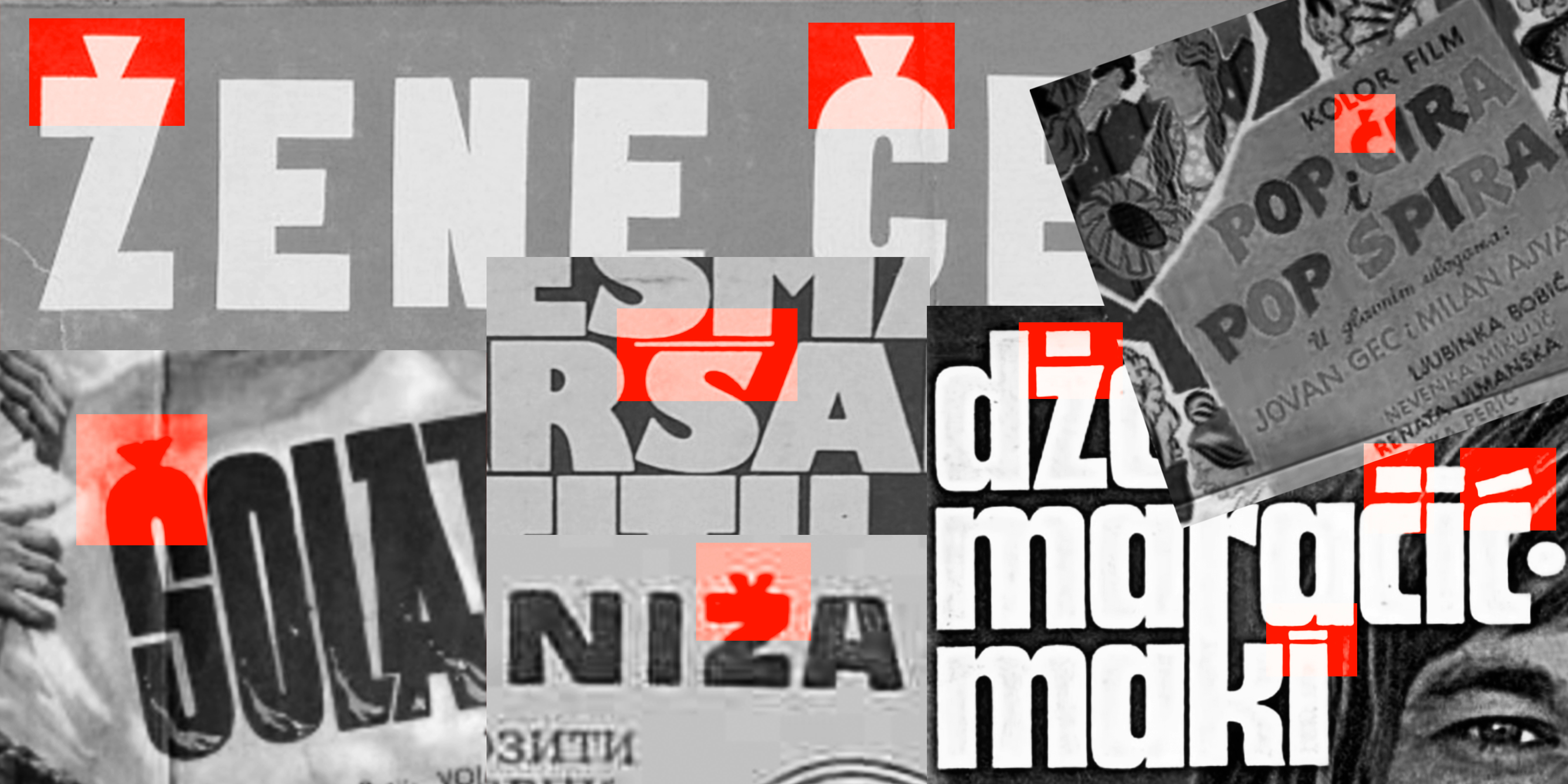
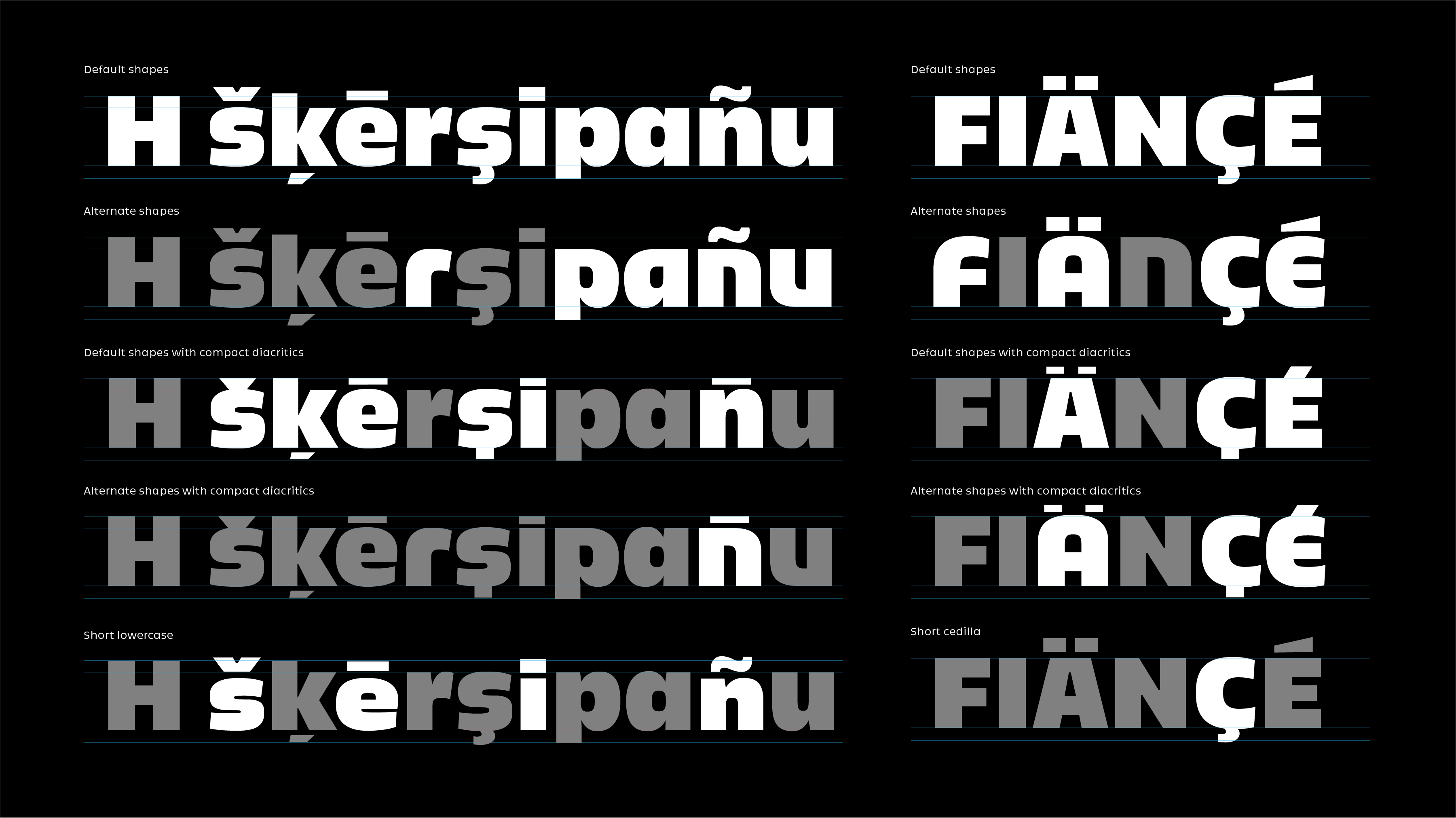
Diacritics were the thing that caught our eye in the first place and we felt like we didn't play around enough with them. The charm of the references laid in the unusual interpretation of the diacritics, so we took it further with more special accented characters with unusual shapes. It was a serious attempt on unseriousness. Then, we went full-on workout mode, adding more weights and giving it a proper cleanup.
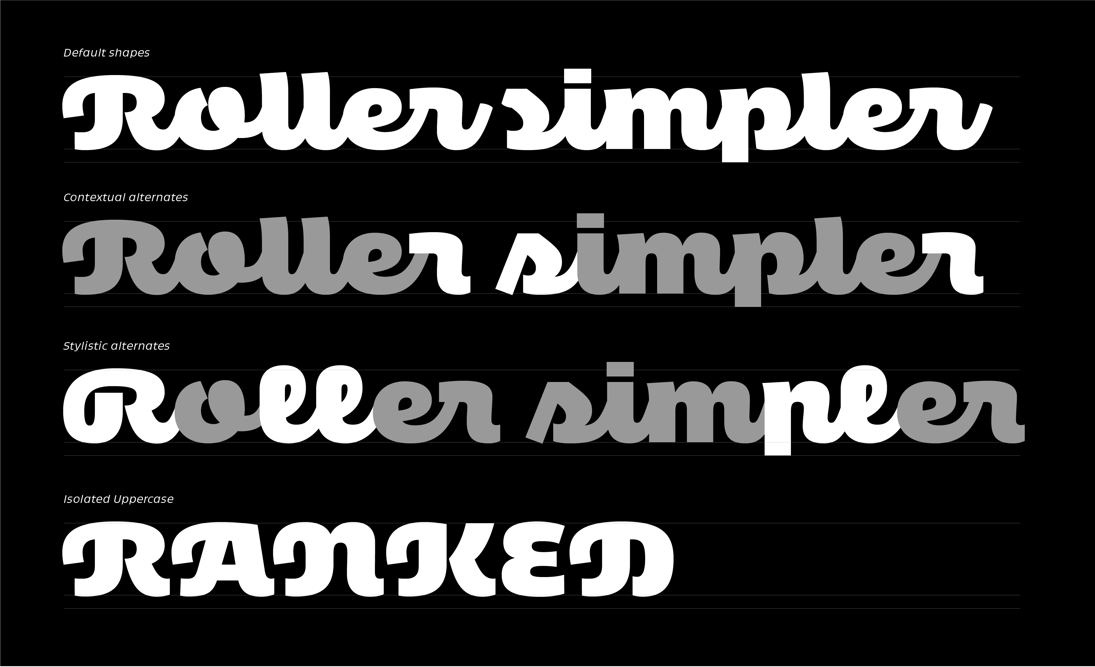
Script styles took a bit of a slower path as we kept looking for the perfect personality to be the ultimate partner to the Roman styles. It wasn't a broad search but more of a finesse game after settling on a specific curve dynamic, and the amount of 'scriptiness'. The initial drawings were a bit too rounded and didn't quite hold hands well with the Roman.
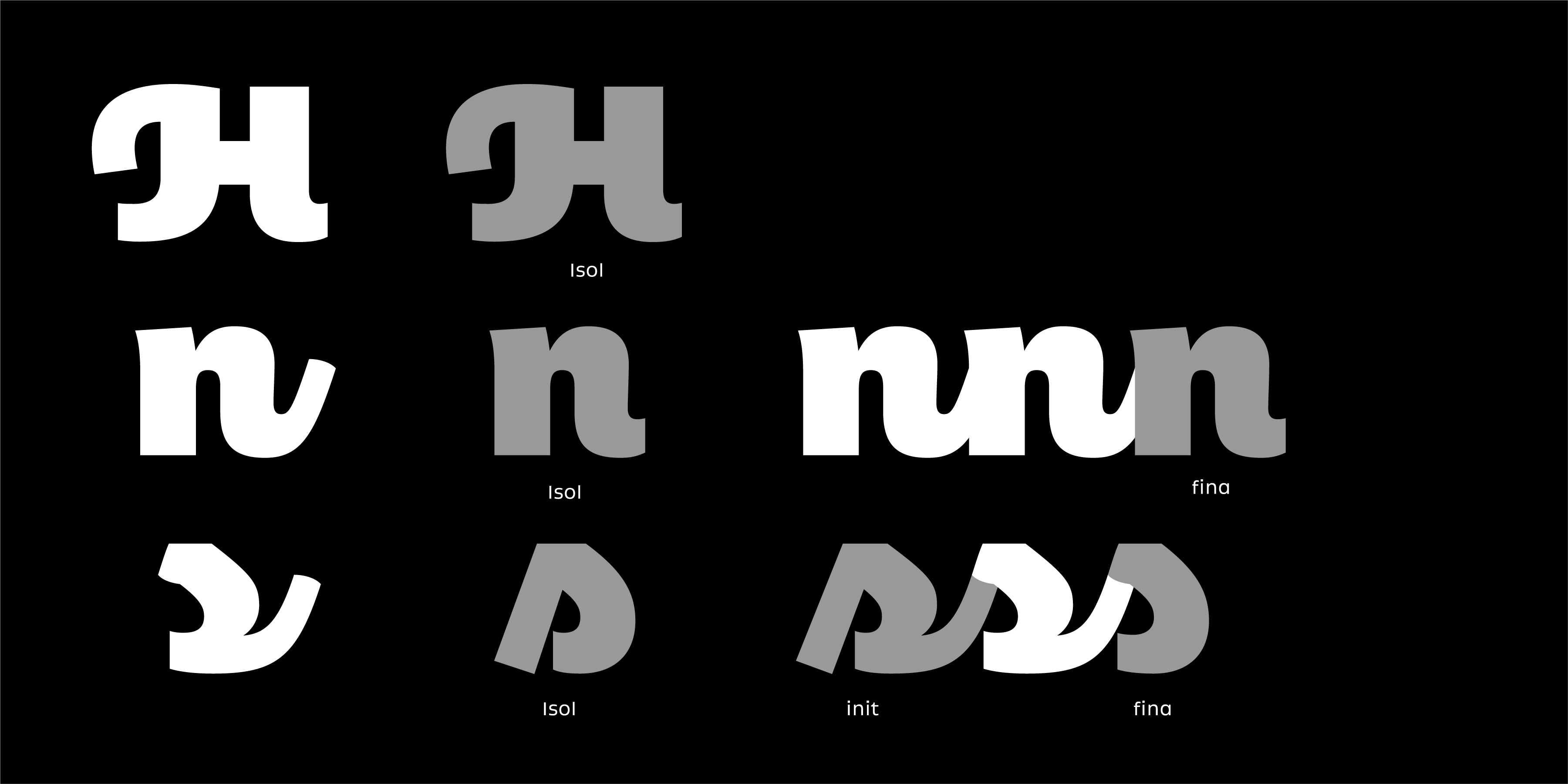
Script, as scripts may be, is always a bit of a (pleasing) headache when it comes to how connected it should be. We realized connectedness is not the deciding factor and as long as other construction parameters are set right, it will work as script. We didn’t connect all the shapes, but they are drawn in a way that they feel as if they are. Considering the personality of these styles, it wouldn’t be very functional or aesthetic to fully script (i.e. uppercase T). It's all about finding the right solution for each letterform so that they:
a) work well in various combinations, and
b) save you time on kerning (although, let's be real, with Yumex, kerning felt like the ultimate test of patience).
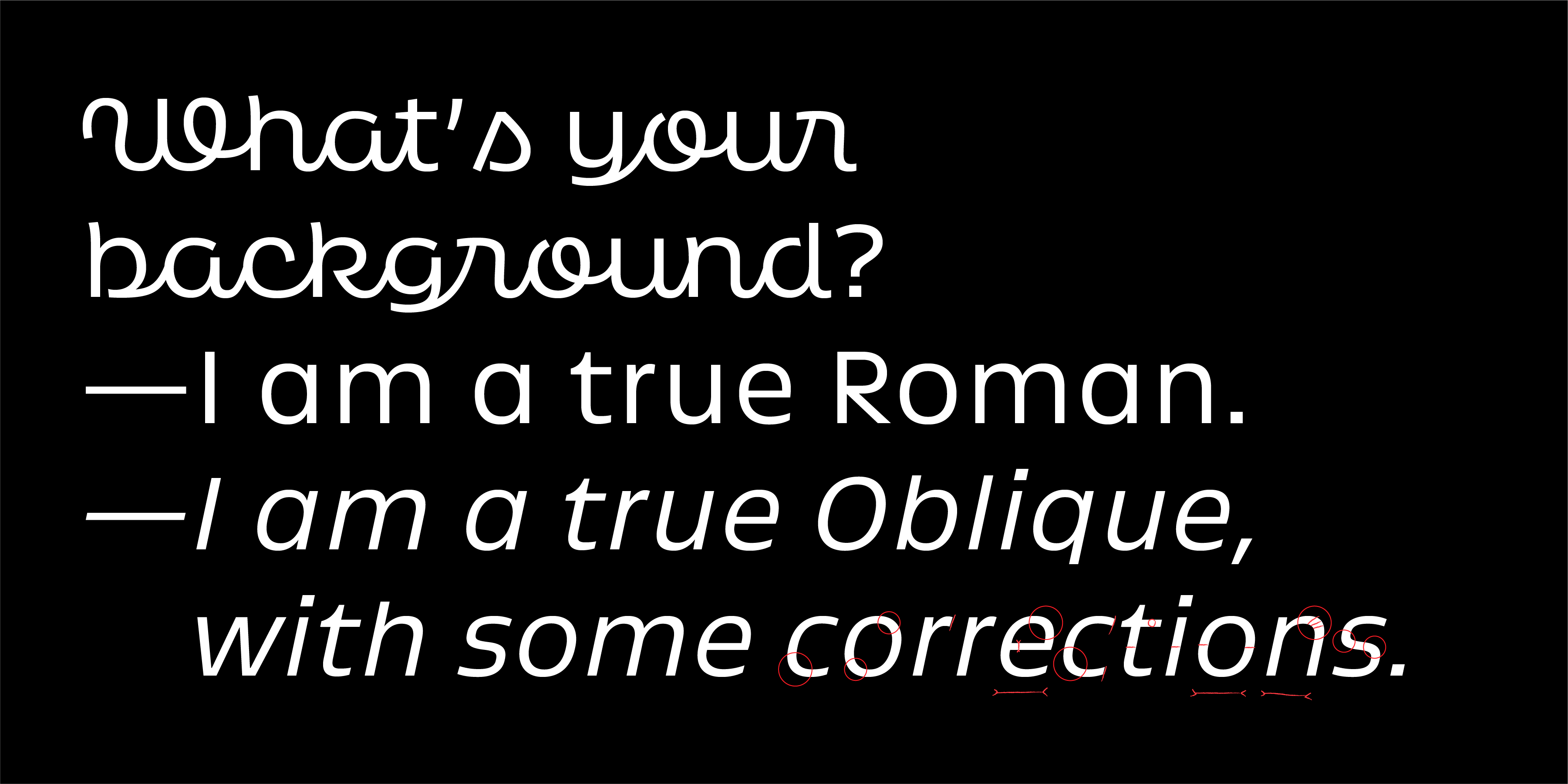
What's a font without obliques?
I hoped it would be a typeface with really nice italics. These we don’t have, but we have obliques. James takes the blame for this one -- it was his idea to broaden versatility of use by adding obliques. Originally we thought of script taking a role of what italic would be for a conventional type family, but we do have to agree, having obliques circles the whole idea nicely and makes type setting more coherent.
Fun in the last round
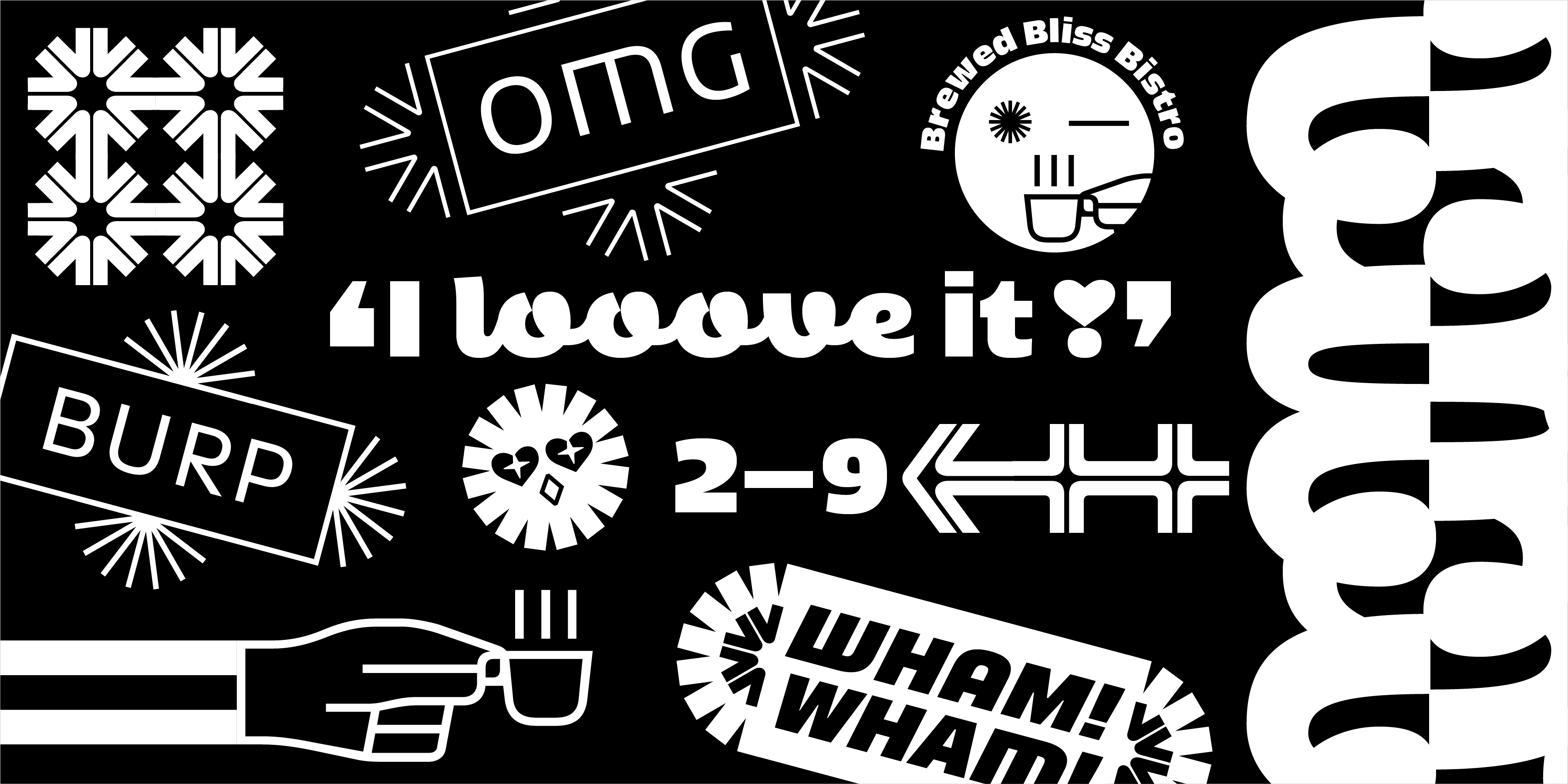
Now that the type was pretty close to being “done”, we could finally dedicate more time to non-letter elements: pictograms, symbols and graphics. The script doesn't have its own symbols, but the ones from the roman styles work just well, as all of them are made to match the weight, look and feel of the typeface. These are a lot of fun and with a bit of imagination, can be used to create some pretty nice looking stuff!
Dual Yumex
And there you have it – the grand finale of our font adventure: the big Yumex family, boasting two subfamilies – Yumex with romans and obliques, and Yumex Script, each with 7 styles, making a total of 21 styles. We're thrilled to see Yumex shine in both large and small sizes, while the script injects that extra touch of personality for displays. A massive shoutout to Ohno for putting trust in us, and setting those real deadlines (ouch, but also yay!). Finally, we’re overjoyed to see this one stepping out of the folders and into the hands of designers!