It had long been a dream of mine to collaborate with Julien Priez, aka Boogy Paper. His work has inspired much of my own, and the first time we met, I learned we shared many interests. Julien is one of those rare friends that seems to blissfully indifferent to the 5,572 miles that separate us. This is the story of that project: Julien’s typeface Montreuil. It truly was a collaboration, with Julien driving the initial concepts and early development, and Ohno coming in later to design a complimentary text face, and bring Montreuil to the finish line.
Part 1: Julien
In a city, there are inhabitants, architecture, streets, traffic, landscapes, trees or not, animals or not either, life or maybe not. In Montreuil, there are people from all over the world, apartment blocks next to 19th century houses, contrasting landscapes, bicycles, cars, lots of buses, you can even take the metro but no RER, dogs and cats, weasels and rats, and above all, lots of life. But aren't these characteristics common to other cities?
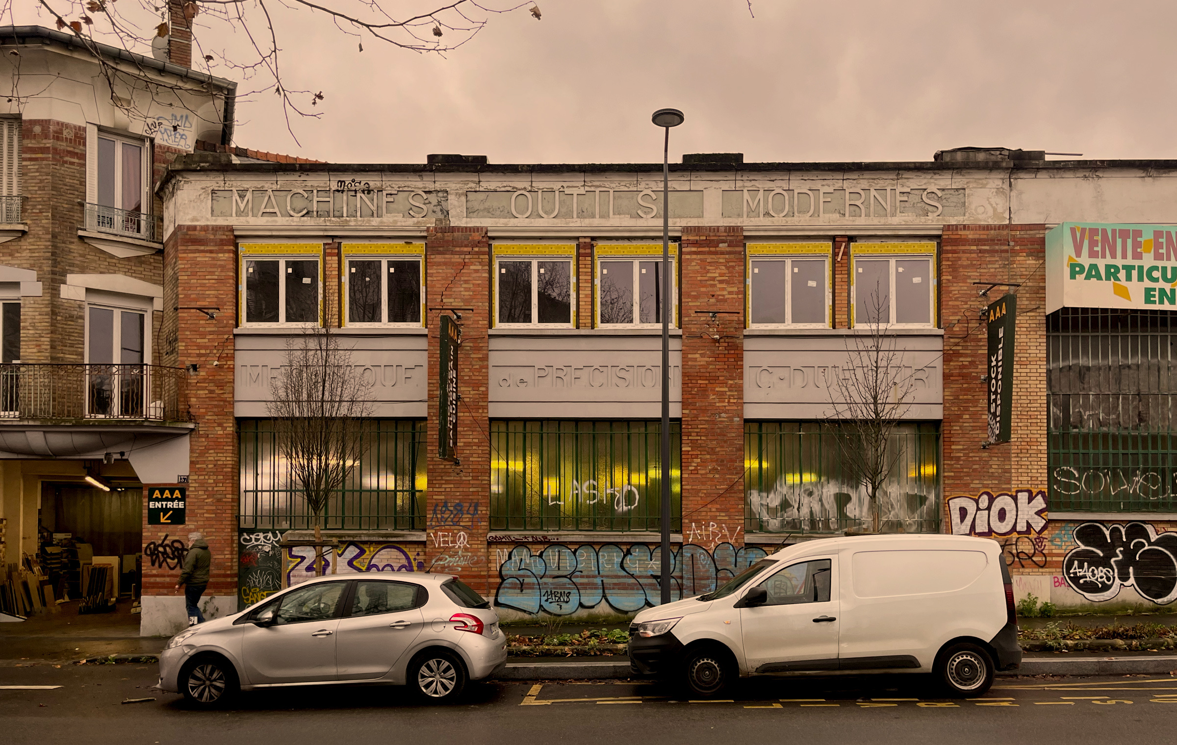
In Montreuil, people walk the streets, drive their cars and take the bus. They look out of their windows, they see their city and they orient themselves in it thanks to what they see. They see their city and imagine it. They think of characteristics that are unique to Montreuil. What are these characteristics?
The logo of my grandfather’s plumbing business.
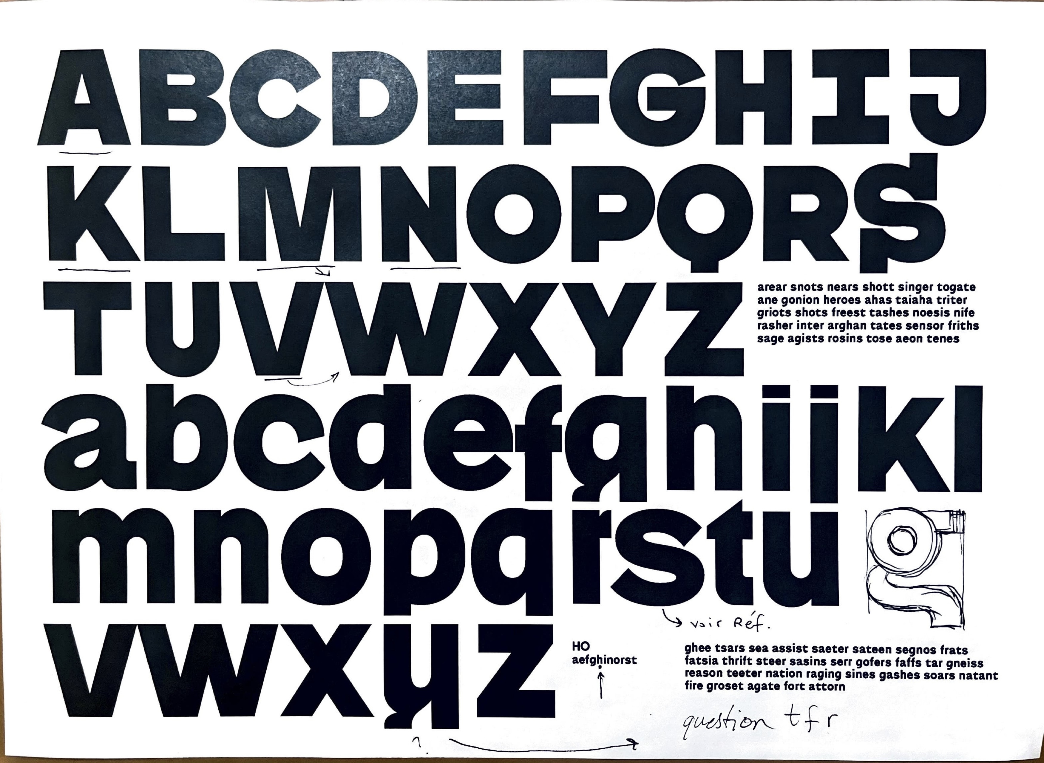
They may think of the shape of a gate they turn in front of to go to school, the color of the walls of the Cité de l'Espoir that age with them, the sidewalks of Boulevard Chanzy torn up by tree roots, the street lamps that have fallen into the trees and obliterated the streets, the patterns on the bricks that mark the houses of Lower Montreuil. They know, but don't think about, the texts that cover the signs on the rue de Paris, the graffiti announcing a subway stop, the disappearing advertising signs, the industrial characters engraved on factory gables.
In the city of Montreuil, there are politics, demonstrations and the CGT, red and yellow banners and many workers, weeds and selective sorting, large parks and associations, people thinking about Montreuillois and Montreuillois who don't think about it. Maybe they're thinking about the shape of the gate in front of which they turn to go to school, or the color of the walls of the Cité de l'Espoir, which ages with them...
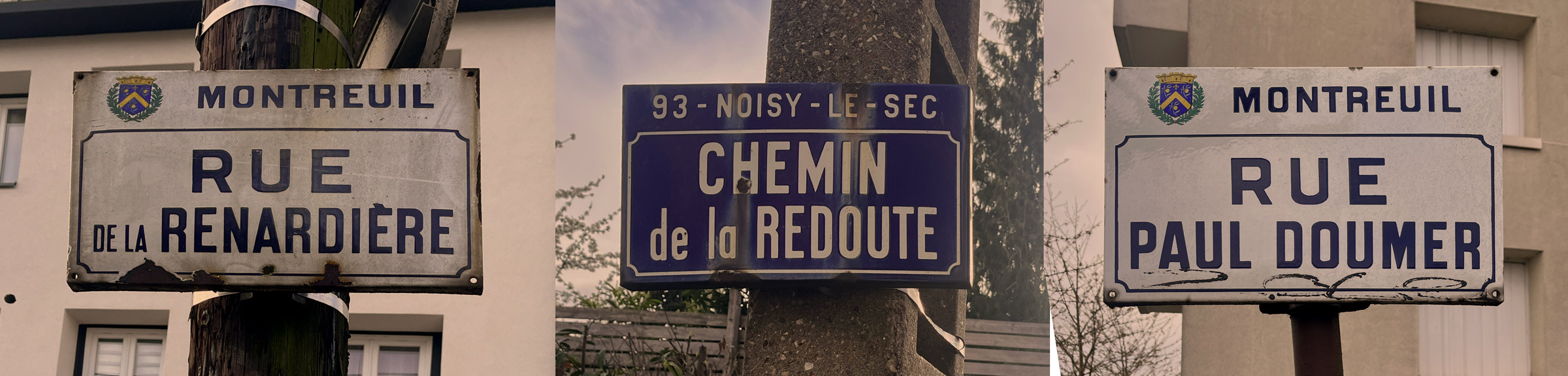
Street signs in Montreuil, France.
Around 2010 I began playing with a Lego-inspired typeface—a kit of modular parts that could join together to form interesting variations and abstract graphics.
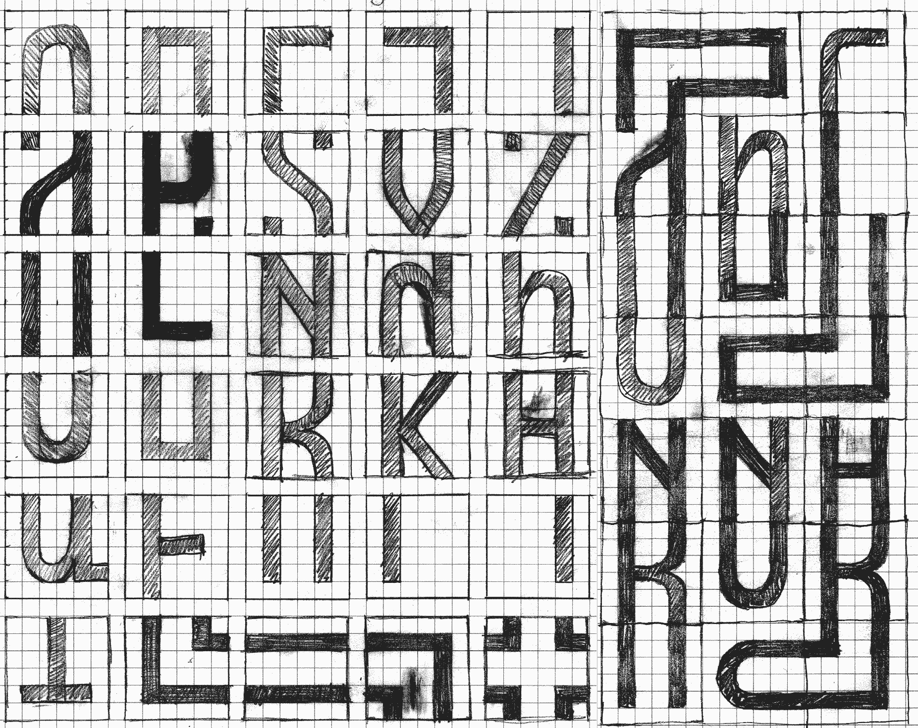
An early sketch for Montreuil from 2010.
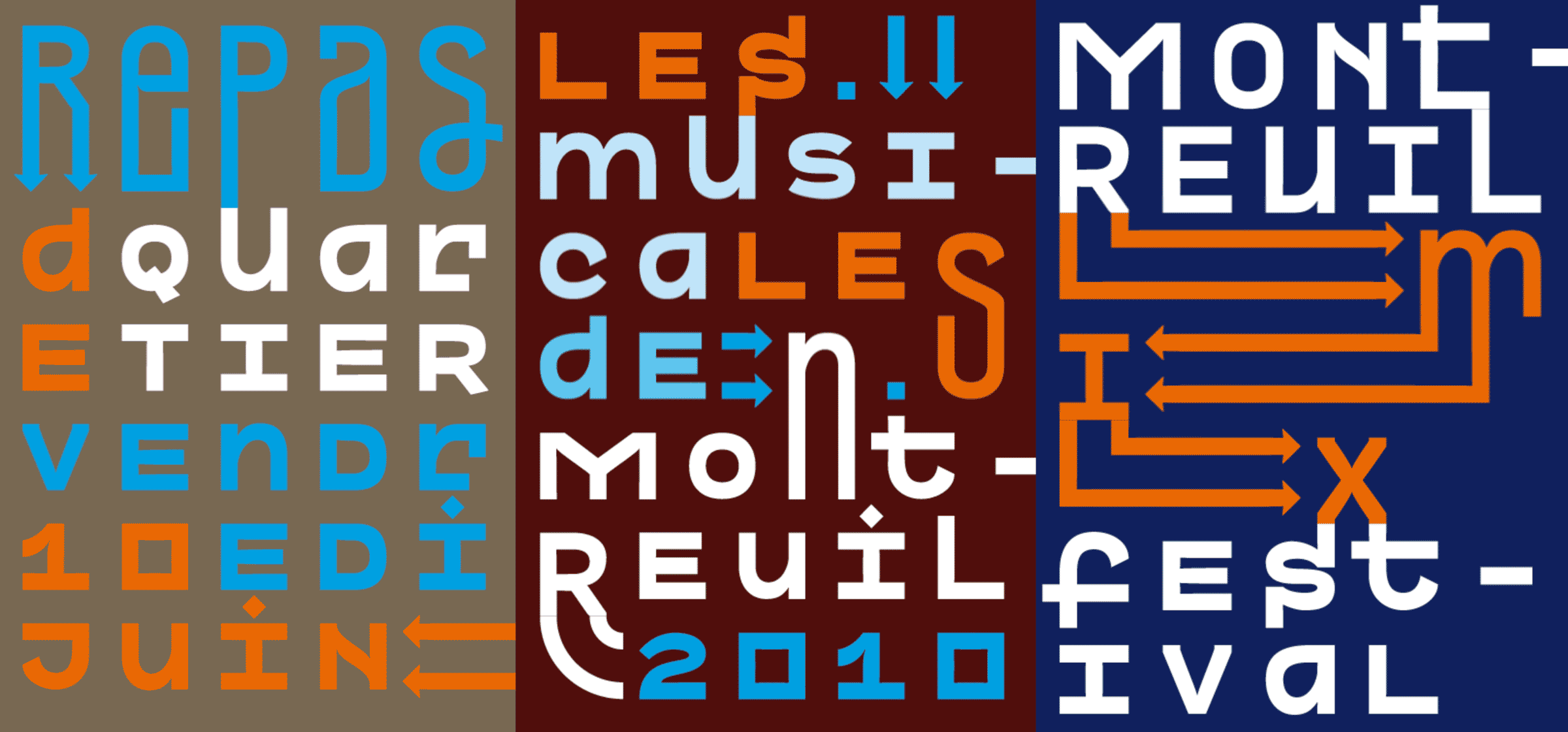
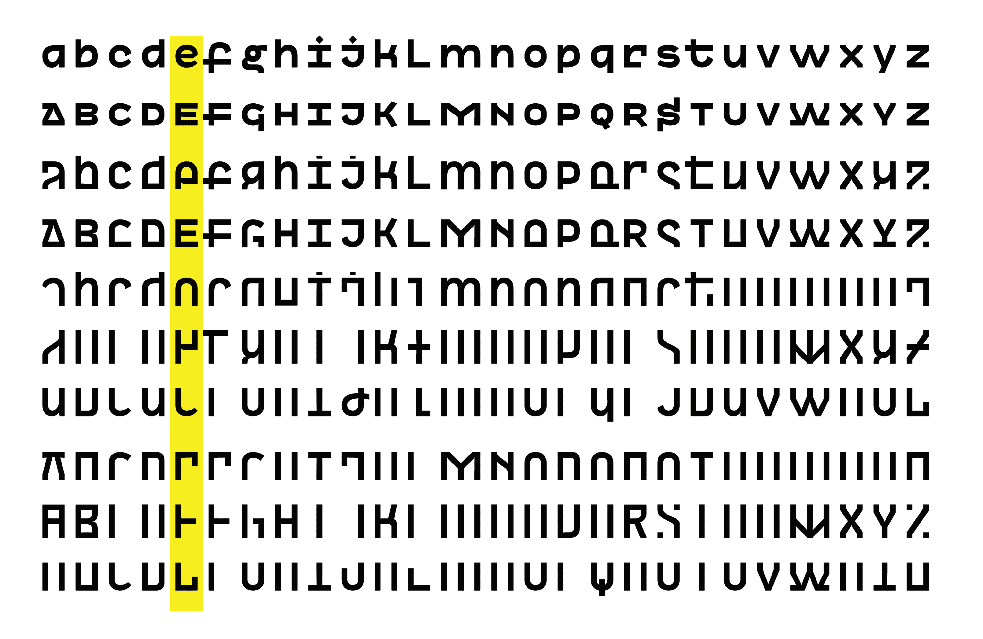
An early version of the character set showing a more humanist influence than what was to come.
James approached me many years later about a collaboration. I was finishing work on Boogy Brut, my first typeface with Bureau Brut. James asked for a sans, and so I thought for a long time about what kind of sans to create. The market is already saturated with so many options, and I don’t want to recreate a revival.
Then I remembered something I had created in school about 15 years, the Lego typeface. It is unusual and inspired by the source material of Montreuil. There are two types of typefaces: those that can stand on their own and those that require more effort from the graphic designer to be effective. I believe in empowering designers to have fun and be creative with shapes and systems. Therefore, I planned to include the extensive set of modular alternates and parts to inspire users to play with the typeface, rather simply set type.
An early proof of Montreuil play after an extensive redesign.
But this was just the first part of a two-stage family I was beginning to envision.
The second stage would be based on the design of the first, but simplified, proportional, and with more weights and italics. Ohno’s team took the lead on this stage.
Part 2: James
Julien’s concept for this project was ambitious—it was made up of personal references, hundreds of alternates, a unique way of building graphic with typography, and the vibe of an entire city. I knew that any addition to this complicated recipe had to be super functional, but like Julien himself, very warm.
Warmth in type design is something I think about constantly, but struggle to define. Sometimes it’s a roughly drawn line, or simply a curved line. I think of the worn down wooden banisters in line for Thunder Mountain at Disneyland. How do you put that quality into cold, mathematical vectors? I have no answers here, only drawings!
Boogy with Boogy’s
Before we had landed on this idea of a Montreuil typeface, we briefly considered something based on Dalton (or The Daltons?) which is a French cartoon I know nothing about. I’m not sure how, but Julien put together these amazing sketches that I knew had potential.
Julien’s early sketches for a typeface that never quite went anywhere.

My digitizations of Julien’s work never went beyond this version, but I learned one thing: it was really fun to work with Julien’s drawings!

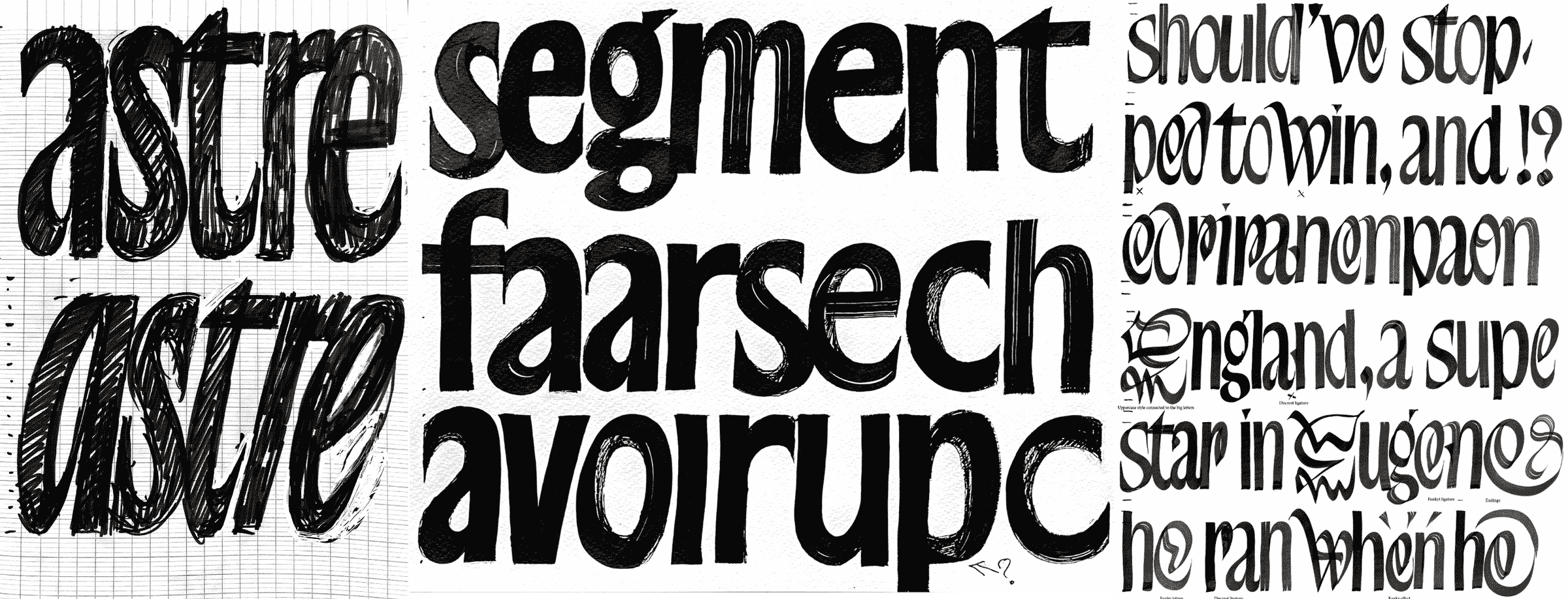
After the project shifted towards a low contrast grotesque, I asked Julien to take a stab at the text version. He got quite far with it, drawing a nice bold that seemed functional, but still relevant to the project. He provided sketches for a light as well, but I focussed on the bold and attempted to iron out the kinks, and add in just a bit more humanist flavor to letters like c, e and s.

Left: Julien’s version. Right: My iteration on Julien’s work.
From there, we built out the lowercase in light and bold, and just as I was finishing up the alphabet, I realized the light could go lighter and the bold could go bolder. For some reason, I have to learn this lesson over and over, with pretty much every project I start! Even after all these years, the extremes never land where I thought they were in the first place.

The new extremes pushed the weight a little lighter and a little bolder than Julien’s original drawings, and I tried to maintain the quirkiness in certain glyphs.

Going lighter and bolder mean there was a further distance for the weight spectrum to travel, and so some inconsistencies naturally begin to appear. This is really obviously in low-contrast designs on the a and e, where the middle horizontal stroke starts to be too thin.

We can fix this by adding a new set of drawings right in the middle so the interpolations can blend in a natural way.
BRINGING IT HOME
After Julien had been cooking this idea for over a decade, and James had done his part, it was time for the rest of the team to take the project to the end of the line. Colin Ford began work streamlining the Play style to work with a logical set of OpenType features, and pack in all the technical data to make sure the fonts play nicely in all software. Jamie Otelsberg set to work finishing up the character set and drawing the companion italic for the Text styles. After a lot of iterations on obscure punctuation, accents, and nailing the small caps, everything was ready to go.
This project represents a lot to me: my friendship with Julien, a mish-mash of cultures and influences, and the idea that even a typeface can bring friends together. In a perfect world, Julien and I would live closer, our kids would grow up as close friends, and we would talk more often about things other than type design. But the reality is Julien is at home in Montreuil, and Montreuil is now at home at Ohno. My hope is that this typeface generates an inconceivable amount of cash that would demand a reunion very soon. Thank you for reading, thank you to Colin and Jamie for all their help, and thank you to Julien for trusting us with Montreuil.