In 2015, I was invited to speak at a conference in Chattanooga, Tennessee. I had the option to set up a little merch table at the side of the conference, but I had absolutely no merch to sell. Because Chattanooga is one of the best city names ever, I decided to do a play on vintage postcards.
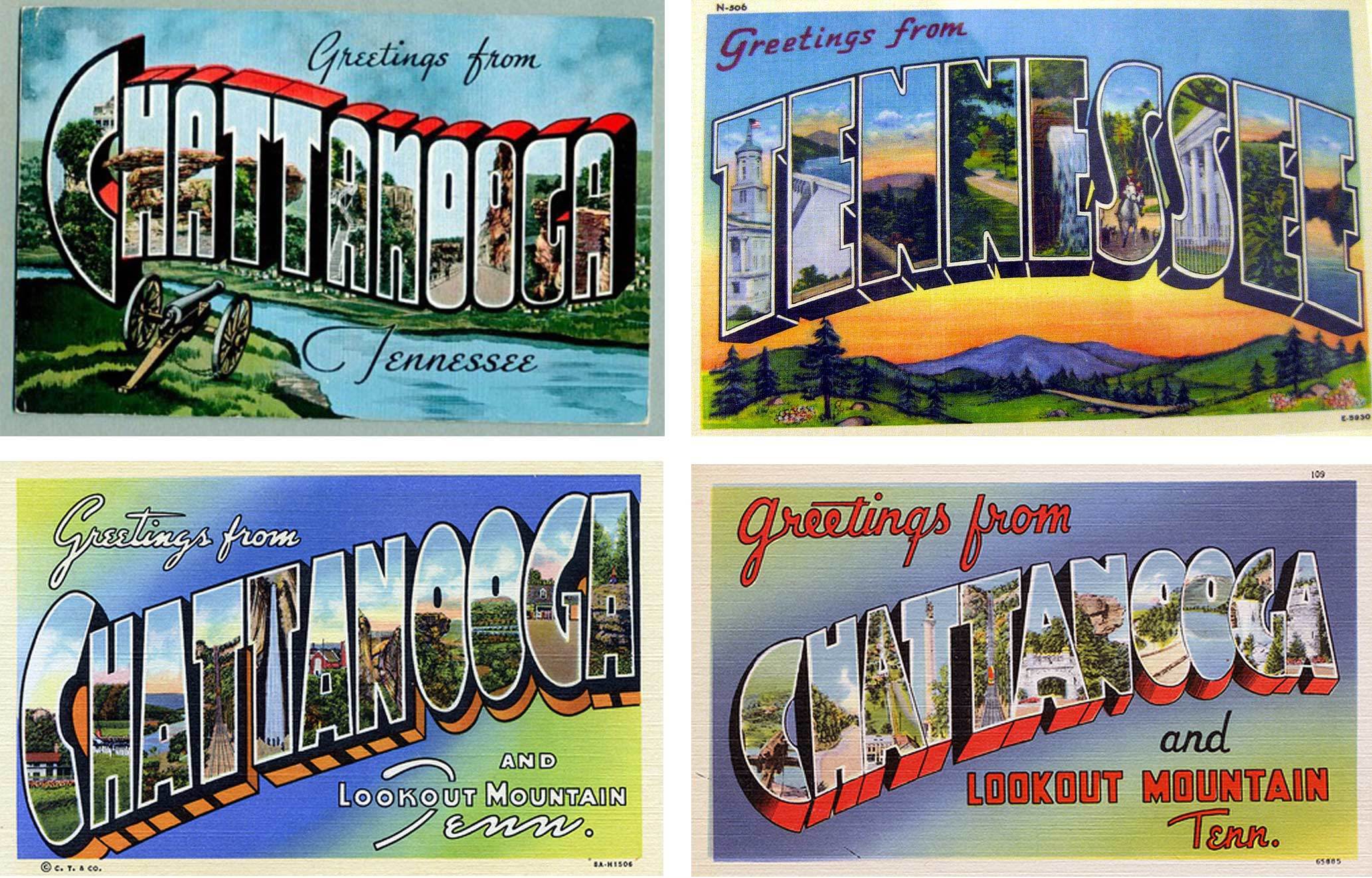
I love these postcards, but who has the time to fill each letter with an illustration?
These pose such an interesting typographic problem: get the letters super bold, with whatever distorted proportions necessary, to make as much room for the contained illustrations as possible. I knew the letters wouldn’t be a problem, but I had no idea how I’d fill them up. Then I got around that idea by doing a die-cut, allowing folks to put whatever image they wanted behind the lettering.
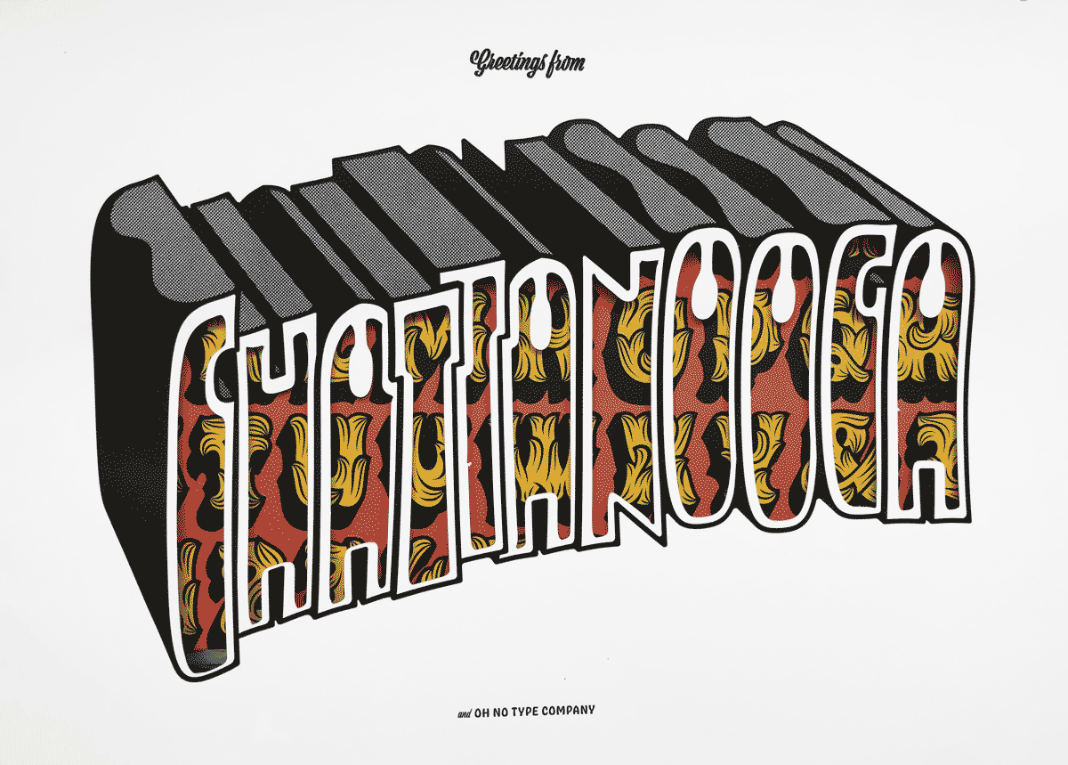
I have no idea if people actually did this, but I was hoping people would put maps, origami paper, or any cool patterns or textures behind the letterpressed and die-cut top layer I designed. These were letterpressed by James Tucker at Aesthetic Union.
As is often the case with these sorts of lettering projects, I couldn’t help but begin working on the rest of the alphabet. There is something irresistible about the puzzle of super bold letters. Many parameters must be played with in an interesting way when you are prioritizing a match of negative space (counters and letter spaces), rather than the (typical) match of positive space (strokes, stems, etc).

The typeface at this time had the working title of Chattanooga. Unfortunately, there was already a typeface by this name.
I continued working on a wider width of this same style, and had a real bucket o’ fun. This was back before a child and mortgage had shifted my priorities. My rent was cheap, and there was no reason not to fiddle aimlessly with a bunch of half-baked ideas for silly display faces.

Soon after fleshing out some of the condensed alphabet uppercase, I came to the normal width, and began playing with the lowercase.
A little less silly
Around this time, I went to TypeCon in Denver, and took a pre-conference sign painting workshop with John Downer. John introduced me to the idea of “snap,” one of the coolest type terms I’ve ever heard. Snap, as I came to understand, referred to slightly flared terminals that imbued letters with a little extra warmth and clarity. Letters with snap were the subtle mark of a true master of the craft. I was drawn to this concept because it was the opposite of something you’d see in the typical geometric grotesque. Also, it seemed in line with some of the characteristics I was baking into Chattanooga. Finally, it is much easier to get some snap with Béziers than it is with a squirrel hair lettering quill!
A digitization (by me, not John) of John Downer’s brushwork. His original letters were 2 ½" tall. The brush lift at the terminals, creating those little corners, is a sight to behold.
After the conference, I came home to my project, and was struck with an overwhelming exhaustion with the extreme zaniness of the style. This can happen very quickly in a project. If I take a break and lose steam, all of a sudden the letters aren’t getting me stoked anymore, and progress halts.
Still fond of the general idea, and desperate to push myself to create a larger-than-normal type family, I simplified the forms and expanded the designspace.

A bit less silly, but still vibrant and warm. The potential for use increased. I started playing around with the lowercase.

Even less silly. Chattanooga is all grow'd up.
The result was oddly satisfying. The designspace seemed limitless, and I thought it would be a handy font for designers. I knew it was going to be a heavy undertaking, so I braced myself for a tremendous workload.
I was working in the Mission at that time. To get to my studio, I had to walk past one of the print shops that advertises things like “BUSINESS CARDS, COPIES, FAX” in stretched vinyl lettering. I didn't realize it at the time, but I have a total soft spot for stretched Arial, Antique Olive Nord, Microgramma, Impact, and Gill Kayo. I love imagining a designer squishing those already bold letters and thinking, “Yup, this is perfect.” The best part is when the edges of those vinyl letters curl up from too much time in the sun, and a snap-like effect is briefly achieved before a corner gives way and the letter fully distorts.
One of the sources of inspiration: stretched vinyl signage that slowly wants to distance itself from its substrate.
The terminal dilemma
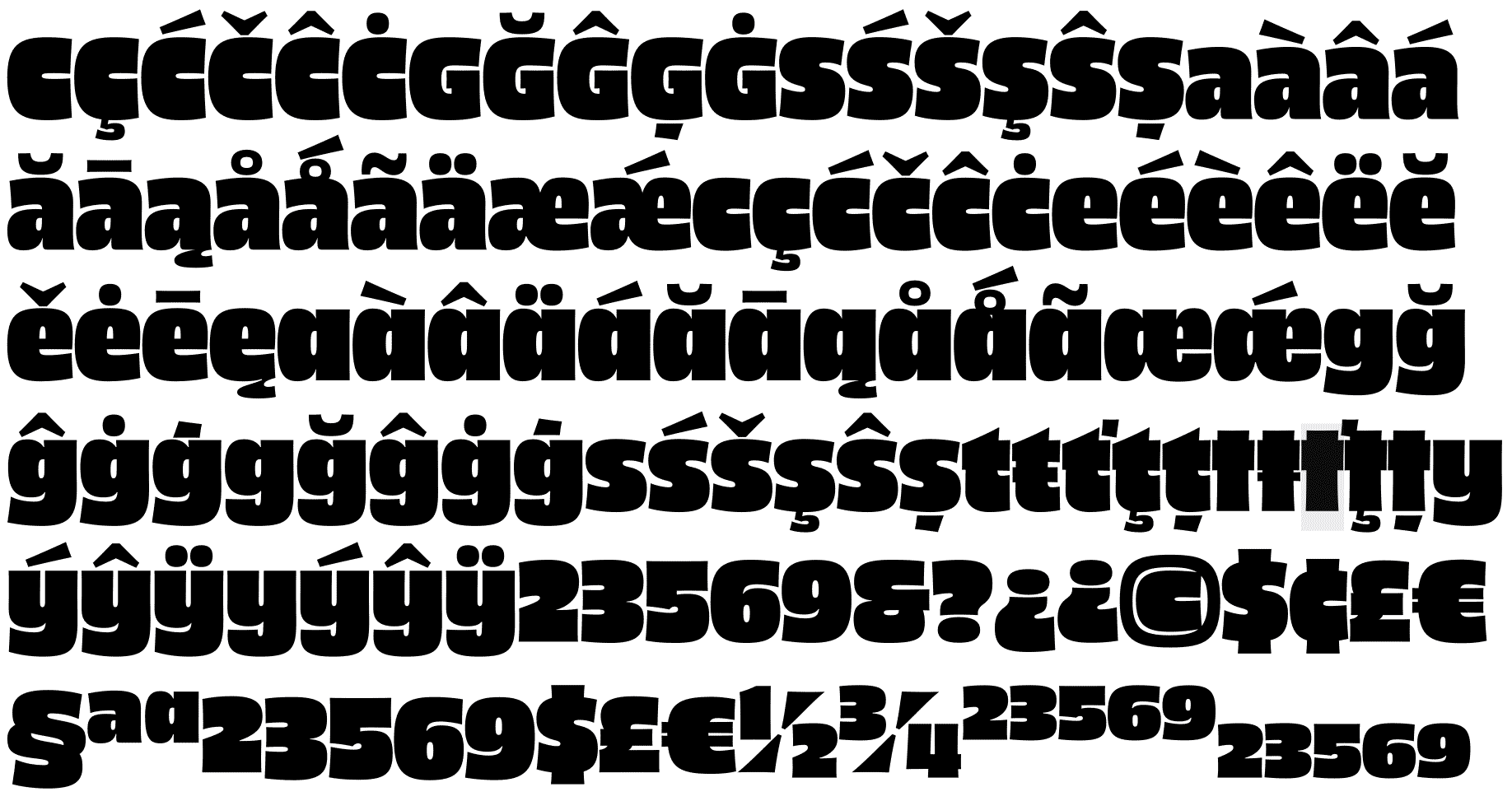
The first issue that really threw me for a loop was the terminals. In the heavy weights, it made more sense to have vertical terminals on C, G, S, a, c, e, g, and s. However, in the lighter weights, those terminals created unsightly pockets of whitespace. The letters were fine in isolation, but words were bothering me.

Unfortunately, terminals that worked in the bold didn't work as well in the light condensed styles. I had to find a solution to deal with this. I briefly considered switching the terminals depending on weight and width, but it was such a dramatic change.

I posted this on Dribbble, looking for guidance. Jordan Bell chimed in with the helpful feedback of breaking these two options off into different stylistic sets.
I mostly avoid solving problems via stylistic sets. In most cases they don’t get used, and it becomes tricky to get everything working properly. It also creates more work for kerning, specimen making, and customer support in the future. Even with all those strikes against it, I still liked Jordan’s suggestion. Also, at this point I was pretty oblivious to just how much work I was creating for myself. Immediately I realized 2, 3, 5, 6, 9, $, ¢, £, €, &, §, ©, and ª all needed alternates as well. Then I realized all the alternate figures needed old-style alternates, too. Later I figured out all fractions, superiors, and inferiors that had those figures in them needed more alternates still. I was like FML.
Alternates always seem like a good idea at the beginning, and a terrible idea at the end.
Being crushed under the weight of my own designspace
At this point, I had done typefaces with a weight axis, and I had done typefaces with a width axis. How hard could it be to put those things together? Famous last words.
Type families can snowball out of control so quickly, I often have entire years of my life scheduled out after 5 minutes of daydreaming. This is fine if you’re the sort of freak that has mastered self-discipline and laser focus. For other human beings that are easily distracted, the project files can end up laying dormant on your hard drive for eternity. I am firmly in the “human being” camp, and that's exactly what happened. The workload I created for myself was the very thing that put the brakes on my progress.
Marty and Future Fonts
Around this time (2016–2018), I released some other fonts, and I got involved with Travis and Lizy, two friends that were starting up a project called Future Fonts. I came on board with art direction and recruitment responsibilities, and put my own projects up there as well.
Ohno was not doing so hot. I was three years in, and disappointed that the foundry wasn’t even close to supporting itself. Sadie and I had our little girl going through 150 pack boxes of Huggies at a frightening rate, and I needed to figure something out quick.
I met up with my buddy Marty Grasser, and lamented about some of the stressors floating in my head. Lucky for me, Marty has one of the most healthy approaches to combining art and business of any designer I know. His advice was simple: “You gotta come back to earth, man!” Marty’s perspective on the Ohno catalog circa 2018 showed me the forest for the trees. There was almost nothing in there that you could use on more than one project. It was all self-indulgent esoteric bullshit. I was completely inspired to make something one step closer to a workhorse. I emailed him a preview of Chattanooga that night.

September 5, 2018, Chattanooga in it’s limited form, emailed to Marty.
The risk was pretty low to bring Chattanooga to Future Fonts. I planned a cooking-show rollout of the styles, so the updates could be frequent, and it was more or less already done. Version 1 went up September 25, 2018 for $16. It was just one style.

The first Obviously specimens on Future Fonts. A single condensed style with seriously limited punctuation, and no accented characters. The license that Future Fonts gives type designers for releasing early and often is tremendously useful. My love for that platform and community can’t be overstated.
I’ve talked about this in process articles before, but Future Fonts has been so good for keeping me enthusiastic about my own projects. There is some added accountability, and oftentimes great feedback from the community. It’s relatively easy to get a v1 together, and with this project, the first couple of versions were already done by the time I got started sharing it with the world.
The unfortunate realization of the inevitable slog before me
Around October, the work I made visible through Future Fonts had caught up with the work I’d done. There were no more additions to the typeface that I had hiding in my back pocket. I was confronted with the brutal reality of how slow this was going to develop. Here’s the reason why.
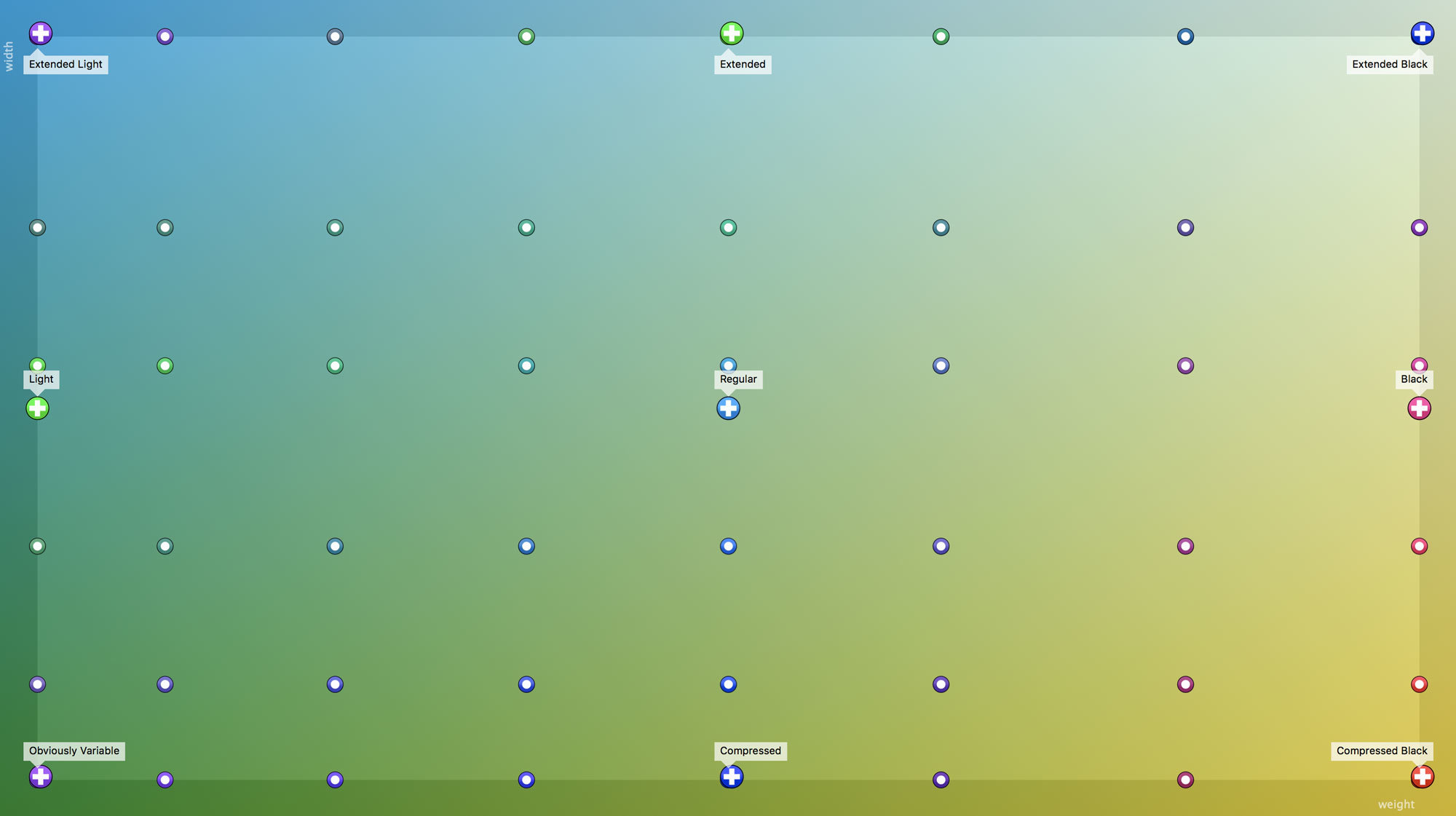
The plusses are masters: the actual drawings I have to create by hand. The dots are instances: computer-generated blends of the masters. Obviously had grown to a nine master family, so any character that got added needed to be drawn nine times. What makes that difficult isn’t the drawing, but the consistency checks that get exponentially more difficult with each additional master.
Still it seems I wanted to make things harder on myself. I shifted the masters around, and tried to get it to a place where I could get the most (instance) bang for my (master) buck. This was a decision I’d pay for later, as many of the interpolations didn’t go as smoothly as I’d hoped.
At this point, the design work was essentially done, and it became a matter of production work. In general, I like how type design is a mix of about 5% creativity and problem solving, and 95% zoning out with flow-state production work. Obviously was pushing this ratio closer to 1:99, and my patience was wearing thin. Luckily, Future Fonts income reports were showing this was my most financially viable project, so I kept my nose to the grindstone and pushed out a few more versions.
Do I really need italics? Ugh, ok.
I knew at some point someone was going to ask for italics, but I didn’t know if I had the heart to actually make them. After all, this essentially would take the above designspace into two dimensions, doubling the number of masters. It came from Sébastien Brothier, and I had to figure out how to attack it.
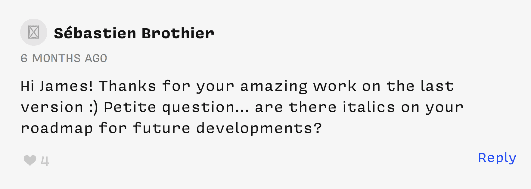
Just a petite question from Sébastien.
I showed these two options to my friends Kel Troughton, Tommi Sharp, and Tad Wagner, and the unanimous decision was to opt for the more normal obliques.
Obviously had been drawn with variable fonts in mind from the beginning. I knew that if I drew the romans with a sympathetic structure to how italics work, I could interpolate between them, and give users a fun “slant” slider so they could select the italic angle of their desire.
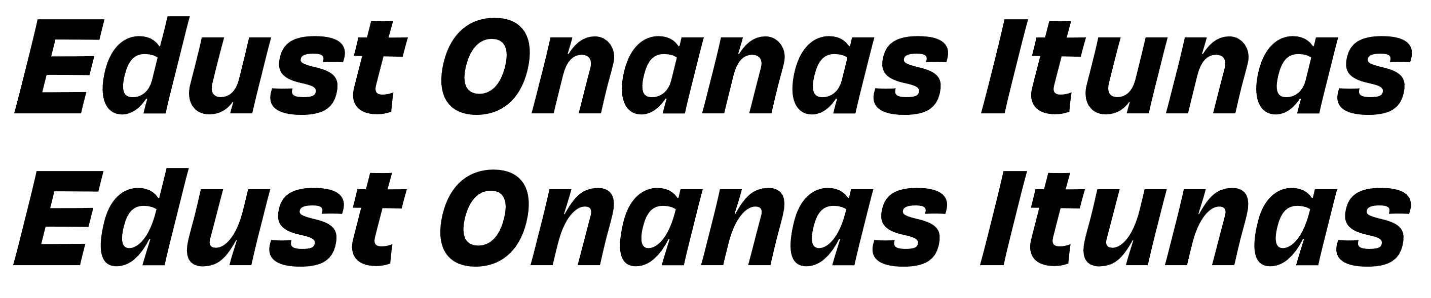
This was a particularly boring and isolating operation to perform. The number of masters quickly doubled to 18, and I had to go through nine of them and correct the obliques.

Left: digitally slanted. Right: corrected. It's almost unnoticeable to the untrained eye, but each digitally slanted letter is far from acceptable. The shortcomings of digital slanting are especially visible in round and diagonal strokes.
Typographics
A lovely reward for this mountain of soul-crushing tedium came in the form of Nick Sherman’s identity for Typographics 2019. Nick was riffing off the sort of blue collar graphic design that he and I share a fondness for. When combined with the brightly colored gradient backgrounds, the identity made a shocking impact. It simultaneously celebrated working-class design sensibilities and bleeding edge technology in the form of variable fonts.
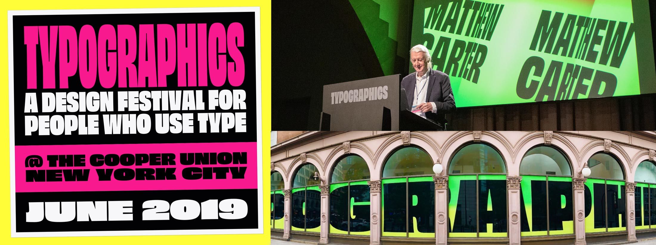
Obviously in use at Typographics 2019. Art direction by Hex Projects. Top right: Matthew Carter presenting, photograph by Henrique Nardi. Bottom right: Photograph by Ken Barber.
Final polish
There were several stupid things I had to fix in the final versions of the fonts. For instance, accents over characters like I in the wide styles had to be made narrower to avoid collisions, and I added more (perhaps unnecessary) stylistic sets for a t with no tail (Jesus t), and a single-storey a.

The narrower I accents. Have you ever felt like you bit off more than you could chew?
I never thought this would be done
Here’s what I want to remember for later: We are running a marathon, not a sprint. As much as I like to work quickly and get stuff out there, there is something to be said for the long and winding road that creates work of considerable heft. Also, a community of people gently requesting additional styles and features can do a lot for sustaining development. To do anything, I have to feel like it’s worthwhile, and hopefully important. Obviously was already worthwhile—it was a learning experience in font production and self-discipline—but it’s up to you if it becomes important. Typefaces are defined by their use, and that’s where you come in. Thanks for reading.
Thank you
Sadie Fenton, Loretta Edmondson, Kel Troughton, Tommi Sharp, and Tad Wagner, Marty Grasser, Travis Kochel, Lizy Gershenzon, John Downer, August Miller, Savannah Julien, Ben Kiel, Nick Sherman, Jordan Bell, and Rob Stenson.