In May of 2016 I got the coolest email that a type designer can possibly get: my favorite band reached out because they wanted a custom typeface. I’m still baffled thinking about the unlikelihood of this event. It’s almost enough to make me think a higher power had something to do with it.
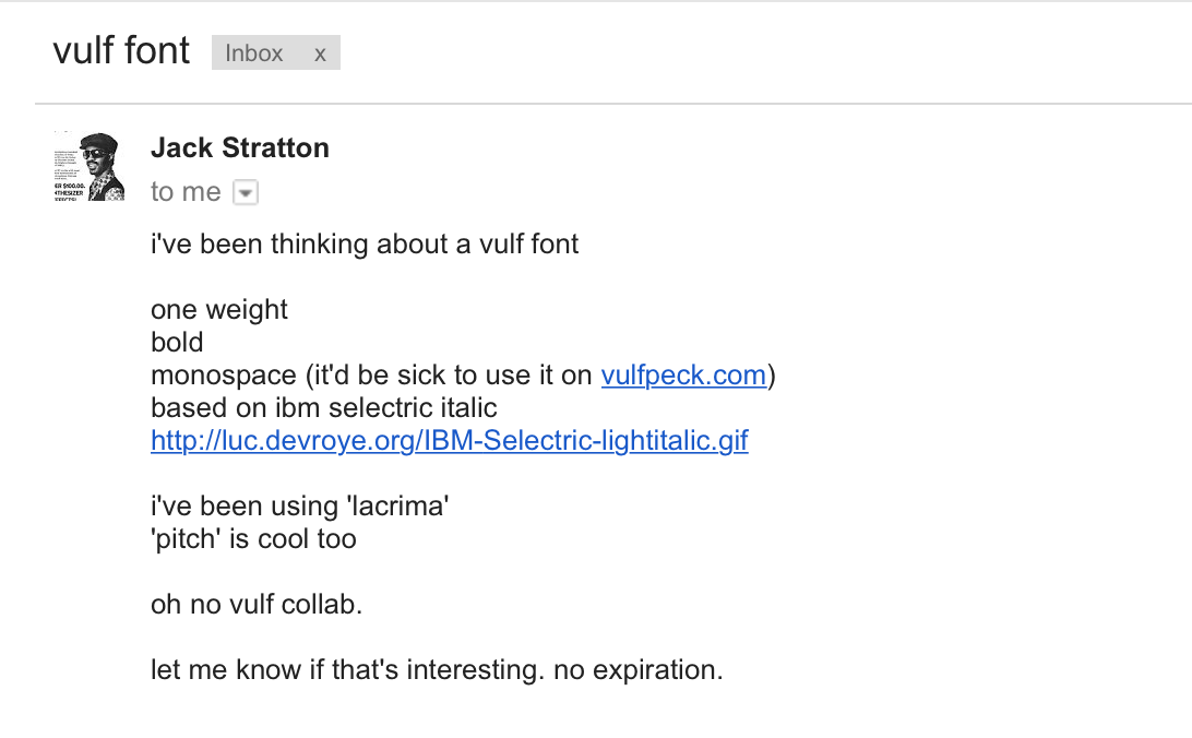
The original email from Jack Stratton that had me counting my lucky stars.
In the time since then, Vulf Mono has become a good seller for our little foundry, and I’ve taken every opportunity to evangelize about Vulfpeck’s music and videos. I think there might be a higher Vulf-fan-per-capita rate within the field of type design thanks to these efforts.
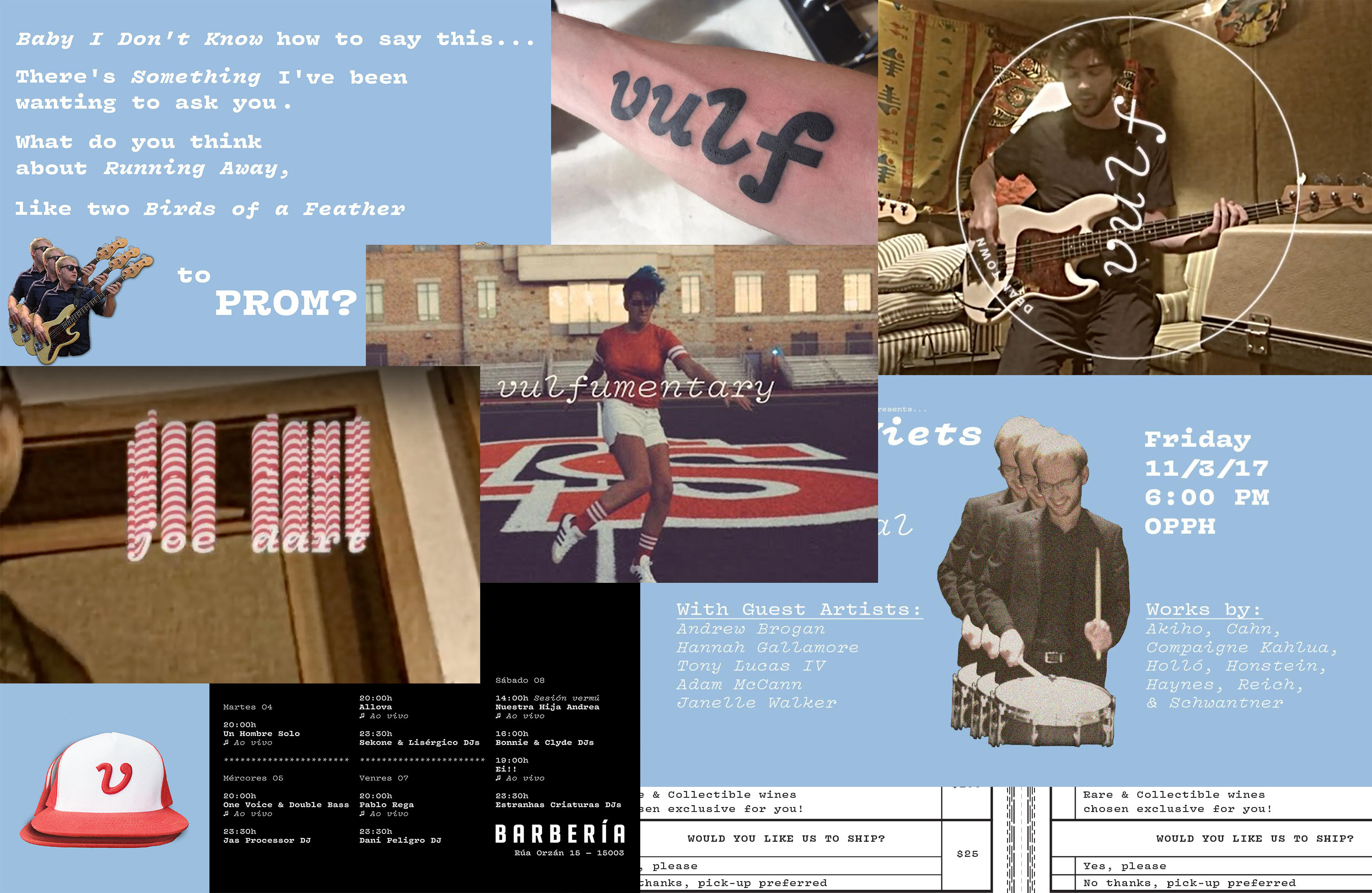
In use examples for Vulf Mono are usually merch, videos, fan art, and extremely rarely, client-based graphic design work. Someone even used it to ask someone to prom. I’m not sure if it worked.
One of the most interesting parts has been watching where this font pops up. Vulf Mono isn’t distributed anywhere besides this site, and for that reason, it doesn’t get the same exposure to graphic designers. Most of the folks using it are Vulf fans that come by way of vulfpeck.com. They put it to use in fan art and cover videos, and some of the more technically literate users make it the default in their text editors. It’s been a tremendously enjoyable experience all the way around.
A few seemingly unrelated ideas
The t-shirt is the ultimate merch item. I’m amazed by the universality of it. It’s a beautiful thing to remember we are all just human beings with fairly similar, oddly shaped bodies that need to be covered up most of the time. Everyone needs a shirt, and if you can support an artist you love while wearing one, even better.
Much to my dismay, not everyone needs fonts. Since the democratization of desktop publishing, this percentage has significantly increased, but it remains an esoteric purchase for most folks. When you make that font a monospace, the potential uses are dramatically stifled. For that reason, Vulf Mono was one of the most odd and specific pieces of merch ever.
Like a lot of people, I have grown increasingly disappointed by the pitfalls of functionalism. One by one, as huge tech companies ditch their typographically original logos (think Spotify, Google, Airbnb, Pinterest, etc) in favor of geometric sans serifs, my heart sinks a little more.
But one cannot deny just how useful a sans can be. A low-contrast letterform that is free of decorative frills is the ultimate typographic common denominator. It will be used in some way as long as their is written language.
In an exercise in humility, and an effort to gain some understanding, I opened up a anonymous survey for Ohno a few months back. One piece of criticism that multiple people remarked on, was the desire to support our foundry, but also to use a typeface more than once. To justify the hefty cost of licensing, something has to be useful on more than one project. Like a lot of good advice, this stung quite a bit.
All of these seemingly unrelated ideas were floating around in my head when I saw video for Animal Spirits. Surprisingly, the video used Forma DJR, a dangerously well-drawn revival of Forma, Nebiolo’s 1968 answer to Helvetica. How could Vulfpeck, a band with a custom typeface, be using anything other than their eponymous Vulf Mono? The answer was a hard pill for me to swallow: there is no fighting the utility of a sans.
I had to overcome my fear of the genre, leverage the work already done on Vulf Mono, and create a sans with warmth, love, and humanity. It could provide a more thorough typographic palette for the band, and make the typeface-as-merch-item idea slightly more universal. Perhaps most ambitious of all, it could serve as a reminder that neutrality in graphic design is just one answer, it isn’t THE answer, and it’s over-represented to say the least.
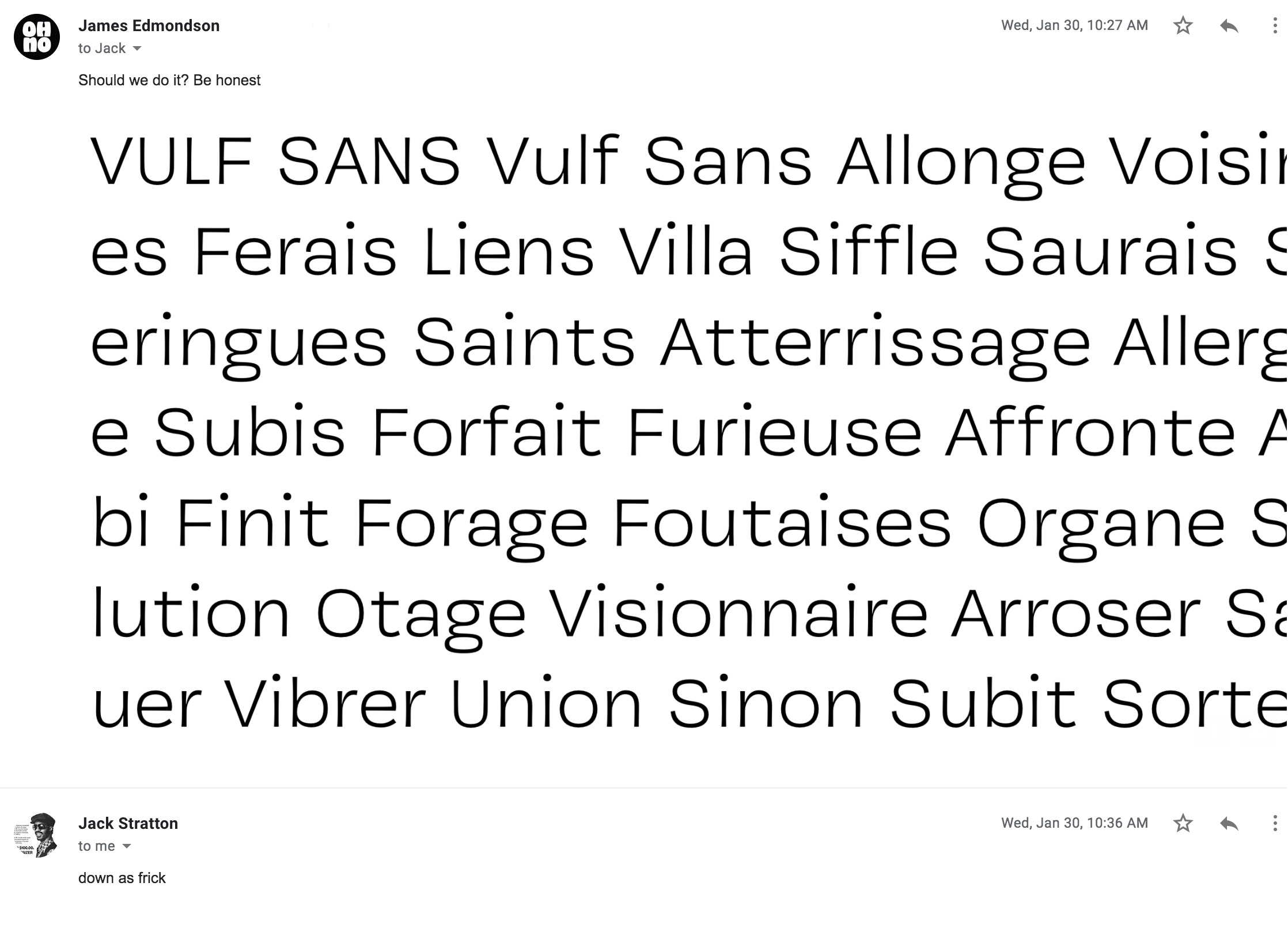
Luckily Jack was down as frick.
Lost in translation
Translating something always risks a loss. Most type designers are familiar with the bummer of tracing signage for a revival typeface, and watching the life get immediately stripped away as cold bezier make mathematically “perfect” but visually uninspiring straight lines. In Vulf Mono, we got around that by adding subtle concavity to every outline. Luckily, that seemed to work on the Sans as well, but there were other vibrant features of the Mono that I wanted to somehow preserve.

Step one was simple enough: remove the serifs, and make it proportionally spaced.

Gradually, the S turned from an extremely straightforward and balanced design, into something a little heavier on the bottom, smaller on top, with some generous width.
The width of the romans were brought to a slightly wider-than-normal place. In the Mono, the generous width was chosen to get all-caps settings looking closer to normal, as monos typically make the sacrifice of condensed caps. A slightly wide Sans seemed to work as a gentle nod toward the Mono.
In the italics, the width stayed in a relatively normal place. In most cases, italics are more condensed than romans, so pairing a wide-ish roman with a normal-ish italic heightened the contrast.

A large difference in width between the roman and italics makes them more easily identifiable in text. In Covik Sans I played with making the difference almost undetectable, but in Vulf Sans, the condensed proportions and 13° slant accentuate the contrast.
The punctuation seemed to be an obvious place to bridge the two families. Monospaced designs often feature exaggerated punctuation for two reasons: to fill a huge gaping hole, and to clearly identify the important difference between commas and periods, brackets and braces, or carrots and asterisks. Vulf Sans got enormous commas and quotes, large dots over the i and j, and some bodacious curly braces.

Vulf Sans got some exaggerated punctuation to match the Mono.
The ball terminals ended up being the salient feature of Vulf Mono, just as they were in Light Italic, Vulf Mono’s main inspiration. A sans could feasibly have ball terminals, but that seemed way too heavy handed. There needed to be some link, so I began messing with closing the apertures just a little too far.

By wrapping the top terminals in on themselves slightly, another connection to the Mono was made.
Here’s where I took it too far. I was looking for a way to tie in Vulf Mono’s lengthy entry strokes into an interesting design feature for ascenders in Vulf Sans Italic.

A failed idea: terminating ascenders and legs of R and K at an angle made an impactful impression on the texture, but in a way that was a bit more chaotic, and less nuanced I’d hoped.
When looking at how far to push weight, I realized the limiting factor in the Mono was simply the three stems in m. There is only so far a mono can be pushed, but a proportionally space sans can go quite a bit bolder when economy of width isn’t a concern.

Where Vulf Mono was only four weights, Vulf Sans adds one more. I see this as analogous to the band’s lineup. In 2016, they were predominantly a four-piece with features. These days, it’s quite rare to hear a track without Cory Wong (the unofficial fifth member) contributing rhythm guitar.
Vulf Sans: The second typeface from the only band with a typeface
Vulf Sans has taught me that I can get behind more genres of type than I’d previously thought. Like any great pop song, I hope for it to strike a balance of catchiness, relatability, and emotional resonance. Maybe fans will find it useful for things beyond fan art, and maybe they’ll even use it more than once. ✌🏻