While staying with Cara Di Edwardo on the Lower East Side of the city that never admits there are other cities, she asked me to design a t-shirt for the 2017 Typographics design festival. I thought that would be fun, and wanted to use the treasure trove of legendary design work at the Lubalin Study Center as a starting point. Lubalin was a famous art director for many reasons, but I particularly enjoy how the lettering artists he employed (like Tom Carnase, John Pistilli and others), were fearlessly pushing type parameters like weights and x-height to stop readers dead in their tracks. Work like the Oh! & Ah! identity is the typographic equivalent of a Joe Dart bass solo.
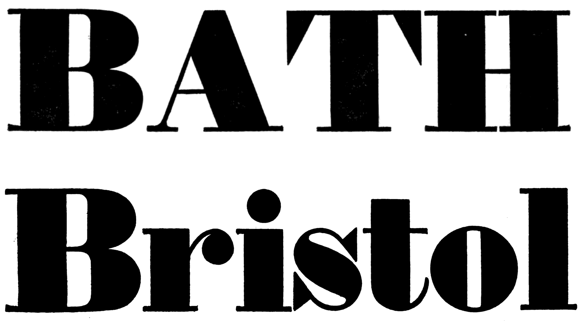
Using those ultra fat letters as inspiration—or more honestly, ripping them off completely—I started sketching some compositions for Typographics. I made a few changes to the Oh! & Ah! Model, which was more or less traditional, save for its extreme weight. I boosted the x-height to the maximum, and squared up all round shapes to get each letter filling out as much of a rectangle as possible. That way, no pockets of negative space would be distracting readers from the letters.

Incredibly fun to draw, and totally challenging. The normal shaped letters like o, a, p, h, and the like weren’t going to be a big problem, but letters like y, g, and s took some finessing.
As letters get more bold, the negative spaces inside them shrink. This is obvious, but less obvious is the fact that the spaces *around* the letters must shrink as well. Most of the time, spacing is a reflection of the size of the spaces inside the letters. To my students, I call this the “counterspace equals letterspace” technique. That, in conjunction with the “three at a time” technique makes up most of my strategies for good spacing.
In the world of super bold letters, tolerances shrink, and spacing issues seem to have a magnifying glass upon them. Traditional fatfaces have a ton of space around A, V, and the like.
Here, Edmund Fry’s Ten Lines Pica (1816) looks ok in certain places, but all that space around A, T, and r make me wonder if there is a better way. This is of course coming from 200 years ago when drawing and manufacturing technology wasn’t quite what it is now. Some of the spacing issues could be solved with kerning, but not all.
Expanding the alphabet proved to be an indulgence impossible to resist, and soon nailing the spacing exposed some unexpected solutions in the uppercase as well.

You don’t typically see triangular serifs so large, but inspiration came partly from just wanting to fill the space, and partly from The Pyte Foundry’s Overdose and Overdone.
In a way, it’s quite similar to the San Francisco psychedelic poster artists of the late sixties. They were inspired by Vienna Secessionist lettering that minimized negative space. It made each letter into a fun puzzle, challenged readers, and allowed for exceptional spacing! There was always a 1:1 ratio of counterspace and letterspace, allowing for eyeballs to glide along text without hiccoughs. After seeing some of these experiments of mine, the seasoned type veteran, John Downer emailed me to point out some flaws. John is a heavyweight in the field, and among other things, designed the premier display typeface of the craft beer revolution. I was eager to read his thoughts. He said this:
“Reducing the areas of counters for F, J, L, and T will always give us fits. (That's why they all need kerning with an abnormally high number of other letters.) I’m not sure that enough of the negative space can be eaten up purely by changing the shapes of serifs. It didn’t work out very well for the artists who drew letters on hippie posters, now did it? Sometimes, you need to realize the inherent limits, and concede that a solution doesn’t exist for every last detail that needs fixing. Wiser to acknowledge the nature of the beast and settle for what you get.”
Those were all good points, and John is no doubt a master of the craft, but my opinion remains: there are quite enough wise designers acknowledging these limits and arriving at similar results. Ohno Blazeface was an opportunity to try things slightly differently. Also, John and I can agree to disagree on how well it worked out for the artists who drew letters on hippie posters. I think those posters were pretty cool, and wonderfully illegible!
Taking a left turn
It was at this point where a productive person might commit to an idea, and see it through to the end, but thanks to the lack of a deadline or any accountability partners keeping tabs on my progress, I felt the freedom to shift ideas entirely. Plus, there are a lot of nice fatfaces already.
I was curious what a stoney or slightly psychedelic filter over this foundation might look like. I admit my hypocrisy during this part of the process—I spend a great deal of class time singing the praises of sketching, and what a vital part of the process it is to hold a pencil in your hand and watch the results appear before you. That’s what I should have done, but instead, I did a few half hearted thumbnails, and went right into the computer editing the outlines of the more sober fatface to produce something considerably more groovy.
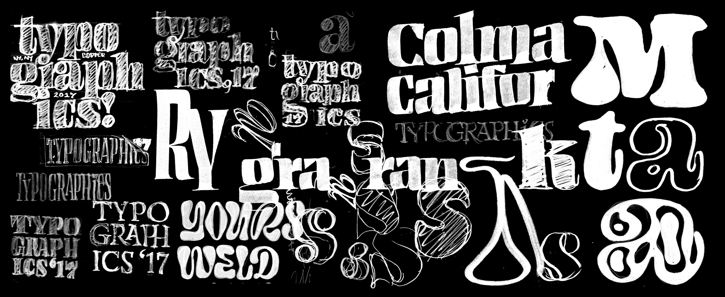
Chaotic, nonsensical, and more or less meaningless to anyone other than myself, this composite is actually a good representation to my sketching techniques. Towards the right shows the initial Blazeface doodles.

My rules were to embrace weird forms, but only if they allowed for better spacing or consistent allocation of weight.
This actually turned out to be an acceptable way of working, as I could easily leverage all the previous weight, width, and contrast decisions, which freed other parts of a my brain to experiment with slightly unusual forms. In the capitals, particularly uneven shapes like C and L could be even more exaggerated to fill that distracting negative space. V and A pushed this to the maximum which created some bizarre and slightly illegible letters, but they failed to draw much attention to themselves in the middle of words, so their exuberance was permitted.
The first revision of the numbers were based on painfully conservative conventions. They were the typographic equivalent of an undercover cop: trying too hard to blend in while being way older than everyone else.

Those ball terminals were way too 19th century! Looking back at the uppercase, I borrowed the triangular serif shape for the numbers, and things started relating more intentionally.
Less Useless
The problem with extremely high contrast faces is exactly what makes them cool in the first place: they only work huge. At enormous sizes, they can make a huge emotional impact. At small sizes they just look fucked. Letters bleed together, counters fill in, thins disappear, and no matter how good the composition, the layout looks like it was completed by an amateur. To solve this problem and give designers a useful toolbox from which to select the right font for the job, I added an optical size axis.
It’s possible that Cooper Black is one of the most useful display faces of all time. It seems at home in most decades, and while it is almost too easy to use it for iconic design work (like the Thundercat or Black Keys record covers) its adaptability in both size and application cannot be denied. I’ve thought a lot about what specific characteristics made Cooper Black so good. Was it the huge x-height? The plump terminals? The short descenders? Whatever it was, I tried to put a lot of that into the small optical size version of Ohno Blazeface. I didn’t want to copy the shapes, I just wanted to copy its ethos.

Now when viewing them side by side, they are incredibly different in almost every way, but their literal descriptions are quite similar.
Ohno Blazeface straddles a line between silliness and sobriety that is really fun to draw and design in. Too often designers rely on sterile sophistication so that their work can be taken seriously. But in everything I do here at Ohno, I try to remind people that we are human beings. We read with flawed eyeballs and emotional hearts. Pandering to the stoic and hip can get in the way of having a lot of fun with typography, and Ohno Blazeface is another weapon for fighting the soulless generic work that maintains its steady footing in the pantheon of design trends. I admit, making type that is obnoxious or attention-seeking is pretty low-hanging fruit. For me, it’s much more rewarding and challenging when stylistic decisions are made in the name of good spacing. It’s silly for sure, but it takes a lot of seriousness to be this dumb.