I fell in love with single stroke capitals through signage in San Francisco. Taking the 24 bus down 16th Street, to California College of the Arts every day made it easy to develop an appreciation for signage.
It wasn’t until I finally took a workshop at New Bohemia signs that I actually understood how those letters were created, and exactly why: cost, efficiency, and speed. While a traditional “Gothic” style (now simply called “Sans”) requires additional finishing strokes, casuals embrace the qualities of the brush, and simply let strokes begin and end how they naturally flow from a brush. It’s a perfect example of riding the horse in the direction it’s already going. Thanks to the efficiency coupled with good looks, the style proliferated like crazy.
What the heck does “Casual” mean?
As is often the case of design decisions born of real-world constraints, people fall in love with the result as it becomes familiar. Decades later, in a purely digital environment when we no longer need to worry about how One Shot Lettering Enamel reacts with squirrel hair (signpainting brushes are seriously made out of that stuff!) we still are fond of setting type with typefaces that mimic this iconic style.
The essential ingredients of a casual are that it must look, well...casual. But that’s just another word like “edgy” or “optimistic” that means a lot of different things depending on who you talk to. But what does it mean for type?

Creating perfectly straight, upright stems requires tremendous care and precision. Adding a slant allows for better ergonomics, and for imperfections to be disguised as lively dynamism. Plus they look like they’re moving really fast!

Next is the negative pen angle at about 30°. Let the brush do what the brush wants! It’s a human being for crying out loud.
Fortunately for fans of the genre, a great many casuals have already been masterfully digitized by the likes of Ken Barber, Flavia Zimbardi, and others. Over time, it became striking to me that the genre hadn't been deconstructed and thoroughly explored like many other flavors of type. If there are about a million billion neo-grotesques, couldn’t there be a neo-casual? That was the thought that led to my first sketch, a file on my computer simple called Weird Casual.

In an effort to solve the weight build-up issues of traditional casuals (like when a thick stroke meets another thick stroke), this experimental sketch went crazy with the tapering. There are so many problems with this, it’s hard to know where to begin. The cap alignment is wonky, the widths are all over the place, and G is too slanted. I still like the I though.
Death to the weird
Like many of my unfinished typefaces, I fell out of love with this design, and decided it was too familiar to be experimental, and too experimental to be useful. It died on the vine, like so many before, and so many that have yet to be.
But casuals have my heart, and they’ll have my heart forever. I knew it wouldn't be long before I approached the Neo-casual genre with newfound vitality. All of a sudden, without reason, this showed up in a Robofont file in front of me:

Let me be the first to say I have no idea why I drew this. It’s poorly drawn, and ill-considered. What’s up with that a? I have no idea. But the G got me thinking, and I quickly iterated by adding contrast. That’s a classic Ohno move. Just throw some thins in and see what happens.

Whenever I try to change one thing, I often get inspired to make a few other sweeping changes as well. All of a sudden I felt the design crystalize, and got into the EVERY-GLYPH-CELL-MUST-BE-FILLED mindset. That’s a dangerous place to be, especially when you don’t really know what you’re doing, but I simply couldn’t help myself.

At this point, I was having fun, and most of the letters seems to effortlessly design themselves. That sounds like a joke, but it’s actually how it feels. I know a design is getting somewhere when the answers reveal themselves for all the rule-following letters. Unfortunately there are always the usual suspects of characters that baffle me nearly every time.
Voices in my head
It’s at this point in the process when the voice of my former teacher Erik van Blokland enters into my head: “Single style typefaces are just islands. Explore the designspace.” I had to switch gears from my font production flow state, and begin the more laborious task of seeing how much contrast and weights could be tampered with.

I pushed the weight as far as I could, and brought the contrast down to a nearly nothing. It seemed to be a nice designspace conceptually, but the bold, low-contrast style looked so corny to me! I just couldn’t release something so absolutely cheesy looking. But the designspace gets what the designspace wants! In the end, I decided to have the static fonts (the OTFs) travel diagonally across the designspace—only letting the variable font access the other styles.
Now we had an idea, a plan, and the alphabets drawn in lowercase and uppercase. The interpolations were mostly working, and now all we needed was a hero. A selfless nomad who could bring the project to fruition by dedicating herself to the backend of the character set, and loving all those glyphs we need for all those latin-based languages outside my native tongue. She came in the form a recent RISD grad by the name of Corinne Ang.
Corinne has entered the chat
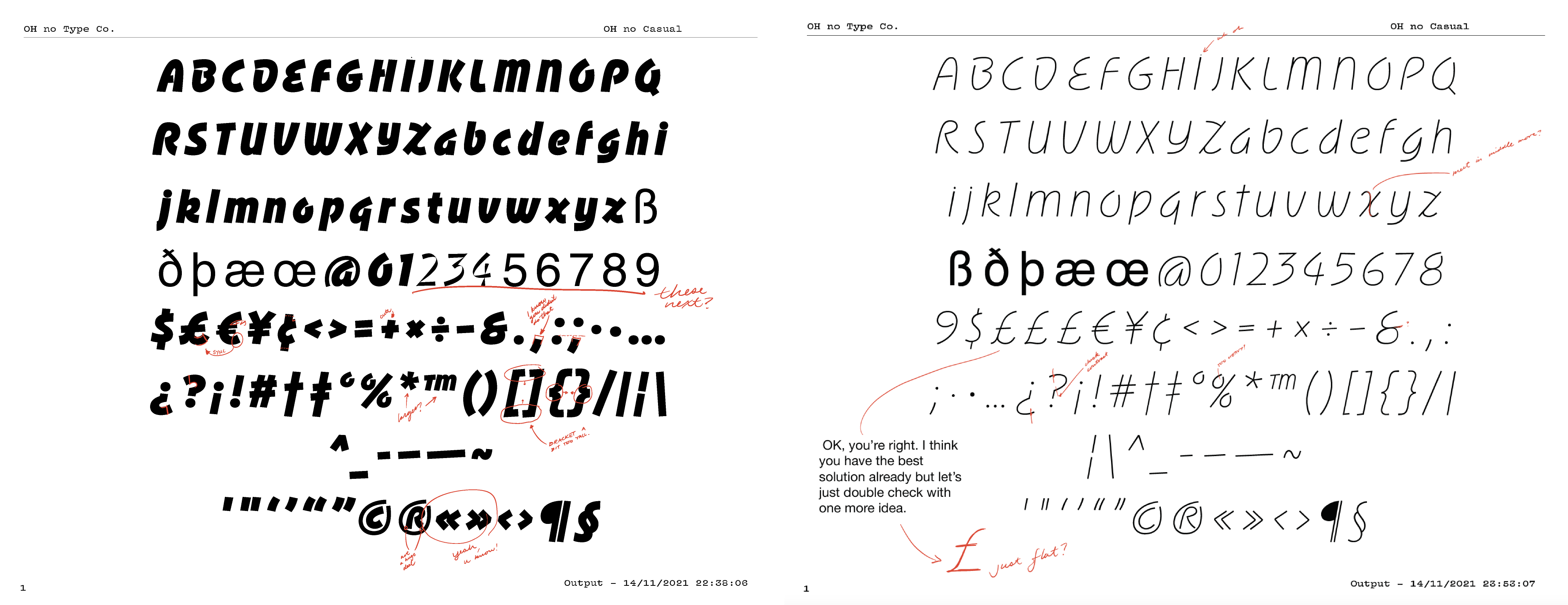
I met with Corinne to begin work on the Light Low Contrast source file. She returned in a week with many of the forms figured out better than I could have hoped. The figures were a mystery to me, and somehow, Corinne tackled them with the finesse of a seasoned pro. My job was as simple as making a few notes, then watching with amazement as she ironed out the kinks, and gradually worked her way through the other source files. It was several weeks of Corinne moonlighting on the project and meeting on Tuesdays to chat and go over our notes.

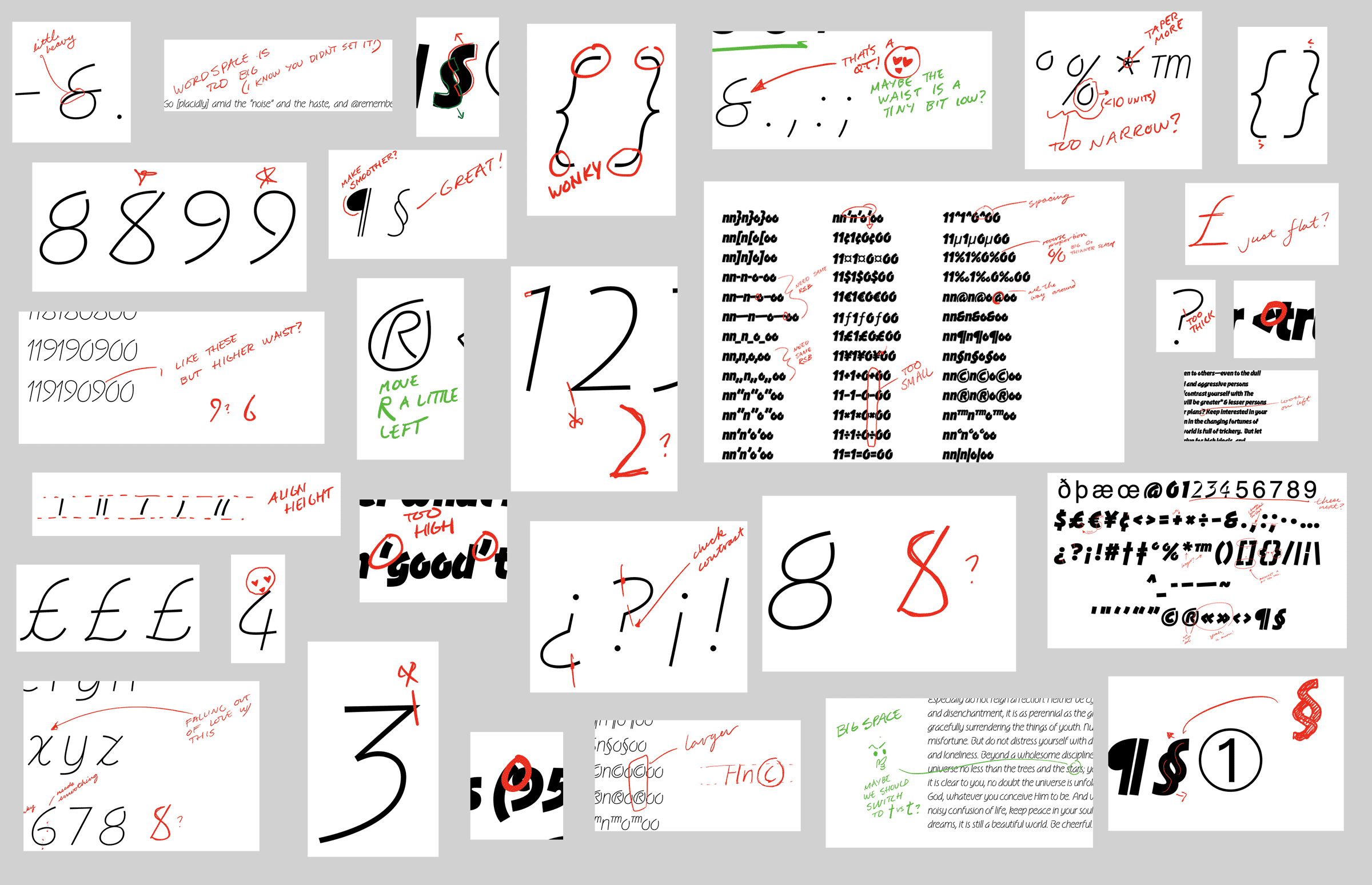
A select portion of various notes I was making on Corinne’s proofs.
Corinne: One humid summer day during a Google meets call I mentioned that I wanted to learn more about the later half of the type design process and asked James if I could help OH no out a little. He graciously said “yep! Do you want to take a crack at Slip (OH no Casual’s original tentative name)?” Having seen glimpses of it already, how could I not be stoked?
Entering someone else’s working file is like entering unfamiliar terrain. So, the first step was figuring out what the rules of the jungle were. Like any person doing something for the first time I thought to myself “don’t SLIP up dude.” With that bad dad joke out of my system I got to investigating by seeing how the typeface worked through compositions.

Needless to say OH no Casual is not as casual a job as the name suggests. So where to start? The low contrast forms are like a skeletal structure on which the high contrast styles add brush rotation to. So, it was only natural to set a solid base and draw the punctuation in the low contrast styles first. Like a tricky maths problem, you just gotta simplify the process to manageable portions. Feels good to know that something usable came from high school maths classes.

Some of the early proofs.
Speaking of maths, the numerals were particularly finicky. Their differing calligraphic origins from the alphabet meant that there were less hints to grab from existing letters. The real struggle was figuring out where and how to adjust the underlying structure so that it felt loose and fresh just like the alphabet.

After some experimentation we found that it was best to keep an open form in the exit strokes and look for sharpness in some of the curves to keep it texturally spicy.
All that was left was diacritics and the high contrast styles. They ended up being drawn at the same time. Thankfully we have the ever enchanting sorcery of Glyph Construction to speed things up. The bigger challenge was finding out how contrast is applied onto these forms that are added onto the letters. The bars that go across some characters were a good example of this.

It turns out this was a fancy dress party all along! You get a bowtie, I get a bowtie, we all get bowties.

When the bar crosses a letter twice it’s double the trouble. But, in this one the simpler solution was right and there’s the important lesson that one size doesn’t fit all.
With all the funky shapes and pieces drawn out, everything needed tightening up and kerning. And so it was time for Jamie to kern, and for Colin to work his magic!
The Textile
While Jamie was bulldozing through the kerning with the tenacity of a hydraulic press, I took a moment to add a little je ne sais quoi to Ohno Casual. Whenever we take on a display typeface, we try to do a little something extra to make the font fun to use. Hobeaux Rococeaux had a dingbat font for borders, Ohno Softie got Colin’s patented Shortie Caps™, but I was clueless for what that bonus feature for Ohno Casual could be.
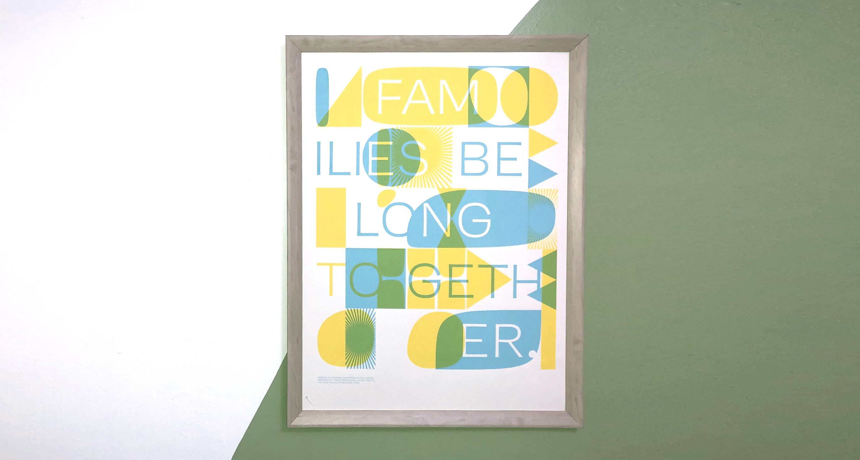
Then I remembered a poster I had designed for a fundraiser a while back that featured Vulf Sans with a mid-century inspired two-color pattern interwoven with the type.

Designed in 2019, printed by Nat Swope, 18" × 24". The frame is from Target and is an absolute piece of shit.
I always thought that could make for whacky dingbat font, and because the source material was sympathetic to Ohno Casual (mid-century being a time when Casual sign painting was completely ubiquitous) I started to see if the two could work together.
While it wasn’t an obvious match, I enjoyed the interplay enough to see how to build this out into an actual font. Creating dingbat fonts is a bit sad. Ultimately the chosen locations of where these random shapes fall onto unicode values is a bit arbitrary, and at worst, you need a manual to use them. But because I was trying to use the font to create chaos instead of predictable patterns, that freed me up to simply put them wherever. It might be one of our most useless fonts yet, which is always a great accolade for which to strive!

A-Z of the Textile font are 2 unit wide shapes, a-z are the same shapes, inverted. 1-9 are shapes made to contain words of varying lengths. Stylistic Sets change those shapes, while keeping the width fixed. This is all totally logical, right?
Colin: By the time that I got my hands on Ohno Casual, Corrine and James had taken care of the art, and Jamie had taken care of the kerning. My role of cleanup hitter was basically to start the process of making the font files, or "manufacturing" in type design jargon.
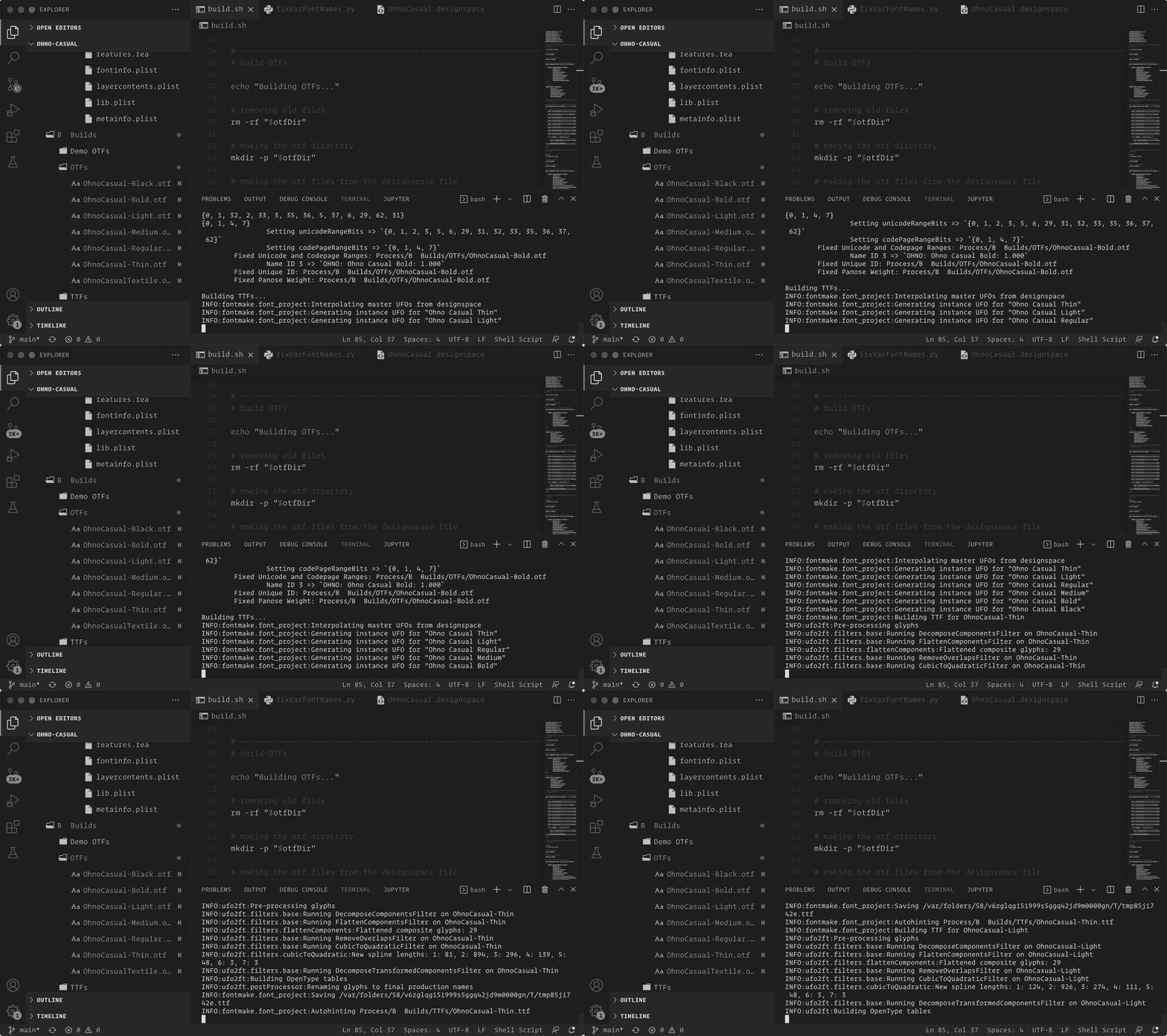
I take the raw source files (UFOs and DesignSpace files, in our case), and not only make font files out of them but ensure that they meet the requirements of the OpenType specification and other generally accepted practices. I do this using the fantastic open source tools from Google, fontmake and fontbakery.

Running the build script for Ohno Casual in VS Code. It takes care of most of the manufacturing process and makes it easily repeatable!
But before that, this process usually starts with a discussion with James about how he wants users (like you, dear reader!) to experience the font. We want the fonts to be a tool you all would find useful and easy to use in your design process.
This conversation typically winds up being a push and pull between what we want the fonts to do and what the OpenType specification says is acceptable. Often we need to apply it in a creative way to get the font to work the way we want it. In situations like this I always keep in mind what our teachers Just van Rossum and Erik van Blokland (second EvB namecheck this article!) say about Toolspace — you want the tool to adapt to and serve your needs, not the other way around.
For Ohno Casual, it was clear that it had a weight axis (Thin to Black), but the classification for other axis was less clear. In variable fonts, you have access to 5 "registered" axes: weight, width, optical size, italic and slant. The second axis of Casual didn't fit any of those, so we opted for an "unregistered" axis, Contrast (abbreviated CNTR) on the same scale as the weight axis. There are certain benefits and drawbacks to choosing an unregistered axis, but we felt like it fit with the vibe of Casual's variable font being an open space intended for exploration.

This design space is made for exploring, baby!
Next we discussed Ohno Casual Textile. James had a pretty cool set of symbols drawn, but we needed to nail down how we wanted them to relate to the base font.
As he wrote above, we decided that they should exist on the same scale as the rest of Casual, but they're not really intended to be interspersed with the text. They're instead intended to be used as graphic elements on a different plane. Since they're built on a grid system, intended to be stacked like blocks, I adjusted the vertical metrics of the Textile font so they would sit flat on top of each other in most applications (though you will need to make sure your line spacing or leading is set to "1.0" on the web or in Adobe applications).

Some of our favorite Stylistic Set names ever.
The one thing remained is what to call the stylistic sets. Since they're a series of abstract shapes of various dimensions, I was finding it almost impossible to come up with names that suited them. "SS02: Spiky Spikes pointing to the right" or "SS05: A lava-lamp shape growing in intensity" was just as much gibberish as if I named them something like "Keke" and "Xewo". So that's what I did temporarily.
James and Sadie had already set off on a long weekend with their kids, so I marked it on my checklist to tackle it with James when he returned. Though, throughout the rest of the manufacturing process, the names started growing on me. I realized I unwittingly named them according to the Bouba/kiki effect, a phenomenon in which cultures all over the world similarly tend to associate a round shape with the name "bouba" and a sharp shape with the name "kiki". So when James got back from his trip I vehemently defended my new favorite stylistic set names and he agreed they were pretty much perfect.
Conclusion
Ohno Casual could have resulted in as many as eighteen styles, but by moving in a single diagonal line across the designspace, we’ve limited it to six. That means there are styles reachable via the variable font version (which comes included with the whole package) that aren’t reachable via the OpenType discrete styles. I hope that’s a push to experiment with using variable fonts, and stake your claim on a part of the designspace that works specifically for you. Heck, maybe you like the Bold Low Contrast more than I do.
It might not be what you expect when you hear the name, and it might not be the easiest to use, but I’m thrilled with how our team worked together to bring this oddball to the finish line. Ohno Casual is unfamiliar, distinctly contemporary, and frankly cost us more money that it will generate. Hahahaha. Prove me wrong!