I flew out in the afternoon, and landed at La Guardia about 5. I arrived at the agency’s studio expecting a deserted office, but it was as bustling as it could have been. Every single desk was occupied. What time do people leave work in New York? My Californian sensibilities were completely thrown out the window. I was motioned into a glass room with hundreds of logotype iterations on the walls. “What do you think, James?” the art director asked. “I think there are too many logotypes on the walls!” (I thought that, but didn’t say it).
I worked on that project for a solid week. It was fun, challenging work. Then the emails stopped. Months later I saw the rebrand launch with none of my work, and my name was erased from the project. I had to confront the reality that all of my contributions were on the cutting room floor.
While this feeling of wasted effort was new to me, it certainly wouldn’t be to most folks working at this level of branding. There are so many directions killed, that no matter your role, you know your input has a slim chance of survival. But for me—someone who’d spent the last five years focusing on the cumulative effort of building a type foundry—it was a disheartening, and alien feeling.
Those soft forms kept rattling around in my mind, and without really intending to, I drew a new set of capitals from scratch.

The first drawings for Ohno Softie completely ignored the ruler tool and left plenty of room for fluctuations in contrast. The only goal was to maintain similarly sized pockets of negative space.
On the spectrum of expression, it was somewhere between Rodger and West Bubblegum. I was convinced of the idea that if you’re going to make something rounded, you should really just make everything rounded. Even the negative space shouldn’t have any hard corners. Straight lines? Not for this one, bub. A good representative for the genre should fully embrace all of the softness that it could possibly imbue. Any opportunity for a curve should be taken. In my head, I was executing the client work in the way I would have liked to see it get approved. And this time, it was without the heartbreaking realities of user testing!

The challenge of getting these shapes to interpolate seemed doable enough. Right? Right?!?

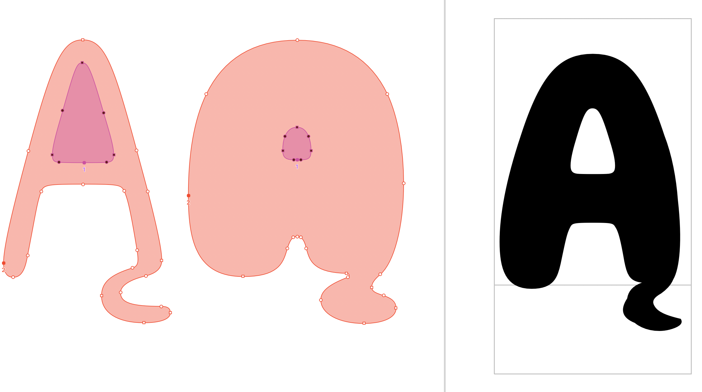
Between polar ends of the weight spectrum, intermediate weights can be interpolated automatically thanks to a shared point structure. On the H, it’s totally logical.

Ugliness! With the Black weight A drawn, I thought I could just use the same points to create the Light. But unfortunately, things aren’t always so easy.

Corrected! With a few more points added to the outline of the Light, and similar points plotted to match on the Black, an acceptable interpolation was achieved, but still, it’s not perfect.
After drawing the bold and the light, I found this was a pretty handy typeface to have around, so I decided to task Jamie Otelsberg (our font production assistant and studio admin) with the job of adding punctuation and accented characters to turn my fledgling idea into something more real. Take it away, Jamie!
James said to me in our morning meeting, "why don't you take Softie and run with it." I was pretty excited to jump in, and as soon as we got off the call, I opened up the two source files in Robofont and I was immediately reminded of the doodles that I used to do on my 3 ring binders in middle school. I thought to myself, “BUBBLE LETTERS – YES I CAN DO THIS!”
I had fun drawing round, doughy accents, punctuation, and getting in deep with Glyph Construction—the Robofont extension designed to make your life a bit easier when it comes to generating accented characters. I looked at a lot of existing typefaces to learn about accent placement, but I learned the most from making proofs and getting feedback of "a little more to the left... a hair more to the right."
Gotta love the red pen!
Not that I really thought it would be easy, but drawing bubbly characters was more challenging than I initially imagined it would be. However, after many rounds of feedback and lots of encouragement from James, we were finally getting somewhere with the character set.
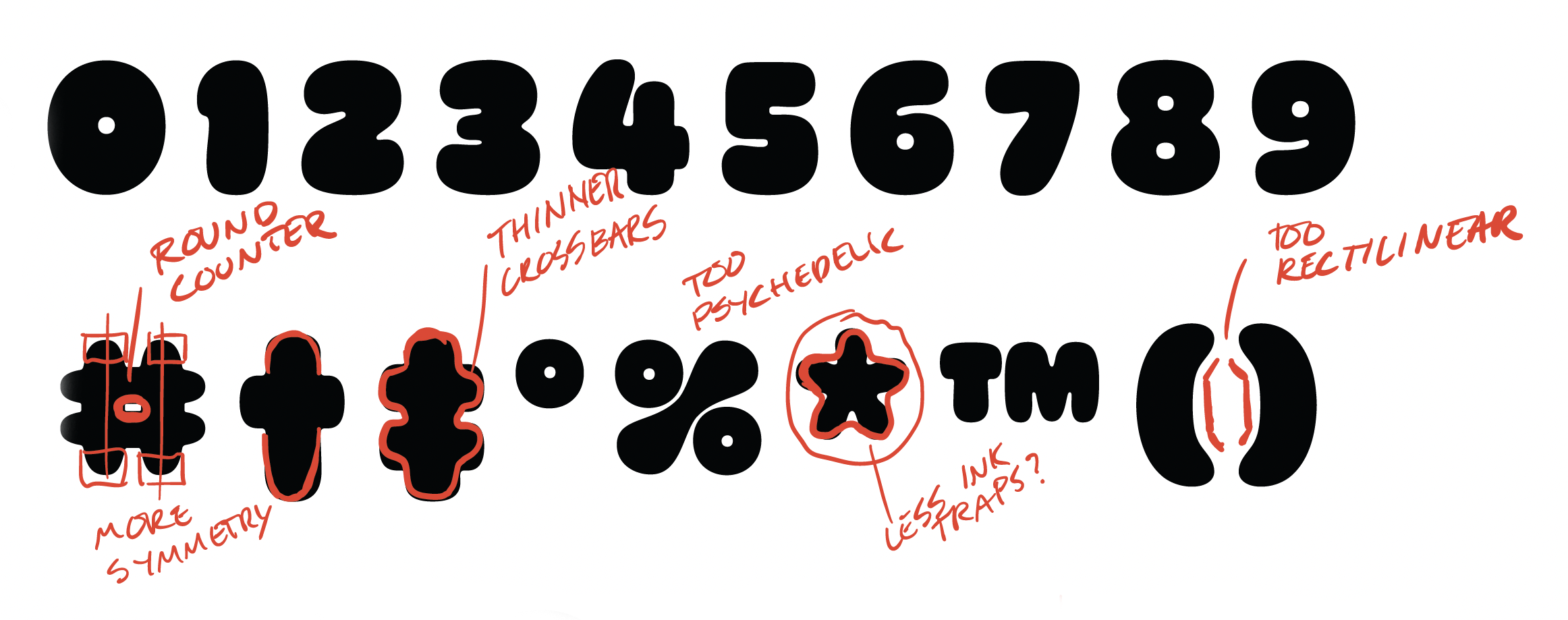
We use Prepolator (a Robofont extension) to check for interpolation errors, and what was especially challenging was to try to find a middle ground when drawing, so that the light and black weights can interpolate properly. Sometimes the shapes were so different between source files that it was difficult to figure out the optimal spot to place the points. At this juncture, we knew we needed a middle master (a source drawing that falls in between the two extreme weights to make a smoother interpolation).
View from the Prepolator window. The Aogonek was particularly painful.
This was right at the moment when we welcomed Colin Ford, master font engineer (and super nice guy!) onto our team and the next logical step for Softie was to pass the baton into his extremely capable hands.
Like any last leg of a relay race, when I was handed the Softie baton I had just one thought — Don’t mess this up!
Softie’s Light and Black weights were already in such good shape thanks to the work of James and Jamie, and I didn’t want to risk losing the super fun personality that they had imbued it with. There was just one thing wrong with Softie at this point in time, and it was its middle weights — the crème filling of the Softie cookie sandwich.

Without corrections, the middle weights started to look muddled!
Because the Light and Black were so fantastically different — the Black, plush and corpulent; the Light, taut and confident — the middle weights were a battleground of competing ideas. Even with James and Jamie's valiant efforts early on in the process, the middle still looked confused. The worst of the conflict was taking place in the Medium, and I knew if I could take control of that territory, the Regular and Bold weights would sort themselves out.

Without corrections, glyphs like X and e looked too compensated. They were corrected to remove the distortions.
In the Medium, glyphs like X and e existed in a weird middle ground — struggling to remain like their kin in the Light weight, but pulled apart by the sheer gravity of the Black. We removed the creeping influence of the Black and re-oriented the Medium back towards the low contrast character of the Light. In doing so, we gave each of the middle weights its own raison d'être. The Regular and Medium became usable, thicker versions of the Light, and the Bold took on more of the character of the Black.

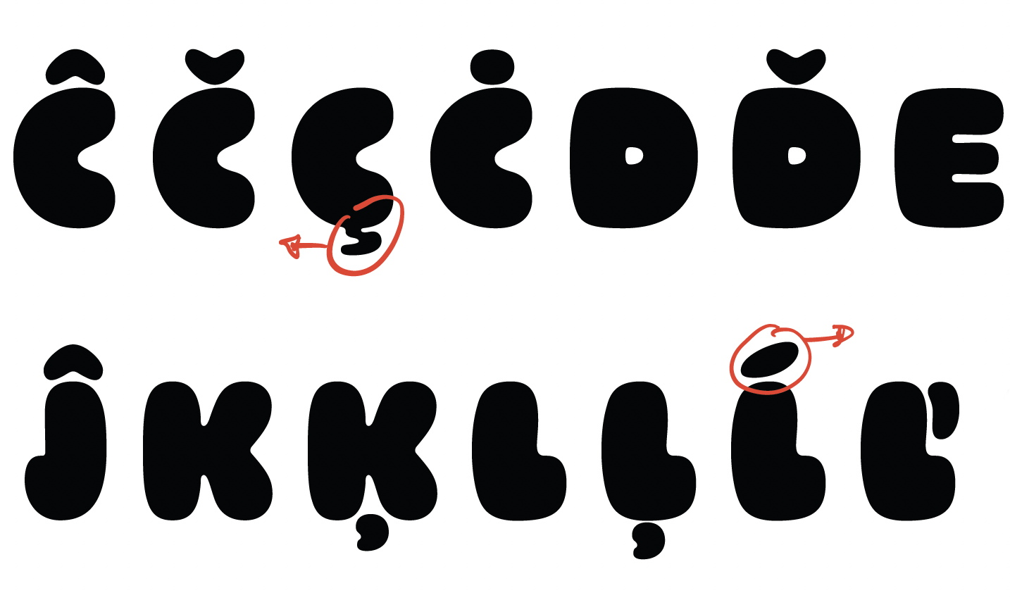
Shortie Caps™, use 'em tight!
In talking to James about where we wanted Softie to go, we both agreed that it needed a feature to fit with its personality and to dial up the playfulness. We landed on short, bouncy versions of accented capital letters that duck back into the cap height. We're calling them Shortie Caps™. They are the same width as the caps, just squished shorter to accommodate for diacritics. If there is a mark on the bottom of the glyph, they even gleefully leap into the air to give it some room. Feel free to use them in tight spaces!
A hard end for a soft typeface
For some reason, Ohno Softie sat in the hopper for a lot longer than we typically strive for here at Ohno. It comes at a time when we’re growing and learning how to work together. Slack, Asana, Github, Notion, Google Meet, Notify, and Dropbox all played a role, whereas, with past projects, it was simply me (James) and Robofont. Collaboration isn’t easy, but it allows for us all to deliver on what we’re best at. I appreciate Ohno Softie for being a good example of an Ohno font: a silly idea taken very seriously. Getting cold, hard vectors to appear soft and warm is difficult. But that’s the name of our game, and it’s a fun one to play.
Sometimes in our conclusions to these process articles, we talk about what genre of graphic design might employ such a typeface as this. It wouldn’t shock me to see it show up on donut shops, fabric softener packaging, or even an international fast-food chain. But honestly, I prefer to see all the things I didn’t expect. Can Ohno Softie look chic? Elegant? Menacing? That’s where you come in. I dare you to mess around, have fun, and take Ohno Softie where no one has taken it before. We worked hard, so that you can play with Softie.
