Polymath is the third in our trilogy of sans superfamilies with an optical size axis. First was Degular, the grotesque. Then came Retail, the humanist. Now finally we arrive at the Polymath, the geometric.
It’s hard to overstate the dominance of sans typefaces in our current landscape, but I’ll try! They are the 4/4 pop songs, the white kitchens, and the blue jeans of typography. For many years that was reason enough for a snobby, esoteric type enthusiast like me to dismiss them entirely, but recently, thanks to kids and a mortgage, I’ve enjoyed the challenge of approaching these expected classifications in a way that feels authentic to us. A bad result is another drop in the bucket, and a good result is something that makes me fall in love with a previously overlooked category of type, and brings something new to the conversation.
Optical Delusions
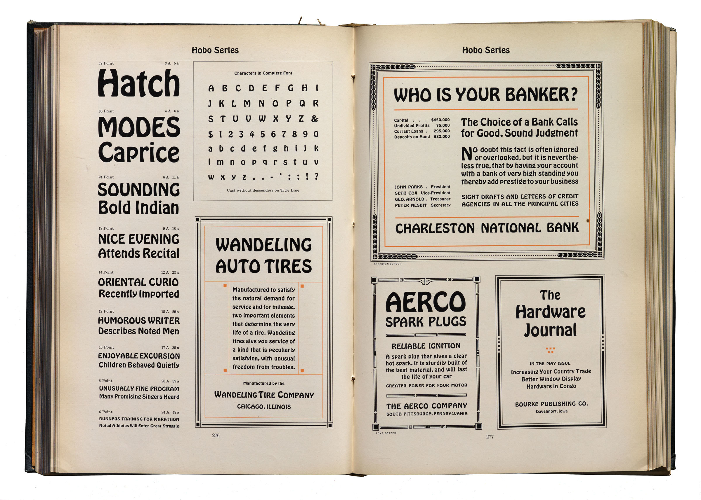
Even our beloved Hobo was originally drawn for various sizes because it came at a time in history when there was no alternative. Yes, even in an article about a geometric sans, I will sneak in an image of Hobo.
I am completely convinced of the importance of optical sizes—or specific sub families intended to excel in small, medium, or large sizes. To me, this is the reason that old specimens of letterpress-printed type look so good. In a purely analog, physical workflow, it would be impossible to scale type. This meant that every single piece of text would be printed at the size for which it was designed. The result is a page that looks effortlessly good. With the invention of phototypesetting, scaling type was suddenly feasible, and that became absurdly trivial with digital typesetting. The results were mixed! Unbound by physical limitations, amateur designers ran amuck with display type at text sizes, vice versa, and everything in between. For a while, the optical sizes of physical type were sadly absent from the layout process.
But as digital font production tools got better and better, and the superfamily gained popularity, we once again have the option to choose typefaces with size-specific variants. The prompt of this project became as simple as that: A geometric sans, with an optical size axis, done in a way that only we would do it.
Hopeless Semantic
Polymath began as “Semantic” a working title that I’d give a C+. The terminals were perfectly flat, and the squarish rounds were a little too reminiscent of Degular and Obviously. It felt more like a cheap redrawing than a new design, and I was desperate to find something that made it stand on its own.
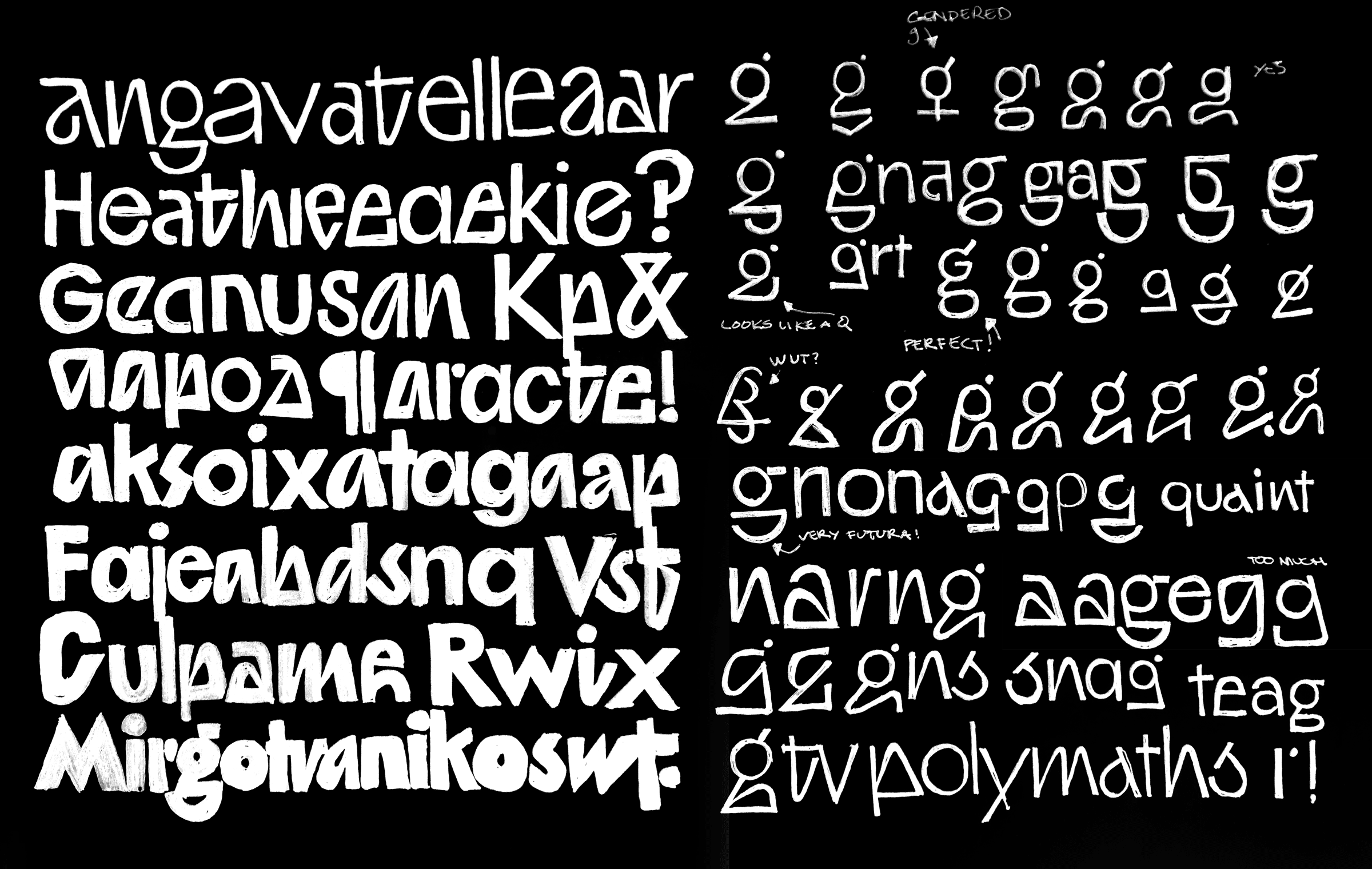
Very early on, I started sketching various alternate forms. Some of the ideas were decent, and about 95% were what I would lovingly consider steaming piles of dog shit.
Taking (artful, nuanced, and not at all cheap or lazy) inspiration from Paul Renner’s Futura, I approached that through the use of stylistic alternates. The old Renny Boy had some ideas like the dotted r that worked surprisingly well in text, and then others that drew a ton of attention to themselves. I think both are useful, and because OpenType allows us to group alternates into logical categories, ideas started snowballing before I realized how much work it would amount to. This is a standard part of anyone’s type design process, when things get out of control for no reason other than a disconnect from reality.
While I blatantly took a few ideas from The Rennmeister, many of them felt inappropriate for Polymath, and many just didn’t speak to me. I started the hunt for something that felt ownable and unique—a prompt that has led to a lot of failures and the down-punching Tumblr I am So Tired of Your Experimental Sans.

This form of g was of the alternates that seemed to strike a balance between experimental and legible.

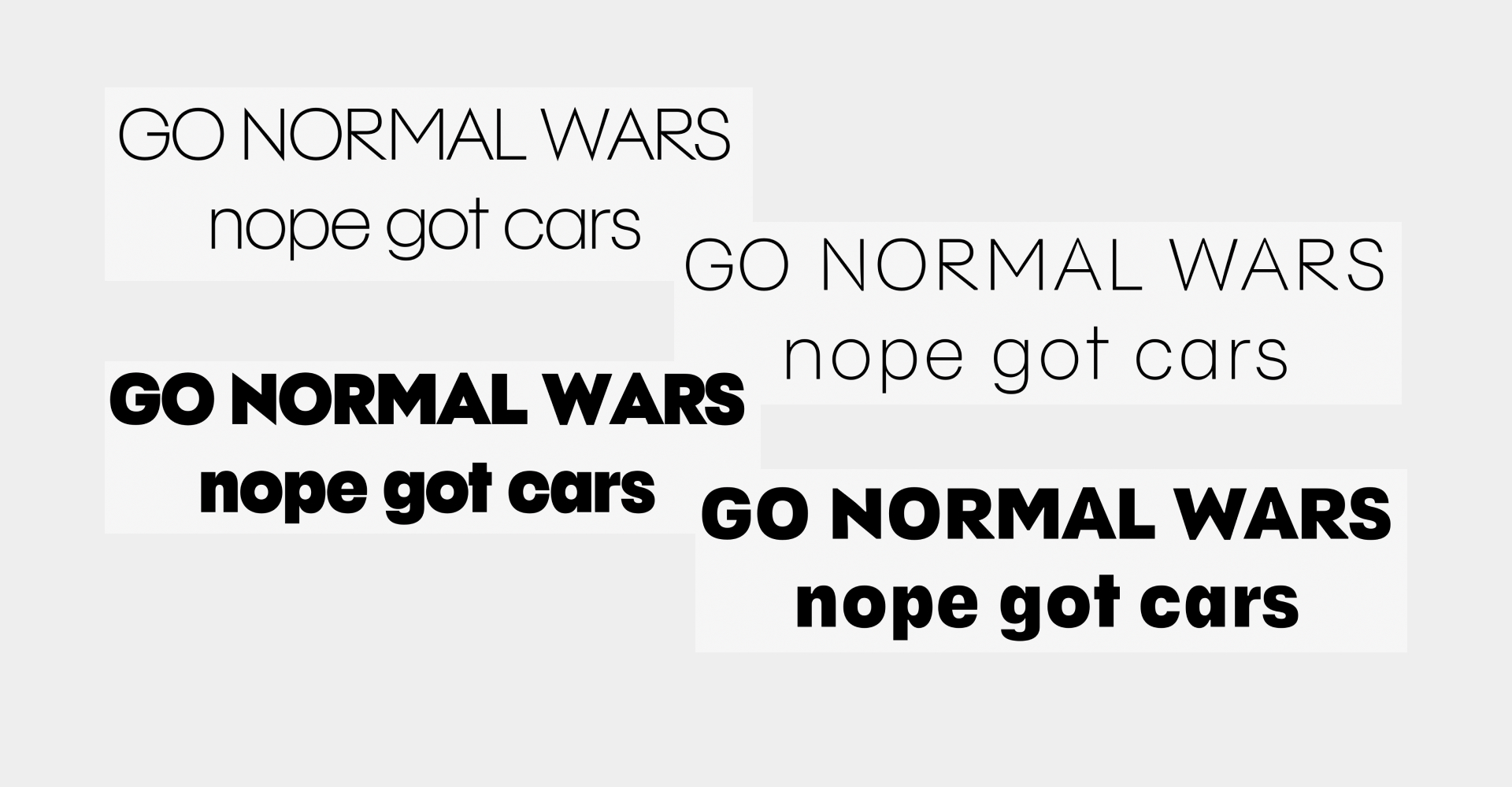
The first look at the family was something that didn’t feel fully cooked, and a bit too derivative.
Passing the baton
Finally I arrived at four sources that interpolated for the most part, but only covered a modest character set. It was time to pass the project over to someone that could flesh out my ideas, and build a technically sound expression of everything I was attempting to do. Enter Colin M. Ford!
Colin: Thanks, James!
When Jamie and I took over the project, we talked to James about the project and what he wanted it to ultimately look like, he just said he wanted it to be "Geometric as hell" and left the rest up to us.
Beyond the alternates — which were, with a few exceptions, unchanging from the start — the concept for Semantic was a lot clearer in the Thin than it was in the Super weight. We would learn this is extremely common for geometric sans, especially early on in the genre's history. Adding weight to perfect triangles, circles, and squares is never as easy as it seems.
Early concepts of the weight range. The Thin is basically there, the Super needs a little more focus.
But, what exactly is a Geometric Sans? Where did the genre come from, and did it change over time? How could Futura and ITC Bauhaus both reference the same concept and look so different??
It's one of those questions that seems easy to answer at first because it's always just been — like when a child asks you what time is. "Well, it's like, a clock, I guess, and... space? —" you trail off, and then it hits you; you've never really thought about *the concept of time* and where it came from in a way you could explain to anyone, let alone a child. Your eyes widen. Where to start? From the beginning, I guess... And then you realize, after you are a few sentences deep into explaining Einstein and his theories, that they actually were asking what the time was, but now it's far too late...
... Where were we, again?
Selling Tomorrow... Today!
Whenever I tackle something big, I like to dig down to the root of it and climb back up it, so I can understand how it started and how we got to where we are today. This is ironic because the concept of the geometric sans has always from the start been linked to the concept of the future; Just think of the names of the big typefaces of the genre — "Futura" (literally "The Future" in Latin), "Neuzeit Grotesk" ("Now-time" or "Modern Age" in German), "Avant Garde", "Avenir" ("The Future" again, this time in French).
Never looking back, eschewing old ornamentation, and distilling the essence of form. From the start of the genre, breathless marketing material positioned geometric sans serifs as something more clean and pure than other typefaces. More than any particular stylistic trait, I found that the common trait that links all geometric sans serifs together is the conceit that hidden under our vulgar letterforms is some sort of divine geometry — a conceit that is, of course, bullshit.
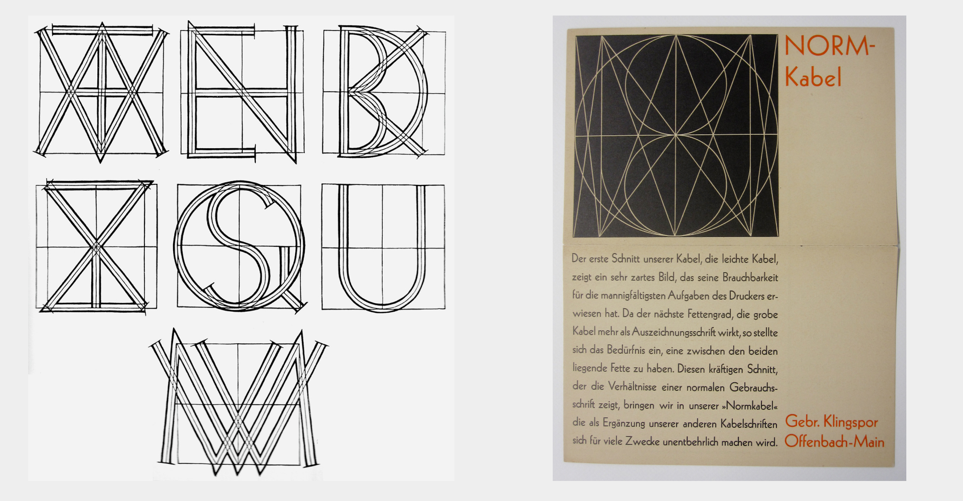
Early marketing material that accompanied Kabel often showed its geometric "skeleton"... but the thing is, if you traced them out, you didn't get Kabel. It was all marketing. Photo Credit: The Herb Lubalin Study Center.
The real concept that links geometric sans serifs together is they pretend that they are built off of divine geometry, but in reality they still need all the usual compensation and optical adjustments all typefaces do. The alphabet, after all, is a wild animal — you can't cage it.
But pulling back the curtain on geometric sans serifs didn't lessen my appreciation of them one iota. If anything, it showed me the power a narrative has on the concept of a typeface. Typefaces are more than a group of beautiful letters, or even a beautiful group of letters. They can be stories, too, and the best ones are.
The concept that ultimately appealed to us the most with our own geometric sans was not a narrative of relentlessly looking forward, claiming to achieve higher and higher levels of perfection (as many of the other entries in the genre are wont to do), but looking back on the genre with genuine love and appreciation.
A Serifless Roman
Still searching for how to express this concept in the form of a typeface, I remembered Kris Sowersby's process article for Klim's revival of Futura, The Future. (If you don't regularly read Kris' design information articles with each new release, like I do, you are missing out — they're waaaaaaaay better than anything we've ever written on this website.)
In it Kris shares two main insights — first, Futura was considered by Renner to be a "Serifless roman", not necessarily a "sans-serif". This distinction is definitely lost on many, now that in the 2020's sans serifs have become the default way we experience letters for the most part. But there were already many sans serifs extant in the 1920's too, some of them pretty widely used like Akzidenz Grotesk. But Renner didn't want to make a typeface that had its origins in what we would call "display type" for 19th Century jobbing presses (the "Akzidenz" in Akzidenz Grotesk, Kris notes, means "Job printing", i.e. not book printing). Those typefaces descend into a inky, malodorous mess of inaccurate organic curves intended for the basest of all uses — advertising. Futura is sharp, clean, machine-made. Renner chose classical Roman proportions, which he saw as being based on pure geometry, and intended Futura for use in long blocks of text in books.
Like a lot of German book types of the time, Futura has a low x-height and long ascenders and descenders. The ascenders and descenders offer "landmarks" which help in differentiating word shape and thus increase reading comprehension and speed. Low x-heights and long ascenders also physically push lines of type away from each other, thwarting any overactive typesetter from setting the type too economically, leaving ample room for important things like accent marks.
Which brings me to Kris' second insight — the proportions of Futura are crucial to it feeling like Futura. When creating Geograph for National Geographic, Kris discovered that by changing the x-height you effectively time travel. The higher the x-height, the more it felt like a 70's geometric sans like ITC Avant Garde. More on that, later.
The Sincerest Form of Flattery
Whatever Renner's intentions were for the dignity of Futura's proportions, they were soon rendered moot. Futura was a hit, and Bauer was very good at selling it. Various type houses in Germany created their own "flagship" geometric sans, like Neuzeit-Grotesk, Berthold Grotesk, and — an OH no favorite — Kabel, by Rudolf Koch and produced by Klingspor. All intended for text use. Kabel probably has the most bananas lowercase of all the geometric sans serifs released at this time, but it and Futura share a lot of details in broad strokes.
By the 1930's, Type houses in the UK and the USA start to pick up on them, and we get various knockoffs like Spartan, Tempo, and Twentieth Century. Geometric sans serifs flood the market, and quickly start to take up the jobs they were specifically intended not to do — jobbing type. Type houses offer cuts from tiny text size all the way to display, probably to the great disappointment of Renner and Koch.
One of my favorite Futura "inventions" of this era is Futura Extra Bold. For almost all geometric sans serifs, a bold weight is an after thought. The geometry just works better the thinner it is, where you can see the lines tracing the lines forming circles, triangles, and squares. All that shit goes out the window when you add weight to it, and boy does Futura Extra Bold have a ton of it. It has only the barest whif of Futura left about it, as the typically sharp apexes are crushed and flattened under its weight. The perfect circles, fat as car tires. The perfect Roman proportions, sacked.
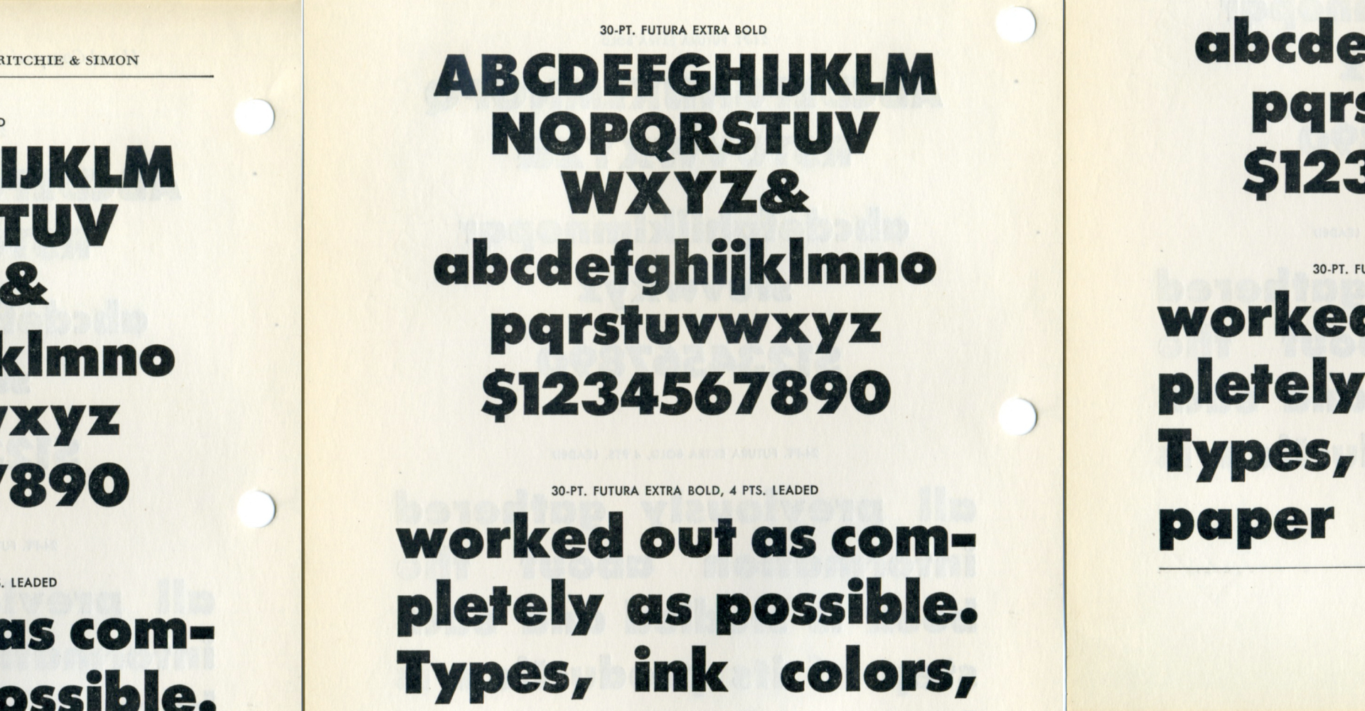
Is she Futura? Not really. But to me, she is gorgeous. Photo Credit: James Puckett.
By the 1970's, Futura and Kabel were still extremely popular, but the invention and subsequent transition to phototype setting presented an opportunity for redesigns with the needs of the 70's typographer in mind. Victor Caruso from the International Typeface Corporation (ITC) got special permission to redesign Kabel "as Rudolph Koch might have chosen to create his Kabel letterforms if the technology of film and phototypesetting had existed in his era," or so says the original pamphlet for ITC Kabel (1976). Caruso's interpretation of what Koch might have done was pretty creative, however, because he seemingly inflated the x-height with a bike pump.
Phototype was a pretty coarse technology, comparatively — most text-size setting, at least initially, was still done with lead type — and that led most designers to make letters with large proportions with short ascenders and descenders so you could more effectively stack lines together. It was also cheaper to make alternate glyphs, because type producers no longer had to cast them in lead at every size or finding space for them in a linotype machine. It wasn't just Kabel that got this treatment either, there were high x-height versions of pretty much every popular sans serif available.
A page from Photo-Lettering One Line Manual of Styles, 1971. Photo credit: Stephen Coles.
The characteristics of phototype could not be exemplified better than by ITC's first typeface, ITC Avant Garde Gothic by Herb Lubalin and Tom Carnase (1970). It goes without saying that Avant Garde defined the 70's. Half-rubbed sheets of Avant Garde Letraset were a fixture of any working commercial artist's briefcase at the time. The dozens of alternates made design work *almost fun* for students and professionals alike. Maybe it was too much fun. So fun that, by the 80's, everyone had a big hangover from Geometric sans serifs like Avant Garde and basically had to spend the decade sleeping it off.
The Closer
The one and only Adrian Frutiger was the man to turn on the lights and splash cold water in the face of the type buying public. In 1987, Frutiger was hunting for a new sans serif to fit between Futura and ITC Avant Garde in Linotype's catalog. He landed on the concept for what would become one of his greatest typefaces, Avenir. As he recounts in the massive Adrian Frutiger – Typefaces: The Complete Works monograph, he wanted to create a "modern version of the constructivist grotesque" through the lens of his trademark humanist style (exemplified by one if his previous typefaces, Frutiger). In summarizing the process of working on Avenir, Frutiger notes, "the sans serif is like a slippery eel, always sliding through your fingers, it's very difficult to get your grip on it." Continuing, "Avenir is the typeface where I expended the most effort in getting it exactly right, all by hand. In that sense I pushed it to the limit. It's the most precise typeface I've ever drawn."
Reading this, I felt that Frutiger *got it.* He also saw that the claims of perfect geometry and higher purpose was bullshit. Instead, he got down to work, and worked with all the subtitles of our human written language, instead of attempting to work against it, and failing.
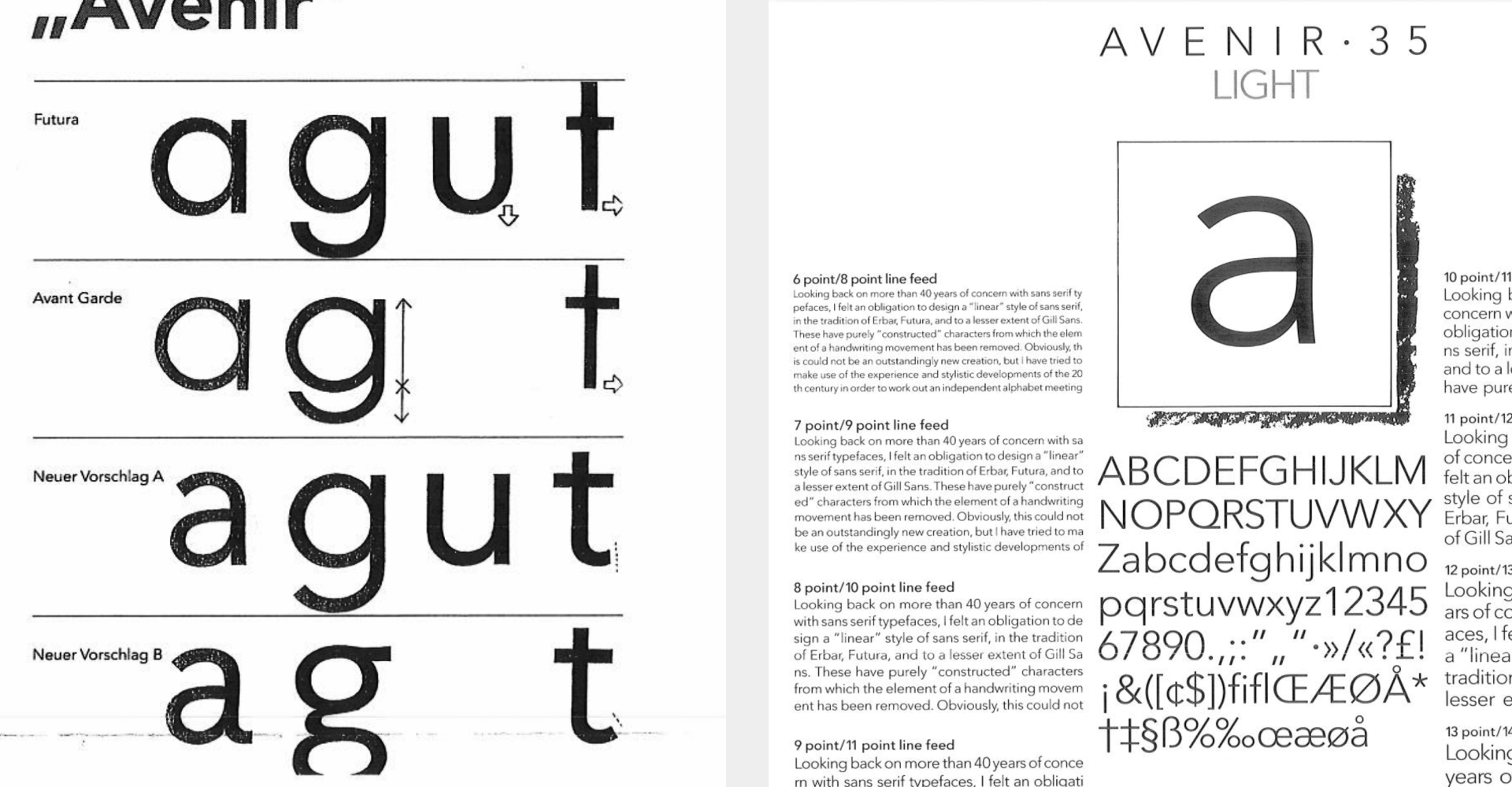
Left: Sketches positioning Avenir between Futura and Avant Garde. Even Frutiger couldn't help himself when it came to alternates — at bottom, an alternate a and g that would eventually see the cutting room floor. Right: a page from the original Linotype specimen, 1987.
Avenir has circles that are noticeably not perfect circles, drawn by hand instead of cool geometry. All letters have subtle, human adjustments to make them easier to digest. Proportions-wise, Frutiger chose an x-height between that of Futura and Avant Garde, with moderate ascenders and descenders. He also chose caps that were not based on Roman capitals, like almost all other geometric sans serifs had done in the past — with their syncopated rhythm of wide and narrow caps — but older, Greek capitals, which are more even and square.
Avenir's precise-yet-human approach kicked off the current wave of geometric sans serifs that we are living in today. Gotham, Montserrat, and others all live in its shadow. So too does Polymath, which brings me — finally — back to us.
Choose a Size
Looking back on the journey that geometric sans serifs have taken as a genre inspired us to take all that we loved and admired from each era, join it with our passion for optical sizes, and encapsulate that in Polymath:
The text size takes inspiration from the 1920's era of geometric sans serifs. Normally here at OH no we have an inclination to *increase* the x-height for smaller sizes. For Polymath, we chose to do the opposite. Its long ascenders and descenders and smaller x-height positions it perfectly as a "serifless roman", highly readable at text sizes.
The display size takes inspiration from the 1970's, with its enormous x-height and tight-not-touching spacing. Use it HUGE for impactful logo and headline use, just like they would do in the phototype era.
Finally, the standard size takes its inspiration from geometric sans serifs from the late 80's onward. Perfect for all the things you've come to want to use them for — like interfaces, text blocks long and short, and corporate collateral.

We've paired all this with OH no's largest Latin character set to date — full, modern support for over 7.5 billion speakers, more than 775 languages written with the Latin script ("orthographies"). This includes, in addition to our usual language support, the ability to typeset in languages like Vietnamese, but also languages oft-overlooked by western type design, like Yoruba, Guaraní, and Hanyu Pinyin. But maybe we'll expand on that in another article, this one is getting a bit long!
For now, I'm going to throw it back to James to close us out — take it away, James!
The End
Seeing Colin’s work in elevating my ideas, and generally making the typeface a bulletproof workhorse was inspiring. Beginning to work on the specimens was a breeze. It shouldn’t be too shocking that designing with this typeface feels quite easy. But the range of weights, the three optical sizes, and the vast selection of alternates made it feel like shooting fish in a barrel.
The working title had switched from Semantic to Polymath. At first it was a name that seemed too good to be true—a nice combination of letters, relatively short, and a logical meaning that signified that this type was ready for any job. Later I realized it was a bit close to XYZ’s Polymode, and mentioned that the name was going to have to change. XYZ, being the class acts they are, shot me message to say it wasn’t too close, and they didn’t mind. So here we are!
I’m extremely happy to add Polymath to our library as our 25th complete family. I’m very grateful to Colin and Jamie that worked hard to make it a reality. And we’re of course indebted to all the designers that came before us to make these shapes look as logical as they do. My hope is that this is a typeface that will allow us to make more typefaces, but that’s up to you! Thanks for reading.