We have long admired the work of Sandrine Nugue. Our favorite work from her includes (but is not limited to) her typefaces Infini and Orientation: two seminal projects that take a familiar humanist skeleton, but dress it in a way that is distinctly contemporary, and painfully original. We were thrilled when she reached out to us with a new design she was bringing to life. It came out to be Camelion, a distillation of her influences that simply works extremely well. It might seem to be a departure for Ohno, as a typeface that was designed outside of our headquarters, and brings in more subtlety and sophistication that we might be known for. I don’t see it as a departure. Rather, a new influence that compliments our library, and helps us point in a direction that, like Sandrine’s work, is timeless and unique.
—James Edmondson
Production work on Camelion was handled by Colin Ford and Jamie Otelsberg. The following is Sandrine’s writing about Camelion’s development.
In December 2021, I received a commission to design a book cover about an unknown relationship between Marie-Thérèse Walter and Pablo Picasso. Picasso’s family, who didn’t support this book, do not allow to the use of photographs of his works and of himself. Thus a solution was to suggest the relationship with lettering (a dream!). I designed an evocative ampersand, soft and violent at the same time.
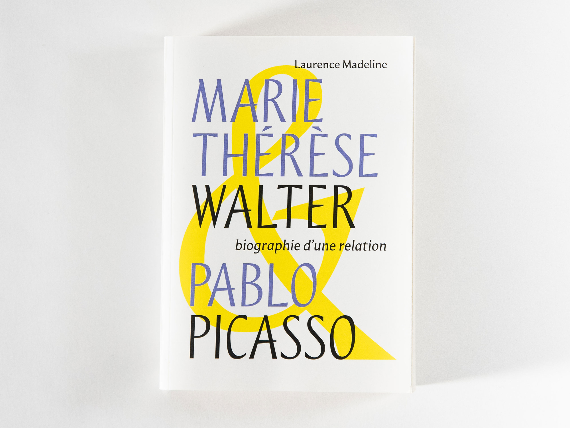

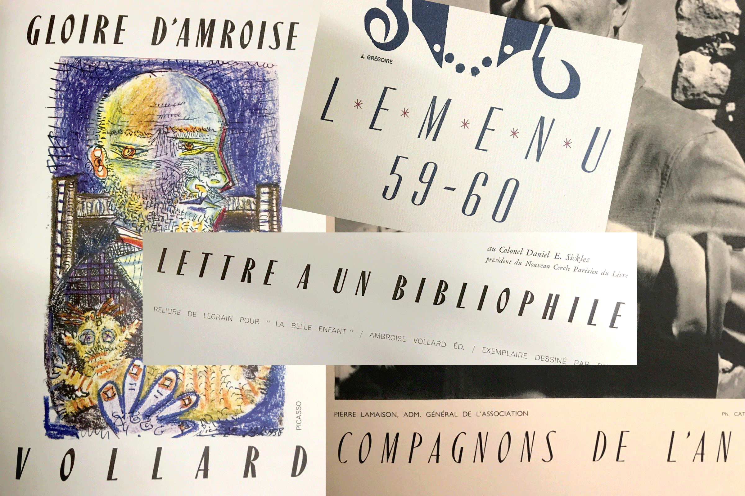
Concurrently, I selected some typefaces I discovered a long time ago in the archives of ésad in Amiens (where I studied type design from 2011-2013). They are typefaces from the sixties and seventies and one is directly related to Picasso’s drawing. I appreciate the old-fashioned and elegant aspect of these condensed and contrasted typefaces. Then imagined a lettering from these archives to compose their names on the cover could be a solution.

The book was published in January 2022. Then at the end of the Winter, from my own motivation, I began designing a lowercase based on these capitals. The very light slope of the letters reminds me some of my favorite typefaces like Vendôme (François Ganeau, 1950) & Eras (Albert Boton, 1976). At the beginning, I kept the contrast and some strange features, it could work as a display typeface, but my will was quickly to design a comfortable sans serif for body text.


Finally, it took the shape an upright italic, a style that has always intrigued me. I have always been fascinated by the story of italic, the very first invention by Alde Manuce assisted by his punchcutter Francesco Griffo (1501) when italic was autonomous without needing a companion roman. It is a long story in my work process because in 2014, when I designed Infini, its italic was able to be independant and used for body text, in reference to its origin.

During my studies, I became a fan of Joos, a Laurent Bourcellier’s typeface designed in 2009, a traditional upright italic. Also by Coline, an Émilie Rigaud type family released in 2010. She created a family with a roman and two variations of italic, allowing the user to define different combinations.
My secret goal was to design an upright italic for body text.
There are some remains of my graduation typeface named Ganeau caption (2013). I injected some lapidary while maintaining classical proportions and sharp terminals. I didn’t want an overly soft and round italic. It was a challenging hunt to balance comfortable reading with strong character—was it even possible?

I questioned how the two styles could switch responsibilities, while becoming eachother’s inverse. A switch in the history of typography was imagined: the roman would become the ally of the italic, so the roman was slanted. Finally it was an upright italic and a slanted roman. Two complimentary styles covering the needs of the typographer in an irreverent and playful way.

After some talks with friends and colleagues, I decided to make the concept and the design of the type family more simple. Maybe it was too much a private joke for type designers to switch these classical roles. To be more useful, the upright italic would be perfectly straight without any slope and it could be interpolated into the classically slanted italic. The user could define its slope with the variable font format.

The name « Camelion » has been chosen, in reference to the animal (it is the old french word to say caméléon in french and chameleon in English), first because of the reversal between italic and roman. Even after changing the design of the type family, I kept this name because the typeface is still able to be adapted from the principal to the secondary style. The typeface can be transform from a one role to another—just like a Camelion.
