Atlassian, a large player in the world of online collaboration and project management, was in need of a unified typographic voice for their brand. Their ever-growing list of products cover a broad spectrum of target audience and utility, presenting a need for a custom typeface and logotype that conveyed bold energy, without annoying their pragmatically minded clientele. What ultimately resulted from our explorations was Charlie Display and Charlie Text, a geometric sans for use on all their product logotypes, and marketing materials.

Atlassian
Completed
2017
Client
Atlassian
Creative Direction
Sara VanSlyke, Megha Narayan, & Leah Pincsak
Deliverable
Logotype and Custom Typeface
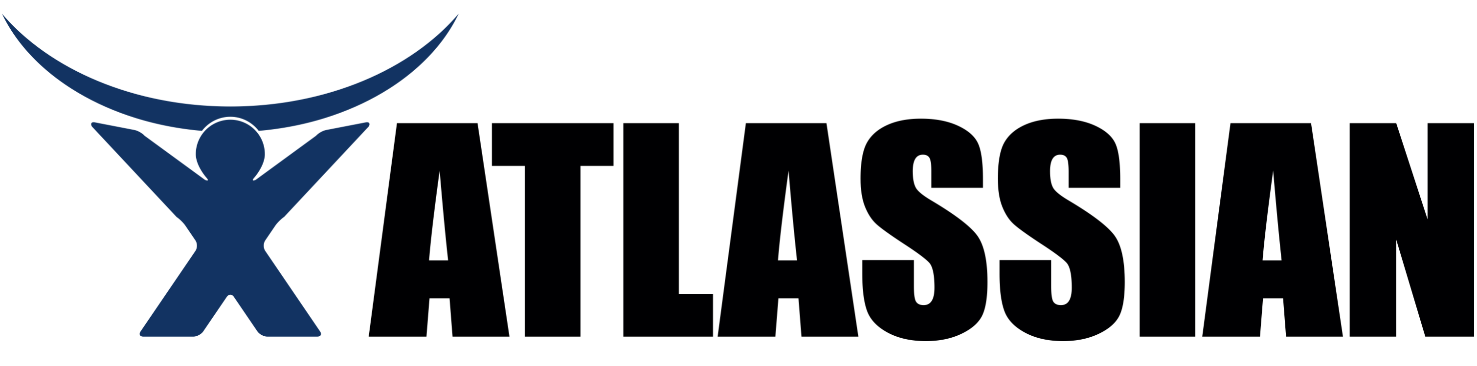
The earliest form of the Atlassian brand in all its glory. This was in use even before Impact became the meme font.
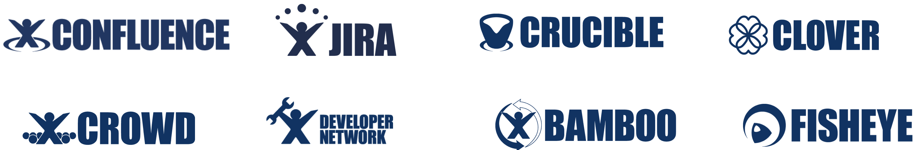
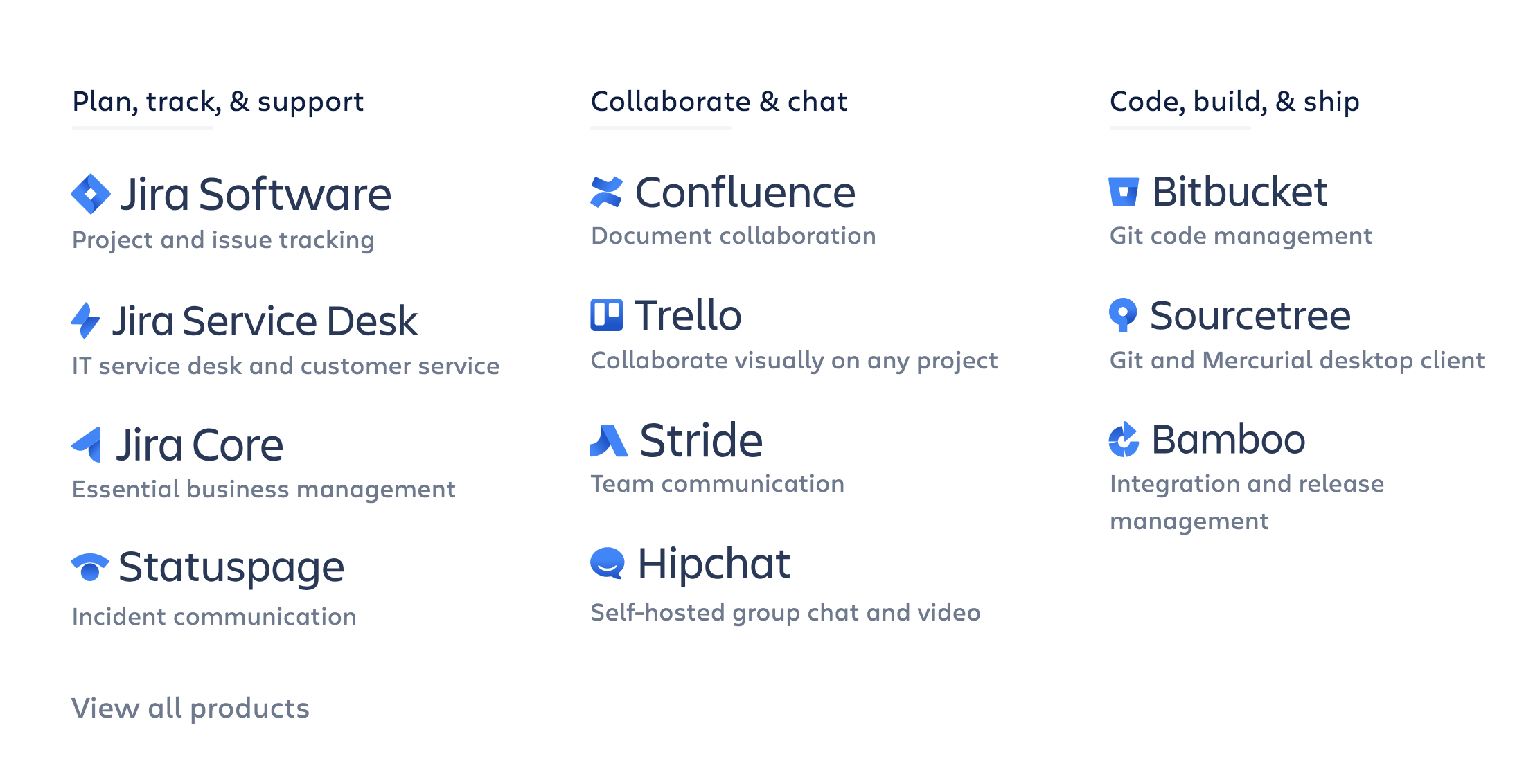
Atlassian now, and even as a younger company, has an ever-changing list of products under its umbrella. From a user experience perspective, it makes sense that each of those products has its own logo, but still need to belong to the same family.

This was the current form of the logo when I was brought in. First, we sat down with the Atlassian design team to discuss what their brand was all about, and where they had been stylistically up until this point. We talked about the strikes against their existing logo, and how to avoid a similar situation in the future. The little atlas guy on the left was Charlie, who was a beloved emblem that represented teamwork and Atlassian pride.
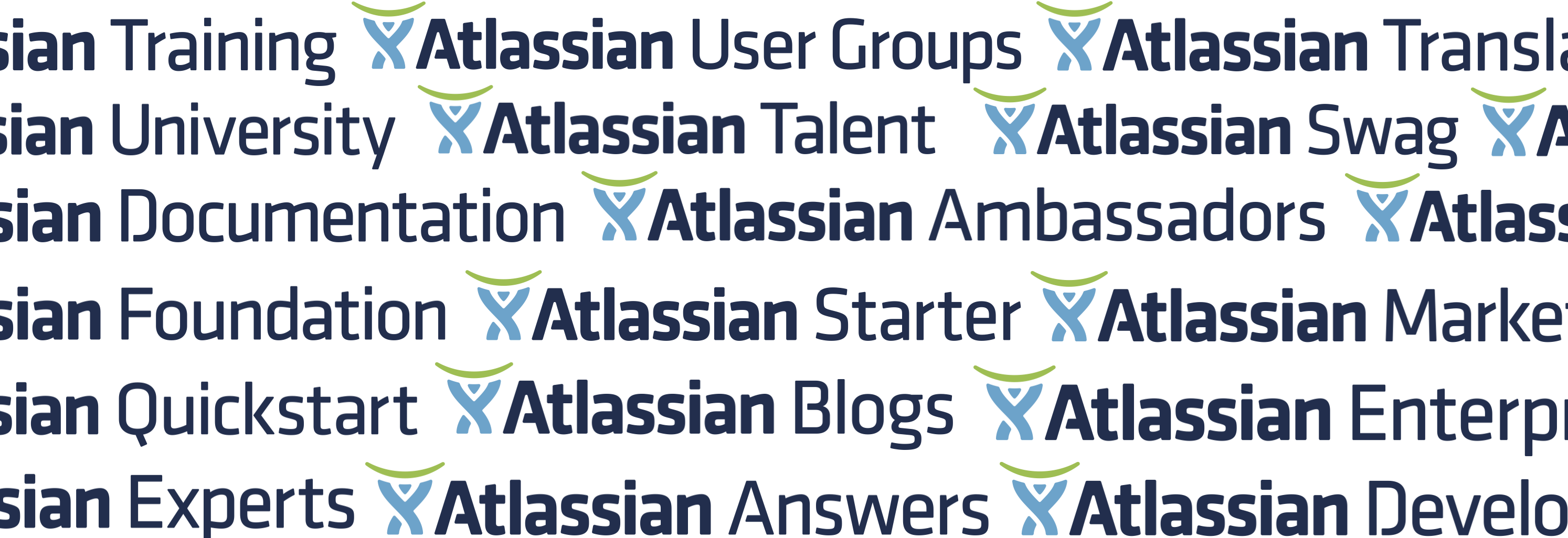
Obviously taking care of the logo was the first part of this undertaking, but we had to keep in mind that eventually it would be adapted into a custom typeface that would be applied in infinite setttings. Beyond product logos, the type would also be used in all messaging and marketing materials.
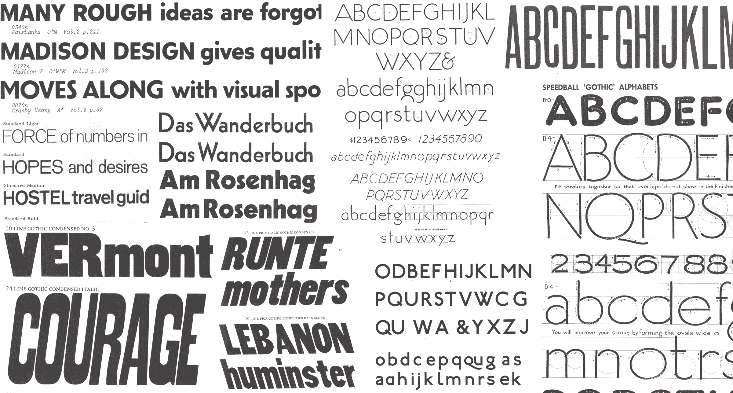
I presented various scans to the team that I thought were interesting, but that short presentation served mostly to compare and contrast the three main genres of sans serifs: geometric, grotesque, and humanist.
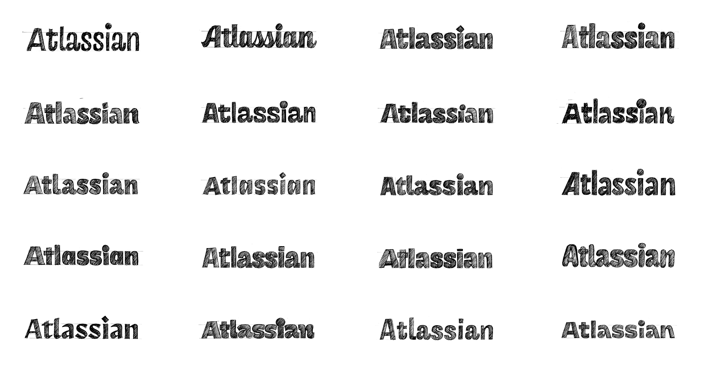
The first round of work is always pencil sketches. That way, we are not forced to finalize minute details, and instead the broader picture of weight, spacing, and general tone is the only priority. Although the only constant throughout this entire project was that it was going to be a sans of normal width, I always like to break free of that just to make sure we aren't leaving anything viable on the table.

After eliminating many of the oddballs, we tried to zero in on what this was going to be. Ideas that were goofy, too eccentric, or otherwise pointlessly weird were gradually ditched in favor of things that were a bit more on the neutral side, while still retaining an element of bold energy.
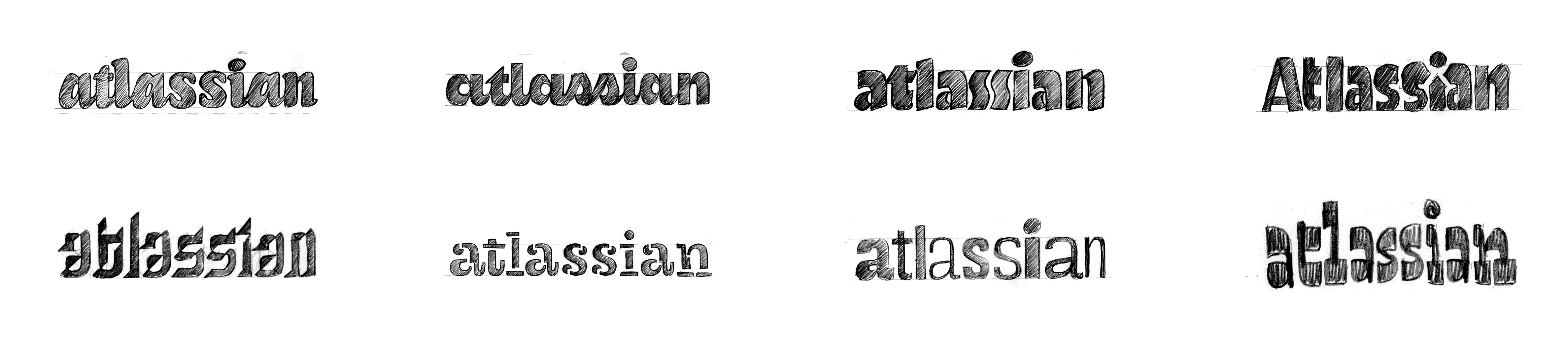
After noodling on those vectors for a few weeks, we decided to just look again at a complete rethinking of what this logotype could be, focussing on the concepts of diversity and togetherness.

After meeting up with the amazing designer Angy Che who was handling the icons, we started to combine our ideas into a couple cohesive systems. On the left was the geometric sans where the team kept gravitating towards. On the right, was a more typographically adventurous palette combining a condensed sans with a script logotype. Because the product names got really long (for instance, Jira Service Desk), I thought it was obviously a good idea to use a condensed face. This was immediately rejected.

Coming back to the logotype, we explored a few options to make it stand on its own a be a little bit more special than simply typing out “Atlassian” with the custom sans.

Coming to the idea of the custom typeface, a range of weights was explored. The earlier multiple weights can be examined the better, as you often find unexpected issues and relationships that need to be defined. The light informs the bold, and vice versa.

Throughout the entirety of this process, numerous tests and experiments were performed. Here is an example where we wanted to see what effect would result from changing the look of the terminals. It’s amazing to see such a change in tone with just this subtle change!

Another example of this is where we wanted to explore the x-height (the size of the most of the lowercase

Further explorations allowed us to explore every imaginable variation in weight, and decide exactly point on the weight spectrum a useful member of the family would occur.
While I was at work on the custom typeface, Angy and the Atlassian team further refined the icon style to match the spirit of the type, and provide a flexible system for current and future offerings.
The logotype switched to an all caps setting, allowing it to obviously stand apart from the capitalized product names. Angy and the Atlassian team handled the final here, and shaved off the horizontal on L. Looks good to me!

At this point, Charlie Display as it was now being called, was looking good for display sizes, but fell apart for text. We changed the x-height to be more in line with typical text faces, and let the characters and spacing grow wider for a more comfortable reading experience. Overall, it’s not hugely different, and most readers will probably fail to realize the typeface has changed when moving from headlines to paragraphs, but that's precisely the point!
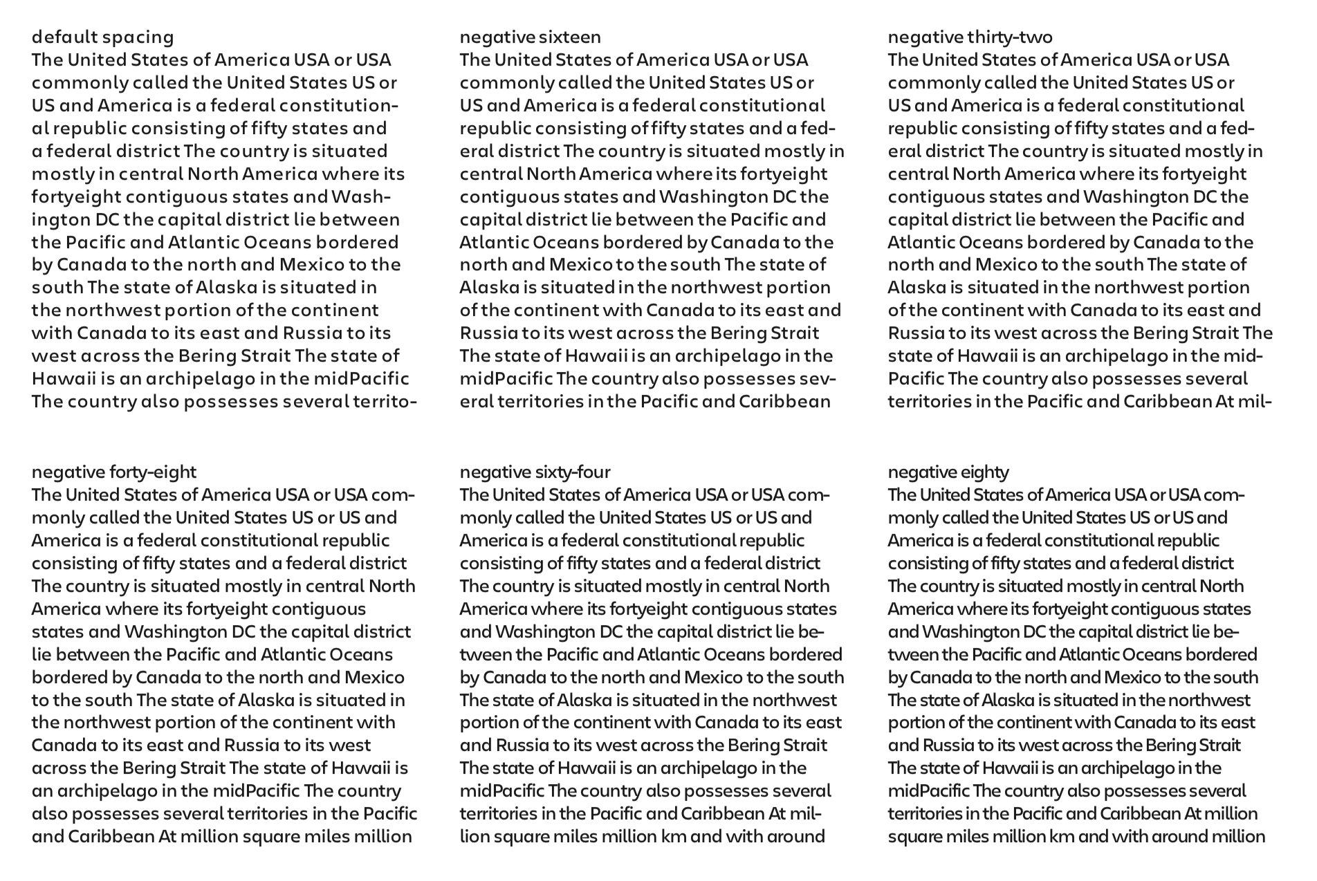
I have my own opinions about how things should be spaced, but sometimes it’s necessary to make those decisions as a group. In those instances, I like to make a proof with simple adjustments made in increasingly minute differences, until spacing enlightenment is achieved.

Once the desired incline was set, we explored a couple different directions for the italics. It's pretty obvious to guess which one Atlassian favored. I still think a fairly expressive italic with a sober geometric roman could work, but not for this brand in particular.
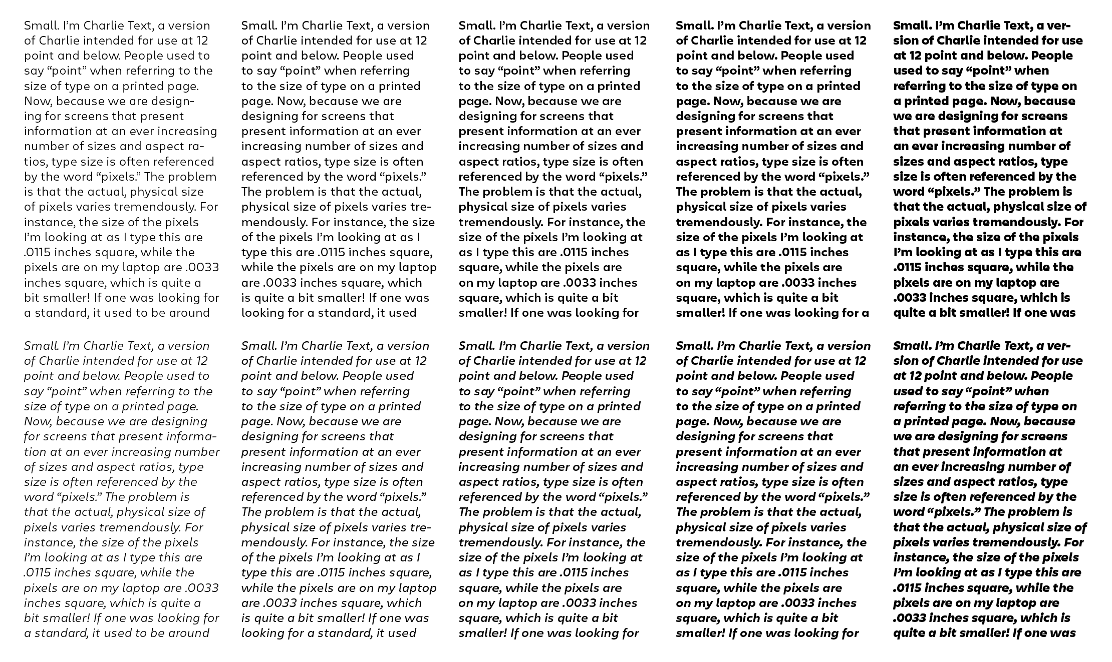
After some finessing and expanding the character set. We had a text family that was meeting the requirements of the project. As I often tell students, drawing a letter is easy! Making a word? That’s harder. A phrase is getting more difficult, but a paragraph? Pretty tough! I was pleased to see an even texture, and everything rendering clearly at small sizes.

Almost a year after we had begun this process, the entire family was (for the most part) complete. I brought in my buddy Ben Kiel to help with the mastering and make sure all the fonts were working on all software and operating systems.
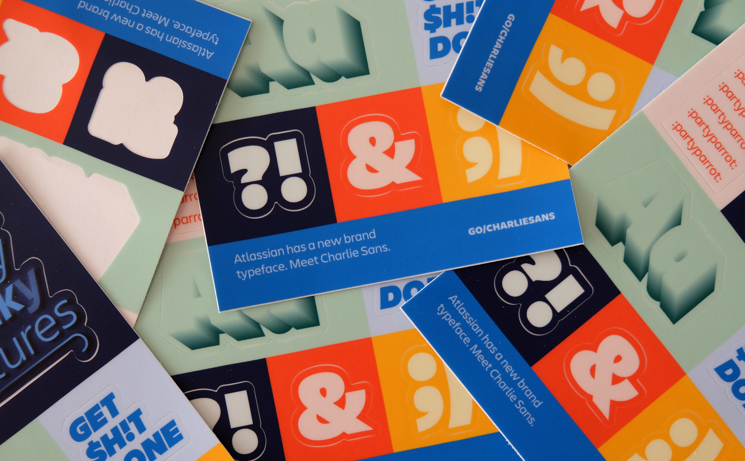
To celebrate the fonts being released and used within the company, the design team at Atlassian got some fun stickers printed.
They also made these playing cards. I am not sure exactly what the cards are for, but I love to see the Display and Text styles working side by side! It’s a dream come true.
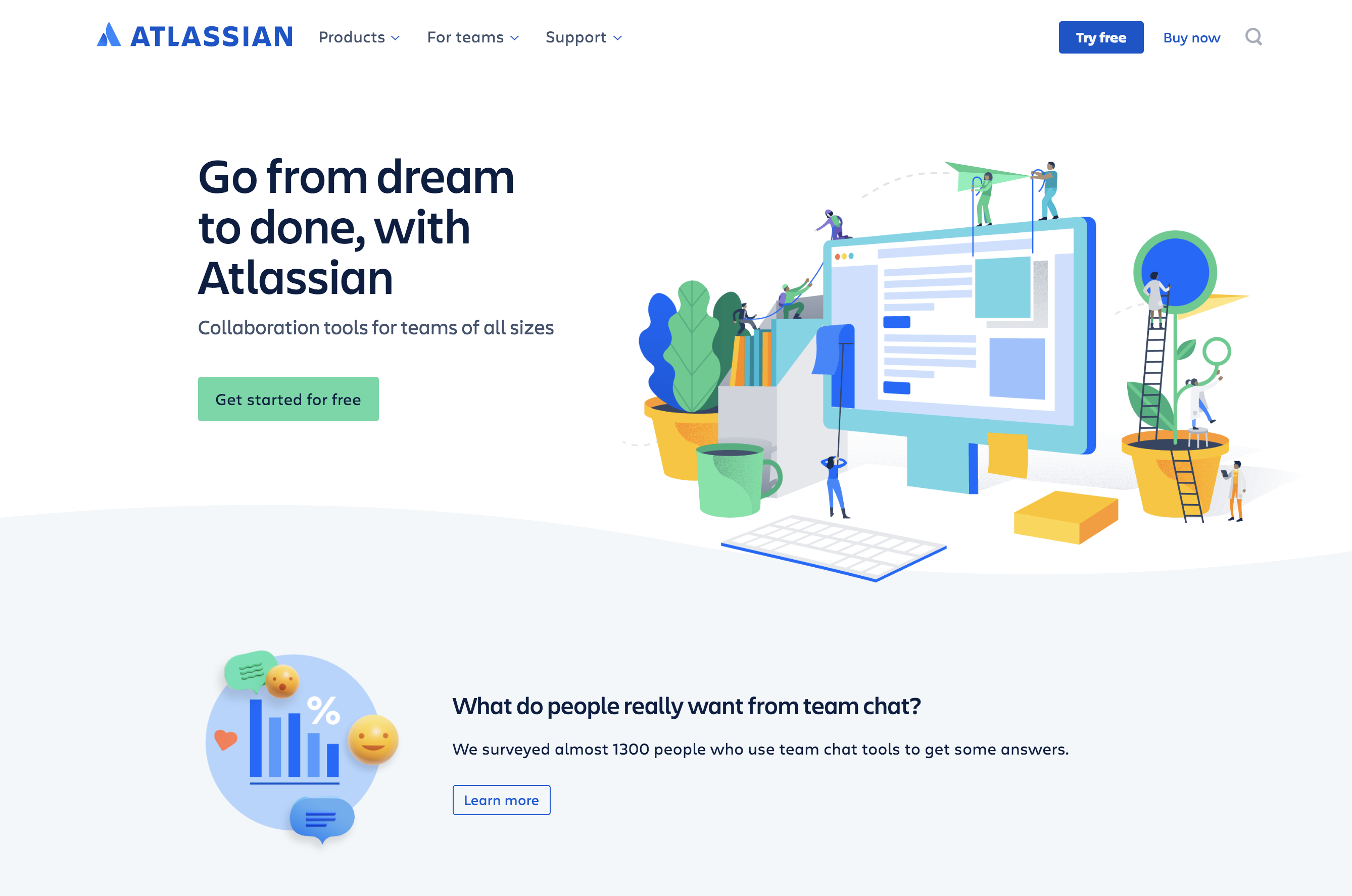
Seeing the entire project come together with the rest of the brand and illustration style has been really exciting! Angy and the Atlassian team did an excellent job creating a vibrant systems that feels energetic and fresh. It’s no secret that I’ve been outspoken against the use of geometric sans for tech identities in the past, but this project, like most things in this world, was not about me. I was brought in to help Atlassian achieve their goals of creating type for a system that is unique and high quality, and I’m thankful for the opportunity.