It’s always a joy to work with MacFadden & Thorpe. They were working with McEvoy Foundation for the Arts to create a really unique identity system when their request graced my inbox. The studio has a keen interest in modular type, and the starting point for this identity was absolutely classic MT. I was thrilled to learn that they wanted to take their efforts as a starting point, but make it a true collaboration. What started as a simple drawing of an alphabet eventually turned into a two-font family, with enough punctuation to cover their needs.

McEvoy Foundation for the Arts
Completed
2017
Client
McEvoy Foundation for the Arts
Creative Direction
MacFadden & Thorpe
Deliverable
Custom Typeface

That starting point was conceptually rock solid, but there was perhaps some room for improvement. Particularly the S and Y stood out as problematic to my eyes.

The heart and soul of this design is built around super bold geometric constructions with rounded terminals. It is energetic and unique, strikes an interesting balance between high and low brow, and has nice and tight spacing which is perfectly suited for such bold letters. At this point, there were two items on the agenda: ironing out the minor inconsistencies, and exploring alternate forms in case there are other constructions that might better surrender to the typeface’s agenda. Inconsistencies revolved around the various ways of treating interior and exterior corners, stem widths, and sizes of counters. Additionally, there are a few letters (notably Y, and S) that seem more inline with an OCR inspired design that others. Rules on where diagonals are allowed, and what angles are permitted were not yet clear, and it seemed like more attention is being paid to the positive shapes, rather than the negative.

Immediately, rouding the vertex of M starts to get that detail on the same page as everything else. The crossbar on F was lowered to equalize the top and bottom negative spaces. We also experimented with some options for A. This was an important one to nail down early, due to the confusion over how diagonals were to be handled.

Top: Before. Bottom: After. I could go into detail about what specifically changed on each letter, but the point was this: maintaining the interest while ironing out all inconsistencies. Actually, that’s type design in a nutshell! I think what made this project interesting for me was trying to maintain and even amplify another designer’s voice.

Soon after we had a handle on capitals, we started playing with number and punctuation. At this stage, it really starts to feel like a typeface. Most of the punctuation was logical, but the question mark was a mystery until I realized you could just put a backwards C on top of a period and call it a day. Because this is such a super bold design, there isn't always the room available to express these shapes in all their detail. For instance, the @ lost half of its circle, and the fraction line in the percent doesn't have room to go all the way through. The ampersand came out with this shape when I realized the diagonal in the traditional form would have made the counters too tiny. Both the ampersand and the pound sign (or hashtag, depending on how much you use social media) has crossbars that are thinner when inside the letter, and chuckier once they are free to stand out on their own.

The complete lowercase followed a very logical construction. There are a few areas of interest, particularly the top right of the main stem in b and h features a diagonal-looking notch for clarity. This detail is inverted for the q. The crossbar on f hits quite low, but does a good job of filling in the available space.
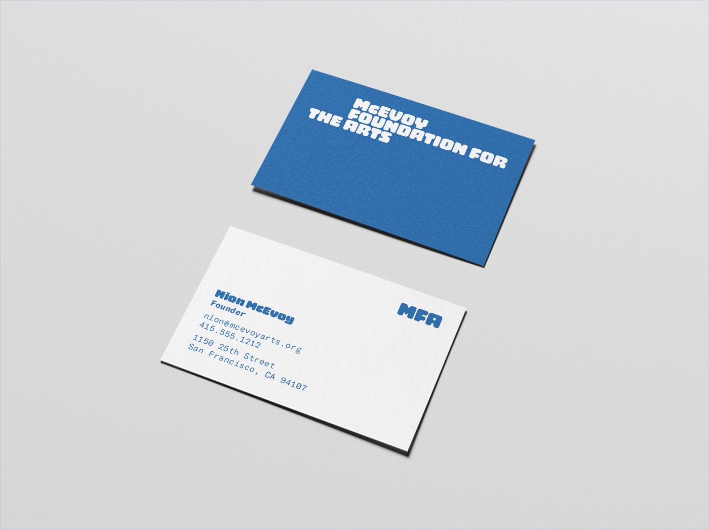
Image courtesy MacFadden & Thorpe. Seeing their system, layouts, and color all come together was a thrill.
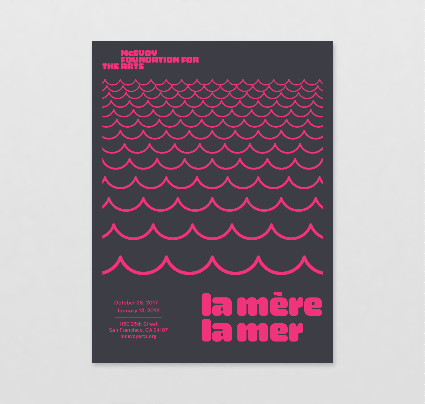
Image courtesy MacFadden & Thorpe. Illustrators are brought in for each event. Blue: Lydia Ortiz. Grey: Jason Munn. Pink: Kameron Allen.
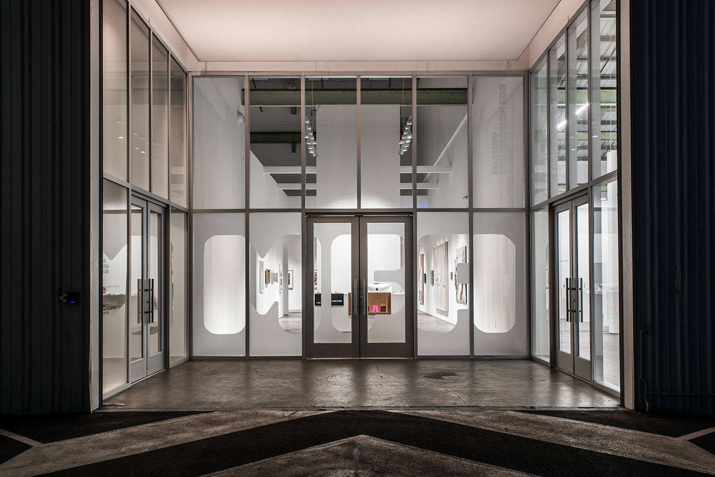
Image courtesy MacFadden & Thorpe. This type was set at approximately 6,912 point.
Next