OH no Type Company.

Foggy for Dice

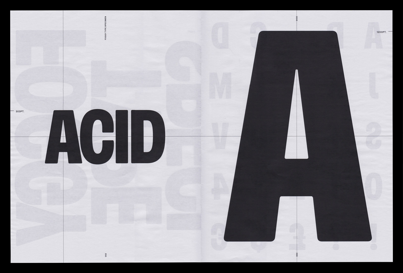
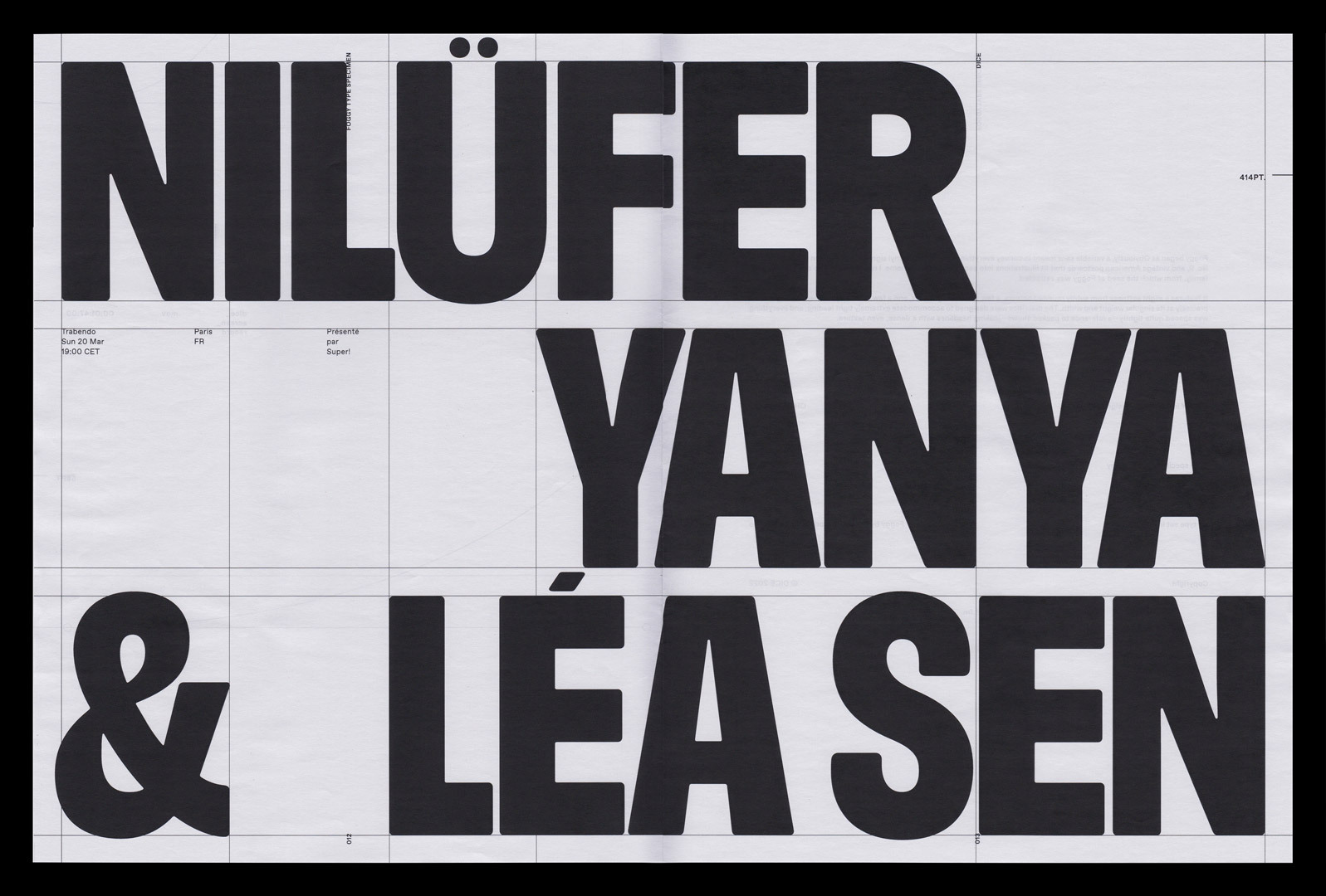
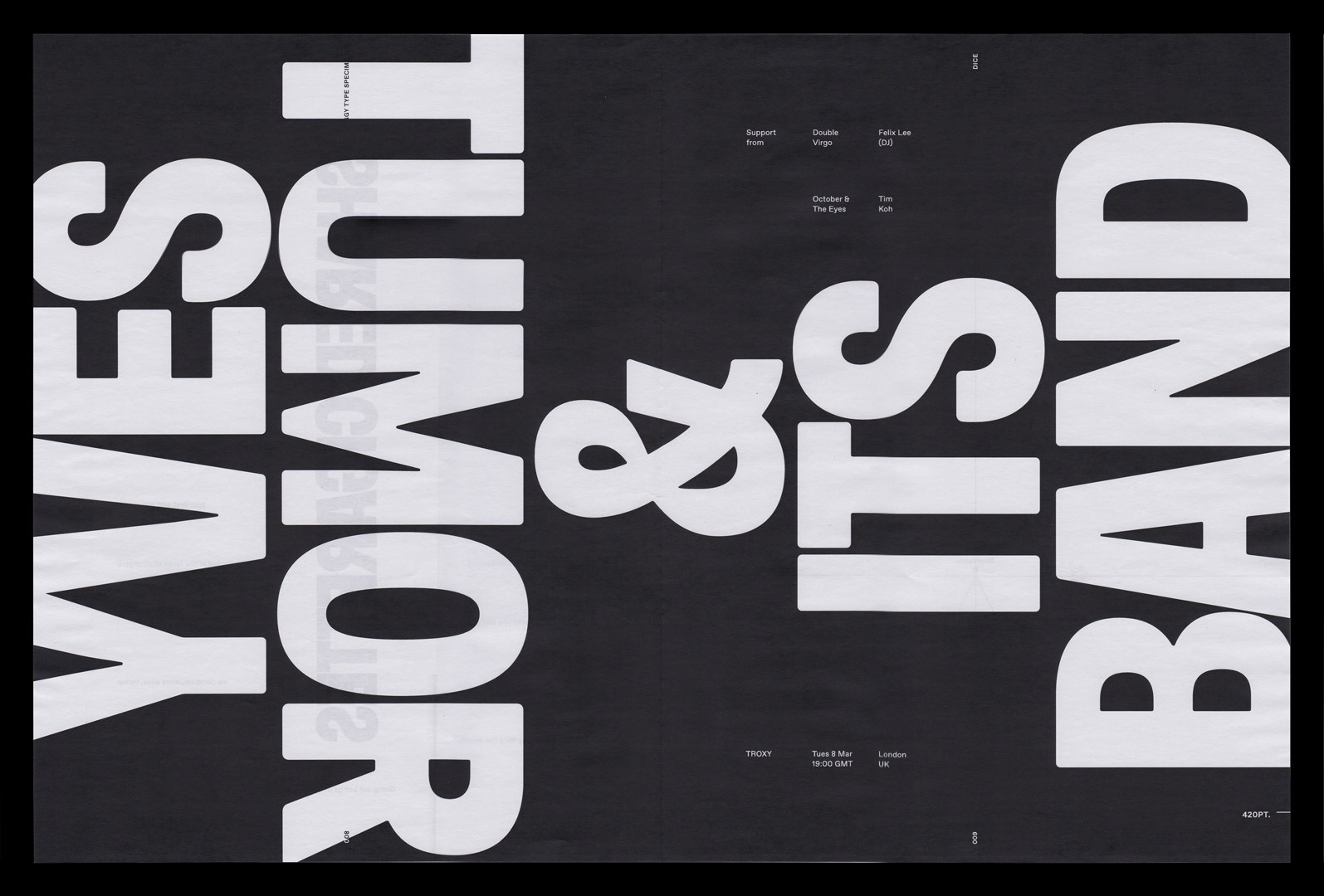
We worked with design lead Stewart Walker to customize the Narrow Bold style of our typeface Obviously to suit Dice's needs for tight, impactful headlines. Many of the more expressive details of Obviously were toned done, and the slightly concave stems were modified to be perfectly straight. Every corner was slightly rounded for a more casual and hand-made appearance. The design team at Dice did a fabulous job of art directing the customization, and putting the resulting fonts to use in a system that is confident and flexible. The name “Foggy” comes from the nickname of one of Dice’s founders, Andrew Foggins.

From Dice: “Foggy features a slight softness from subtly rounded corners, clean straights lines, and fewer compromises than its variable forefather. The diacritics are designed to accommodate extremely tight leading, while the lettter-spacing is kept similarly close—a reference to packed live shows—resulting in headlines with a dense, even texture.

Completed

2024

Client

Dice FM

Creative Direction

Stewart Walker

Deliverable

Custom Typeface

Foggy 01

The process of customizing Obviously for Dice was fairly straightforward, with a few local and global changes.

Foggy 02

While most shapes kept the same general construction, some glyphs were overhauled.

Foggy 04

Contrast was lowered, and every corner was slightly rounded.

Foggy 03

A minimal character set was chosen, and lowercase omitted to keep costs down.

Foggy 05

Some punctuation was made significantly lighter to keep the emphasis on the letters.

DICE Foggy Type Specimen Social Posts 2

Specimen designed by Dice.

DICE Foggy Type Specimen Social Posts 6

Specimen designed by Dice.

DICE Foggy Type Specimen Social Posts 3

Specimen designed by Dice.

Covik Sans Regular
Covik Sans Regular Italic
Ohno Blazeface 18 Point
Covik Sans Bold Italic
Covik Sans Bold
Vulf Mono Light
Vulf Mono Light Italic
Vulf Mono Bold Italic