We’ve had the pleasure of collaborating with JKR on many projects in the past, but this custom typeface for Nordstrom Rack was definitely the most variable. JKR’s team came to us with a very clear idea of how they wanted the letters to look and move, but nonetheless we did our due diligence to make sure we weren’t leaving any stones unturned. We examined many forms for each glyph to make sure we were landing in the best possible spot. I’ve never designed so many percent symbols in my life! The resulting logotype and custom typeface is completely customized to the needs of the system, making something geometric, flexible, and extremely impactful for headlines.

Nordstrom Rack
Completed
Client
Creative Direction
Deliverable
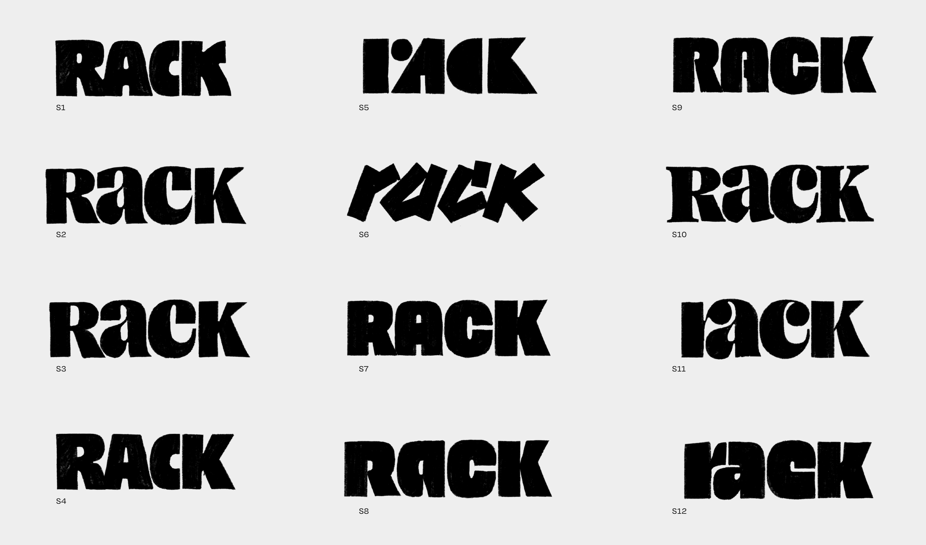
Before we began the refinement stage, we wanted to make sure we weren't leaving any viable options on the table.

An exploration in the squareness of the forms to find the sweet spot.

Alternates forms of each glyph. In our conversations we were trying to avoid a strong relationship to the 1970s.
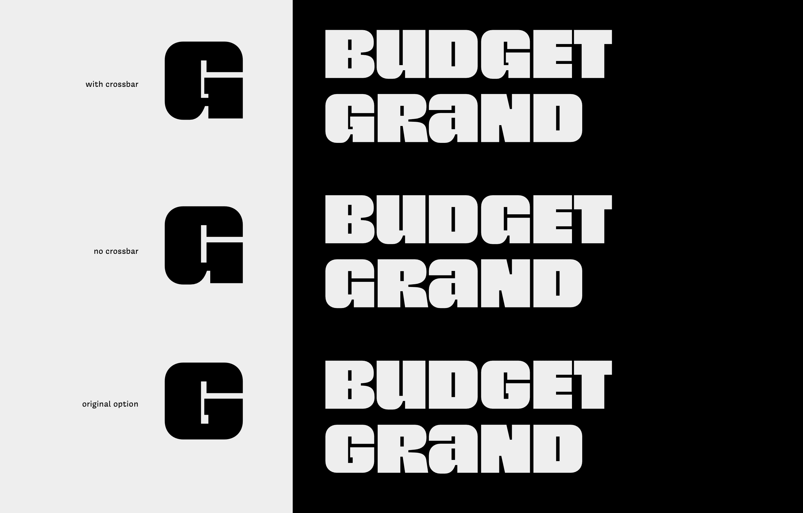
Many glyphs required a few attempts…
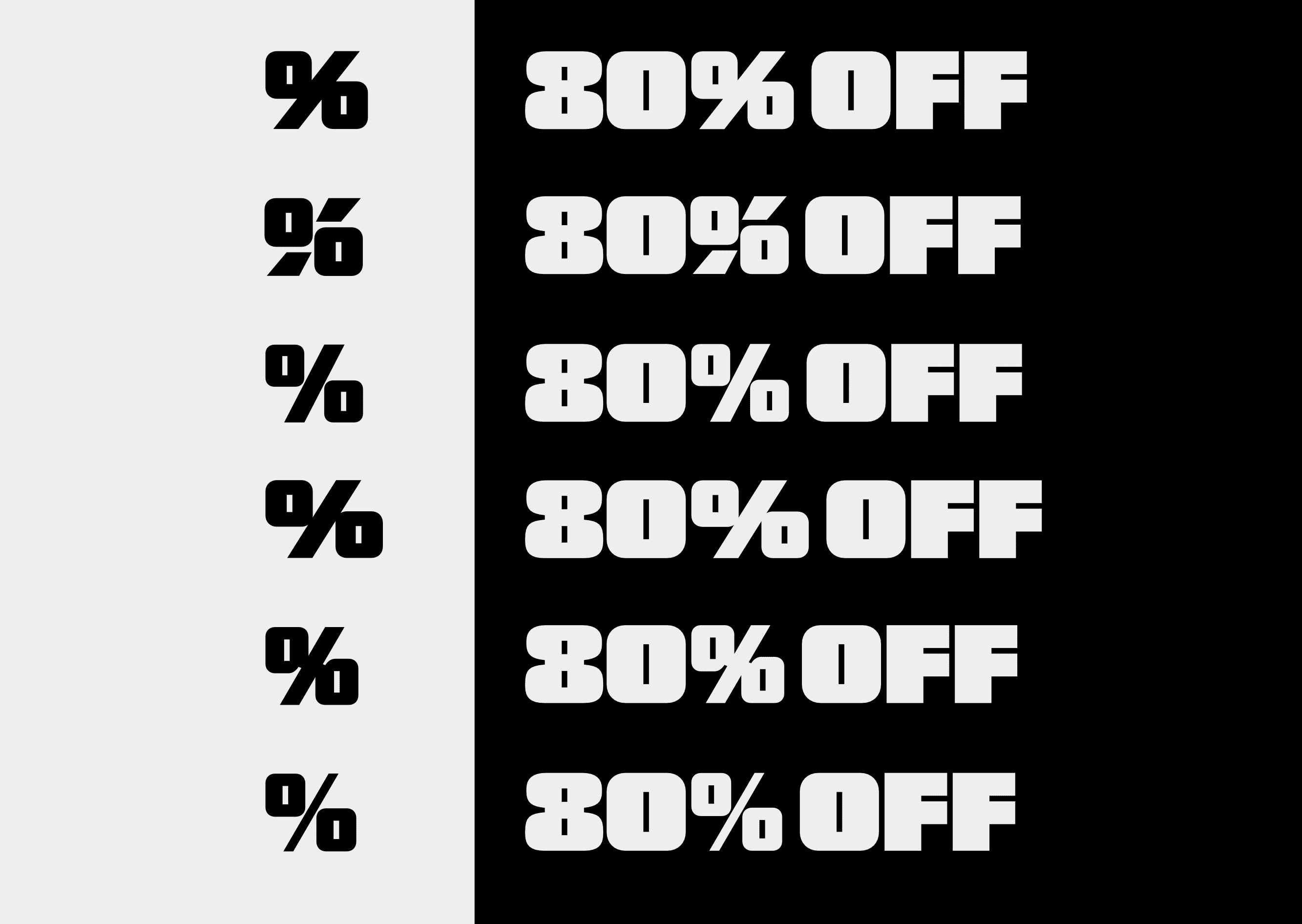
But nothing as much as the percent symbol!

The resulting font was a capitals only display face.

The letters and numbers included variations for adding massive amounts of weight to either side. This was all rolled into a single variable font.
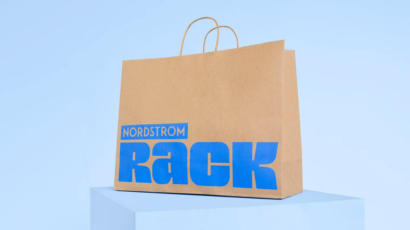
What a glorious bag! Image courtesy of JKR.
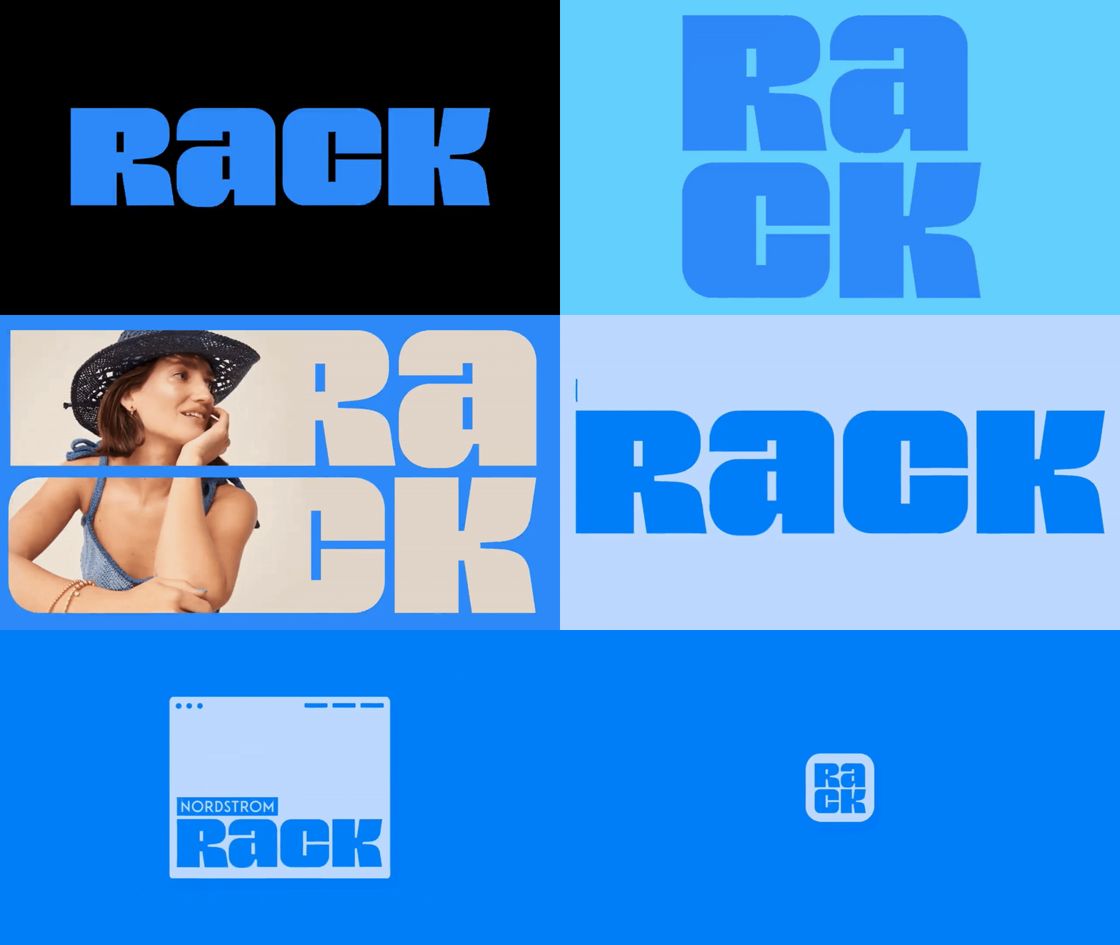
The variable font in action! JKR uses the custom typeface to create a responsive identity for Rack, from billboard to app icon. Animation courtesy of JKR.
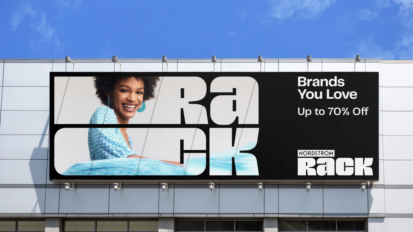
The variable font allows it to act as a frame for photography. Image courtesy of JKR.
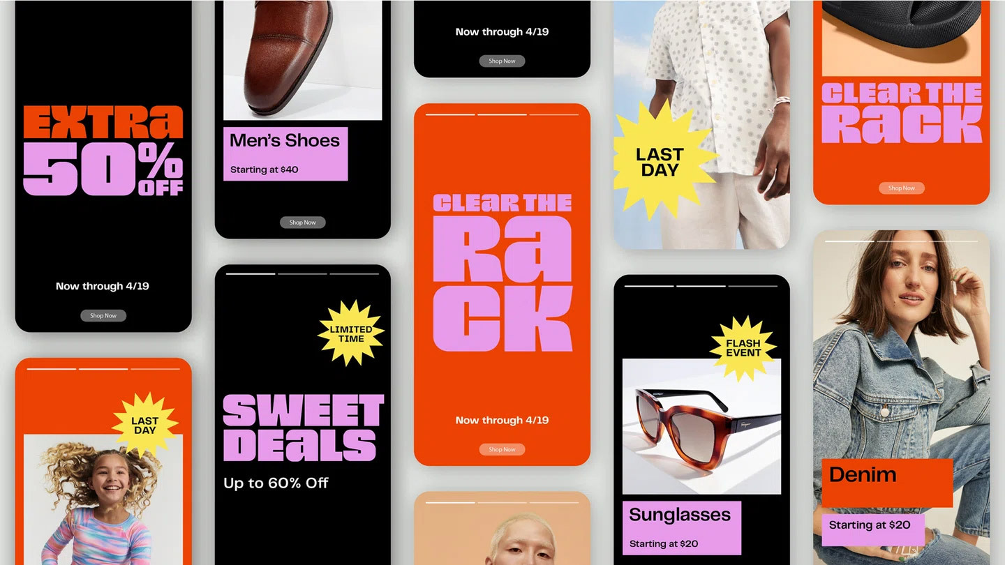
A look at the system on mobile. Image courtesy of JKR.
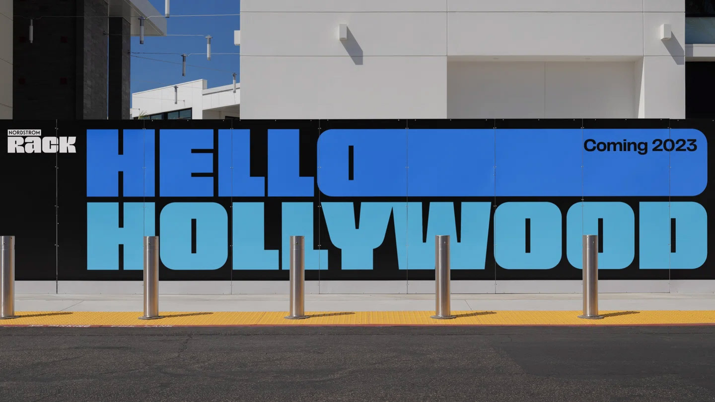
I’ve never seen such a wide O, and I love it! Image courtesy of JKR.
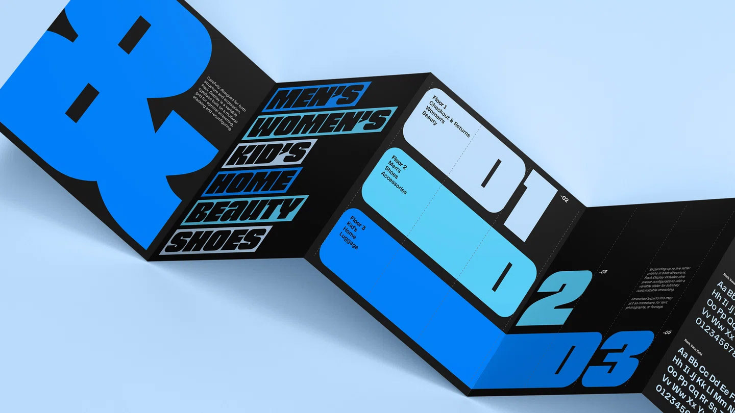
Image courtesy of JKR.
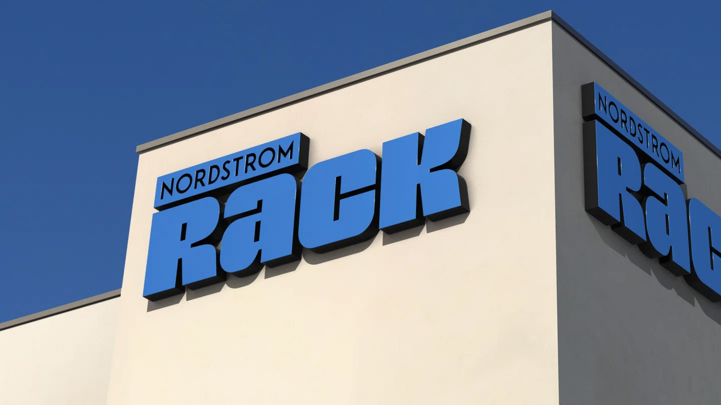
Image courtesy of JKR.